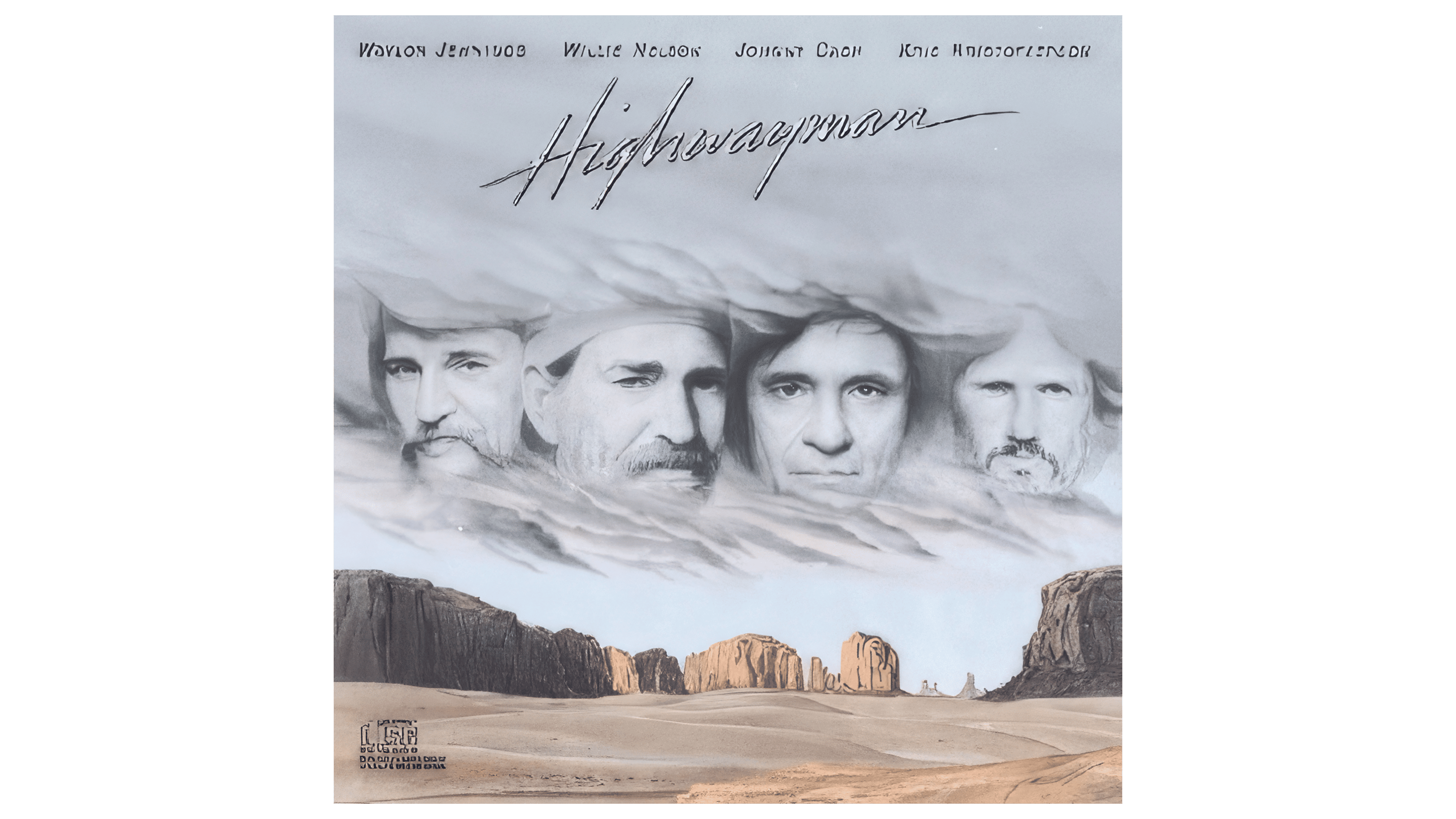
 Highwayman Album Logo PNG
The Highwayman Album logo demonstrates that the boundaries of the mainstream do not confine true creativity. It embodies the spirit of freedom, adventure, and a thirst for discovery characteristic of country music. Behind the simple shapes of the emblem lies a concept of the unknown and the search for life’s meaning.
The story of Highwayman began in 1984, when Kris Kristofferson, Willie Nelson, Waylon Jennings and Johnny Cash met in Switzerland to record a Christmas television special. Their informal sessions led to plans for a shared album, and the four singers entered the studio in early 1985.
The project took its name from Jimmy Webb’s song “Highwayman,” in which one soul returns as a highway robber, sailor, dam builder, and star traveler. Each performer sang one part, giving the title track four distinct voices. Producer Chips Moman, who had worked with the artists separately, directed the recording and helped shape a track list that included “The Last Cowboy Song” and “Against the Wind.” The arrangements centered on the contrast between the four vocal styles.
Columbia Records released Highwayman in May 1985. The title song reached number one on Billboard Hot Country Singles, while the album topped Billboard Top Country Albums. The group received an ACM award for vocal performance in 1985, and the song won the 1986 Grammy for Best Country Performance by a Duo or Group.
The album launched a longer partnership as The Highwaymen. The musicians later recorded two more albums and toured together. Highwayman was reissued several times, and other performers covered its songs. By 2023, it remained one of country music’s best-known collaborative records. It continued to reach new listeners through later releases.
Meaning and History

What is Highwayman Album?
This is a musical project where four legendary country artists joined forces to create a collection of songs about freedom, adventure, and the American spirit. The album became a symbol of unity and creativity, blending the individual styles of each artist into a powerful musical experience. The songs tell stories that convey the beauty and complexity of life, making the album a classic of the genre.
1985

The musical group The Highwaymen adorned the cover of their debut album with a simple inscription resembling someone’s autograph. This is the Highwayman Album logo. The sweeping lines convey the overall mood of the songs: lyrical, rebellious, and addressing sharp social issues.
The wordmark is created in a handwritten font with many diagonal lines, making the letters difficult to read. The diagonal form gives the text a sense of dynamism, reflecting the powerful energy of country music.
There is no traditional dot over the “i” because the designers intended the inscription to be a single continuous line. Even where the line breaks (near the “w” and “m”), the glyphs are positioned as close together as possible, creating the impression of a unified whole. This makes the logo resemble a rising and falling wave. And it is not just a wave but sound vibrations.
The chosen font has one drawback: it makes the word “Highwayman” hard to read. However, it has many strengths, including uniqueness, recognizability, strength, and expressiveness. Country music enthusiasts can easily identify which artist the logo belongs to despite the letters’ lack of clarity.
Light gray shadows surround the inscription, evoking the unease characteristic of the album’s songs. However, the yellow color of the letters softens this negativity, as it is associated with friendliness, optimism, and joy.