 Hismile Logo PNG
The Hismile logo highlights the company’s innovative approach to teeth whitening. It reflects the benefits of freshness, cleanliness, health, and harmony that can be achieved with regular use of the brand’s products. In essence, the emblem embodies the beautiful, bright smile that everyone desires.
HiSmile was founded in 2014 on Australia’s Gold Coast by Nik Mirkovic and Alex Tomic. Tomic was 16, and Mirkovic was 21 when they started the company with 20,000 Australian dollars from their savings. The idea came from the growing demand for at-home teeth whitening and the founders’ plan to create a product that was affordable, useful, and easy to use.
During the first months, the team developed a whitening gel and an LED whitening device. By late 2014, HiSmile released its first teeth-whitening kit, combining the device with gel. Sales and promotion were handled online, with social media becoming the main channel. In 2015, the brand grew quickly through Instagram campaigns with bloggers and influencers.
In 2016, HiSmile added mouthwashes and toothpastes, then expanded into the United Kingdom and the United States. In 2017, the company partnered with Kylie Jenner, which increased sales and public awareness. In 2018, Conor McGregor appeared in campaigns, helping the company reach a wider international audience. In 2019, HiSmile opened its first U.S. office and introduced a new oral-care line.
From 2020 to 2022, HiSmile updated its whitening gel formula, entered retail through beauty and health chains, launched professional oral-care products, and opened an office in Singapore. In 2023, it released a new LED at-home whitening system developed with dentists. It opened its first physical store in Sydney. In early 2024, the company began certification work in South Korea and Japan. It introduced a smartphone app that uses augmented reality to show whitening shades and track progress.
Meaning and History
What is Hismile?
It is an Australian oral care brand known for its teeth whitening products and dental solutions. The company offers a range of products designed to improve dental hygiene and aesthetics, including teeth whitening kits, whitening toothpaste, and mouthwashes. The brand is particularly known for its PAP+ formula, which effectively whitens teeth without causing sensitivity. It emphasizes safety, allowing users to easily achieve a brighter smile at home, and focuses on ensuring products are cruelty-free and use quality, scientifically proven ingredients.
Old
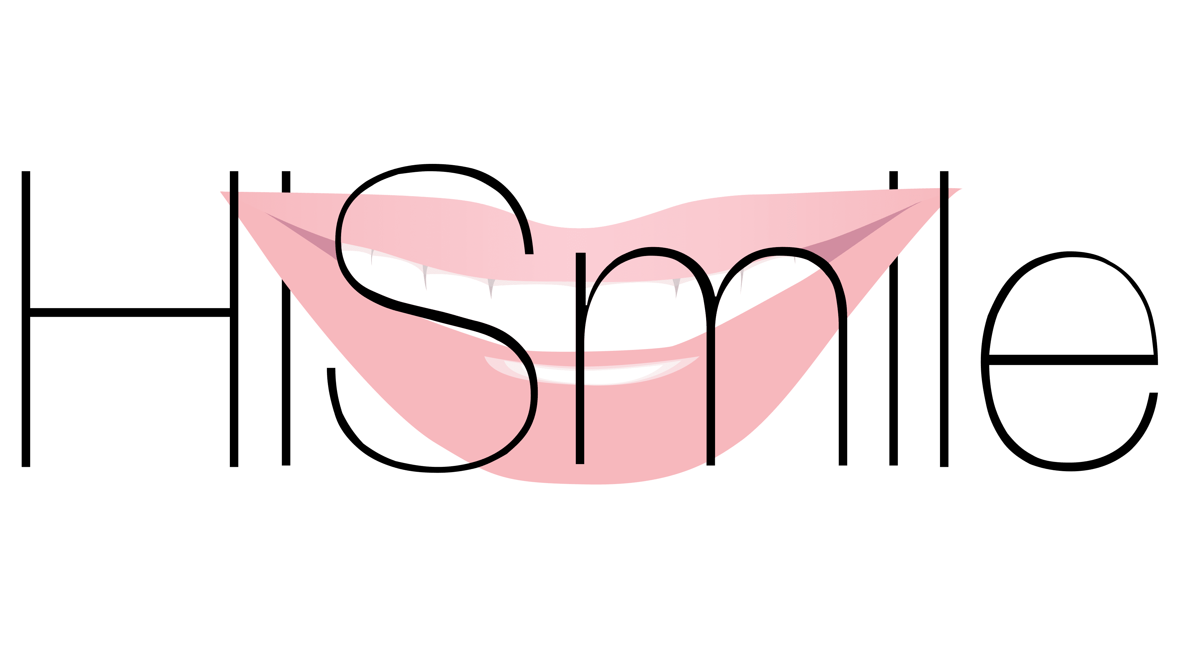
Hismile used this logo until 2019, when the company adopted a stronger and more impressive look. The old emblem was too soft, from its light pink color to the thin lines of the letters. This made the wordmark appear less convincing, although its subtle design effectively conveyed the idea of comfort and safety.
Starting in 2014, the brand’s target audience was people who fear dentists and prefer to whiten their teeth at home. For this reason, the Hismile logo was designed to be as calming as possible to build trust with those hesitant to visit a dentist. The designers achieved visual softness by using an extremely thin font, striking a perfect balance between straight lines and smooth curves. The absence of serifs emphasized the simplicity and accessibility of the oral care products.
The Australian company’s name was presented in a concise black inscription. The “H” and “S” were in uppercase, while the other letters were in lowercase, adding dynamism to the logo. The wordmark was filled with invisible energy, symbolizing the brand’s progress and commitment to developing innovative products. The thin lines conveyed the precision with which Hismile’s products whiten teeth without damaging the enamel.
The wordmark was harmoniously combined with the image of a bright white smile. Its radiant glow hinted at the effectiveness of the company’s toothpaste, powders, serums, whitening strips, and other products. Plump pink lips were stretched into a smile, creating an aura of positivity and instilling trust in the brand.
The mouth was positioned in the background, serving as a backdrop for the inscription. Its corners passed through the two lowercase “i “s, fitting perfectly into the space between the vertical stroke and the dot. This created a spatial illusion, making it seem as if the edges of the lips were threaded between the letters and held the wordmark in place. Essentially, the emblem hinted that Hismile helps maintain a flawless Hollywood smile.
New
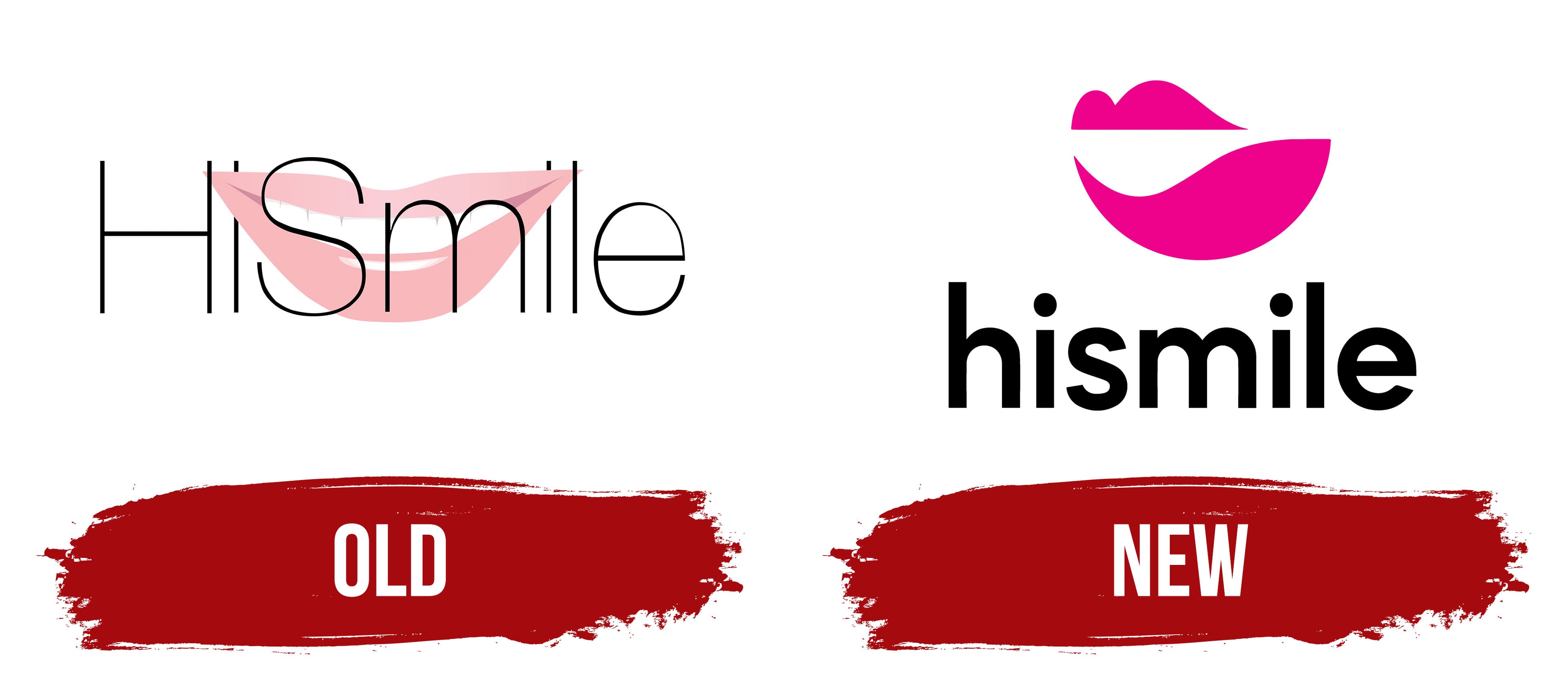
This logo was introduced in April 2021 alongside the innovative PAP+ line. The change in Hismile’s visual identity was part of a marketing strategy to draw attention to a revolutionary product, something the market had never seen before. The company developed a unique teeth-whitening formula that poses no harm to gums or enamel.
The new emblem is designed in a modern minimalist style, reflecting the progressive nature of the Australian innovator. The wide smile, a recognizable brand symbol, was transformed into an abstract design of two differently-sized shapes over the years. From their positioning, smooth curves, and bright fuchsia color, they represent lips. Teeth are no longer visible, so the logo contains no obvious references to Hismile’s products. The enigmatic smile only suggests that consumers will be pleased with the results.
The company name is written in a standard font, somewhat similar to Biotif Semi Bold by Degarism Studio. It features simple forms, uniform line thickness, no serifs, and smooth rounding. This design ensures letter clarity, making the wordmark easily readable even on small screens and reflecting the brand’s focus on digitalization.
The black text contrasts with the fuchsia-colored lips. This visual dissonance catches the eye, helping Hismile stand out among competitors. The logo’s creators intentionally chose vibrant colors to emphasize the strong emotions their products evoke. This hints that no one will remain indifferent after using Hismile’s innovative oral care products.