![]() Hoonigan Logo PNG
Hoonigan Logo PNG
To win, one must be highly focused and not distracted by external irritants. This is precisely what the Hoonigan logo asserts. It conveys unity, team spirit, and the determination to stay within bounds, even in unfavorable circumstances.
Meaning and History
![]()
Ken Block was a professional racing driver and an avid rally promoter. He loved speed, extreme driving, and sharp turns in cars, and he shared this passion with others by uploading his own content on YouTube. His team developed stunts, brought them to life, and conducted the filming. Car enthusiasts attracted attention not only with their thrilling videos but also with their own stores. They produce and sell several categories of goods, including clothing for adults and children, accessories, and merchandise with the logo, which remains virtually unchanged: the brand name, bracketed on both sides by square brackets.
What is Hoonigan?
Hoonigan is the shortened name for Hoonigan Racing Division, a racing team, its YouTube channel, and its online store. The brand’s visionary creator is professional racing driver Kenneth Paul Block, who organized it to participate in the American Rally Association. Initially, the club was called Monster World Rally Team. It was established in 2010, with its headquarters located in Park City, Utah.
2010 – today
![]()
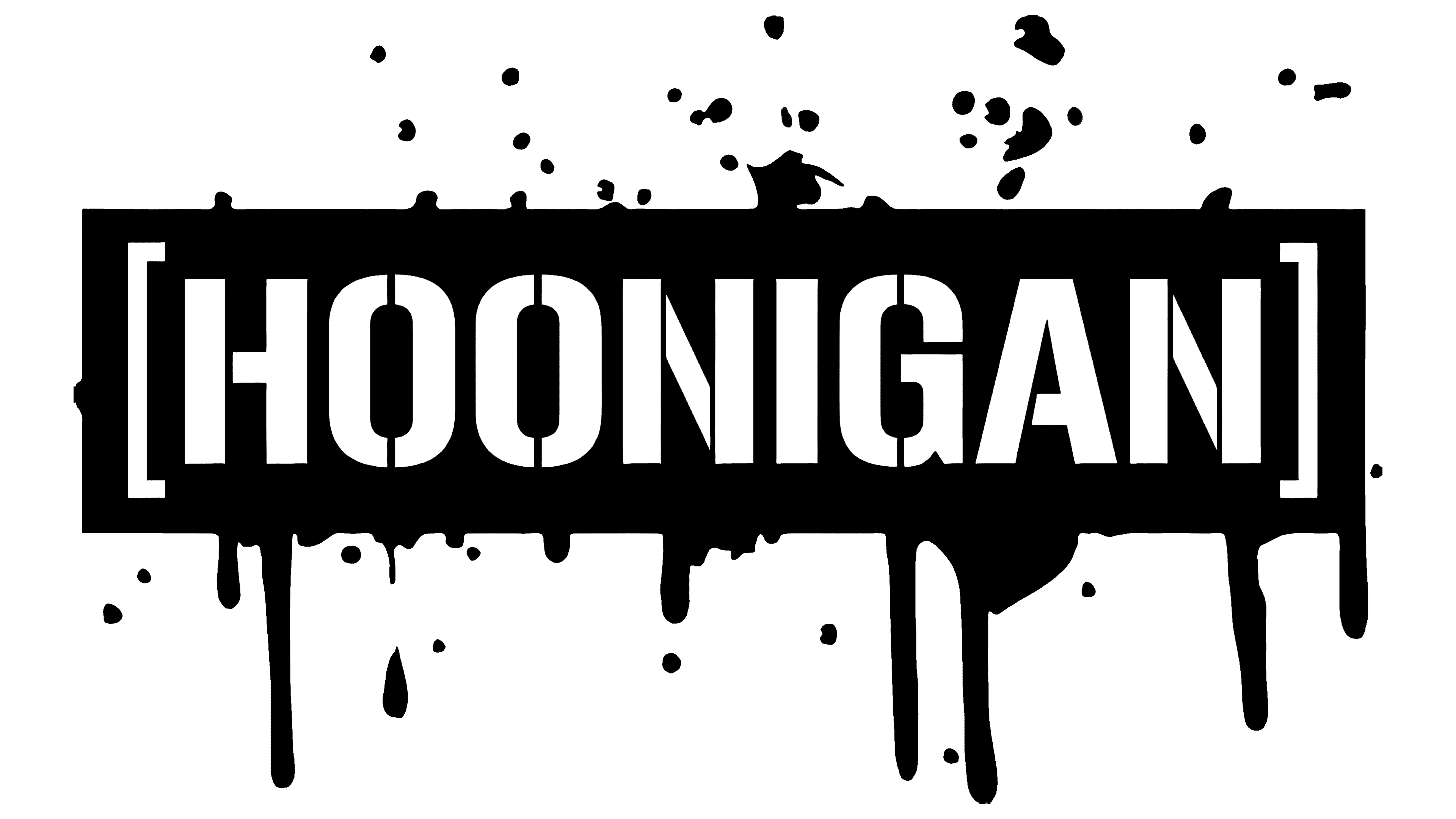
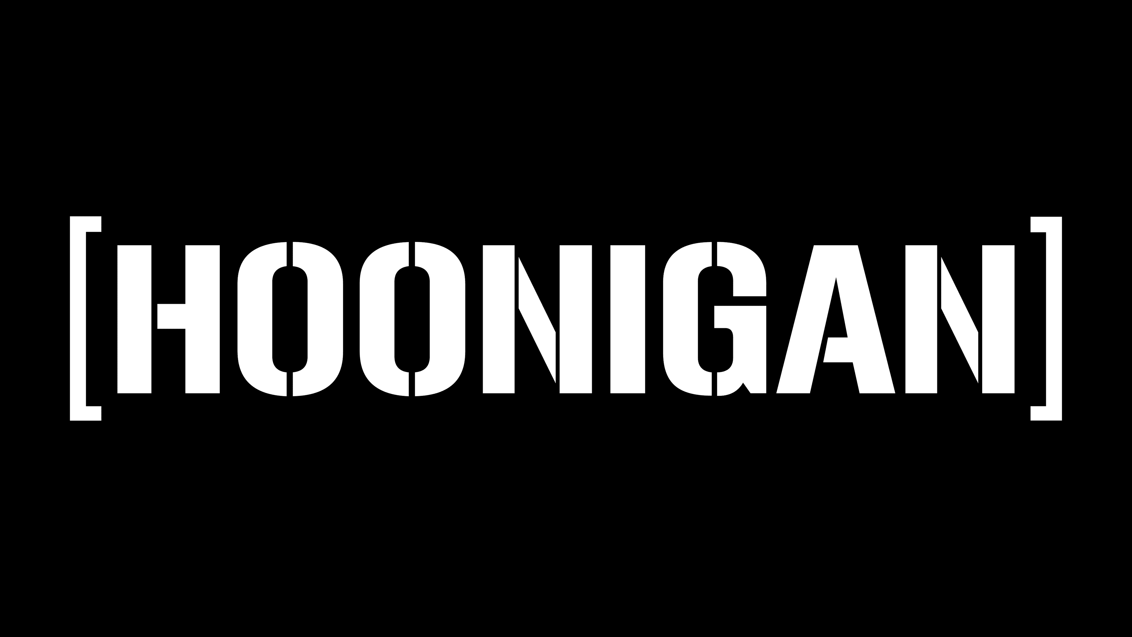
The Hoonigan logo is textual. It features the brand name in a stencil-style font. All letters are uniform: massive, uppercase, geometric, blocky, bold, combined from two or three elements. The exception is only “A,” which is formed from one part with an open crossbar. The distance from the crossbar to the neighboring leg is similar to the space between parts of other glyphs, so the single-component letter is visually perceived as multi-component.
“O” is double: it is divided into two mirror fragments. “N” is triple: it has two vertical strokes, and in the gap between them is a diagonal stripe hanging alone in the air. There is also a version with the crossbar attached to one of the halves. The team’s name is enclosed in square brackets as if to denote the boundary of its interests.
Font and Colors
The text in the Hoonigan emblem is set in a stencil-style typeface reminiscent of Gunplay Regular (developed by designer Ray Larabie). It was inspired by the lettering on a poster for the 1972 film The Getaway. The only discrepancy is in the letter “N”: in some versions of the logo, it is formed from two parts, and in others, from three.
The visual identity palette is more straightforward and traditional, featuring black and white. If a light background is chosen for the name, the glyphs themselves are dark, and vice versa. This ensures excellent contrast and makes the word easily readable despite the presence of empty spaces in the letter lines.