![]() Illenium Logo PNG
Illenium Logo PNG
The stylish logo of Illenium surprises with its geometric nature and plasticity. Yes, it harmoniously combines harsh lines and soft curves, presenting itself as an original sign. Such an emblem speaks to the owner’s contradictory character and contrasting psychological evolution, given his young age.
Illenium, the musical project of Nicholas Daniel Miller, was born in 1990 in Downers Grove, Illinois, and emerged from Miller’s personal struggles and transformative experiences, particularly an overdose and subsequent recovery that inspired his passion for electronic music production. His initial work, created in a home studio, blended melodic dubstep and future bass, earning early attention through remixes such as “Don’t Let Me Down” by The Chainsmokers. Miller’s debut album, Ashes, marked the start of significant recognition, enhanced by his innovative live performances incorporating traditional instruments. Subsequent albums, including Awake, Ascend, Fallen Embers, and the self-titled Illenium, expanded his sound into electronic, rock, pop-punk, and dubstep, earning critical acclaim and Grammy nominations. His memorable live events, such as the massive Trilogy show in Las Vegas, have drawn tens of thousands of fans. Miller continues exploring new directions, such as the collaborative DOLOR project with Ray Volpe, while actively releasing music and performing worldwide.
Meaning and History
![]()
Nicholas Daniel Miller’s music career almost instantly brought him fame when he started remixing popular songs by established artists. His first album, titled Ashes, was released in 2016. The themes of fire, rebirth from the ashes, and the purifying flame continued in subsequent collections, underscoring their immense importance to the young man.
This theme is also conveyed in the album cover design, where the central motif is fire. The musician’s emblem also traces the analogy with purification through fire and rebirth from the ashes. Its key image evokes the Phoenix, and the curved lines with pointed ends are perceived as tongues of flame.
What is Illenium?
Illenium is the artistic pseudonym of DJ, producer, and songwriter Nicholas Daniel Miller from Denver, who works with several youth music genres. His discography mainly includes dubstep, pop-punk, rock, and electronic dance tracks. He has received several high awards and is in the top 50 best DJs in the USA (according to DJ Mag).
2008 – today
![]()
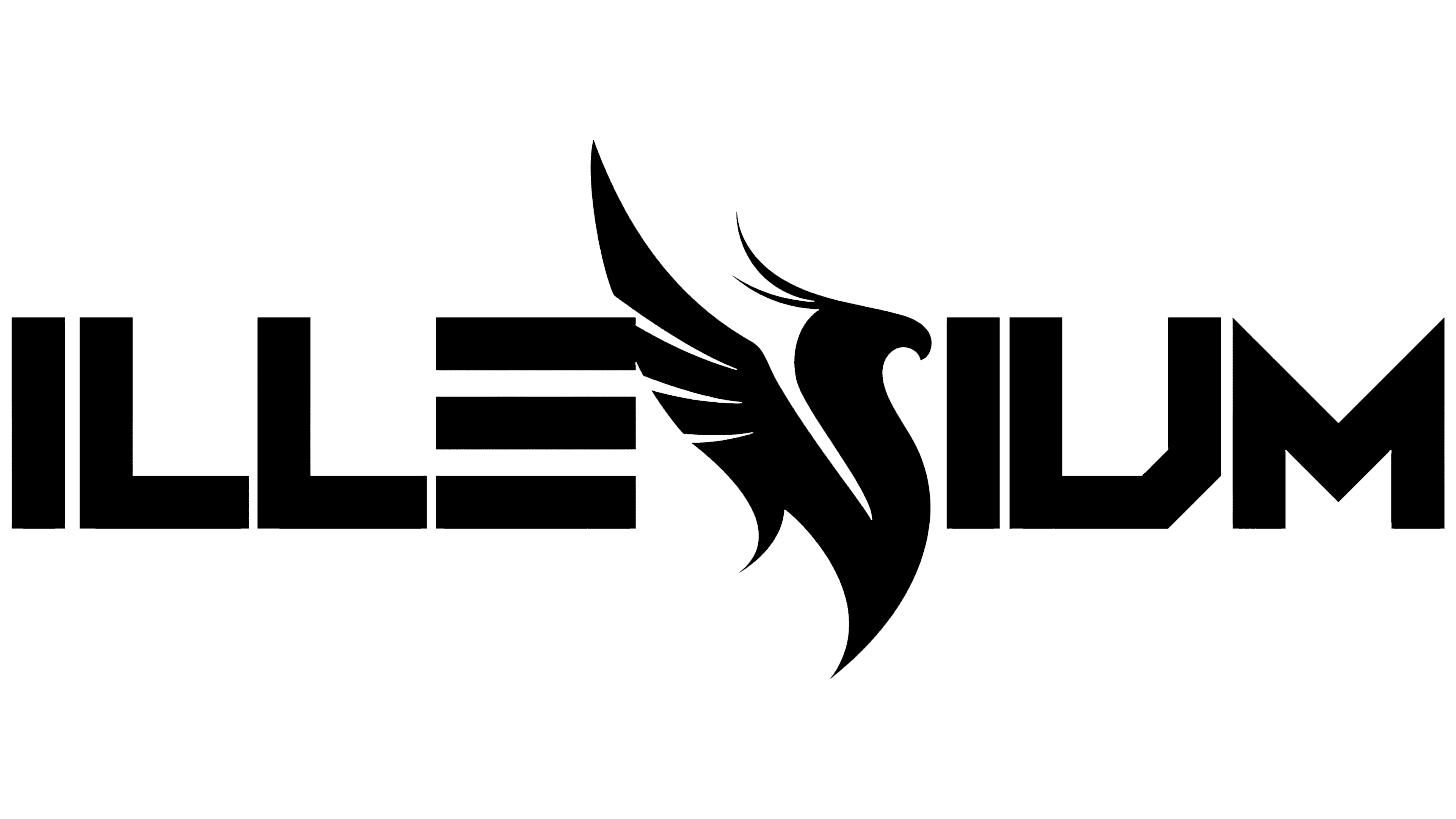
The Illenium logo features the DJ’s stage name and a drawn element of great significance to the DJ. It reflects his worldview, attitude to creativity, and even character. The graphics and text are harmoniously connected since they represent an intuitive substitution that does not affect readability.
- The inscription is in uppercase. The symbols are smooth, even, sans-serif, and resemble geometric figures. In particular, “E” resembles three parallel rectangles in a horizontal position, “I” is perceived as a lone pillar, and “L” perfectly conveys a 90-degree angle. The letter “U” has a more complex structure with a cropped side part (at the bottom right).
- The phoenix is depicted sideways, with wings raised, to roughly convey the outline of the uppercase “N.” It has a curved neck, and two elegant feathers are drawn on its head. The body ends with a narrow, pointed stripe. The bird is painted in the same color as the surrounding glyphs. It is larger than the inscription, extending beyond the line at the top and bottom.
The word “Illenium” is arranged in a single row and set in a single style. Essentially, it’s a successful mix of industrial design with classic.
Font and Colors

For the Illenium logo, a custom-designed font has been chosen that, in its main features, resonates with Vermin Vibes by Chequered Ink and Wildstar. It’s as geometric, smooth, and chiseled as these fonts. The emblem’s palette is mustard, representing a slight mix of green to brown. It also reveals a golden shade.