


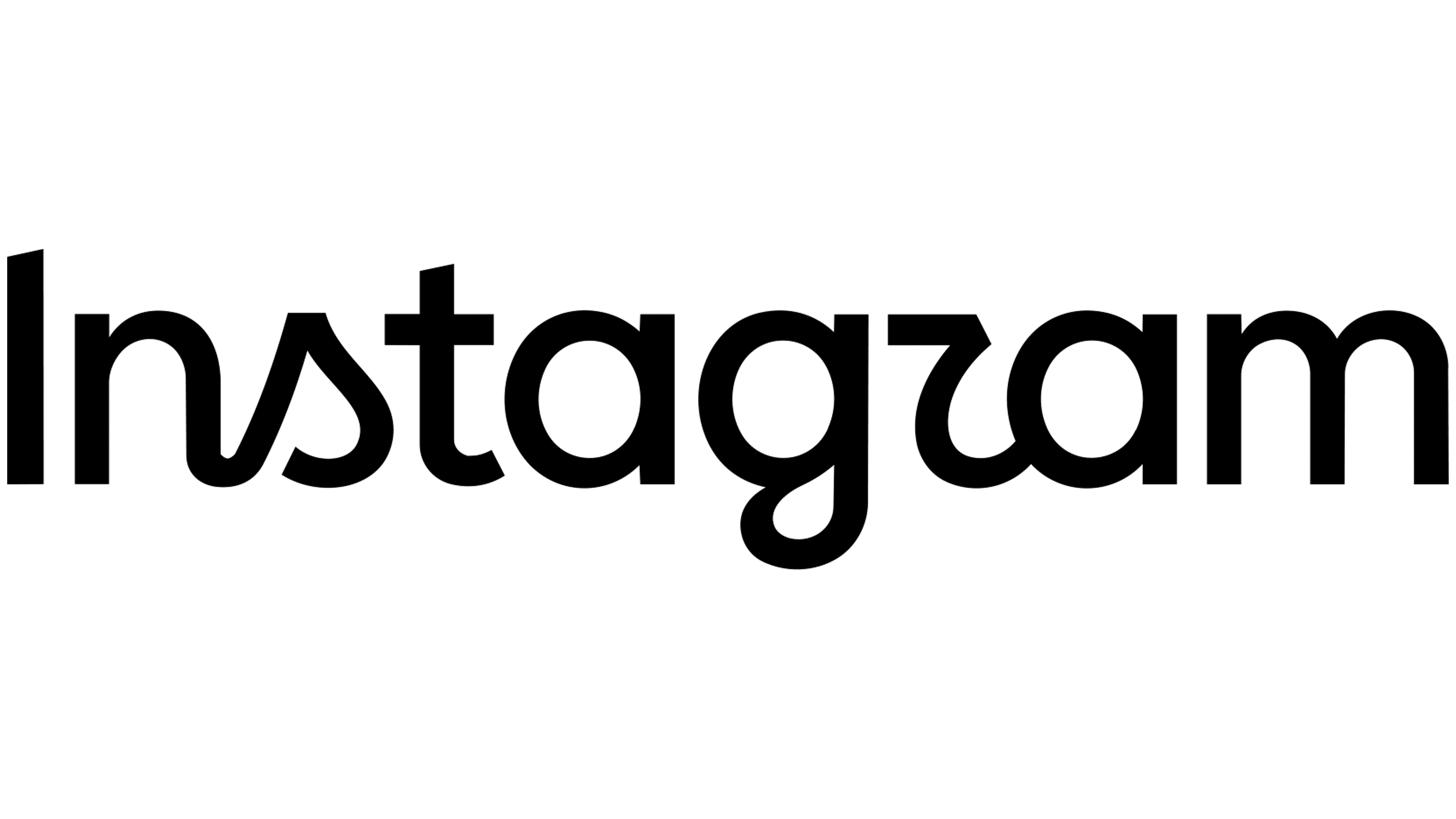
On August 13, 2026, Instagram introduced a new wordmark that brings its lettering closer to the rounded contours of its camera icon. The letters are thicker, the curves simpler, and the handwritten details blend with more conventional typographic forms. The update is designed for everything from the app header to international campaigns and services like Edits and Instants.
Instagram launched in 2010 as a photo-sharing app. In 2012, Facebook (now Meta) acquired it. It has since grown into a platform with about 3 billion users, encompassing photos, videos, Stories, Reels, livestreams, and direct messaging. The camera icon represented Instagram across different formats, while the script wordmark retained the look of an early mobile app. The designers needed to adapt the lettering for creator programs, cultural events, advertising, and new products.
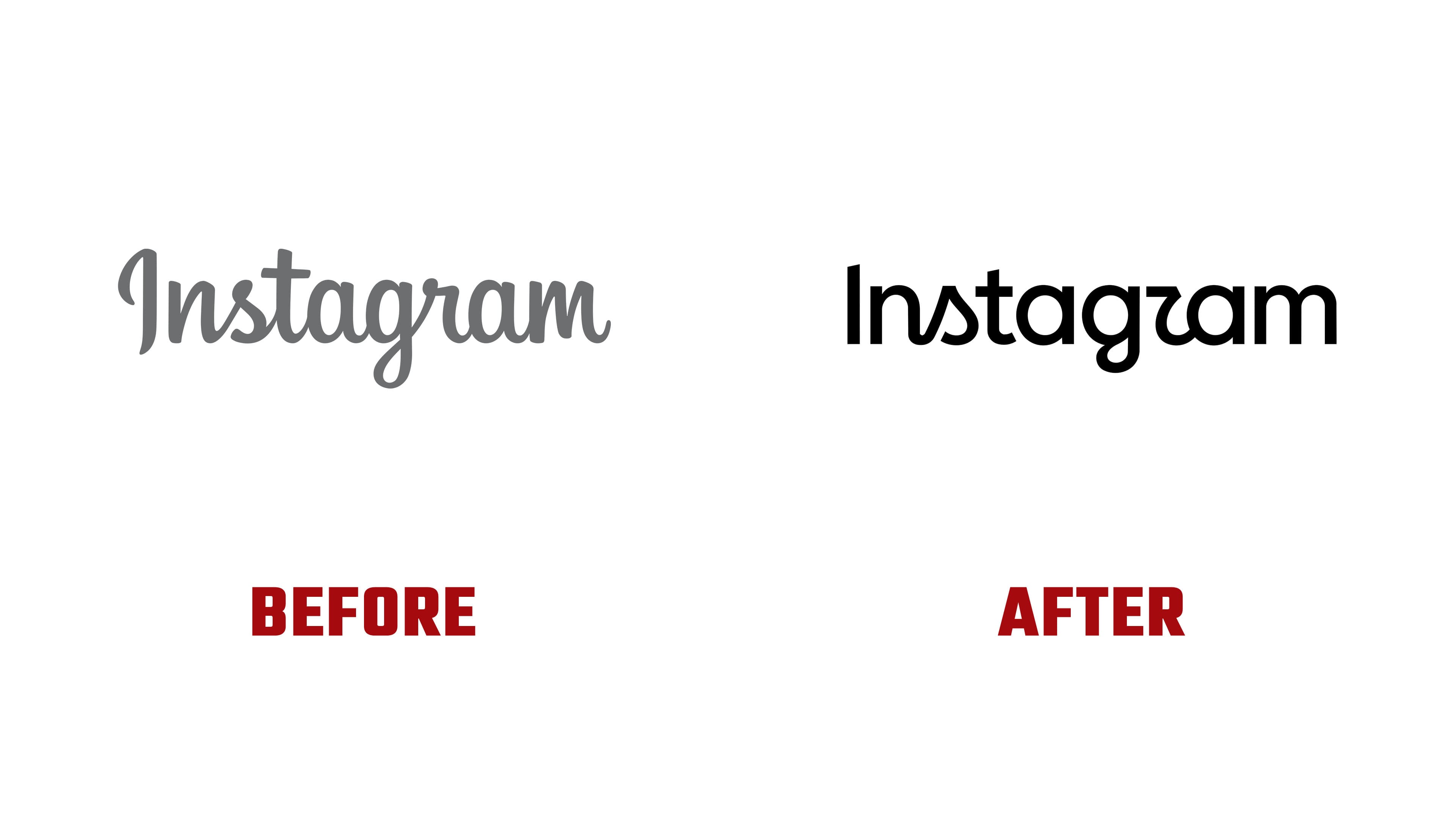
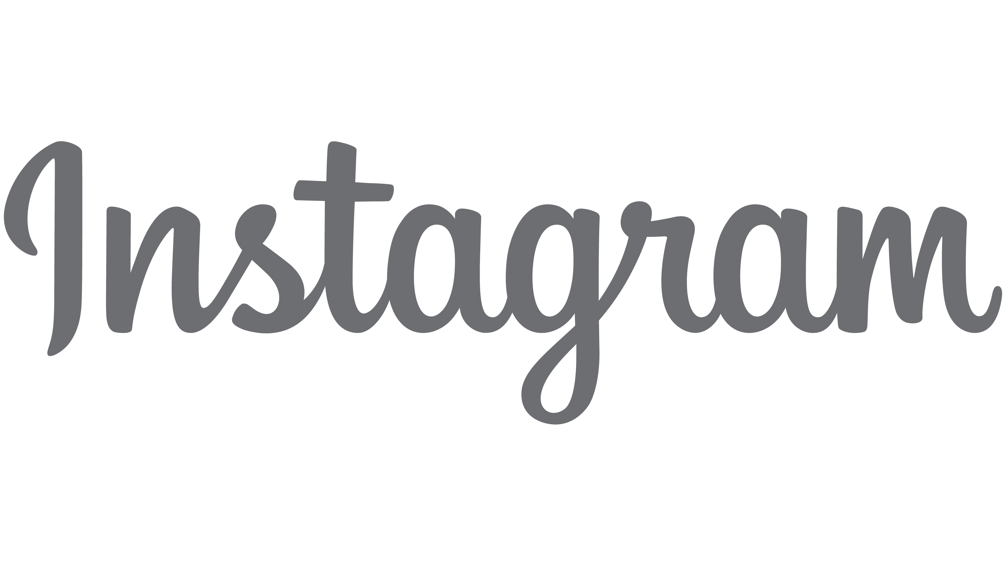
The early logo used the Billabong typeface. In 2013, Mackey Saturday created a custom wordmark, reworking the letterforms and their connections. He changed the initial “I,” which had resembled a “J” or “g” in the previous version. That calligraphic wordmark served Instagram for 13 years. During that period, the platform’s broader identity evolved. In 2016, an abstract camera on a multicolor background arrived, followed by a new identity in 2022.
Meta’s internal team, agency Koto, and Jeremy Mickel, founder of type studio MCKL, worked on the 2026 version. The team developed the logo and broader identity in less than a year. The designers explored hundreds of options, from uppercase lettering and camera-inspired shapes to versions resembling everyday handwriting. Some sketches abandoned script entirely. Comparing the options led the team to retain the handwritten foundation that connects the name to Instagram’s history.

The updated logo reduces decorative turns and thickens the strokes. Rounded sections more closely follow the camera icon’s geometry. The previous wordmark resembled a calligraphic signature with varying stroke widths. The new version uses heavier forms while retaining selected features of connected handwriting. Through those details, the designers sought to preserve a sense of personal expression and human involvement in creating posts. They refined the letters’ curves, terminals, widths, and spacing.
The “gr” connection became a particular point of discussion. Koto describes it as a ligature and links the abbreviated “r” to the previous script logo. After the unveiling, some users saw a “z” and read the name as “Instagzam.” The designers intended the connection to carry forward Instagram’s lettering tradition. To develop it, the team studied calligraphy, handwriting styles, and the small irregularities of handwriting.
The camera icon remains in place. Using its rounded contours as a guide, the designers brought the platform’s two main identifiers into closer alignment. The team conducted several rounds of external feedback, considering how the logo was perceived across regions. They reviewed ligatures, proportions, spacing, and how the wordmark worked with the rest of the identity. The lettering is intended to last about 10 years, while the accompanying identity will continue to evolve.
Meta collaborated with Something Special Studios on the identity, while Mallandrich handled animation. Instagram’s project leads included Product Design Director Jasmine Probst, Brand Design Directors May Hartono and Cynthia Pratomo, and Creative Director Christy Silva. The identity introduces camera-inspired viewfinder frames, contact sheets, and annotations. The gradient appears less frequently, with applications that evoke light leaks on photographic film. An additional version combines green and blue against black. The worldwide rollout began in 2026 and will continue beyond that year.