


![]() Invisalign Logo PNG
Invisalign Logo PNG
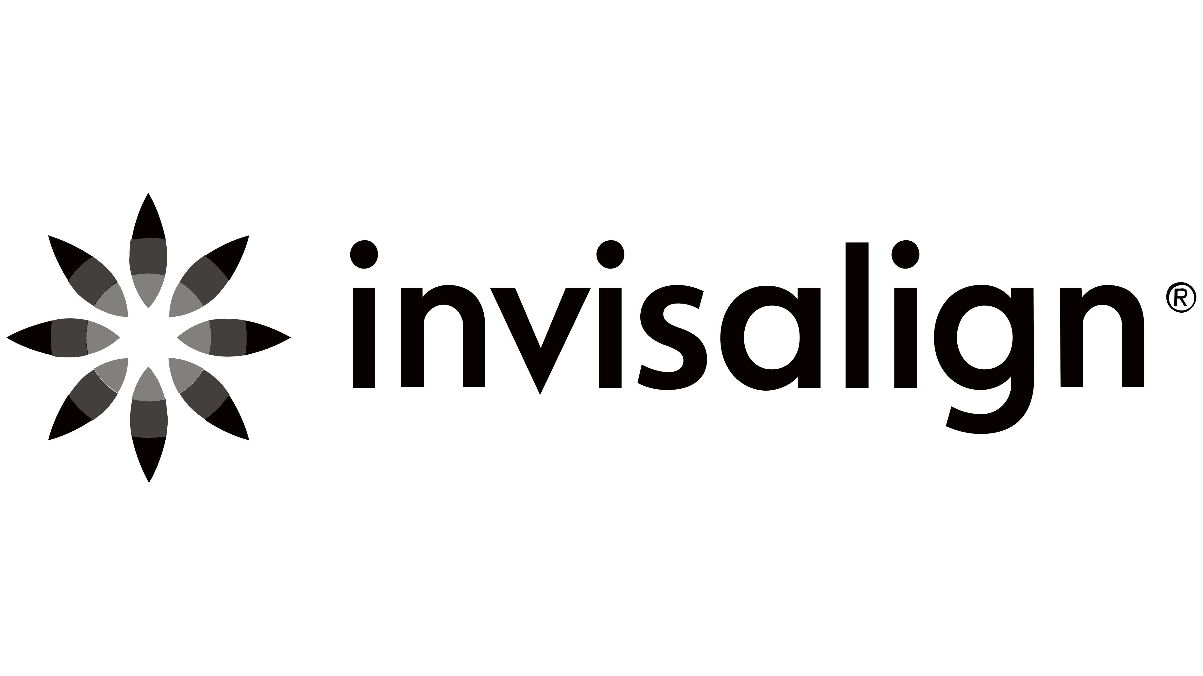
The magical transformation is depicted on the emblem. Beauty, harmony, and harmony are read in the elements. The Invisalign logo conveys a gentle, gradual approach with a permanent, long-lasting effect.
Invisalign began in the mid-1990s, when Zia Chishti questioned the effectiveness of traditional braces after receiving a clear retainer. Together with Kelsey Wirth and Stanford engineers, he developed a system of sequential aligners based on digital modeling.
In 1997, they founded Align Technology in Menlo Park. Early funding from Kleiner Perkins supported research in CAD systems and manufacturing. By 2000, the company had raised about $140 million. In 1998, the FDA cleared Invisalign for clinical use. The product launched in 1999 with a controlled rollout limited to orthodontists, emphasizing medical positioning rather than direct consumer sales.
Initial response from professionals was cautious. Align invested heavily in education, and by 2001, roughly 75 percent of orthodontists in North America had been trained to use the system. In 2000, a $31 million TV campaign targeted adults seeking alternatives to metal braces. On January 26, 2001, Align went public on NASDAQ, raising $130 million. That same year, a legal case forced the company to open access to general dentists, expanding its reach.
Between 2001 and 2003, the founders stepped back from leadership. Chishti later launched OrthoClear, triggering litigation that was resolved in 2006 when Align acquired its intellectual property. In 2011, Align acquired Cadent, integrating iTero scanning into treatment workflows. This enabled digital impressions and improved planning accuracy, while creating barriers for competitors such as SmileDirectClub.
By 2017, Invisalign had been used by over 18 million patients globally. Growth accelerated with broader clinical indications and expansion into markets such as China.
Meaning and History
The parent company patented the Invisalign brand in 1998, along with the identifying symbols, including the motto, logo, and color scheme. To protect copyright, the logo must be supplemented with the registered trademark symbol “®.”
At first, the firm used a simple Invisalign label. All letters were lowercase. The font is bold Avenir. It’s a grotesque typeface that typographer Adrian Frutiger invented in the late 1980s. Versions with partially discolored text are not uncommon. Because of the visual effect, it appears to be reflecting bright light.
What is Invisalign?
Invisalign is a dental method for teeth alignment belonging to Align Technology Corporation. It involves using orthodontic plastic aligners instead of traditional braces. These aligners were introduced in 1988.
Subsequently, the designers supplemented the brand name with an original graphic symbol. This is how a stylized flower appeared on the logo. Eight petals arranged in a circle are elliptical with pointed ends.
Font and Colors
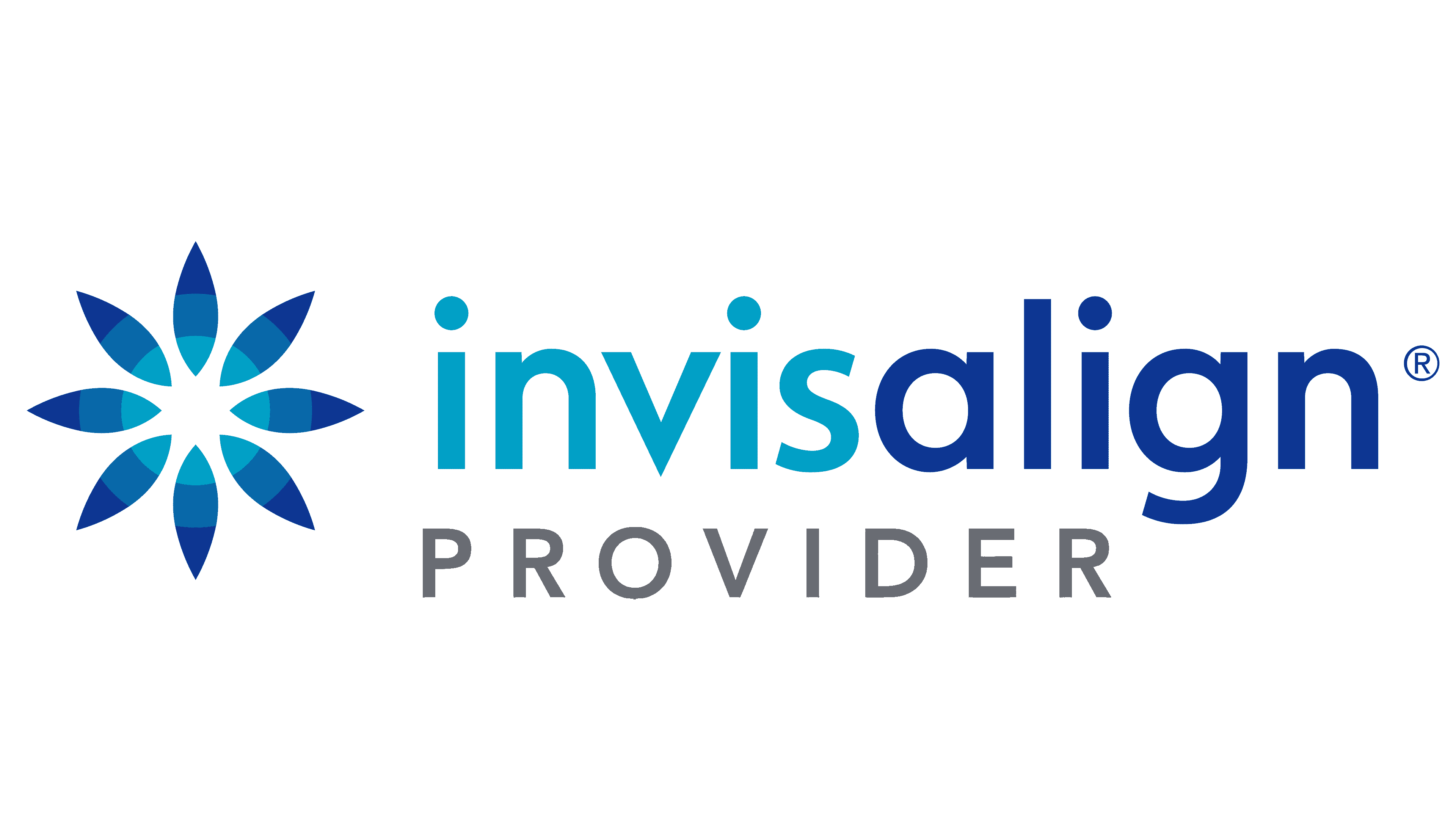
The emblem is available in several colors. The approved range includes three shades of blue. Moreover, the drawing is decorated unusually: each petal is divided into three identical segments with distinct boundaries. The part that is closer to the center is the lightest. The edges, on the other hand, are dark. The inscription is also not uniformly colored. The first half of the word (“invis”) is blue, and the second (“align”) is deep blue.
Align Technology requires the full-color trademark to be preferred. But the copyright holder permits the use of a black-and-white or black-and-white-and-black emblem, provided the original proportions and basic elements are maintained. All shades of gray are also possible.
Another permitted option is a logo with the official slogan “The Clear Alternative to Braces.” This phrase is written in the same font as the brand name. The ts have a curl at the bottom, consistent with Avenir’s typography. Sans-serif characters are easy to read.