 J.M. Smucker Logo PNG
Breakfast and everyday food products include jams, coffee, and nut butters, which are used daily in home kitchens. Producing such goods requires strict control over recipes and a consistent supply to retail chains. The J.M. Smucker logo is associated with a company that produces mass-market food products and manages a portfolio of well-known brands.
The J.M. Smucker Company was founded in 1897 by Jerome Monroe Smucker in Orrville, Ohio. The first product was apple butter made from local fruit. In 1921, the enterprise became a corporation. By 1939, annual sales had reached $1 million following the introduction of the company’s signature glass jar.
In the 1940s, the company released a line of ice cream toppings and received federal recognition for the high quality of its products. In 1959, Smucker was listed on the stock exchange. A few years later, its shares began trading on the New York Stock Exchange. In the 1970s, the company strengthened its position in the domestic market and became the largest producer of jams and jellies in the United States.
In the 1980s, international expansion and product diversification began. The company acquired the brands Knudsen and Sons, Shirriff, R-Line Foods, and Dickinson’s. By 1993, eight percent of sales came from foreign markets.
In the 1990s, the company intensified its merger and acquisition activity. It acquired peanut butter producers Laura Scudder’s and Adams, as well as the Uncrustables brand. In 2002, the Jif and Crisco brands were added to the portfolio. In 2004, the company acquired International Multifoods, which included the Pillsbury and Hungry Jack brands.
In 2008, the company bought the Folgers coffee division from Procter & Gamble for $ 3.3 billion. It was the largest acquisition in the company’s history. In 2015, it merged with Big Heart Pet Brands. In 2023, Smucker acquired Hostess Brands for $5.6 billion.
The company carried out a restructuring and sold the Voortman, Cloverhill, and Big Texas brands. Despite an increase in annual sales to $8.72 billion, Smucker reported a loss of $1.23 billion. It was related to asset impairment, primarily affecting the Hostess sweet snacks division.
Meaning and History
What is J.M. Smucker?
An American food corporation based in Orrville, Ohio, that grew out of a family apple cider business. The company’s main focus is pet food, including the brands Meow Mix, Milk-Bone, Kibble’n Bits, Pup-Peroni, and Rachael Ray Nutrish. The second segment represents coffee under the Folgers, Dunkin’, and Café Bustelo brands. The third segment includes Jif, Smucker’s, and Hostess baked goods with Twinkies. The network includes fourteen distribution centers in the United States and Canada.
before 2020
Jerome Monroe Smucker opened a cider mill in Orrville, Ohio, in 1897 and began producing apple butter. The fruit came from orchards in Wayne County. Smucker delivered the products by horse-drawn wagon and placed his handwritten signature on the jars to verify their origin. The founder’s last name became the business name, while the consumer brand took the form Smucker’s.
The company was incorporated in Ohio in 1921. The year 1897 marks the beginning of production, while 1921 marks the legal formation. The initials J.M. stand for Jerome Monroe and recall the founder. The full name The J.M. Smucker Company appeared in documents, annual reports, and stock market materials.
The Smucker’s brand appeared on jams, jellies, fruit spreads, syrups, and other products. In the logo, a large banner represented the consumer brand, while the lower line identified the parent company. One composition combined the consumer brand with the corporate name.
By 2020, The J.M. Smucker Company owned Jif, Folgers, Milk-Bone, Meow Mix, and several other brands. Its portfolio covered peanut butter, coffee, pet food, and frozen products. Acquired brands retained separate names and logos, while the corporate identity continued using the strawberries and Smucker’s banner.
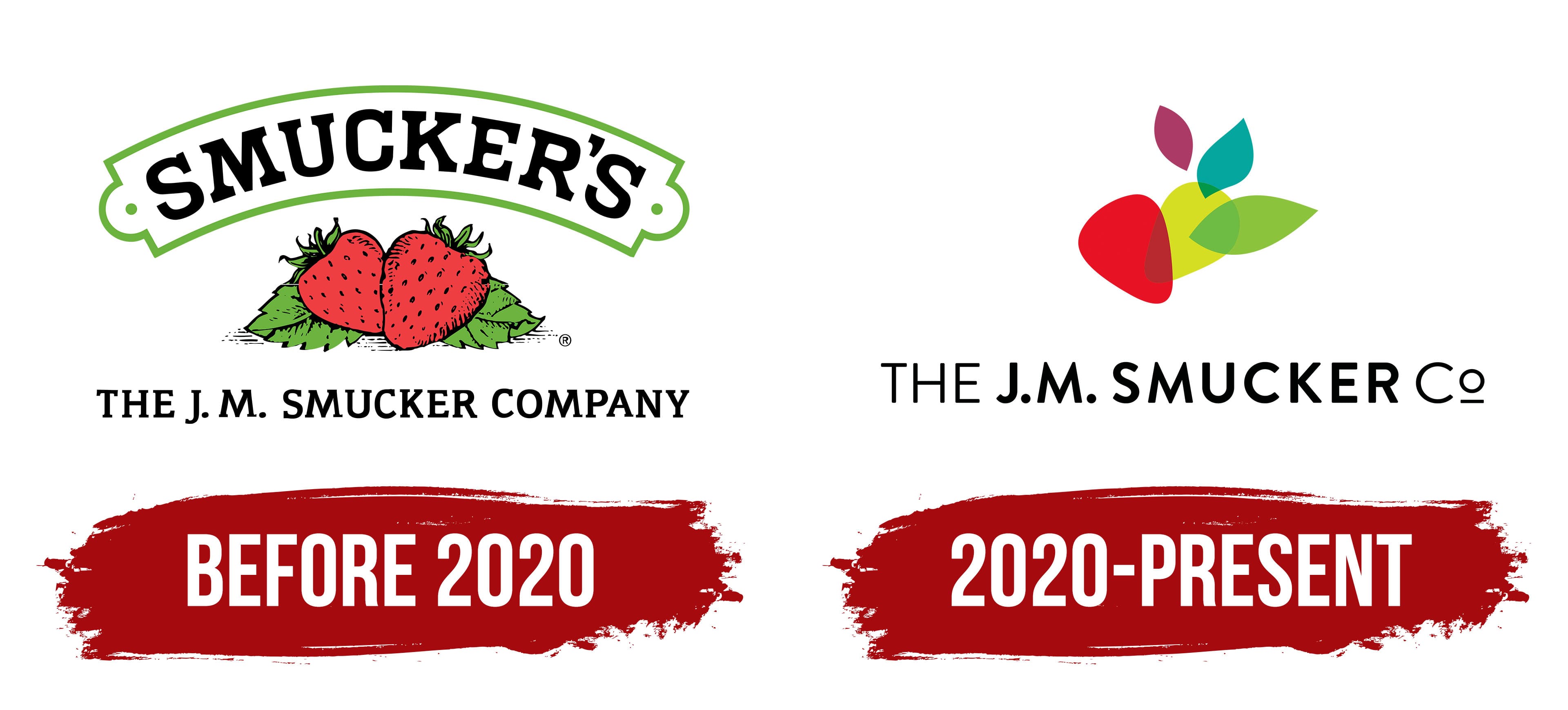
A curved banner containing the word SMUCKER’S appeared at the top of the logo. The black uppercase letters used a heavy typeface with large block serifs. They followed an arc matching the shape of the banner. A green line ran along the outer edge. The frame ended on both sides in rounded projections with small dots.
Two strawberries turned at different angles appeared beneath the banner. The red berries featured hand-drawn shading, black seeds, and dark outlines. Green leaves surrounded the fruit from below and behind. Veins, serrated edges, and shadows appeared on the leaves. The image connected the logo with jams, jellies, and orchard-grown ingredients.
The line THE J. M. SMUCKER COMPANY occupied the lower section. The full name used black uppercase serif letters. The lower inscription was smaller than SMUCKER’S. The straight line balanced the curved banner and completed the vertical composition.
The logo used black, red, and green. Black appeared in the inscriptions, berry outlines, seeds, and leaf details. Red represented the strawberries, while green appeared in the frame and plant elements. White spaces separated the three levels of the composition.
2020 – today
Fruit spreads generated less than 5 percent of The J.M. Smucker Company’s sales in fiscal 2020. The corporate emblem still featured strawberries, leaves, and the Smucker’s banner, so the group was associated mainly with jams. By then, its portfolio included coffee, food products, and pet products.
The company introduced a new identity created by CBX (Creative Brand Experience) on September 23, 2020. The public name was shortened to The J.M. Smucker Co. The corporate brand began representing the parent group, while fruit products continued using the consumer Smucker’s logo. The official media library publishes the two versions separately.
CBX retained the strawberry motif in an abstract form. The emblem consists of five colored figures. The red section refers to Smucker’s early history. The adjacent figure represents a turning point, while the remaining sections relate to growth and the addition of new business areas.
A large red form with rounded edges appears on the left and resembles the center of a berry. Four elongated leaf-like figures appear beside and above it. Together, they form a fan-shaped plant image.
Two green leaves appear on the right. One is yellow-green, while the other is saturated green. They partially overlap and extend at different angles. A blue-turquoise form points upward and intersects with the yellow-green section. A purple leaf appears above and is separated from the adjacent parts by a gap.
Red recalls the strawberry, while the green shades support the plant theme. Purple and blue-turquoise connect the emblem with the company’s expanded portfolio. The multicolored composition suits a group operating across different product categories.
The name THE J.M. SMUCKER Co. appears beneath the emblem. The wordmark uses Brandon Grotesque. Most of the name appears in uppercase letters. In Co, the lowercase “o” is circular and sits above the baseline.
J.M. SMUCKER uses a heavier weight than THE and Co. The founder’s last name occupies the leading position, while the supporting parts appear lighter. The name appears on one line beneath the multicolored emblem and uses black.
Smucker’s spread packaging received its first update in almost 30 years in 2026. The company retained the primary consumer logo while simplifying the berry images and background. The corporate emblem of The J.M. Smucker Co. continued using the 2020 CBX version.