 Jeronimo Martins Logo PNG
Retail chains provide access to food and everyday goods in various countries. Stores operate on a regular shopping basis, offering a range of products for daily needs. The Jeronimo Martins logo is associated with a company that operates supermarkets and retail chains in Portugal, Poland, and Colombia.
The company Jerónimo Martins began operations in 1792 when Jerónimo Martins opened a grocery shop in Lisbon. In 1802, the store moved to the Chiado district. It became part of the city’s commercial history for almost two centuries.
In the second half of the 19th century, the founder’s grandson became a supplier to the Royal Court. After World War I, the company faced a crisis. In 1921, it was acquired by entrepreneurs Francisco Manuel dos Santos and Elísio Pereira do Vale. They focused the business on the food trade.
During World War II, the company invested in food production and strengthened its position. After the war, it evolved into a modern retail chain under Elísio Alexandre dos Santos’s leadership.
In the 1980s, the Pingo Doce brand was created. Later, the company acquired a stake in the wholesale network Recheio. In 1990, Jerónimo Martins shares were listed on the Lisbon Stock Exchange. This opened access to international investments.
In 1995, Jerónimo Martins acquired the Polish chain Biedronka. By 2019, it had grown to 3,000 stores and led the Polish market. By 2020, the Polish segment accounted for about sixty percent of the group’s revenue.
Since 2013, the company has operated in Colombia and has also entered the Slovak market.
The company operated more than 5,700 stores across four countries. It planned to increase revenue to 50 billion euros by 2030 and continued to expand its international retail network.
Meaning and History
What is Jeronimo Martins?
A Portuguese retail group from Lisbon that operates the largest grocery store chains in Portugal and Poland. Annual revenue exceeds 37 billion euros. Founded as a family business and former supplier to the Royal Court, it later focused on retail. The group includes Pingo Doce supermarkets, the Polish chain Biedronka with more than 3,200 stores, the cash-and-carry format Recheio, and the Colombian chain Ara.
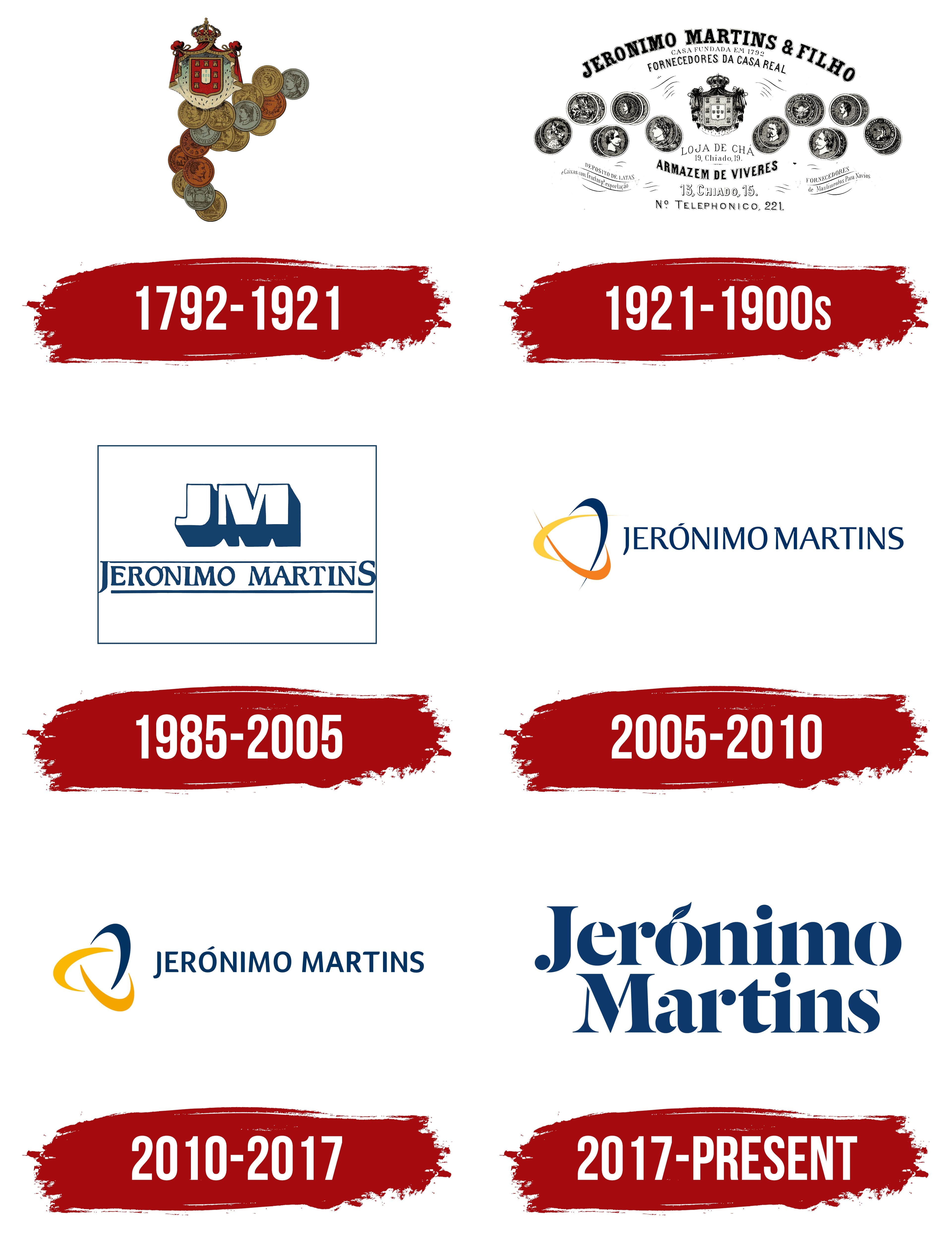
1792 – 1921
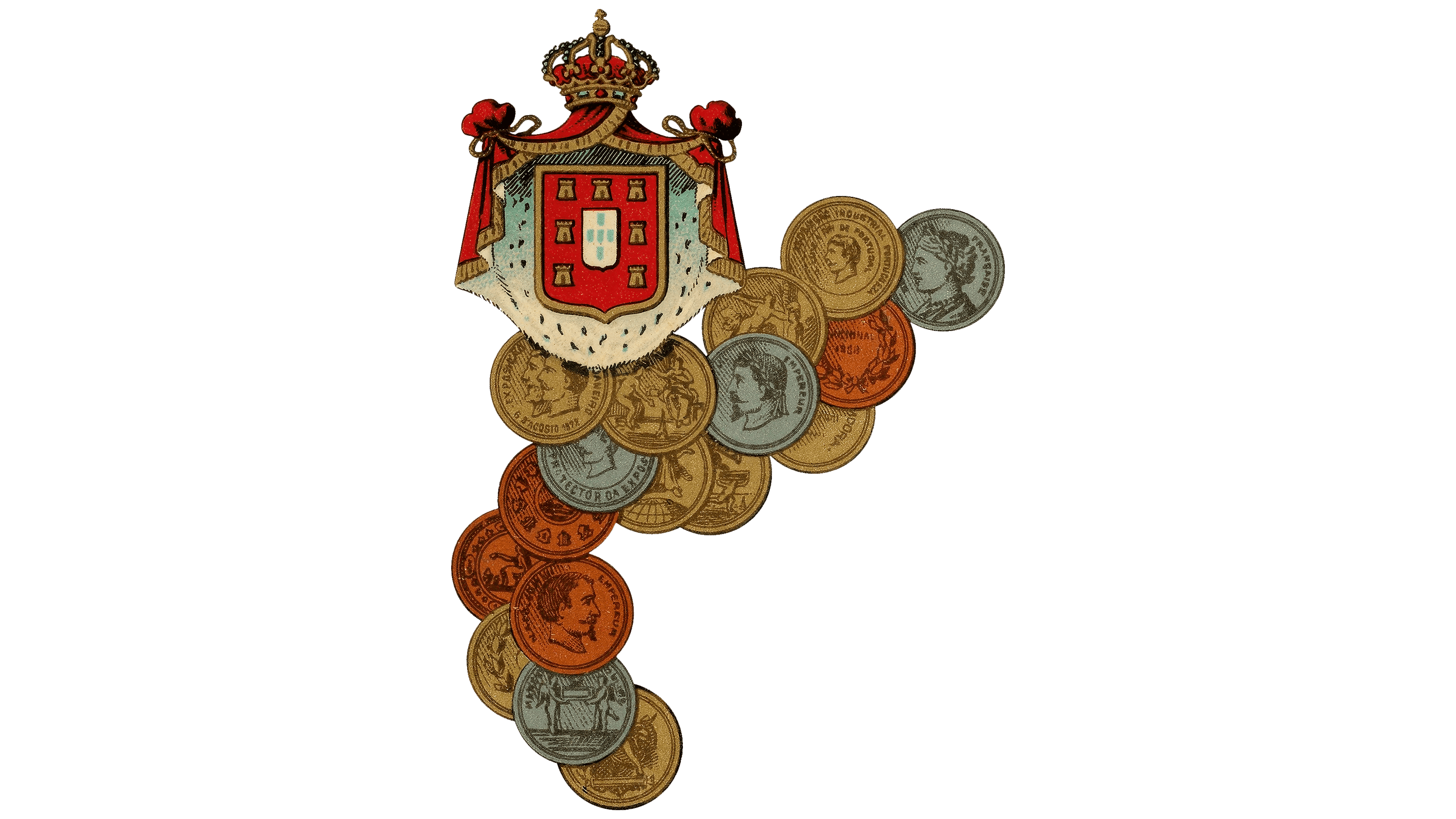
Jerónimo Martins adopted the royal coat of arms as part of its branding in 1858. The trading house received the right to use it when it was appointed a supplier to the Portuguese royal court. The emblem represented a privilege granted long before modern corporate logos emerged.
The future international food retail group began as a grocery store in Lisbon’s Chiado neighborhood. A young Galician named Jerónimo Martins opened the shop in 1792. Its reputation grew on Portuguese and imported delicacies, and the owner’s name gradually became the trading house’s name. In the earlier name Jerónimo Martins & Filho, “Filho” meant “son.” In 1921, Francisco Manuel dos Santos and his partners acquired the business. Another family took over management, but the name preserved the founder’s identity and a connection to the original Lisbon store.
The upper portion of the emblem featured a coat of arms with a red shield, concave sides, and a pointed base. At its center, a vertical white rectangle held five small blue shields arranged in a cross. Seven gold castles surrounded them. A mantle with a light-colored lining and red outer folds framed the shield. The fabric gathered into folds and knots on either side. Above the shield stood a crown decorated with a cross, pearls, and gold ornaments. The red, white, blue, and gold distinguished the small heraldic images within the shield.
Overlapping medals beneath the mantle resembled coin-shaped reliefs. They varied in size and color. Gold, silver, and copper tones appeared alongside gray-green, brown, and orange areas. Raised rims framed profile portraits of men and women, figures in classical clothing, tools, and scenes of work. Animals and architectural motifs also appeared. Some medals carried inscriptions in old-fashioned serif lettering. The detailed relief and metallic tones made them look like award medals.
1921 – 1900s
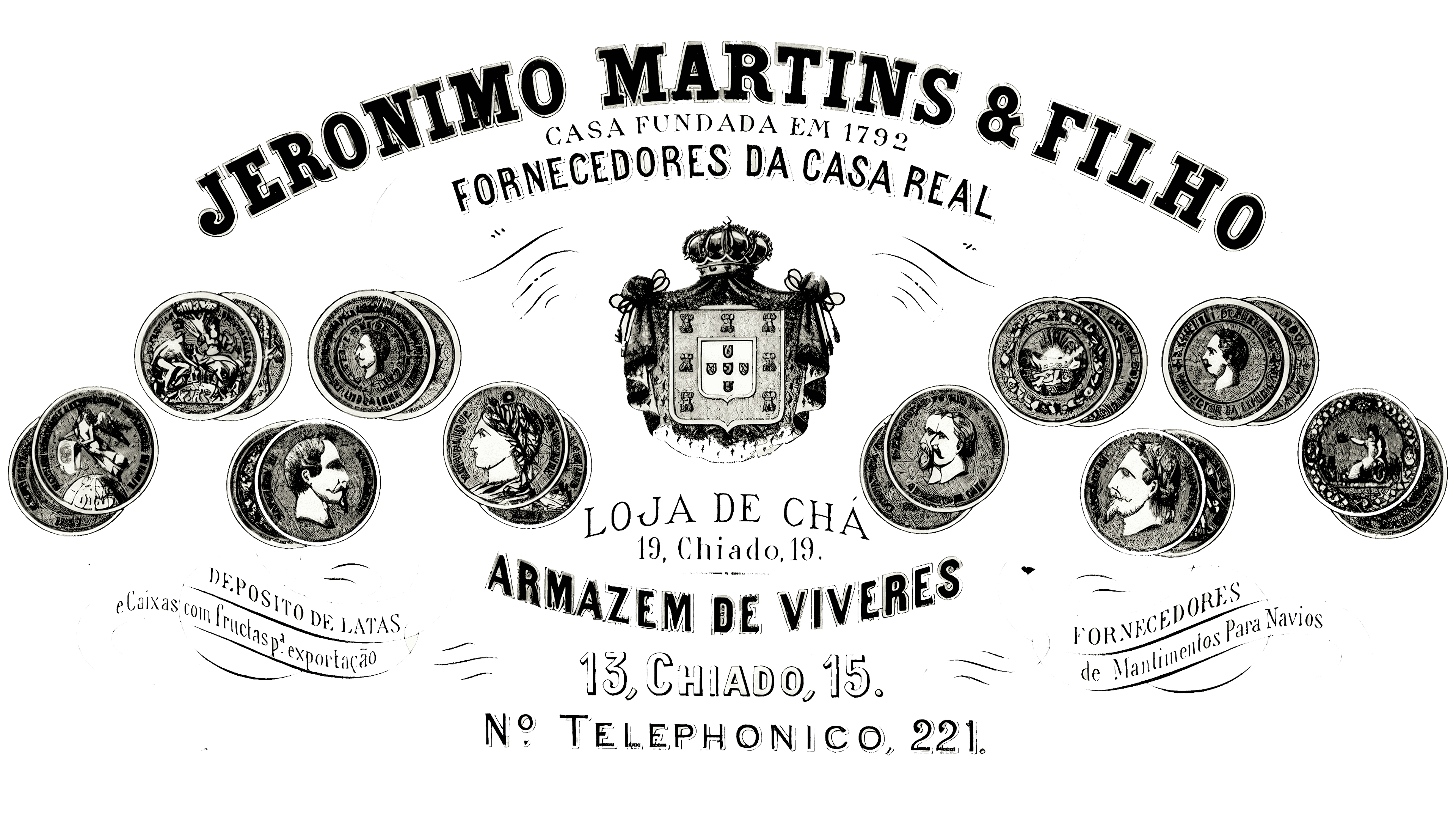
In the black-and-white Jerónimo Martins & Filho design, the royal coat of arms appeared alongside the trading house’s name, addresses, and department details. Text surrounding the emblem described the business’s history, status, and services. The letter size varied by the line’s purpose. The name at the top was large, while the contact details below occupied less space.
“JERONIMO MARTINS & FILHO” arched across the top in capitals with heavy serifs. The lettering resembled Clarendon-style typefaces. Beneath it, a small line read “CASA FUNDADA EM 1792,” meaning “house established in 1792.” Next came “FORNECEDORES DA CASA REAL,” or “suppliers to the royal court,” in larger letters curving above the coat of arms. The date conveyed the business’s longevity, while the court reference identified its status as a royal supplier.
The Portuguese heraldic shield occupied the center. Five small shields formed a cross on a white rectangular field. One small shield contained five dots. Seven castles surrounded them. A fur mantle with a decorative border framed the coat of arms, topped by a crown with a cross and rounded ornaments. Fine hatching gave the image an engraved appearance. Medals on either side featured profile portraits in relief, allegorical scenes, decorative motifs, and inscriptions in Portuguese and French.
The lower lines described the retail departments. “LOJA DE CHÁ” identified the tea shop, followed by the address “19, Chiado, 19.” The grocery warehouse name, “ARMAZEM DE VIVERES,” appeared in bold, followed by “13, Chiado, 15.” The line “Nº TELEPHONICO, 221” supplied the telephone number. Additional information appeared along the sides. On the left, “DEPOSITO DE LATAS e Caixas com fructas p’ exportação” referred to the storage of tins and crates of fruit for export. On the right, “FORNECEDORES de Mantimentos Para Navios” advertised provisions for ships.
Royal imagery also appeared in the trading house’s Almanaque Preço Corrente almanacs, published from 1880 to 1916. The founder’s grandson, João António Martins, initiated the first edition. In 1885, the design included color, ornamentation, and lithographs. Rafael Bordalo Pinheiro was among the artists who contributed to the publications. The coat of arms appeared on the covers. Still, references to the monarchy were removed before the republic was proclaimed in 1910. The almanacs adopted an Art Nouveau style, with geometric Art Deco lines appearing in 1914.
1985 – 2005
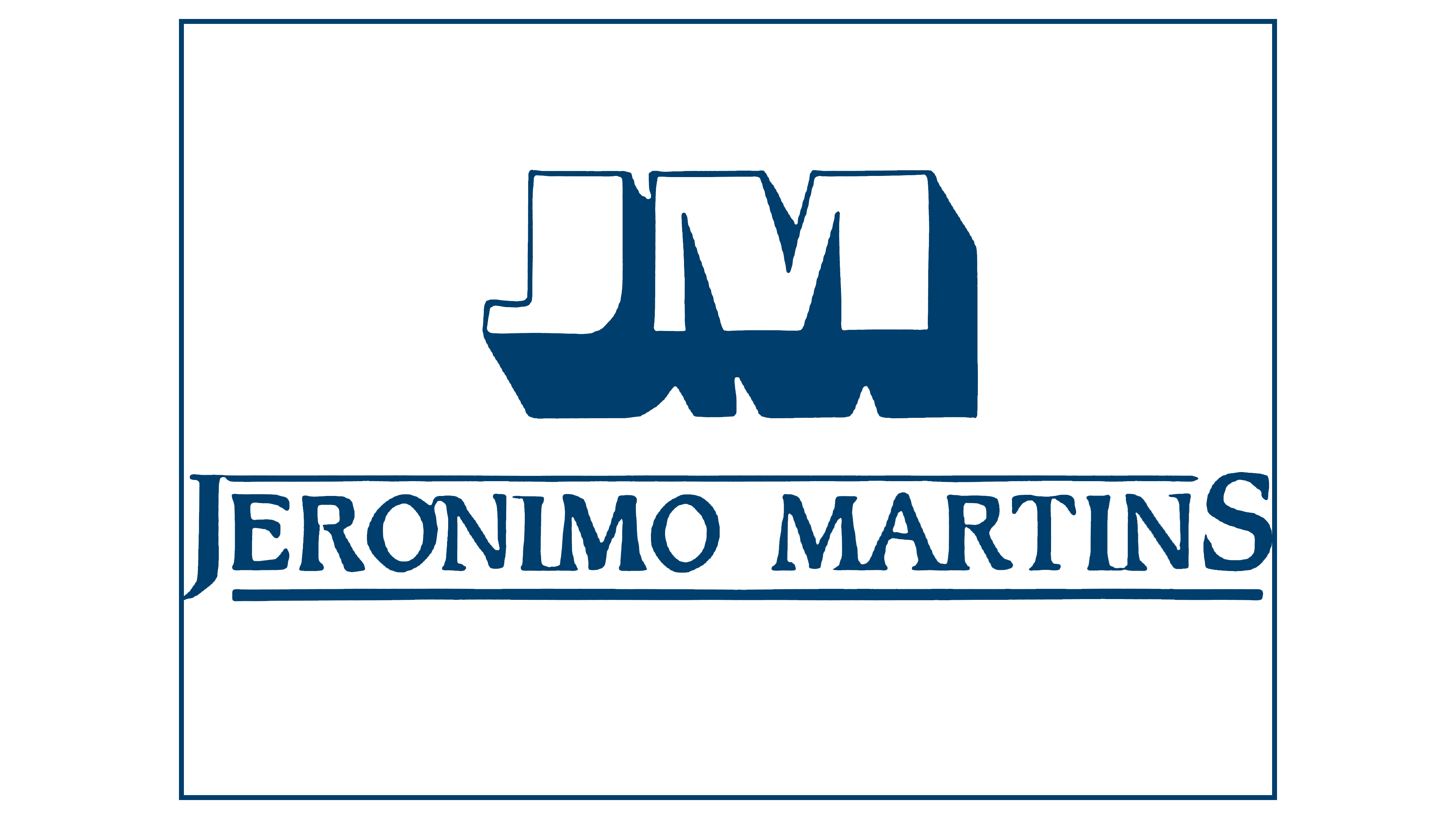
A later Jerónimo Martins logo reduced the name to the monogram “JM.” Large initials occupied the upper portion, with the company’s full name beneath them. Instead of the coat of arms, medals, and numerous explanatory lines, the company used initials and a name enclosed in a shared frame.
The monogram consisted of two bold capitals placed close together. Thin dark blue outlines surrounded their white front faces. Large lower and side surfaces created deep shadows, giving the initials a three-dimensional appearance. The “J” and “M” sat close enough to read as a single monogram.
Beneath it, “JERONIMO MARTINS” appeared in serif capitals resembling Goudy Old Style or Garamond. Dark blue horizontal rules ran above and below the name, separating the lower line from the large initials. A thin rectangular frame in the same color enclosed both parts of the logo. Blue carried over into the next corporate identity, maintaining a connection to the monogram.
2005 – 2010
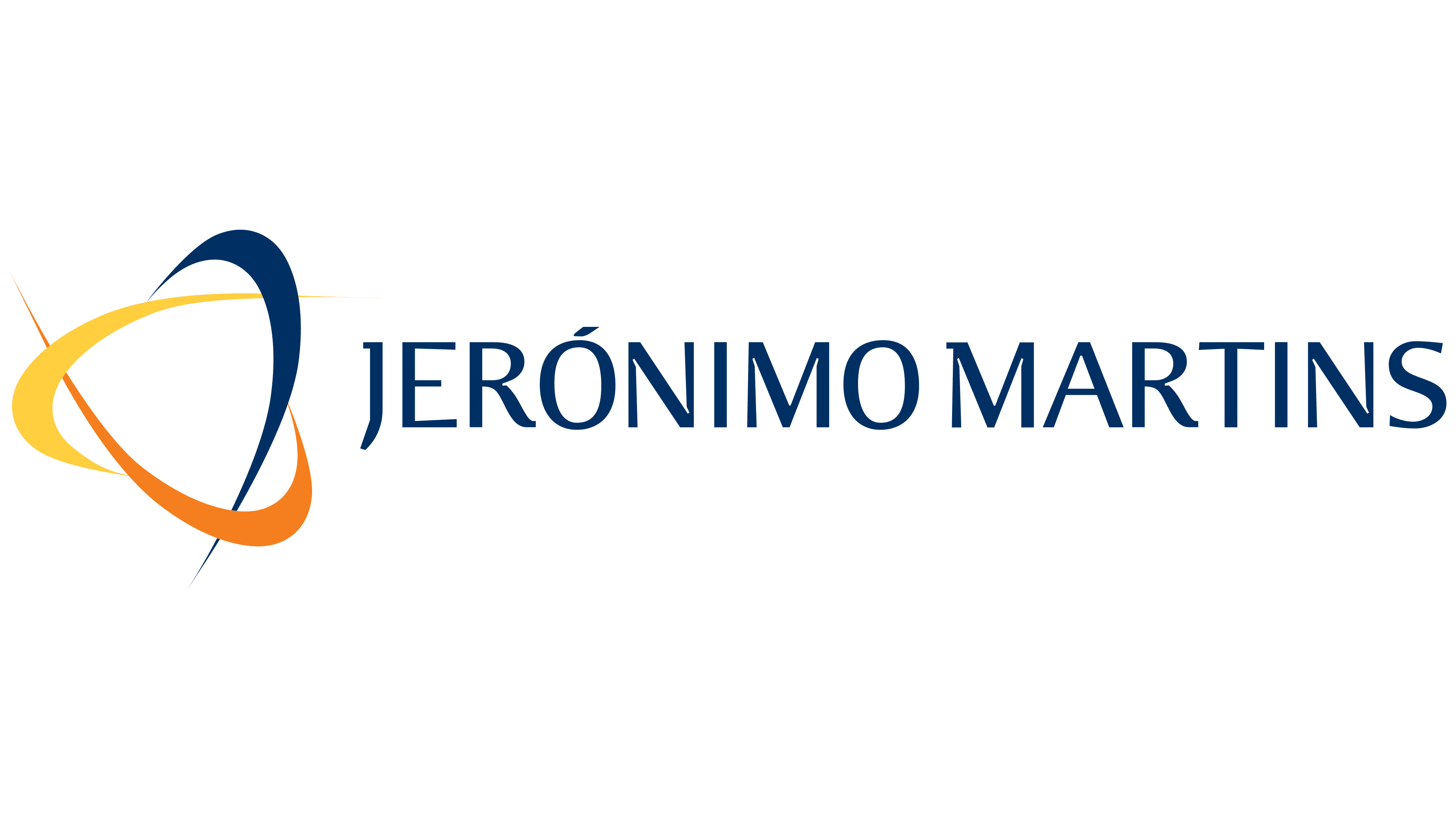
After a difficult restructuring period, Jerónimo Martins returned to developing its core business and refreshed its identity. RMAC Design, designer Ricardo Mealha’s studio, developed the project in 2003. The public presentation took place on March 10, 2004. Employees had seen the new identity the day before at Lisbon’s Belém Cultural Center, or CCB.
Three intersecting curved ribbons replaced the monogram. A dark blue ribbon formed an elongated vertical arc, a yellow ribbon crossed it, and an orange ribbon curved around the lower portion. The ribbons widened in the middle and tapered to pointed ends. Their curves and overlaps created depth and resembled satellite orbits. Arranged around a circle, the arcs conveyed the group’s international outlook and the unity of its businesses and brands. The rounded, stylized lines connected the emblem to the food sector.
Blue maintained continuity with the previous identity. RMAC associated it with rigor, professionalism, and universality. Orange represented innovation, while yellow stood for transparency. The different colors helped distinguish the ribbons where they crossed and made their curves easier to follow.
The full name, “JERÓNIMO MARTINS,” appeared in a single line to the right. Its dark blue matched the emblem’s vertical arc. The sans-serif capitals resembled Optima and other humanist typefaces. The accent over the “Ó” preserved the Portuguese spelling.
2010 – 2017
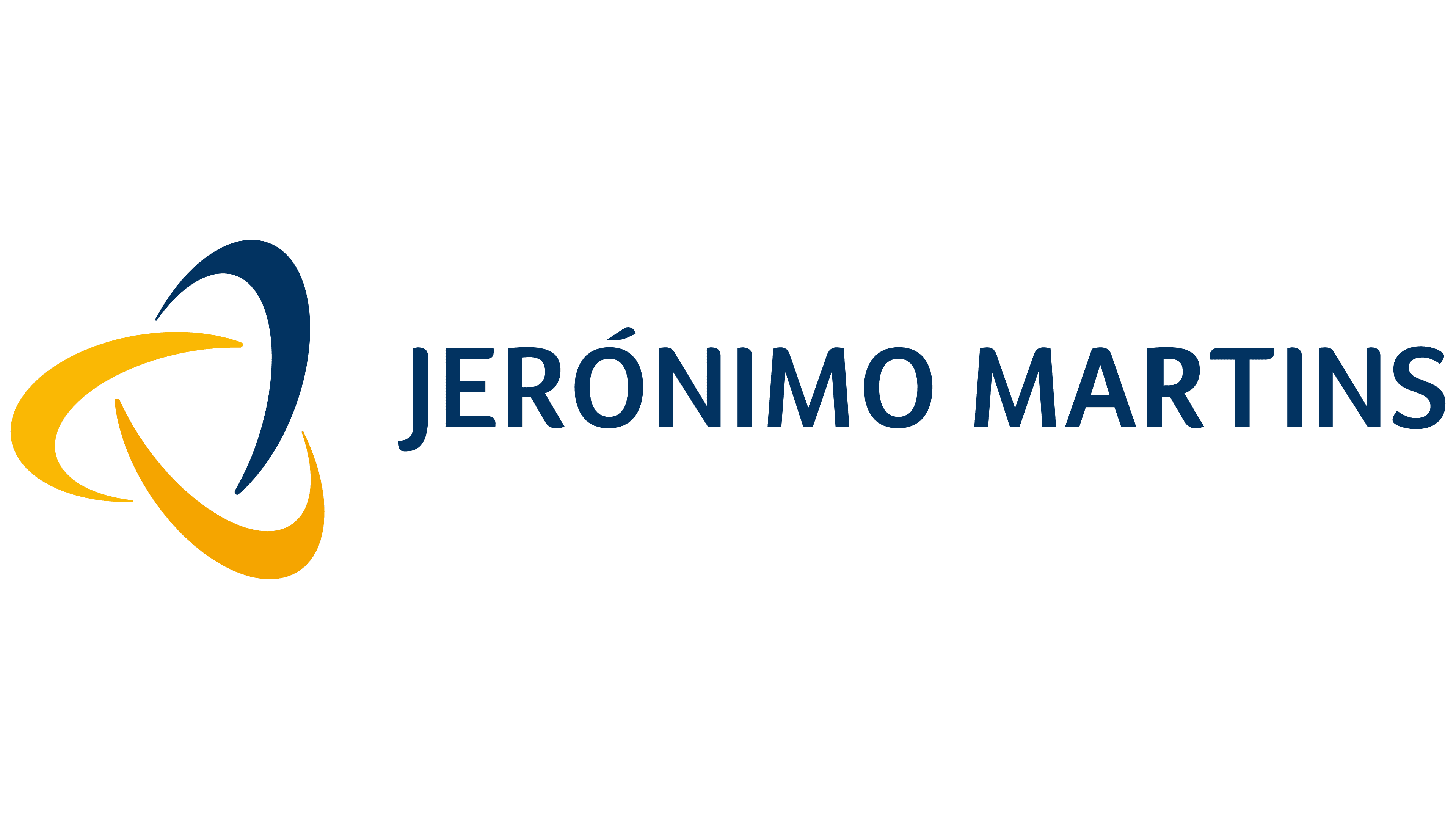
Jerónimo Martins’ identity had originally been created to rebuild trust in the group after the crisis at the beginning of the century. The design later became more compact, retaining the emblem on the left and the full name on the right. Before the 2017 update, the company associated the existing identity with cohesion, order, and development.
The arcs were widened to give the emblem a compact silhouette. Slender ends gave way to broad color areas, and the three-dimensional image became flat. Three arcs remained arranged around a circle, with gaps between them. One stayed dark blue. The former yellow and orange areas converged, leaving the other two arcs yellow.
“JERÓNIMO MARTINS” retained its horizontal arrangement, capital letters, and dark blue color. Thicker strokes gave the lettering more weight. The sans-serif typeface resembled Frutiger or Myriad. The Portuguese spelling retained the acute accent over the “Ó.”
2017 – today
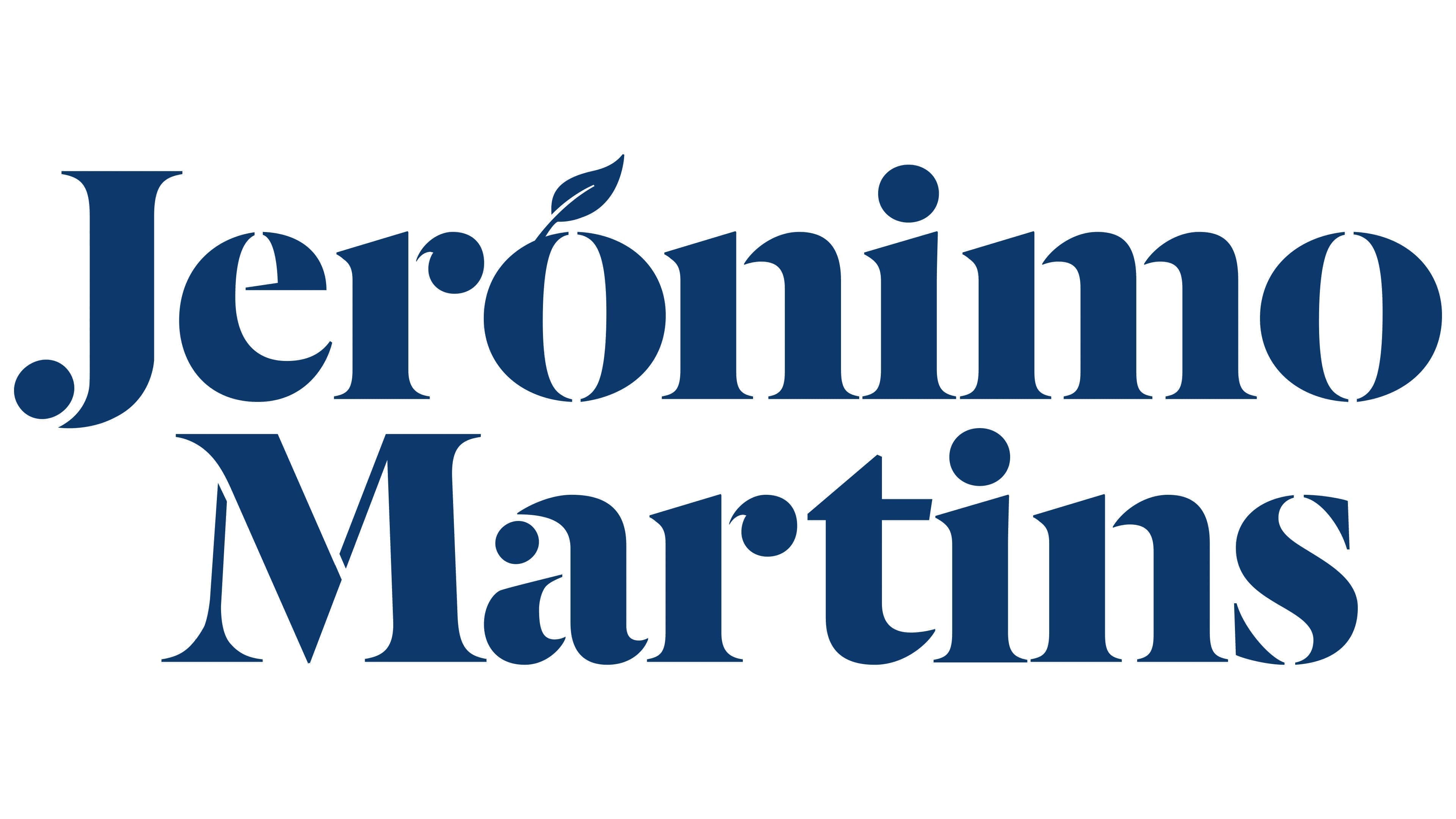
For its 225th anniversary, Jerónimo Martins refreshed its corporate identity to reflect its international scale and focus on food retail. Communications director Sara Miranda explained that the previous identity no longer matched the company. The new identity was intended to convey connections to food, freshness, and growth. The company unveiled it on September 27, 2017, at the opening of a logistics center in Alfena, in the municipality of Valongo.
Four agencies were invited to participate, two Portuguese and two English. None had worked on the group’s brands before. British agency The Partners received the commission. It proposed combining the company’s heritage with a contemporary wordmark. The separate emblem beside the name was removed, and a symbol was incorporated into the lettering.
“Jerónimo” appeared above “Martins.” The initial “J” and “M” remained uppercase, while the other letters became lowercase. Heavy main strokes combined with very fine connecting strokes and sharp serifs. The weight contrast recalled traditional book typography and Didone-influenced typefaces. The “J” had a rounded lower terminal with a nearby decorative dot. The “r” featured a small teardrop-shaped detail, while thin diagonals ran through the heavy “M.”
The Partners’ creative director, Nick Eagleton, connected the idea of growth to a small detail in the name. A leaf with a slit through its center appeared above the “ó,” pointing upward and to the right. It replaced the conventional accent, preserving the Portuguese spelling of Jerónimo while introducing a botanical motif. In the primary version, both words were dark blue. Other color options included a rich Dusk Blue and turquoise. The color system drew on the variety of food products and the changing light throughout the day, from a warm dawn through bright noon to richly colored twilight. The idea referred to the daily lives of food shoppers and producers.
The leaf also appeared beyond the logo. In 2018, designer Luís Covas used it for a Jerónimo Martins Christmas event. Leaves were cut from watercolor paper and repeated against colored backgrounds. The detail above the letter became a separate motif within the corporate identity.
UMA Brand Studio developed an anniversary identity for the group’s 230th anniversary. The studio dated the project to 2021 and published it in February 2022. The studio built the number “230” from multicolored geometric shapes, including rectangles, circles, and rounded sections. Green leaves placed between them continued the main logo’s botanical motif. Beside the number were the word “years” and the two-line Jerónimo Martins name in green. The numerals combined blue, turquoise, pink, yellow, orange, and red. UMA Brand Studio connected the anniversary identity to the company’s heritage, future, and commitment to protecting the environment and biodiversity.