 Jyske Bank Logo PNG
Banking services include account management, lending, and asset management, which support everyday financial tasks. The business revolves around routine transactions, from payments to savings. The Jyske Bank logo represents a Danish bank serving private customers and businesses, offering accounts, loans, and financial services.
Jyske Bank was established in 1967 through the merger of four regional banks in Central Jutland. The new organization was named after the Jutland Peninsula. The bank focused on serving small and medium-sized businesses, farmers, and private clients. The headquarters was located in Silkeborg.
In the 1970s and 1980s, the bank gradually expanded its branch network. During this period, it strengthened its reputation as a reliable financial partner. In 1989, the bank was listed on the Copenhagen Stock Exchange. In 1990, it acquired Sparekassen Nordjylland, strengthening its position in the northern part of the country.
In the early 1990s, Jyske Bank successfully endured the banking crisis. In 2008, the bank acquired Salling Bank, thereby reinforcing its market presence. However, the global financial crisis soon followed, increasing non-performing loans.
In 2014, the bank acquired the Danish division of the Icelandic Kaupthing Bank. In 2017, the bank concluded a major transaction with BRFkredit. As a result, Jyske Bank became a leader in Denmark’s mortgage market.
In 2019, the bank became the first in the world to offer a mortgage loan with a negative interest rate of minus 0.5 percent per year. In 2021, the regulator fined Jyske Bank for compliance violations. After that, the bank strengthened internal controls and revised its operational processes.
In 2022 and 2023, the European Central Bank’s interest rate hikes increased the bank’s profitability. This was due to a higher interest margin. In 2024, the company invested in digitalization and optimization of its branch network.
Jyske Bank ranks third among Denmark’s largest banks. It combines traditional banking services with modern digital technologies and remains an important player in the Jutland economy.
Meaning and History
What is Jyske Bank?
Jyske Bank is one of Denmark’s largest banks, headquartered in Silkeborg. It serves about 900 thousand clients through a network of branches and international offices. The financial group owns the mortgage institution Jyske Realkredit and a subsidiary in Gibraltar. It offers accounts, loans, mortgages, leasing, investment, and pension products, as well as corporate and trade financing. Main business areas include corporate banking, support for small and medium-sized enterprises, and mortgage lending.
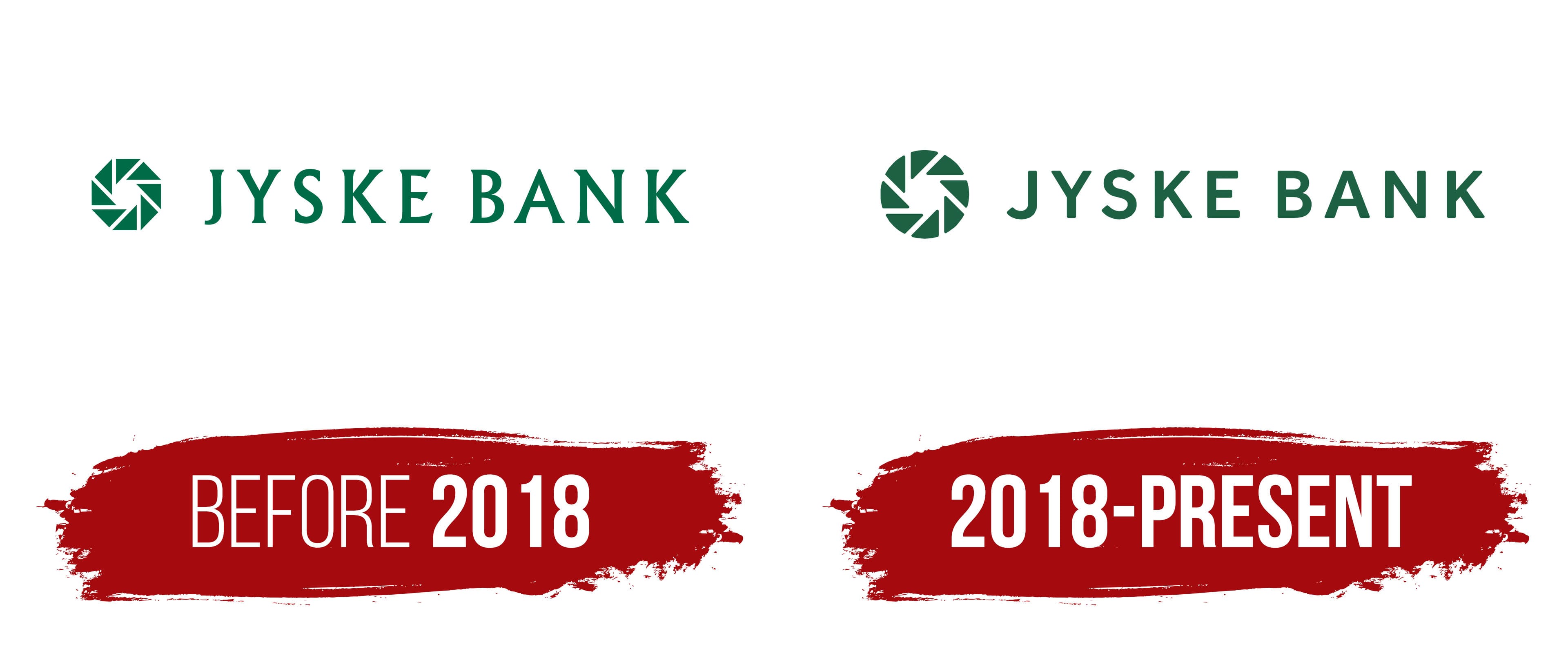
before 2018
The name Jyske Bank is connected with Jutland, the region where the bank originated. The Danish word jyske comes from Jylland. While preparing for the merger, the executives looked for a short name consisting of no more than two words that would be easy to pronounce abroad. Jyske Bank met those requirements. E. Sveinbjørnsson, head of the Danish banking supervisory authority, approved the name and noted its broad geographic scope for the merger of four local institutions.
The bank began operations on July 7, 1967, after merging Silkeborg Bank, Kjellerup Bank, Kjellerup Handels- og Landbrugsbank, and Handels- og Landbrugsbanken i Silkeborg. The first corporate emblem appeared during the same year. Eight angular segments surrounded a square opening, resembling the blades of a camera aperture. The bank called the shape the “iris” and associated it with the iris of an eye or an optical system. According to Jyske Bank, it represented the ability to examine details while seeing the full picture.
Chase Manhattan Bank found the new emblem similar to its octagonal symbol. The dispute reached the Danish Maritime and Commercial Court, which rejected the American bank’s claim. Jyske Bank continued using the iris. Its green color and eight-blade design with a central opening remained in place for decades as the bank expanded its network and acquired regional financial institutions.
Danish designer Per Mollerup is credited with the logo used during the first half of the 2010s. In the horizontal version, a dark green iris appeared on the left, while the name “JYSKE BANK” appeared on the right. The wordmark used Berthold Wolpe’s Albertus typeface. Its uppercase letters combined thin strokes with thicker sections and flared terminals. Wider letter spacing gave the wordmark an extended appearance.
The identity was updated in the mid-2000s as part of the Jyske Forskelle program. The program covered customer service, internal organization, and customer communication. Danish agency Normik worked on the project under art director Sune Lindeskov. The team was assigned to redesign a system used for more than 15 years while preserving the brand’s friendly presentation.
In 2006, the elongated logo format was converted into a square composition while retaining the iris and the previous lettering style. A single shade replaced several versions of green. The new format accommodated placement on signs, online banners, sports facilities, and other media. The Jyske Forskelle 2nd Generation program also included remodeling bank branches. Traditional bank counters were replaced with café areas and round tables where employees met with visitors.
Until the 2018 redesign, the name retained its serif lettering. The iris appeared both with the wordmark and separately, including as a square mark. During the next update, the wordmark was changed to a sans-serif typeface.
2018 – today
In 2018, Jyske became the shared name for the group’s banking, leasing, and mortgage operations. BRFkredit was renamed Jyske Realkredit, and products began consolidating under one brand. The Jyske Bank logo was updated to match the new names. The former serif typeface was replaced with a sans-serif design. The uppercase letters became wider and heavier.
The iris derived from the 1967 emblem remained to the left of the wordmark. The angles and proportions of several blades were adjusted, giving the interior opening a softer outline. The green color maintained a connection with the bank’s historic identity. The symbol appeared separately and together with the name. Green, white, and black versions were available for different backgrounds. Jyske Bank associated the iris with optics, the ability to focus on details, and the ability to see the full picture.
The optical theme continued in the update unveiled in late 2025. Copenhagen agency Kontrapunkt and the bank’s team worked on the identity and brand platform. They sought to bring Jyske Bank’s presentation under a consistent set of standards across all customer communication channels. The project covered digital environments, user interfaces, and animation. Nanna Knudsen, Marcus, Andreas, Torsten, Rasmus, Anna, Jesper, Kristine, José, Alex, and Bo participated in the agency.
Kontrapunkt revised the iris geometry based on the original emblem. The segments received a form that allowed them to change on screen, following the principle of an optical lens. Animation and scale changes expanded the idea of focusing. The name retained its uppercase letters and sans-serif style. The wordmark became more compact, with softer letterform details.
We deepened the primary dark green and added other shades of green. We prepared dark green, light green, white, and black versions to display the logo on different backgrounds.