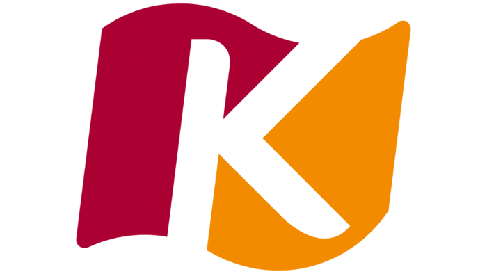
The chain of children’s entertainment centers has a colorful logo, but more is needed to convey the brand’s essence. The KidZania logo represents joy, excitement, and fun. These are the feelings that arise when you visit an unusual amusement park.
KidZania: Brand overview
| Founded: | 1 September 1999 |
| Founder: | Xavier López Ancona |
| Headquarters: | Cuajimalpa, Mexico |
| Website: | kidzania.com |
KidZania is a global network of indoor family entertainment centers. The structural subdivisions of the company are located not only in Mexico (the main office is located here) but also in many other countries. Foreign branches operate in the UAE, India, Great Britain, Japan, Indonesia, Turkey, Brazil, South Korea, etc. The list is constantly growing as KidZania is constantly evolving and becoming more and more popular on a global level.
Each entertainment center has a stylish, distinctive design, the key element of which is an expressive, bright logo. He demonstrates joy, fun, and a positive attitude. Such associations arise through the use of warm colors, including soft orange (the color of the sun) and a muted light burgundy shade. Combined with a modern, clean typeface, this color scheme creates a balanced concept that reflects friendliness.
Meaning and History
KidZania is a completely new level of the entertainment center. Each unit is a game copy of a real city with streets, buildings, roads, vehicles, theaters, and other objects. The idea of creating such a simulation is that children aged 4 to 14 can learn how everything works in cities and get acquainted with existing professions. This helps children to reveal their talents and learn about the world around them.
In terms of visual identity, family centers also stand out. They are easily recognizable by their sunny, cheerful logo that reflects the essence and philosophy of the company. The management of KidZania is committed to providing families with an exciting and fun experience. That is why playful and energetic colors were chosen as the main colors, and a modern sans-serif typeface was chosen for the name design. Each of these nuances demonstrates individuality, creativity, and diversity.
What is KidZania?
KidZania is a unique Mexican company that has a web format. It consists of many centers offering an extensive list of entertainment for the whole family. Various tasks are prepared for the children, and they receive a special kidZo currency. Young visitors can participate in various activities and playfully learn different professions. The project partners are large global companies, including Coca-Cola, McDonald’s, P&G, Crest, etc.
1999 – 2018
The first entertainment center was opened in Mexico in 1999. The idea of creation belongs to the Mexican entrepreneur Javier Lopez Ancona. His creation has become not just an entertainment area but a major project that has won the popularity of many families. The incredible success prompted the management to open new outlets outside the country, which led to the scaling of activities. Each such center had an identical corporate design, in which a bright emblem occupied a central place.
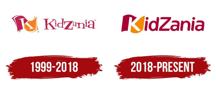
Until 2008, it was a stylish, atmospheric picture, the main features of which resembled a fabulous design. Unusual letters with original tails and sharp ends evoked associations with something fantastic and unreal, and different sizes added playfulness to the logo. In addition, the sign has a special meaning regarding the type of leisure activities in such centers.
The creator positioned KidZania as a real toy-type mini-city. Hence the sign of the flag, inside of which was a stylized letter K. Such a symbol displays an identity and a clear structural organization. The flag also emphasizes the uniqueness of the company, as well as the features of its functioning. The concept is complemented by a pleasant color scheme created by warm, cozy shades.
2018 – today
After a rebrand in 2018, KidZania received a stylish new logo that featured more confident lines, a modern concept and some simplifications in terms of the graphic symbol. A simpler flag replaced the voluminous and detailed picture. The letter K inside the flag has also changed. Similar changes are also observed in the KidZania lettering itself.
Fascinating ponytails, decorative cuts, and sharp ends have been completely removed, and instead, a soft, rounded font with thicker lines has been chosen for the design. Minimalism can be traced in this approach, which makes the emblem more modern and readable. Another feature is its compactness. In the new corporate badge, the distance between the inscription and the flag has been reduced, which also positively affected the overall concept. The logo’s colors remained the same, symbolizing the brand’s unchanging strategy.
Font and Colors
The current KidZania icon is a perfect and balanced picture that evokes extremely pleasant associations. The inscription is made in a modern style, similar to the design of Sans Serif fonts. This stylish format has soft, smooth lines without serifs and decorative ends. The chosen design testifies to the constant renewal, development, and striving for progress.
In addition, the font is not burdened with additional elements and is distinguished by the presence of clearly defined spaces. This makes the inscription readable and quite expressive. Another important nuance is the transfer of the first letter of the inscription directly to the flag. If in the original logo from 1999, the letter K was located both on the flag and at the beginning of the inscription, then in the new version, it is only on the flag.
The innovation positively impacted the overall concept, as it made the logo more original and friendly. Completes the color specification. Despite several important updates, the modern version retains the color scheme of its predecessor. The logo still features muted burgundy and soft orange hues. They show energy, joy, a good mood, and optimism.
KidZania color codes
| Vivid Burgundy | Hex color: | #ac0033 |
|---|---|---|
| RGB: | 172 0 51 | |
| CMYK: | 0 100 70 33 | |
| Pantone: | PMS 200 C |
| Neon Tangerine | Hex color: | #f38b00 |
|---|---|---|
| RGB: | 243 139 0 | |
| CMYK: | 0 43 100 5 | |
| Pantone: | PMS 151 C |
