 Kikkoman Logo PNG
Soy sauce is a basic seasoning used in cooking, marinades, soups, and prepared dishes. Its production requires strict adherence to the recipe and a lengthy fermentation process. The Kikkoman logo represents a company that produces soy sauce and other products using traditional methods and distributes them worldwide.
Kikkoman originated in the mid-17th century in the Noda area. At that time, the Mogi, Takanashi, and Horikiri families began producing soy sauce. In 1838, Mogi Saheiji registered the Kikkoman trademark and became a supplier to the Tokugawa shogunate. After the Meiji Restoration in 1868, the brand participated in international exhibitions in Amsterdam and Vienna. The company gained broad recognition.
In 1917, eight families merged their businesses to create Noda Shoyu Co., Ltd. By the 1930s, the company had several factories, including a plant in Takasago and a Worcestershire sauce production line. In 1946, the company first issued shares to the market. In 1949, product exports resumed.
Since the 1950s, Kikkoman has expanded its international presence. In 1957, it established a subsidiary in the United States. In 1961, the famous dispenser bottle designed by Kenji Ekuan was introduced. In 1972, the company founded a plant in Wisconsin, becoming its first factory outside Japan.
In 1980, the company was renamed Kikkoman Corporation. In 1983, production began in Singapore. In 1986, Kikkoman opened an automated plant in Chitose. In 1990, Kikkoman began production in Taiwan. In 1996, production started in the Netherlands. In 1998, the company opened a plant in California.
In 2002, the company opened a facility in China. In 2006, the company consolidated Kibun Food Chemifa, a soy milk producer. In 2008, the brand updated its logo. In 2013, it launched the Lycopene Rich line of tomato products. In 2018, Kikkoman began promoting soy milk internationally.
In 2020, Kikkoman acquired the Brazilian company Azuma Kirin. In 2021, production started at the new plant in Brazil. In 2024, construction began on the third plant in the United States. The company’s products are available in more than one hundred countries worldwide.
Meaning and History
What is Kikkoman?
A Japanese international food group from Noda, founded by a family workshop that produced soy sauce. Annual production reaches 400 million liters of soy sauce. The company is an official supplier to Japan’s Imperial Household. In addition to soy sauce, the group produces wines, liqueurs, juices, and tomato products; develops pharmaceutical activities; and operates a network of restaurants, including Daitokai in Germany.
1917 – 1987
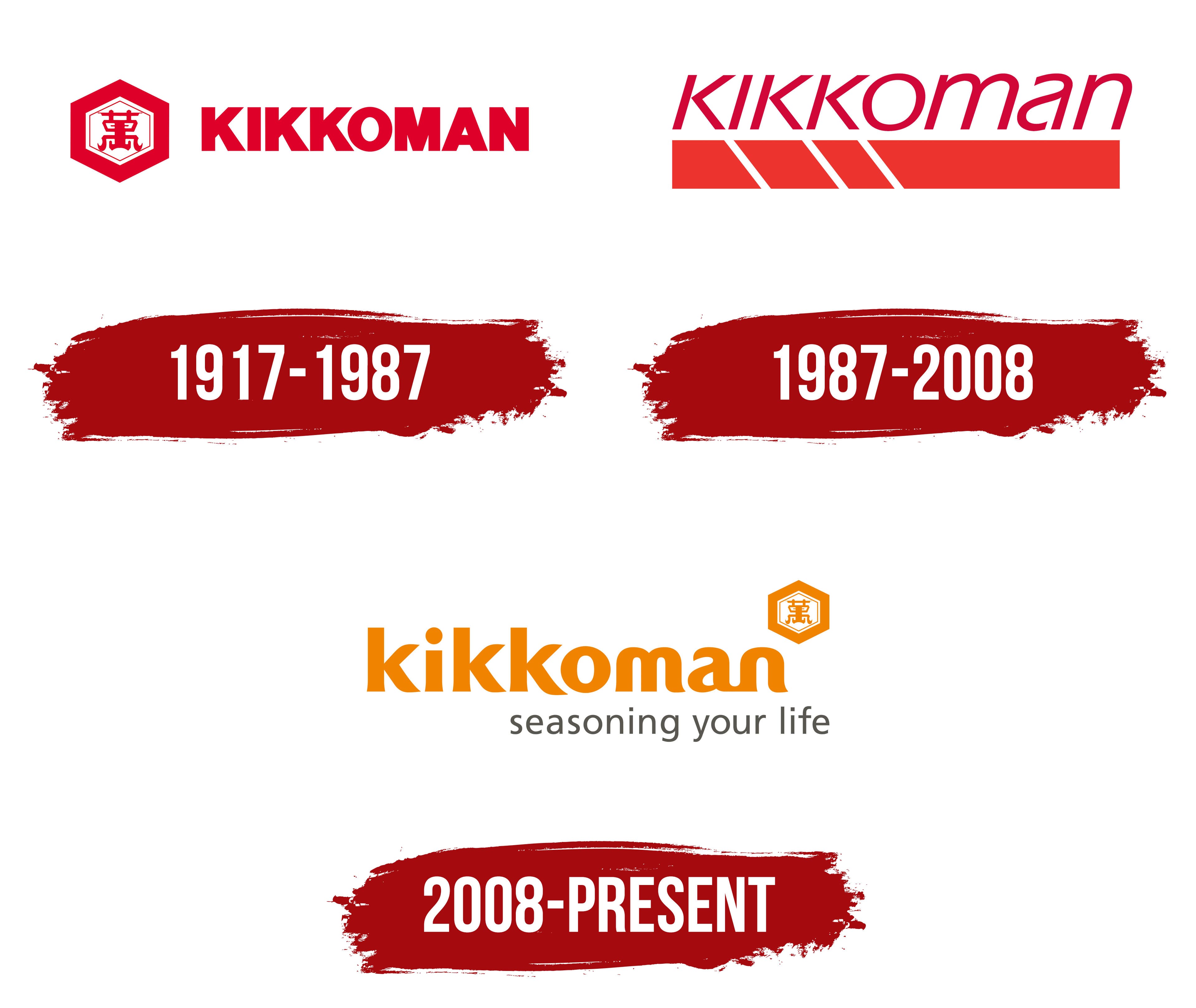
Kikkoman’s hexagonal emblem appeared long before the modern company was established. Soy sauce producers in the Japanese city of Noda had used it since approximately 1820. Japan registered the mark in 1912. After several family businesses merged, it remained in use alongside other trade names. In 1940, it became the common emblem for Kikkoman products throughout Japan.
The brand name explains the meaning of the historic image. The Japanese word “kikko” means “tortoise shell,” while “man” corresponds to the number 10,000. In Japanese tradition, the tortoise represents longevity, happiness, and success. The hexagon depicts the shape of its shell, while the character “萬” inside it is an old written form of 10,000. The Kikkoman trade name was already in use long before the company adopted it.
Soy sauce production developed in Noda, located in present-day Chiba Prefecture. The Mogi and Takanashi families had practiced the craft since the 17th century. On December 7, 1917, eight family-owned businesses formed Noda Shoyu Co., Ltd. The new company inherited several brands from its predecessors, including Kikkoman.
Noda Shoyu Co., Ltd. became Kikkoman Shoyu Co., Ltd. in 1964. The historic emblem was then combined with the Latin-letter inscription “KIKKOMAN” in a single corporate logo. The established trade name became the company name and accompanied its expansion into international markets. In 1980, the business adopted its current legal name, Kikkoman Corporation.
A red hexagon with a double outline appeared on the left. The outer border was thicker, while a thinner inner line repeated its shape. A red “萬” character with decorative curls along the bottom occupied the center of the white field. “KIKKOMAN” appeared on the right in heavy uppercase sans-serif letters. Upright characters and tight spacing formed a dense line, while red united the Japanese and Latin-letter elements.
Designer Tadashi Ohashi worked on Kikkoman’s overall identity system during the 1950s. Industrial designer Kenji Ekuan led the next stage. In 1961, he introduced a tabletop soy sauce dispenser developed over several years and through numerous prototypes. The bottle entered international markets and became a familiar carrier of the Kikkoman name and historic hexagonal emblem.
1987 – 2008
Kikkoman introduced a logo centered on its Latin-letter name in Japan in 1987. The historic hexagon containing the “萬” character gave way to a two-level horizontal structure. The brand name occupied the upper section, while a broad bar formed the lower section.
The name “kikkoman” appeared in lowercase Eras lettering. The thin sans-serif typeface leaned to the right and featured elongated proportions, angled strokes, and rounded terminals. Tight spacing brought the long word together into a unified line.
David Canaan, Kenichi Nishiwaki, Jacqui Ghosin, and Rolando Rosier worked on the project. The designers made the Kikkoman name the primary focus. The Latin-letter wordmark became the main component of the Japanese logo.
An elongated rectangular block extended beneath nearly the full width of the name. Three thin white diagonal openings appeared in its left half. They divided the beginning of the bar into four sections, followed by a solid area. The broad base balanced the light, slanted lettering and reinforced the horizontal proportions.
The wordmark used a dark crimson tone, while the lower block was red-orange. The related colors maintained a connection with Kikkoman’s earlier red identity while separating the two levels through differences in saturation.
2008 – today
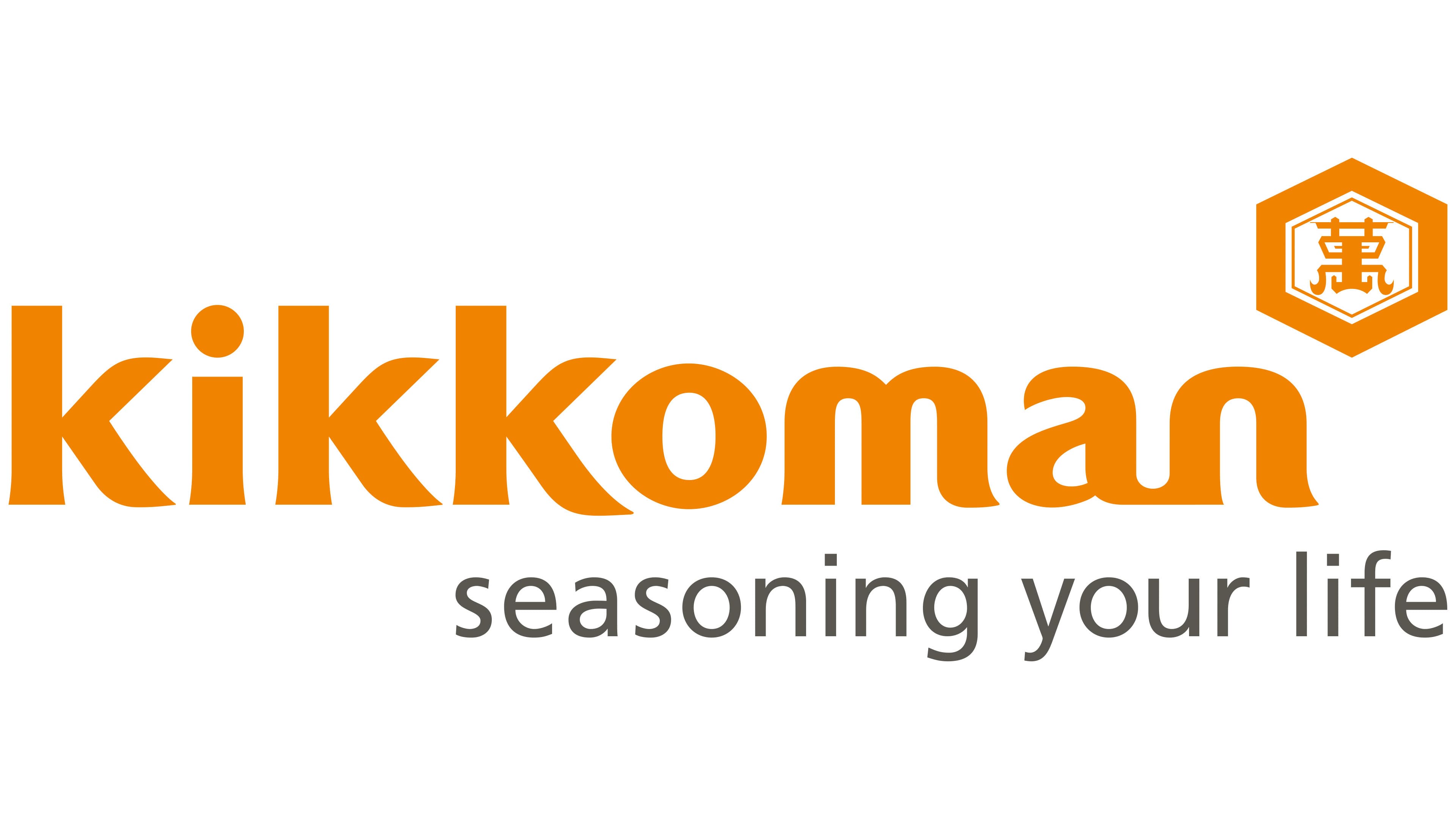
In 2008, Landor Associates updated Kikkoman’s identity by restoring the historic hexagon. The emblem was reduced in size and placed above the right side of the name. A full-scale rollout began in June alongside a new corporate slogan and preparations for the Global Vision 2020 program.
The project drew on the phrase “heart to heart communication.” Kikkoman used it to describe open communication between the company and consumers, as well as food culture in everyday life. Pairing a contemporary lowercase wordmark with the historic emblem linked the group’s international development to its Japanese origins.
The word “kikkoman” appeared in lowercase orange sans-serif letters. Thick strokes, rounded terminals, and smooth transitions formed a soft horizontal wordmark. According to the company, the rounded shapes conveyed enjoyment of food, warm communication, accessibility, and health.
A hexagon with a double outline appeared above the end of the word. The outer border was thicker, while a thinner inner line followed the same shape. An orange “萬” character occupied the white field, with vertical strokes, curves, and decorative curls along the bottom. The emblem’s structure drew on the tradition of Japanese mon symbols.
The hexagonal shape represented a tortoise shell, while the “萬” character stood for 10,000. Japanese tradition associated the combination with longevity and prosperity. Kikkoman connected orange with health, youth, and vitality. Associations with the sun, fire, earth, and harvest supported the company’s connection with food.
The slogan “seasoning your life” appeared below the name. Thin sans-serif letters in a gray graphite tone formed a lower line aligned with the right edge. The phrase described food’s role in making life more enjoyable.