


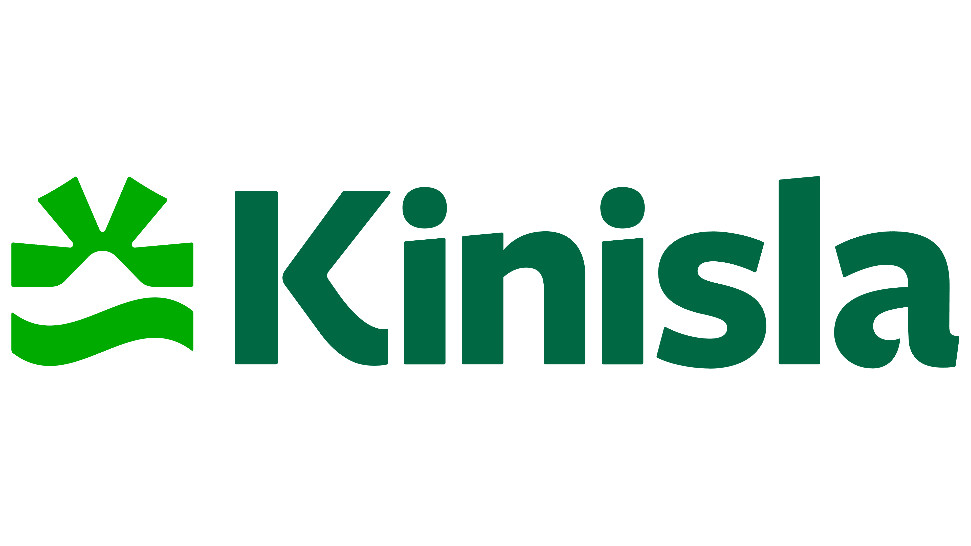
Kerry Dairy Ireland unveiled the name Kinisla after farmer-owned Kerry Co-op acquired a controlling stake in the dairy business. The company presented the name and logo on May 18, 2026, in Listowel, County Kerry. Dublin agency RichardsDee connected the rebrand to the company’s cooperative roots and its ambitions in the international food and ingredients market.
The business traces its history to North Kerry Milk Products, founded in 1972, and Kerry Co-operative Creameries, established in 1974. Based in Tralee, the company works with 2,600 family farms and manages 20 consumer and ingredient brands, including Dairygold, Charleville, Coleraine, and Cheestrings. Production facilities are located in Ireland, Northern Ireland, and Great Britain, supplying international markets.
Kerry Co-op acquired 70% of Kerry Dairy Ireland from Kerry Group. The agreement provides for transferring the remaining 30% by 2035. Alongside the Kinisla name, the company announced a five-year, €300 million investment program and plans to create 100 jobs. The new corporate name encompasses dairy products, food ingredients, and agricultural services.
RichardsDee began with interviews, site visits, archival research, and discussions with people across the business. The agency needed to preserve farmers’ and partners’ trust while broadening perceptions of the company. Themes of research, technology, and international growth joined with connections to the land and its cooperative history. These came together in the phrase “Deep Roots, Bold Moves.”

The team considered hundreds of names before arriving at Kinisla. “Kin” references the bonds and cooperation among farmers, their families, and employees. “Isla” conveys the company’s island origins and connection to Ireland’s Atlantic coast. RichardsDee associates it with coastal communities’ resourcefulness and their openness to the wider world. The name is pronounced “kin-EYE-la,” with the emphasis on the second syllable.
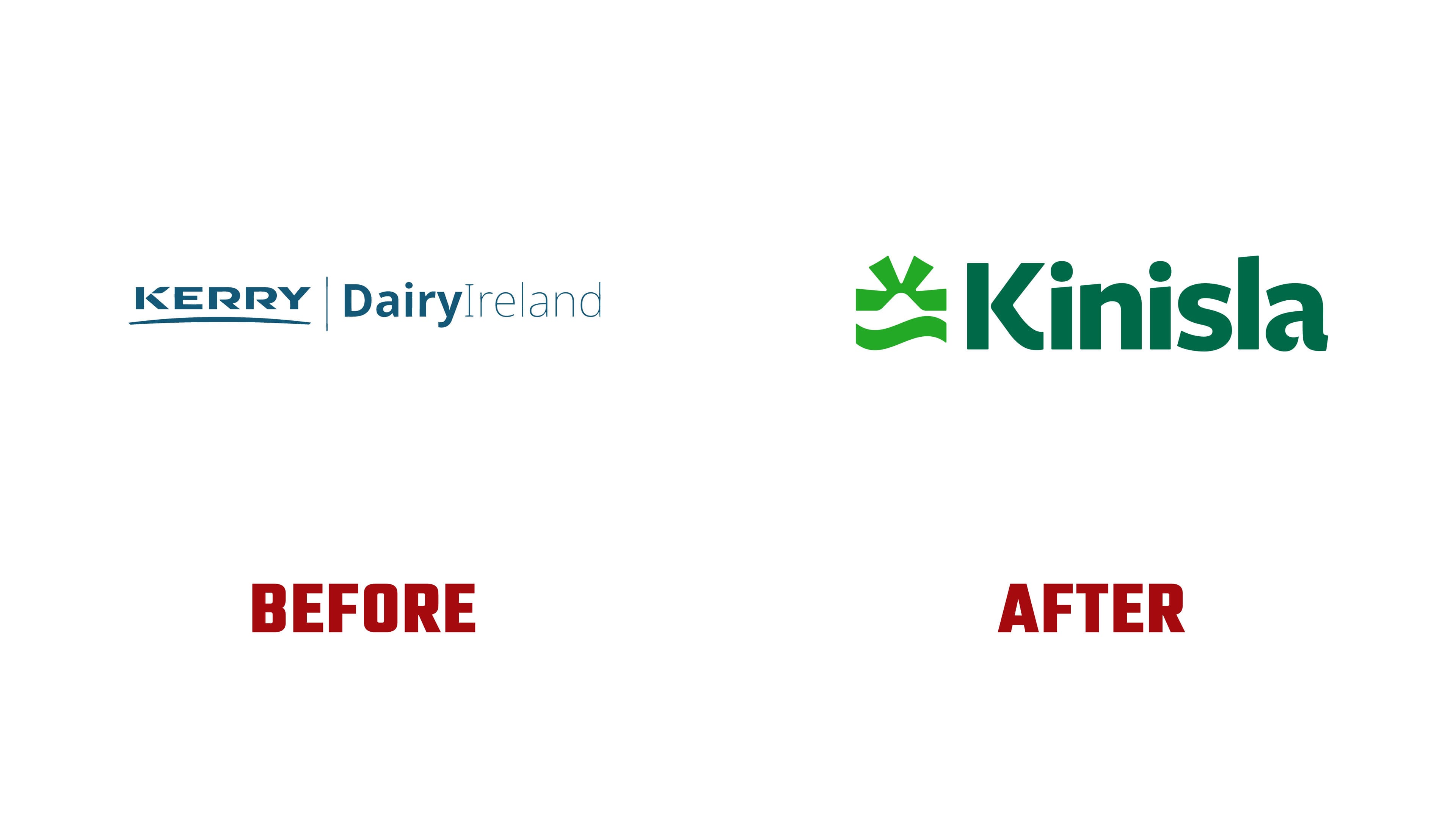
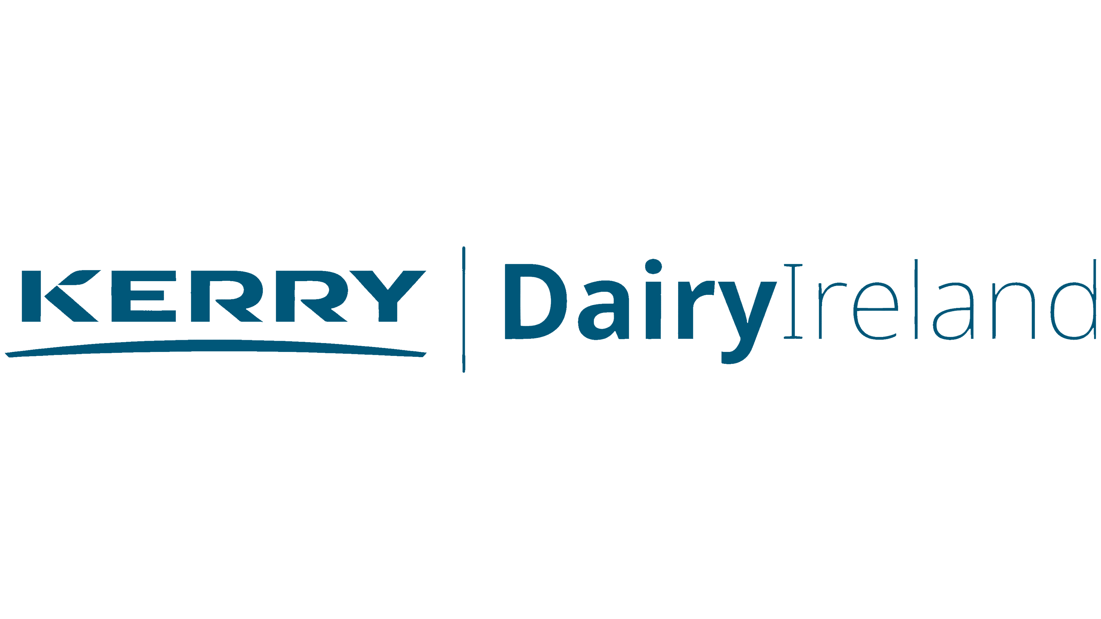
The previous logo emphasized the Kerry Group name. A large KERRY wordmark sat on the left, with angular cuts in the letters and a curved underline. A vertical rule separated it from Dairy Ireland. Bold “Dairy” was paired with a lighter “Ireland,” and all the lettering was blue-green. The new version pairs the shorter Kinisla name with a standalone emblem.
The emblem brings together sea, land, and sun. A wavy band at the bottom represents the Atlantic, while a light, winding gap above it suggests the land’s contours. The upper section spreads into rays associated with optimism and growth. The designers concealed a “K” within the image, referencing the “Kingdom of Kerry,” the county’s traditional nickname. The open design leaves the wave and rays unbounded at the ends.
Beside it sits a compact sans-serif Kinisla wordmark. A capital “K” is followed by lowercase letters. The lower diagonal of the “K” flows into a curved leg, both “i” letters have round dots, and the top of the “l” is cut at a slight angle. The final “a” has a double-story construction. Heavy strokes and tight spacing pull the name into a compact line, pairing the letters’ geometry with the wave’s curves and the angular rays.
In the primary version, a bright green emblem sits beside a dark green wordmark on a pale green background. On dark surfaces, including milk tankers, the name appears in white alongside the green emblem. Pale yellow, cream, light blue, and lilac complement the identity. Photographs of farmers, pastures, products, and customers connect the new name to the people and production behind it.