 Lennar Corporation Logo PNG
Buying a home involves choosing a floor plan, a neighborhood, and a ready-to-move-in house that requires minimal renovation. Behind this is a developer who designs residential complexes, builds homes, and sells them fully furnished with basic finishes and infrastructure. The Lennar Corporation logo is associated with an American company that builds and sells family-oriented homes.
Leonard Miller and Arnold Rosen founded Lennar Corporation in Miami in 1954. It was a small construction company. In its early years, it built dozens of homes for Florida’s growing postwar population. By the 1970s, Lennar had expanded into other cities in the state and had become a notable regional developer.
In 1971, the company listed its shares on the New York Stock Exchange. In the 1980s and 1990s, Lennar grew through acquisitions. The company entered the California, Texas, and East Coast markets. In 2000, it purchased U.S. Home for 1.1 billion dollars and became one of the largest homebuilders in the country.
During the housing boom of 2005, the company built more than sixty thousand homes a year. The 2008 crisis sharply reduced demand and led to nearly two billion dollars in asset write-offs. After the downturn, Lennar regained its position. Market growth in 2012 allowed it to increase construction volumes.
In 2017, Lennar acquired CalAtlantic Group for $ 9.3 billion. After that, it became the largest homebuilder in the United States. The company introduced the concept of a smart home. The Everything’s Included program was created to provide standard features without additional options.
The rise in mortgage rates in 2022 slowed the market. This prompted the company to develop rental housing and pursue modular construction.
The company builds tens of thousands of homes in twenty-four states. It remains a leading player in the U.S. housing market. The main focus is on affordable housing and technological solutions.
Meaning and History
What is Lennar Corporation?
Lennar is the largest American residential real estate developer, building and selling single-family homes, townhouses, and land. The company operates in 21 states and builds over 30,000 properties each year for buyers across various categories. Its vertically integrated structure combines construction, mortgage lending, title insurance, and transaction services. The company is also developing rental housing and residential property management, and through Rialto Capital Management, it invests in real estate and mortgage securities.
1954 – 2003
Lennar began operating as F&R Builders. Gene Fisher and Arnold Rosen founded the construction company in Miami in 1954. Two years later, 23-year-old Leonard Miller purchased Fisher’s interest. He invested $10,000 and 42 parcels of land that he owned in Miami-Dade County. The name Lennar came from parts of the names Leonard and Arnold, linking it to the partnership between Miller and Rosen. In 1971, 17 years after its founding, the business became Lennar Corporation and completed its initial public offering. The company was listed on the New York Stock Exchange in 1972.
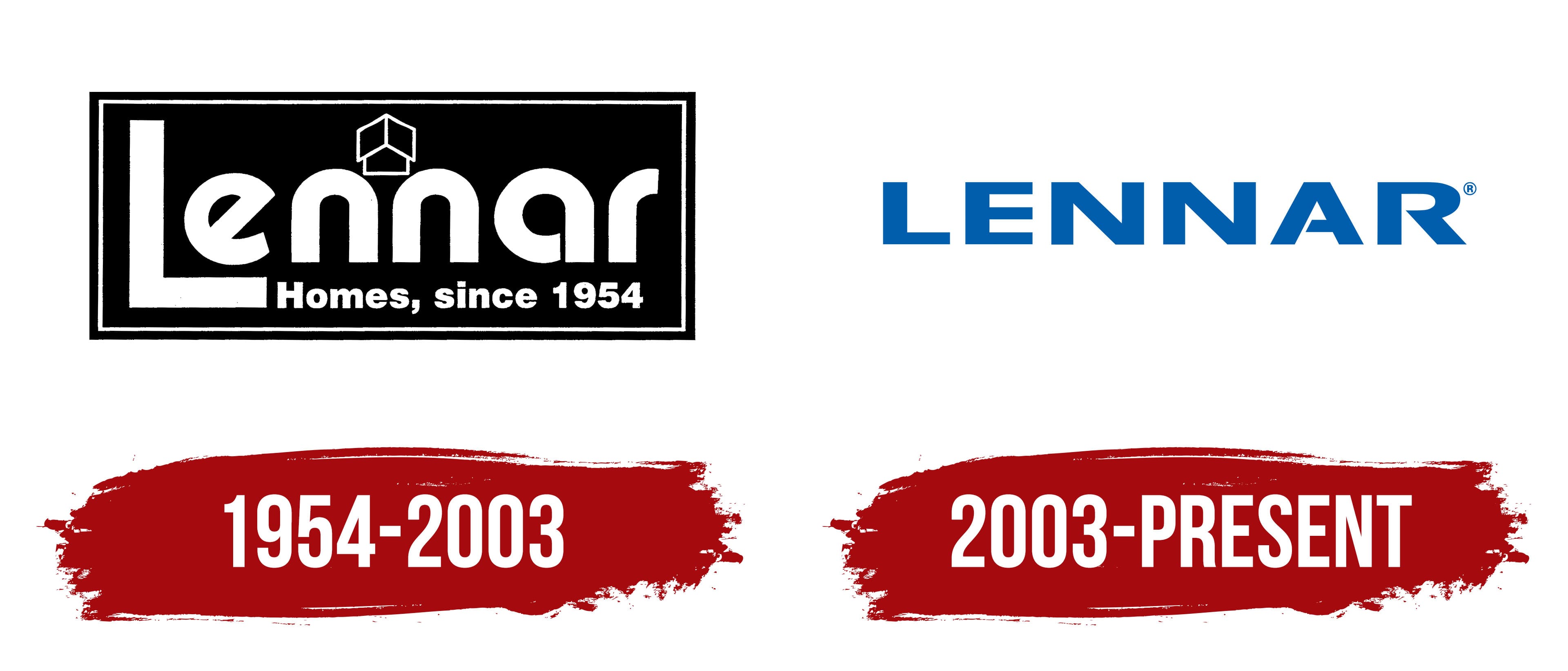
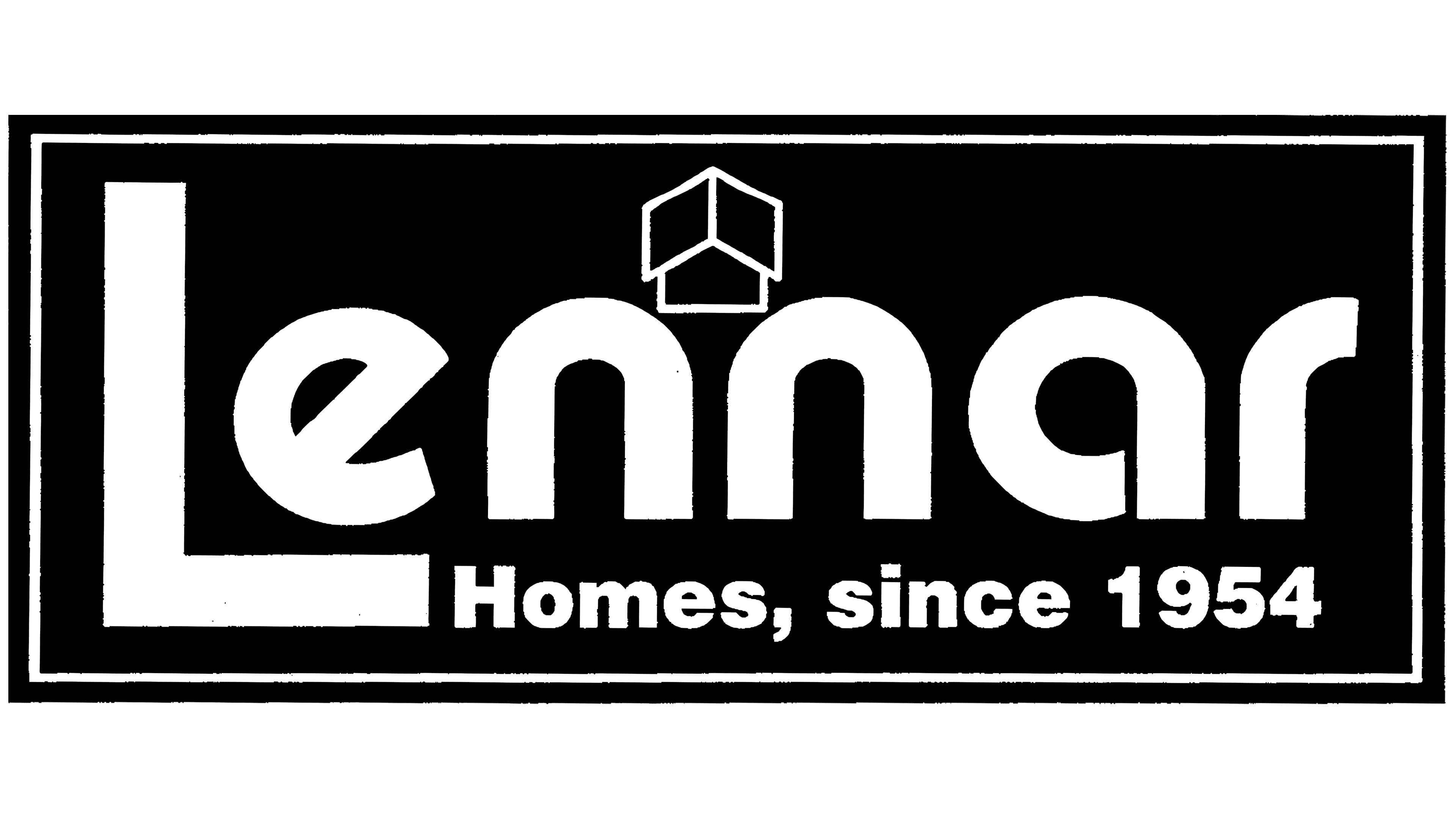
Lennar used two versions of its name in its identity. A stylized “LENNAR” wordmark similar to the modern version had been in commercial use since May 1973. An emblem featuring rounded Lennar lettering and an outline of a house above it appeared in 1981. A line containing the date 1954 connected the company with the year F&R Builders was founded.
In the “Homes, since 1954” version, the white name appeared on a black rectangular field inside a white frame. The large uppercase “L” rose above the lowercase letters, while its long lower stroke extended beneath the beginning of the word. Thick vertical strokes were combined with rounded curves and smooth terminals. The small line “Homes, since 1954” appeared beneath the name and stated that the company had been building homes since 1954. The relative sizes of the inscriptions established a reading order from the company name to information about its work.
A house was drawn in white lines above the center of the word between the two “n” letters. The black background remained visible through its outlines. Diamond-shaped and quadrilateral planes formed a three-dimensional figure resembling a cube and a building frame. The top looked like an angular canopy with a raised peak. The house’s angular outline sat beside the rounded letters, while the shared white color united the image and wordmark. Together with the word “Homes,” the architectural emblem identified Lennar as a homebuilder.
By the late 1990s and early 2000s, the corporate identity used a dark blue rectangle with a white inner frame and thin red border. The house and company name remained white. The lower line read “CORPORATION,” indicating the company’s status. Another version replaced it with the phrase “Family of Builders.” The logo’s foundation remained unchanged, while the tagline presented Lennar as a group of construction companies.
The phrase “Family of Builders” was tied to Lennar’s growth through acquisitions of regional homebuilders. The group brought construction companies and local brands together under one name. Lennar’s 2000 acquisition of U.S. Home Corporation doubled its size and gave it access to new markets. The phrase “Family of Builders” reflected the group’s structure and connected its member companies with the shared corporate brand.
2003 – today
Lennar updated its logo in 2004, replacing the rounded name with angular, uppercase “LENNAR” lettering. During the first stage, the company retained the rectangular base and the architectural image. The new corporate signature entered commercial use on January 1, 2004. The name and motto appeared on separate colored fields, with a roof outline incorporated into the boundary between them.
The large white word “LENNAR” occupied the upper blue section. A red band underneath contained the white italic motto “Quality. Value. Integrity.” The three words represented quality, customer value, and honesty. The motto accompanied the name as part of the standard signature and communicated the company’s operating principles. The angular uppercase letters differed from the slanted lettering in the lower line, separating the name from the explanatory text.
On the right, the white line between the colored fields rose in steps, forming a roof with a red slope and chimney. The small house outline was replaced with a roof integrated into the logo’s overall form. It maintained the emblem’s connection with home construction. Diagonal transitions between shades of blue created depth in the upper section, while the frame, white dividing line, and red band gave the panel a layered appearance.
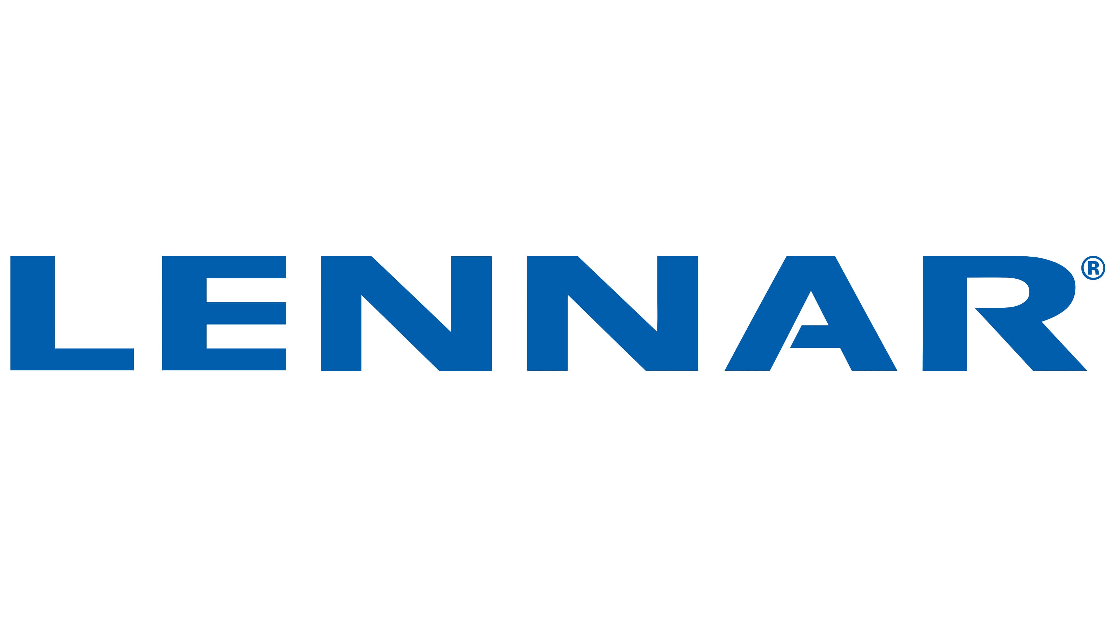
In 2006, the standalone “LENNAR” wordmark became the group’s complete logo. The rectangular base, roof, and motto remained part of the previous identity. The transition coincided with consolidating the company’s construction operations primarily under the shared Lennar brand. The company gave the existing letter design an independent role. In 2006, the name appeared in red on a black background, while a black version on white appeared in 2007. The color changed, but the letterforms remained the same.
In the modern version, the word “LENNAR” consists of uppercase letters of equal height. The sans-serif style combines even strokes with angular forms. Wider spacing leaves room between the letters across the entire name. The primary corporate version uses a rich shade described as medium Persian blue. A white wordmark appears on dark backgrounds.