 MAPEI Logo PNG
The MAPEI logo reflects the company’s commitment to advanced technology. It produces innovative sealants, varnishes, adhesives, primers, paints, plaster mixes, and other construction materials. The emblem’s modern design suggests the reliability and stability associated with the brand’s products.
MAPEI was founded in Milan in 1937 by Rodolfo Squinzi. The name came from Materiali Ausiliari Per l’Edilizia e l’Industria, meaning auxiliary materials for construction and industry. The company began as a small workshop for the building sector, first working with paints, floor coverings, and materials developed under Squinzi’s direct supervision.
World War II created serious pressure in the 1940s, as it did for many European manufacturers. Still, MAPEI continued to operate and adjusted to the postwar economy. In the 1950s, it expanded its product range with new adhesives for floor coverings. Those products strengthened its position in Italy and prepared the company for a wider distribution network.
In the 1960s, MAPEI grew across Italy and began exporting to other European countries. The 1970s brought a key shift into ceramic tile adhesives, which became one of its main business areas. In 1978, the company opened its first foreign plant in Canada. During the 1980s and 1990s, it added facilities in Europe, Asia, South America, Eastern Europe, and the United States. In 1994, MAPEI acquired Vinavil, reinforcing its work in adhesives and sealants.
From the 2000s onward, the company moved into concrete additives, mortars, research, and digital tools. It opened new research facilities in Milan, launched ECO products in 2021, built a plant in Vadodara, India, acquired Thermal-Chem Corporation in 2022, and introduced MAPEI Digital Solutions in 2023. In early 2024, it announced a carbon-neutrality plan for 2040 and expanded in Africa with a new facility in Kenya.
Meaning and History
What is MAPEI?
It is an Italian multinational company that produces adhesives, sealants, and chemical products for the construction industry. Known for its quality products, it offers solutions for various construction and renovation projects, including tile installation, flooring, waterproofing, and concrete restoration. The company offers products that provide durability, efficiency, and sustainability for construction projects.
1979 – today
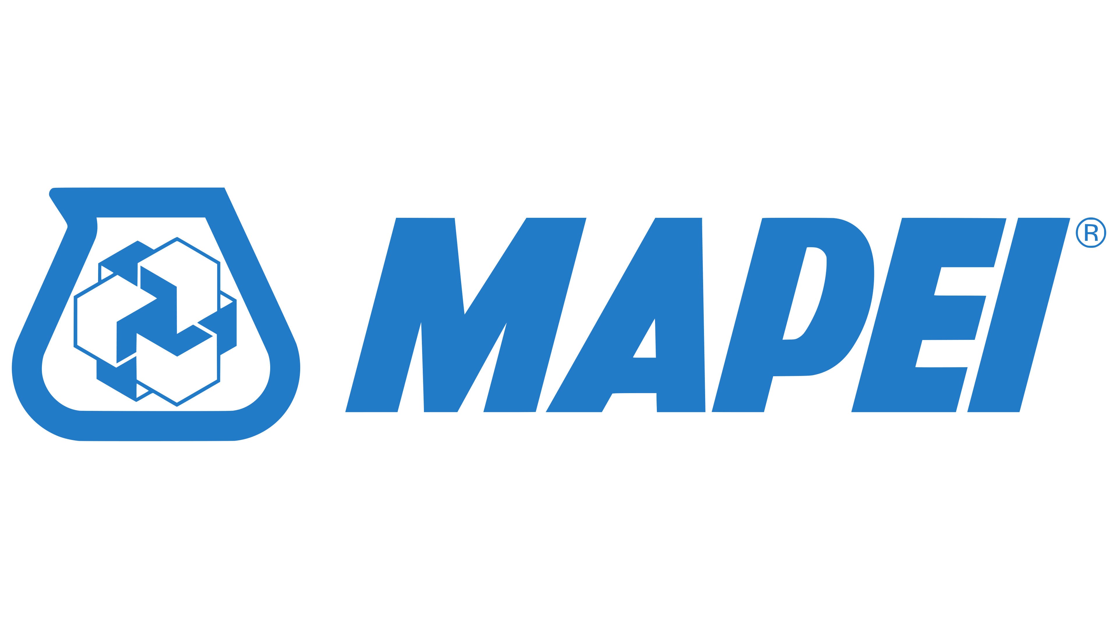
The MAPEI company began using this logo after opening its first factory in Canada. Successful international expansion prompted the creation of a universal visual identity that would reflect the new growth strategy and be easily understood by clients from any country.
In 1979, a conceptual emblem appeared, resembling a container with a short, sharp spout. Some might think it represents a scoop or jug, but that’s false. In reality, the designers depicted a laboratory flask as a symbol of the brand’s direct connection to the chemical industry. The Italian company produces a variety of waterproof coatings, concrete-enhancing additives, adhesives, and sealants. The development of new materials takes place in MAPEI’s research laboratories, so the flask image suggests strict control over all stages of production.
Inside the flask is a complex construction of geometric shapes. These can be seen as six cubes (in three-dimensional space) or multiple polygons (in two-dimensional space). This abstract element holds several meanings related to MAPEI’s field of work.
- The multifaceted pattern resembles a stylized molecular crystal lattice. This refers to laboratory-produced products, as the company actively uses various chemical compounds.
- The emblem looks like it’s made of several blocks. Each block represents one aspect of the brand’s work, and the entire structure symbolizes their close interconnection.
- The design of six cubes metaphorically represents the scientific processes MAPEI engages in. The complex geometric design is associated with innovation and high technology.
- The abstract pattern resembles an “impossible figure,” a type of optical illusion. It looks like the projection of a 3D object that cannot exist in three-dimensional space. This highlights the uniqueness and originality of the solutions offered by the Italian company.
To the right of the laboratory flask is the word “MAPEI,” an abbreviation for *Materiali Autarchici per l’Edilizia e l’Industria*. The bold font exudes strength, solidity, and confidence, emphasizing the brand’s high professionalism. The slight slant of the letters gives the inscription a sense of dynamism, reflecting growth and innovation. Sharp, clear lines symbolize reliability and durability, which are especially crucial for a manufacturer of construction chemicals.
The MAPEI logo’s color is rich blue. It evokes a sense of trust and accessibility, helping the brand build close relationships with clients. The blue palette also suggests stability, precision, and progress, making it a perfect fit for a company striving for cutting-edge technology. White is used for contrast to enhance the clarity of the key elements. It creates visual balance, making the emblem elegant and easy to read.