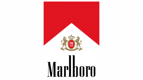
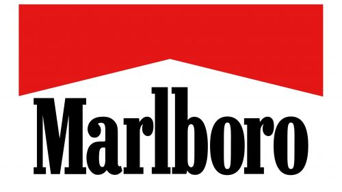
The Marlboro logo symbolizes confidence, independence, and freedom, as the designers successfully captured these qualities in its contrasting colors and dynamic shapes. The emblem is versatile, appealing to a wide range of people—from those who appreciate a calm retreat to adventure enthusiasts.
Marlboro: Brand overview
The British tobacco giant Philip Morris started producing cigarettes under the Marlboro name in the US in 1924, marking the beginning of the brand’s existence. At first, Marlboro was marketed as a women’s cigarette under the tagline “Mild As May.” At that time, women made up the majority of the audience and were not often seen smoking in public.
The brand remained a niche product for women during the 1930s and 1940s. However, it had little market influence, and its sales were low.
In 1954, the brand’s history underwent a sea change. About this time, the first research findings connecting smoking and lung cancer appeared. Philip Morris reinvented the product as a men’s cigarette to reach a wider audience and address growing health concerns.
The business engaged Leo Burnett, an advertising agency, to implement this plan. The firm created the tough cowboy character known as the “Marlboro Man,” who became a symbol of the company. 1955 saw the debut of the Marlboro Man in an advertising campaign.
The Marlboro Man image was a huge hit. The American audience connected with him because he personified the values of adventure, independence, and masculinity. The company’s sales consequently started to skyrocket.
Philip Morris debuted the renowned “flip-top box” for its packs in 1958. This creative packaging idea further enhanced the brand’s appeal.
The company experienced substantial expansion during the 1960s. It swiftly rose to the top of the American tobacco market. Around this time, the business started its global expansion, launching its products in European markets.
The United States outlawed tobacco advertisements on television in 1971, which led tobacco companies to look for alternative forms of advertising. The firm’s main marketing initiatives included sponsorship of athletic events, print advertising, and other initiatives.
In the 1970s and 1980s, the brand’s appeal continued to rise. The product was transferred worldwide and came to represent American culture. During this time, the company also started supporting auto racing, which resulted in forming a team in Formula 1.
The health risks linked to smoking increased pressure on the company in the 1990s. The chief executive officers of the seven biggest tobacco corporations in the United States, including Philip Morris, gave testimony to Congress in 1994 regarding the negative consequences of smoking.
The Master Settlement Agreement was struck in 1998 by Philip Morris and several other significant tobacco firms with the attorneys general of 46 U.S. states. This deal restricted the tobacco corporations’ ability to sell their products and mandated that they pay states billions of dollars to address smoking-related medical costs.
In 2001, Philip Morris rebranded itself as Altria Group to break away from the tobacco industry. However, the product continued to be a vital brand for the business.
In several nations, the 2000s and 2010s were marked by additional prohibitions on promoting and selling tobacco products. Despite this, the cigarette became one of the most well-known tobacco brands worldwide.
In 2018, Philip Morris International, the global company that broke away from Altria in 2008, announced its dedication to a “smoke-free future” and actively promoted lower-risk substitutes like IQOS.
As a component of Philip Morris International (PMI), the brand continued to adjust in 2019 to the shifting tobacco industry dynamics. The business made more of an effort to market lower-risk goods, especially the IQOS tobacco heating device. IQOS is not a direct product of the brand line, but this approach affected its positioning by connecting it to a wider variety of nicotine and tobacco products.
PMI continued funding the creation of substitute nicotine products in 2020. As part of this campaign, a range of tobacco-free nicotine pouches under the IQOS brand was introduced in multiple nations. This action was taken in response to customer demand for non-traditional cigarette options and was in line with the company’s broader strategy of broadening its product line.
In 2021, the company encountered more regulatory difficulties in several nations. The Food and Drug Administration (FDA) in the US declared its intention to lower the amount of nicotine in cigarettes to barely detectable or non-addictive levels. This news severely disrupted the company’s strategy and compelled the business to expedite the creation of substitute products.
As part of its ongoing transformation strategy, PMI declared in 2022 that it wanted to achieve its objective of having over 50% of its revenue come from smoke-free goods by 2025. As part of this approach, the business started testing new product categories, like e-cigarettes and oral nicotine products, under various brands, including Marlboro, in some areas.
The same year, the product encountered tighter regulations regarding promoting and advertising tobacco products in several nations. As a result, the business aggressively created loyalty plans and digital marketing for adult smokers in nations where it was legal.
PMI declared at the start of 2023 that it intended to increase its market share in the lower-risk product category. The business started creating novel nicotine delivery systems to enhance its product line and other PMI products that are now available.
Although the cigarette continued to be one of the most well-known tobacco brands in the world, the company’s focus progressively switched to the creation and marketing of substitute nicotine products.
Meaning and History
What is Marlboro?
It is a world-famous brand of cigarettes manufactured by Philip Morris International. Known for its distinctive red and white packaging, the brand has become one of the best-selling cigarette brands in the world. It is particularly known for its marketing campaigns featuring the “Marlboro Man,” which featured rugged cowboys and outdoor imagery to capture consumers’ attention. The company offers different types of cigarettes, including Marlboro Reds, Marlboro Lights, and Marlboro Golds. Despite its popularity, the brand, like other tobacco products, has been linked to significant health risks.
1924 – 1955
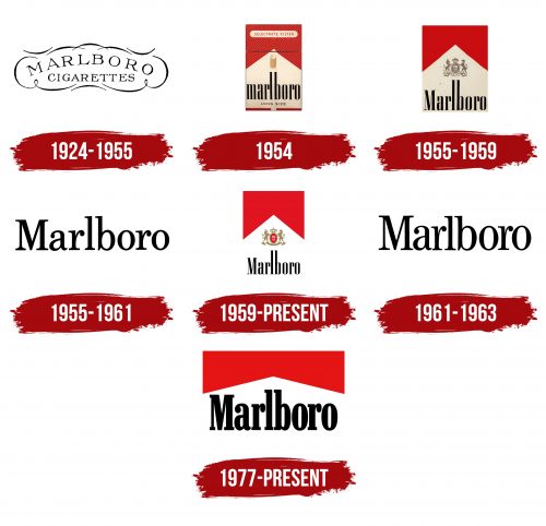
Marlboro was originally positioned as a luxury cigarette brand, so its old logo was designed to emphasize aristocratic elegance. The company name is curved in an arch, reflecting a classic style associated with reliability and longevity. In contrast, the word “CIGARETTES” is aligned horizontally at the bottom, creating a stable foundation that offsets the visual imbalance of the upper line.
The font appears elegant due to the contrasting thickness of the strokes, long serifs, and wide internal spacing. It exudes luxury and high status, as Marlboro was initially aimed at wealthy tourists spending significant time at resorts and hotels.
The refined lettering is enclosed in a frame formed by curved lines. The inner space resembles a large white cloud, giving the logo a sense of lightness, airiness, and weightlessness. This symbol perfectly suits a tobacco brand, as the thin lines and smooth curves evoke flowing swirls of smoke.
Since the emblem was created in the era of black-and-white printing, it features a corresponding color scheme. However, the simplicity doesn’t diminish its appeal—the monochromatic design fits seamlessly with the concept of classic luxury. Black traditionally represents aristocracy and elegance, while white symbolizes pristine purity.
1954
As Marlboro’s marketing strategy shifted, the brand transitioned into the mass-market category while retaining some of its original prestigious reputation. The logo reflected its desire to stand out, which remained elegant and aristocratic after the redesign.
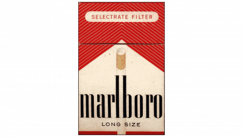
First and foremost, the lettering style changed. The company name is now composed entirely of lowercase letters and is written in a unique font created specifically for the tobacco manufacturer. The designers emphasized the vertical lines, making them tall and thick. In contrast, the other strokes are incredibly thin—even the horizontal serifs present on all glyphs except the “o.”
The straight, wide lines evoke the image of cigarettes neatly arranged in a pack. To highlight this analogy, the logo’s developers placed a realistic image of a cigarette between the “l” and “b.” The yellow filter is prominently raised, symbolizing the relative safety of the product, as the 1950s saw a proven connection between unfiltered cigarettes and an increased risk of lung cancer.
This logo was introduced in 1954 along with an experimental packaging design and has not been used since. The brand name is placed at the bottom on a white background, next to the indication of the cigarette length (in this case, “LONG SIZE”). The top of the pack is adorned with red lines converging at an angle above the vertical cigarette. The inscription “SELECTRATE FILTER” is also written in thin uppercase letters.
1955 – 1959
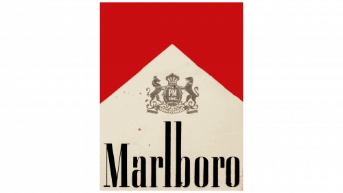
This logo doesn’t feature a cigarette but includes the symbol of Philip Morris International, which owns the Marlboro brand. It resembles a Victorian-era coat of arms, which it essentially is. The original Philip Morris emblem was created in the 1880s when every respectable company had its heraldic symbol. Each component of the crest carries a hidden meaning:
- The English crown signifies that the tobacco manufacturer received official approval from the British monarch.
- The large oval shield reflects the rich history of the longstanding company.
- The inscription “P.M. INC.” stands for Philip Morris Incorporation.
- The horses flanking the shield symbolize speed, strength, and bravery.
- The phrase “VENI VIDI VICI” on the unfurled scroll speaks to the manufacturer’s grand ambitions.
Philip Morris’ coat of arms in the Marlboro logo hints at the brand’s rich heritage, as it has long belonged to this historic tobacco company. The heraldic symbol is rendered in silver, making it less prominent than the other elements.
The primary focus is on the brand name. The familiar font is used for the lettering, with tall, thick vertical lines adorned with fine horizontal serifs. However, now the first “M” is uppercase instead of lowercase—the designers deliberately made it capital to emphasize Marlboro’s prominence.
The elongated letter shapes resemble the cigarettes produced by the American company. The black color enhances the boldness of the lettering, creating a sharp contrast with the white background and the silver crest. Above them hovers a red polygon with a triangular notch. Its striking color has become a recognizable hallmark of the tobacco brand.
1955 – 1961
This wordmark differs from all previous versions with its simple style. Compared to older versions, it appears more basic, as the letters no longer have the unique shape that made them resemble cigarettes. The designers moved away from the creative concept. They returned to a classic approach to present Marlboro in a new way, showcasing the brand’s commitment to longstanding traditions—both in identity and in the production of tobacco products.
The logo features only the brand name. It is written in a geometric font with long horizontal serifs that enhance visual dynamism. The clean, straight lines contrast with smooth curves, which is especially noticeable due to the uneven thickness of the strokes. Some letters have large teardrop-shaped ends, adding an air of aristocratic sophistication.
This transforms a simple wordmark into a recognizable logo that can promote Marlboro in the global market. The minimalist style highlights the company’s desire to appear accessible in the eyes of consumers, as it has long entered the mass-market segment. The black color evokes a sense of boldness and solidity. In the mid-1950s, the brand aimed to make its visual identity more masculine so that its filtered cigarettes would also appeal to men. The logo was used on cardboard packaging and promotional materials for a long time.
1959 – today
In 1959, an updated version of the Marlboro emblem was introduced, featuring the heraldic symbol of Philip Morris International. The designers paid close attention to the details, as these small elements impact the brand’s overall perception. The structure of the crest has been simplified: only the two horses holding the oval shield, the large British crown, and a blank scroll without inscriptions remain.
Most elements are colored in dark gold, reflecting the prestige of the cigarette manufacturer. Only the interior of the oval is red, as the white letters stand out best against such a background. It displays the short name of Philip Morris’s U.S. division: “PM USA.”
The crest represents Marlboro’s rich heritage and is at the logo’s center. The brand name is positioned at the bottom. Its unique font is easily recognizable, contrasting wide and long vertical lines with short, thin horizontal strokes. The visual imbalance of the lettering highlights the distinctive charm of the cigarette manufacturer, which aims to appear luxurious even though its products are in the mass-market category.
The upper half of the emblem still features a red square with a striking triangular cutout. However, the colors are now brighter and more saturated, giving the red polygon a vibrant energy of passion, strength, and expressiveness. Its bold appearance perfectly aligns with the “masculine” and “tough” brand image that Marlboro has cultivated over the years.
1961 – 1963
This logo resembles the 1955 wordmark, but a few nuances set it apart.
First, the letters are taller than before. This effect is created by the long vertical lines, which mimic the elongated shape of Marlboro cigarettes.
- First, the letters are taller than before. This effect is created by the long vertical lines, mimicking the elongated shape of Marlboro cigarettes.
- Second, the inner spaces of the letters appear wider, giving an illusion of lightness, which is associated with the smoking experience.
- Third, the overall perception of the emblem has changed. It now looks refined and elegant, reflecting the brand’s high prestige.
The logo conveys a sense of formality, elegance, and authority. The classic font style characterizes Marlboro as a prestigious company that values tradition and is confident in its reputation. The letters consist of sharp lines of varying thickness, giving the wordmark a dynamic visual appeal. Additionally, the long serifs at the ends of the glyphs add a solid, respectable look to the text.
The simple yet striking design emphasizes the brand name, whose fame has long extended beyond the U.S. This minimalistic yet powerful branding tool conveys Marlboro’s reliability. The black color fills the logo with a sense of strength, and the absence of additional colorful elements enhances the impression of simplicity and confidence.
1977 – today
In this logo, the company name is rendered in a slightly modified version of the Contact font, which began to be used in advertising in 1964 and gradually became the basis for the new wordmark. Initially, the “Marlboro” name appeared on marketing materials, and in 1977, it was combined with the red polygonal “roof” and used on cigarette packaging for the first time.
Neo Contact from American Type Founders visually resembles the older fonts previously used by the tobacco manufacturer. It features similarly long vertical lines, but in this version, they are thicker than in earlier logos. All other strokes, including the horizontal serifs, have also been bolder. This makes the brand name appear strong, powerful, and impressive, promoting the idea that Marlboro cigarettes are intended for women and men.
The increased boldness makes the lettering seem larger than before. This effect is further enhanced by removing the Philip Morris crest, which had long adorned the packaging of tobacco products. Now, the wordmark sits directly beneath the red polygon with a triangular notch and is perceived as a harmonious extension of it. The “roof” has been significantly altered compared to the 1959 logo—it is longer and flatter to match the text’s size roughly.
The new proportions of the emblem help balance the color ratio. Red no longer dominates—it is visually balanced by white and black, which play key roles in establishing the brand’s identity. Black highlights the text, making it memorable; red conveys a sense of determination and boldness; and white visually links these two colors, maintaining a sense of harmony. This contrasting palette creates a strong and confident image of Marlboro, associated with longstanding traditions.
