The emblem embodies style, confidence, and constancy. The Marshalls logo refers to stores that regularly update their assortment. The sign informs customers that only fashionable and sought-after goods are on the shelves.
Marshalls: Brand overview
| Founded: | 1956 |
| Founder: | Alfred Marshall, Bernard Goldston, Norman Barren, Irving Blitt |
| Headquarters: | Framingham, Massachusetts, U.S. |
| Website: | marshalls.com |
Meaning and History
The company is named after its founder, Alfred Marshall. His idea was to offer real brands to customers at a lower price. He realized the idea with three like-minded people, opening the first store in a suburb of Boston in 1956. By 1976, the partners already had 36 branches, which they successfully sold to the Melville shoe corporation, which they continued to actively develop until the giant was reorganized. In 1995, 496 Marshalls stores became part of the TJX Corporation.
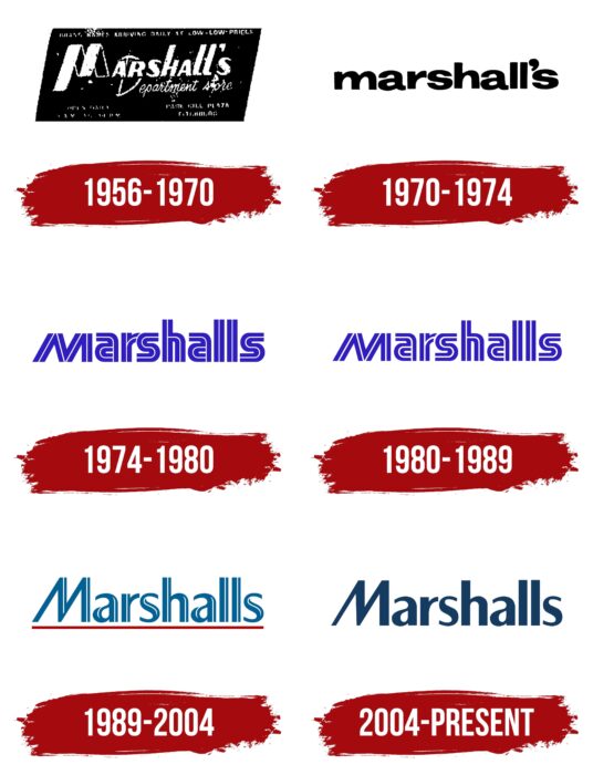
As a reflection of rapidly changing fashion, the Marshalls emblem has been updated frequently – 5 times in its short life. This helped the brand keep up with the times and showed the dynamism of the network and always a new range of products.
What is Marshalls?
Fashion department store brand for the whole family, popular in the US and Canada. He is owned by TJX Corporation, one of the 100 largest on the Fortuna list.
1956 – 1970
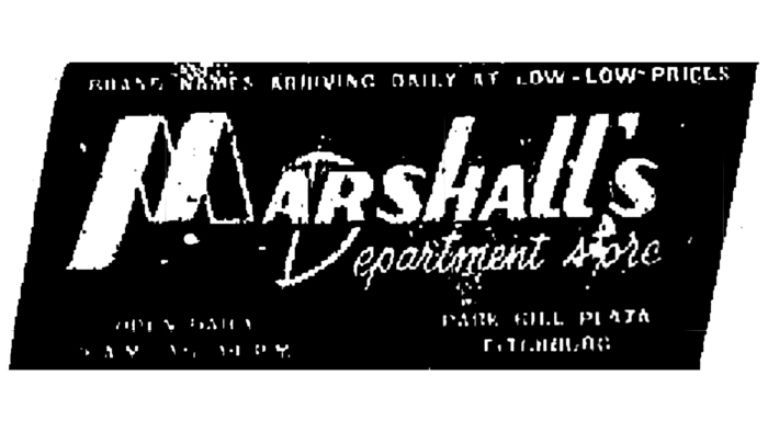
The first logo looked like a label, a sticker placed on branded items – a black rectangle with white inscriptions. The store’s name was placed in the center and was spelled out in white italics, neat letters. The slope indicated the desire for development and movement following fashion.
The image was distinguished by an unusual letter M, created from a twisted ribbon or belt. She added style to the logo and indicated the sale of clothes.
Around the word, Marshalls are various inscriptions that introduced the client to the company. A little below the name is the essence of the proposal – department stores (department stores). At the top, the screen-printed a low price message: daily low-low price. Below on the right is the address of the store.
1970 – 1974
The number of outlets grew, so the visual presentation was revised. For ease of perception, the colors of the emblems have been swapped. The background was made white. It featured the title in straight, rounded, lowercase black letters. This relieved the visual sign of mourning and heaviness and focused on the name. The lowercase first letter indicated casual clothes without pretentiousness and extravagance, comfortable and practical things that prevailed.
1974 – 1980
The brand continues to follow the trends, considering them and updating the logo using the Yagi typeface, which gained particular popularity in the 1970s.
The Marshalls’ letters received a toxic blue color with thin white stripes in the center, which gave the lettering volume. Thanks to this design, the logo has acquired a resemblance to neon signs. At the same time, the edges of the letters looked to cut off, reinforcing the association with luminous tubes.
The design made the emblem fashionable and modern, which attracted buyers. The bright image fully corresponded to the main idea of the stores—the theme of surprise and treasure hunting. Thanks to the weekly arrival of goods, whenever customers came to the store, something new awaited them.
The apostrophe was removed from the name, simplifying spelling and separating the company from Marshall’s Acoustic brand.
Along with the blue logo, the same black variant was used.
1980 – 1989
In 1976, Marshalls was bought by the Melville Corporation, which contributed to the expansion of department stores. Over the next ten years, they opened in 42 US states. The expansion and emergence of many new stores were marked in the logo by light colors, symbolizing novelty. The white tubes are thicker, and the blue color is less poisonous. Similar changes also affected the black version of the emblem.
1989 – 2004
By the 90s, Melville was on the cusp of a reorganization due to too many diverse brands. In 1989, 6% of the corporation’s shares were distributed among employees, and minor changes were made to management. Marshalls underwent a rebranding, which included updating the logo.
By the 90s, denim came into fashion. Pants, skirts, jackets, and overalls were sewn from light denim. Therefore, shops where you could buy denim items attracted many buyers. The Marshalls logo was made to match the new fashion. The visual sign retained the trend toward volume, but the resemblance to neon signs is gone. The blue color was changed to a pleasant blue, and the white lines were shifted from the center. Now, they depicted highlights in three-dimensional letters. The cut ends are smooth and tapered. They hinted at figure-hugging clothes and leggings – another fashionable touch of the 90s.
A special highlight was the letter “M.” Her thin and pointed lines recalled models’ stiletto heels and slender legs during a fashion show on the catwalk.
A red line underlined the name as a symbol of development, high level of sales, fashion offers, and hot discounts. Sometimes, the logo was used without underlining but with capital letters with the same connotation.
2004 – today
In 1995, department stores were bought by TJX Corporation, which owns the main competitor, Marshalls. However, this did not lead to a major rebranding. Changes occurred in 2004 by promoting the idea of parallel supermarkets in the corporation. Marshall’s and T. J. Maxx were merged into the Marmaxx Group but retained their identities. Brand logos are made bright. For the Marshalls, they chose blue, and T. J. Maxx was presented in red.
The dark blue name on a white background evoked a sense of calm, confidence, and style. It was a symbol of practicality, convenience, and durability.
Font and Colors
Classic black, white, and shades of blue represented the logo’s color scheme.
- Black is the color of power and confidence, a symbol of black labels and labels on clothes.
- White – an indicator of the constant updating of the assortment and the opening of new stores.
- Blue hues varied from a rich, acidic Persian blue to juniper and turquoise blues. The logo currently has a sapphire-emerald color. The blue palette is associated with stability, balance, a sense of style, and discounts.
A modern logo font from the Tabac family.
