 Meiji Logo PNG
Food and dairy products are part of the daily diet and are used regularly at home. Chocolate, yogurt, and milk are produced under strict control of raw materials and processing to maintain consistent taste. The Meiji logo is associated with a company that manufactures food and dairy products and operates in Japan and beyond.
Meiji Holdings was established in April 2011 following the merger of two companies with a century-long history. These were Meiji Seika Kaisha and Meiji Dairies. Meiji Seika was founded in 1916 in Tokyo. As early as 1917, the company began producing milk chocolate and pioneered Japan’s confectionery market. In the 1920s, the enterprise expanded its product line to include caramel and biscuits.
Tokyo Milk was founded in 1926. The company specialized in milk processing and producing yogurt and cheese. In 1940, it was renamed Meiji Milk Products. After World War II, both companies restored production. By the 1950s and 1960s, it had become a leader in the dairy and confectionery industries. During this period, the well-known brands Meiji Milk Chocolate and Meiji Bulgaria Yogurt appeared.
In the 1970s, Meiji Seika began producing antibiotics and vaccines, utilizing its accumulated biochemical expertise. In the 1980s, Meiji Seika entered international markets and opened factories in China and Southeast Asia.
By the 2000s, Meiji Seika and Meiji Milk Products had started cooperating while remaining independent entities. In 2009, the companies announced an upcoming merger. In 2011, the process was completed, and Meiji Holdings Co., Ltd. was established. It consisted of two business segments. The first focused on food production, and the second on pharmaceuticals.
In 2015, Meiji acquired Medolac Laboratories, an Australian infant nutrition company. In 2016, construction began on China’s largest baby food factory. In 2018, the pharmaceutical division focused on developing anti-infective drugs.
In 2020, demand for yogurt and dairy products increased. In 2022, the company faced higher costs due to rising raw material and energy prices. In 2023, Meiji invested in developing functional foods with probiotics and vitamins. In 2024, the company expanded its premium chocolate production and opened boutiques in Tokyo and other cities.
The company remains one of Asia’s largest producers of food and pharmaceutical products.
Meaning and History
What is Meiji?
A Japanese corporation with a diversified structure and leading positions in the food and pharmaceutical industries. It manages the brands Meiji Seika, Meiji Techno, Meiji Yasuda Life, and Meiji Sangyo. The company produces dairy products, confectionery, baby food, beverages, pharmaceuticals, animal feed, and optical instruments. It holds leading positions in Japan in yogurt, milk, ice cream, and chocolate production, and exports its products worldwide. The pharmaceutical division covers antibiotics, anti-inflammatory and veterinary medicines, and laboratory equipment. The group structure includes divisions for insurance, pharmaceuticals, optics, and industrial equipment.
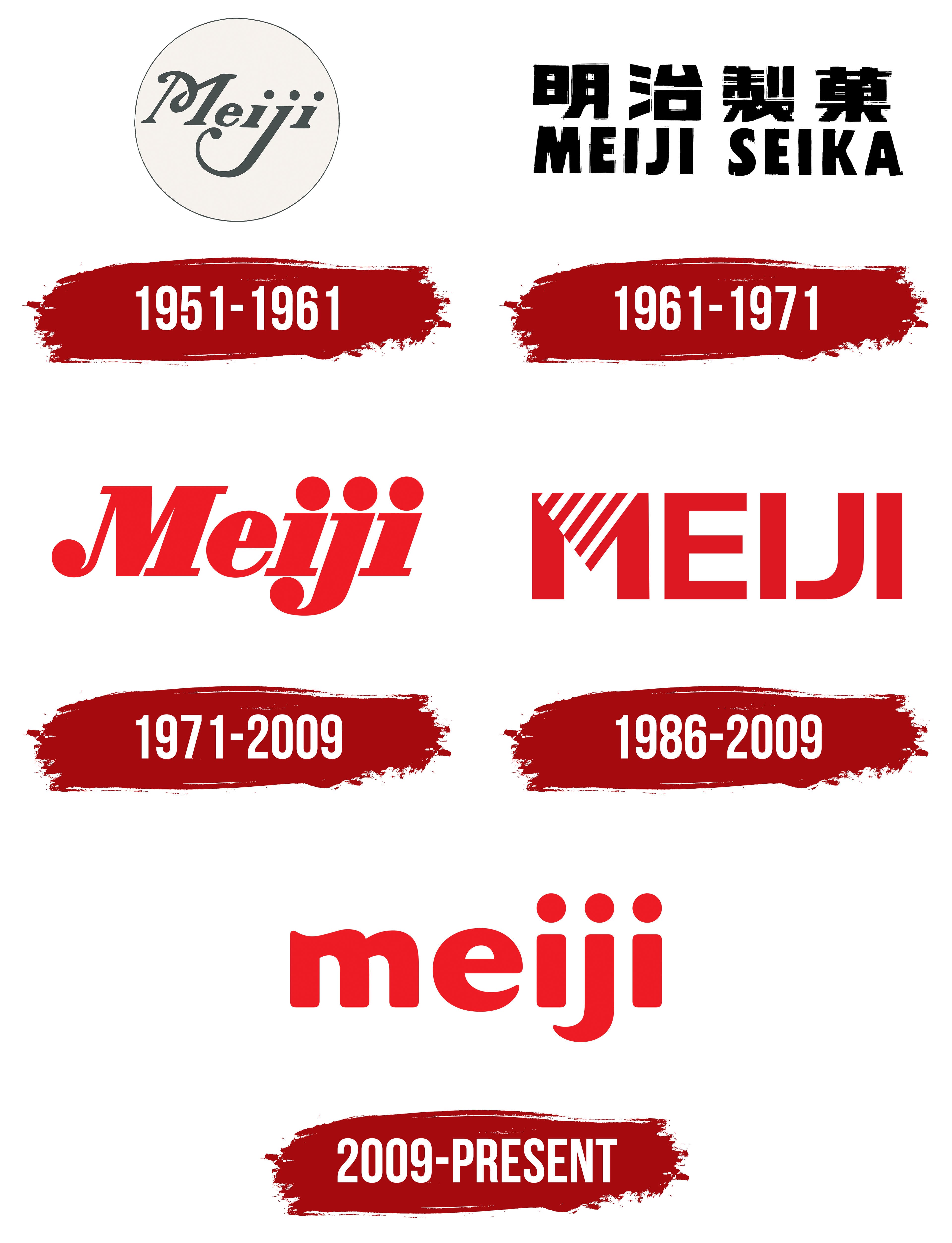
1951 – 1961
The long loop of the letter “j” became the defining feature of Meiji’s Latin-letter signature in the mid-1950s. Documents date its introduction to 1955 and credit Yusaku Kamekura, one of Japan’s leading 20th-century designers. He created custom lettering for Meiji Seika and contributed to the packaging of the well-known Meiji Milk Chocolate bar. Frequent use on packaging turned the inscription into a corporate mark and a permanent part of the company’s confectionery branding.
The word “Meiji” appears inside a circle and rises slightly toward the right. The field has a light beige color with a warm, milky tone. A thin dark gray line runs around the outer edge and matches the lettering. The combination separates the name from the pale background and complements the soft colors used on the packaging.
The name used decorative serif lettering with strokes of varying thickness and calligraphic curves. The capital “M” had a long upper stroke extending above the following letters. The remaining characters were lowercase. The lower stroke of the “j” descended far below the line and ended in a large rounded loop. The slant, alternating thin and broad strokes, and flowing curves created the appearance of a handwritten signature.
The Meiji name entered the confectionery business through Meiji Sugar, established in 1906. It comes from the Japanese name of the Meiji era, which lasted from 1868 to 1912. Tokyo Kashi Co., Ltd., the predecessor of Meiji Seika, began operations in Tokyo in 1916. It merged with Taisho Seika, a company associated with Meiji Sugar, in 1917 and became Meiji Seika in 1924.
The dairy business began with Kyokuto Condensed Milk, established in 1917 and renamed Meiji Dairies in 1940. The confectionery and dairy companies developed separate businesses with shared historical roots for several decades. Their management integration on April 1, 2009, created Meiji Holdings. A 2011 reorganization established the food company Meiji Co., Ltd. and the pharmaceutical company Meiji Seika Pharma.
1961 – 1971
In the updated Meiji Seika signature, the Japanese name and English transliteration received equal prominence. Heavy block typography replaced the calligraphic Latin lettering, and a dense two-level composition replaced the flowing wordmark. The company gained a unified signature that paired its original name with an equally important international version.
The upper line contained the Japanese characters 明治製菓. Thick strokes, rigid lines, and square proportions defined their appearance. Tight spacing increased the line density. A solid black fill brought the complex internal structure of the characters together as one inscription.
“MEIJI SEIKA” appeared below the Japanese name. The Latin words used upright uppercase sans-serif letters. Their stroke thickness matched the heavy structure of the upper line, while the English section retained familiar alphabetic forms. Both lines were black. Differences in writing system, proportions, and letter construction set them apart.
The similar visual weight of the Japanese and Latin sections allowed the mark to work in Japan and international markets. Japanese audiences saw the full name 明治製菓. At the same time, “MEIJI SEIKA” provided its Romanized form for overseas communications and products. The entire identity relied on two versions of the name combined in one composition.
The corporate identity developed during Meiji’s long collaboration with Yusaku Kamekura. His work for the company covered the 1960s and early 1970s and included corporate marks and packaging. From 1961 to 1974, the designer created several projects for the Meiji chocolate line, connecting product packaging with the brand’s overall style.
1971 – 2009
Three large dots appeared above the final section of the Meiji name in the 1971 logo. Yusaku Kamekura completed the redesign. He restored the Latin-letter Meiji name and revised the curves from the earlier calligraphic version. Red united all the letters, and the name became the complete corporate signature.
The initial “M” remained uppercase, while the other letters were lowercase. The characters grew heavier, with thickened areas and width variations between primary and connecting strokes. The word leaned to the right. Rounded, teardrop-shaped terminals softened the massive lettering and maintained a connection to the wordmark’s handwritten origins.
The round dots appeared above the final three letters and were larger than conventional diacritical marks. Their sequence formed a separate pattern across the top of the logo. The lower stroke of the “j” descended beneath the line and continued into a broad curve. Large rounded terminals at the ends balanced the vertical strokes in the middle of the word. The combination of dots, slant, and curved “j” distinguished Kamekura’s work from standard typesetting.
1986 – 2009
In 1986, Meiji Dairies expanded its corporate identity into a comprehensive identification program. The dairy company continued to use a separate brand and hired Takenobu Igarashi. The designer’s archive describes the project as one of the most complete identity systems of his career. The work included a logo and guidelines for applying it to packaging, vehicles, signs, and corporate materials.
Igarashi Studio handled the project. Takenobu Igarashi worked with Yukimi Sasago, Debi Shimamoto, Ichiro Takahashi, and other studio employees. The team built the identity around the name “MEIJI,” using a single-color scheme and a typographic composition.
The wordmark consisted of five red uppercase sans-serif letters. The characters had broad strokes, upright forms, and large proportions. They formed an even horizontal line. A uniform red fill connected the letters, while counters and stroke construction distinguished them.
The primary detail appeared inside the “M.” The middle section formed a triangular area with its point facing downward. Five white diagonal stripes crossed the red surface, creating a repeating pattern. The remaining letters used solid fills, allowing the striped “M” to stand apart as the distinctive part of the name.
The geometric construction worked across applications of different sizes. It represented products on dairy packaging, identified the company on vehicles and signs, and supported the corporate system in business materials. The red MEIJI wordmark, with its striped “M,” gave Meiji Dairies an independent identity while preserving its connection to the historic Meiji name.
2009 – today
In 2009, a unified lowercase “meiji” wordmark replaced the two previous Meiji identities. Meiji Seika had used Yusaku Kamekura’s red calligraphic inscription, while Meiji Dairies used Takenobu Igarashi’s geometric MEIJI wordmark. Establishing a common holding company created a need for a single corporate signature representing the food and healthcare businesses.
Meiji Holdings Company, Ltd. was established on April 1, 2009. The new parent organization received shares in Meiji Seika Kaisha Ltd. and Meiji Dairies Corporation. The Tokyo office of Landor Associates developed the shared “meiji” wordmark, which began rolling out that year. The brand covered the holding company and both historic businesses, bringing them together under one name for consumers, employees, and business partners.
Landor moved from uppercase lettering to heavy lowercase sans-serif forms. Soft, rounded strokes gave the word an open, friendly appearance. The entire inscription used one vivid red shade. The letters stood upright and formed a compact horizontal line.
Several images were incorporated into the letterforms. The upper curve of the “m” resembled cream, while the inner line of the “e” formed a smile. The sequence “iji” depicted people standing together and supporting one another. Three equal round dots appeared above the “i,” “j,” and second “i.” Their symmetrical placement created a separate upper row and united the latter part of the word through a repeating pattern.
The corporate description connected the brand with “food and health,” nutrition, well-being, and warm relationships with consumers. Red continued the color tradition of the former Meiji Seika logo. The company described it as the first color a person perceives after birth and associated it with vital energy. The new signature was intended for audiences of all ages, from infants to older adults.
The logo began appearing on corporate materials and product packaging. Meiji Milk Chocolate received its first major packaging update in 38 years in 2009. The lowercase “meiji” connected the product brand with the group’s unified identity and extended the shared name across multiple product categories.
The 2011 reorganization established the food company Meiji Co., Ltd. and the pharmaceutical business Meiji Seika Pharma. The red lowercase signature continued representing both areas under a common corporate brand. Meiji Holdings maintains legal protection for the names “meiji” and “明治” in Japan and international markets.