The Microcar logo is bright and shiny, immediately drawing attention. The rounded lines convey the compactness and convenience of the company’s quadricycles. The emblem represents the harmony and perfection of a vehicle designed for quick transportation.
Microcar: Brand overview
In 1984, within France’s Bénéteau Group, known primarily for its sailboats, a new division emerged, christened Microcar. This venture pivoted towards producing quadricycles, colloquially known in France as “sans permis” vehicles. Over time, Microcar carved a niche, winning favor among the French populace with its affordable, no-license-required microcars. Particularly, the MC1 and MC2 models became household names.
By the turn of the millennium, recognizing the brand’s growing footprint, a bespoke Microcar factory was inaugurated to bolster its production capabilities. However, the landscape shifted in 2008 when Ligier Automobiles, a fellow French producer of quadricycles, acquired Microcar. This union transformed the combined entity into Europe’s second-largest microcar producer, all under the stewardship of the Ligier Group.
Yet, in this consolidation, the distinct identities of Microcar and Ligier were preserved. Both brands operate in tandem, leveraging shared resources and distribution networks yet retaining their unique marquees. Today, Microcar’s portfolio boasts the likes of M.Go and MC2, petite vehicles driven by compact petrol engines. Microcar is significant in France’s automotive tapestry, emblematic of the nation’s emphasis on compact and fuel-savvy urban transport.
Meaning and History
What is Microcar?
Microcar is a French automaker renowned for its expertise in producing compact, city-friendly vehicles known as microcars. These small, nimble cars are tailored for urban environments, offering superior fuel efficiency and effortless maneuverability in congested areas. Characterized by their lightweight build and modest engine capacities, these vehicles provide an eco-friendly and cost-effective solution for urban transportation.
1984 – 2011
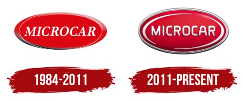
The main symbol of the Microcar brand is an elegant oval resembling a start button, symbolizing the readiness of their quadricycles for immediate action and quick movement. This design emphasizes the convenience and thoughtfulness of the vehicles, ensuring high functionality and ease of use. Operating these quadricycles does not require a driver’s license, making them ideal for people of all ages and occupations in household tasks.
The brand name is displayed in white capital letters with a slight tilt in the center of the emblem, giving the logo a dynamic look. Despite their small size, microcar vehicles are significant in their niche, providing users with unique mobility opportunities. The company aims to continue its development and plans to offer new, more comfortable models to meet the needs of its customers.
2011 – today
The company’s logo underwent significant changes with the shift to electric vehicles. The once concave button became convex, giving it a more modern and dynamic look. Iron accents and white highlights were added to the surface, emphasizing the high-tech and contemporary nature of the cars.
The logo design reflects the shiny lacquered surface of the electric vehicles, symbolizing their novelty and innovative character. The company name is displayed in thin, three-dimensional letters, creating an appealing and clear image. The uniform width of the glyphs makes the text harmonious and elegant, highlighting the brand’s aesthetic appeal.
Despite their compact size, electric vehicles are designed for comfort, ensuring that each ride is enjoyable.


