The Mio logo is distinguished by its simplicity and straightforward color scheme while remaining highly informative. It features a memorable combination of elements symbolizing the water element and physical health. Since 2011, the Mio brand has positioned itself as an inexhaustible source of strength and inspiration for its clients. The company has been creating products to promote human health for many years.
MiO: Brand overview
The Mio brand began in 2011 when Kraft Foods introduced this novel product in the US market. With the introduction of Mio, an inventive liquid concentrate for beverage production, the soft drink business underwent a new development phase.
The brand was created to address the rising need for simple, customized food and drink products. One of Mio’s main selling points was that customers could adjust the drink’s taste intensity by diluting the concentrate with water to the desired strength.
Following a triumphant debut in the US market, the brand began to broaden its reach internationally in 2012. Following its launch, it became well-known among consumers looking for a healthier substitute for conventional soft drinks in Canada.
2013 was a significant year for the company’s growth. The Mio Energy line, enhanced with vitamins and caffeine, was introduced that year. By making this change, the firm could enter the energy drink market and provide a healthier option than typical energy drinks.
A noteworthy event in the brand’s business history happened in 2014. Following its split, Kraft Foods became Kraft Foods Group and Mondelez International. The Kraft Foods Group kept the product in its portfolio, freeing up extra funds for brand development.
The Mio Fit product line, enhanced with electrolytes and B vitamins, was introduced in 2015. This new range broadened the market base by targeting sports and energetic consumers.
The brand entered the UK in 2016 as part of its global expansion, crucial to its global growth strategy.
Packaging advances dominated 2017. The brand made the product even more user-friendly by introducing a new bottle shape with enhanced ergonomics.
The firm increased its variety of flavors in 2018, adding selections such as unusual fruit combos. The decision was made in response to consumers’ increasing demand for various flavors.
The theme of 2019 was sustainable development. The brand started using less plastic in their products by employing more environmentally friendly packaging.
Notwithstanding the world’s difficulties in 2020, the company continued innovating, launching a new product line that met consumer demand for healthier beverages using only natural ingredients and no artificial coloring.
The enterprise introduced Mio Vitamins in 2021 as part of an expansion of its product line. This new line of products, which featured liquid concentrates enhanced with different vitamins and minerals, was created with consumers’ increased interest in keeping healthy lifestyles in mind.
For the brand, 2022 was a big step toward sustainability. The business unveiled new recycled-material eco-friendly packaging.
In 2023, the firm proceeded with its global expansion, breaking into marketplaces across several European and Asian nations. This step involved modifying flavors and marketing tactics to suit local preferences to build the brand successfully in new markets.
The cutting-edge Mio Smart line, which featured liquid concentrates with useful ingredients like probiotics, collagen, and omega-3 fatty acids, was introduced in 2024. This product was created in response to the growing popularity of healthy living and individualized nutrition.
The company keeps changing, emphasizing innovation and catering to the demands of contemporary customers.
Meaning and History
What is MiO?
It’s a brand that offers liquid water enhancers that turn plain water into a flavorful beverage. Owned by Kraft Heinz, its products are designed to be mixed with water to give it flavor without added sugar or calories. The brand offers a wide range of flavors and formulations to meet different preferences and needs, including options fortified with vitamins, electrolytes and caffeine for added benefits. The products are available in compact and convenient squeeze-neck bottles that are easy to carry and use on the go. This convenience allows users to change the flavor of their water at any time, effortlessly improving hydration efficiency. The company’s versatility and approach has made it a popular choice among those looking to make water more enjoyable and beneficial.
2011 – 2024
Every year, the question of products’ health benefits becomes increasingly relevant. Therefore, the North American company Kraft Foods focused on creating original products capable of transforming drinking water into something special.
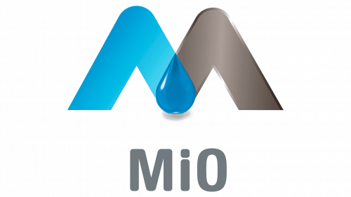
Using a unique recipe, the company created components with flavors that many enjoyed. This key aspect was reflected in the company’s first logo. The emphasis was on making people think of water and health when looking at the first letter of the logo. The combination of two shades in the three-dimensional capital letter “M” was perceived differently: the target audience saw the strength of the water element, while some perceived the drop with clear outlines and contrast as a sea breeze. Regardless of perception, the brand name, through the logo, was associated with strength of spirit and physical health.
The clear geometry of the lines, absence of excesses, and restrained color scheme conveyed the essence. The company managed to attract attention. The high demand for Mio’s enriching additives was justified, as the products met the needs of those leading a healthy lifestyle. The first logo and subsequent versions became recognizable, and the additives became popular.
2024 – today
Thanks to the original additives released under the Mio brand, new opportunities have opened up for people who care about their physical health. It is now possible to consume the recommended amount of liquid daily and enjoy flavorful, low-calorie, and low-sugar water.
An elegant new logo needs to reflect all these qualities. Each element displays dynamism. The logo conveys the brand’s significance and its components’ key benefits without appearing grandiose or expansive.
The rich palette’s blue color indicates the high-quality water the additives provide. The bold font with rounded letters emphasizes the company’s professionalism. The logo is designed in a minimalist and modern style, containing only the brand name and no illustrations, demonstrating the brand’s strong position.
