![]() Monster Sweeper Inc Logo PNG
Monster Sweeper Inc Logo PNG
The Monster Sweeper Inc. logo conveys an atmosphere in which battles with giant creatures are not heroic displays but everyday jobs. While the others fight the kaiju, the team is busy cleaning up the ruins, disposing of the remains, and restoring order in the city.
Monster Sweeper Inc. first appeared on the Shonen Jump+ platform in 2020 as a fictional organization in Naoya Matsumoto’s manga, Kaiju No. 8. Set in Japan, constantly threatened by kaiju giant creatures attacking cities, this cleanup company quietly handles the hazardous aftermath of these intense battles. Specializing in dismantling massive kaiju remains left behind by the Defense Forces, their difficult and dangerous work prevents potential pollution, toxins, and mutations from affecting the public. Kafka Hibino, the manga’s protagonist, works tirelessly at the company, dismantling toxic kaiju remains despite dreaming of joining the Defense Forces. Although Kafka is initially too old to become a frontline soldier, his life changes dramatically when he accidentally gains kaiju-like powers, complicating his already challenging job. Alongside colleagues like Reno, Kafka demonstrates humor, resilience, and determination in the face of exhausting tasks. Matsumoto thoughtfully emphasizes how crucial yet often overlooked such civilian services are compared to the heroic image of military defenders. Ultimately, Monster Sweeper Inc. symbolizes the essential efforts of everyday people who quietly help society recover and move forward after each devastating Kaiju attack.
Meaning and History
![]()
What is Monster Sweeper Inc?
This fictitious organization is dedicated to cleaning up cities after battles with giant monsters. Its specialists remove the creatures’ remains to prevent infection and help the inhabitants return to normal life. Special equipment and trained personnel are used for this. In addition, biological materials are being studied to help better understand the nature of these creatures.
2020 – today
![]()
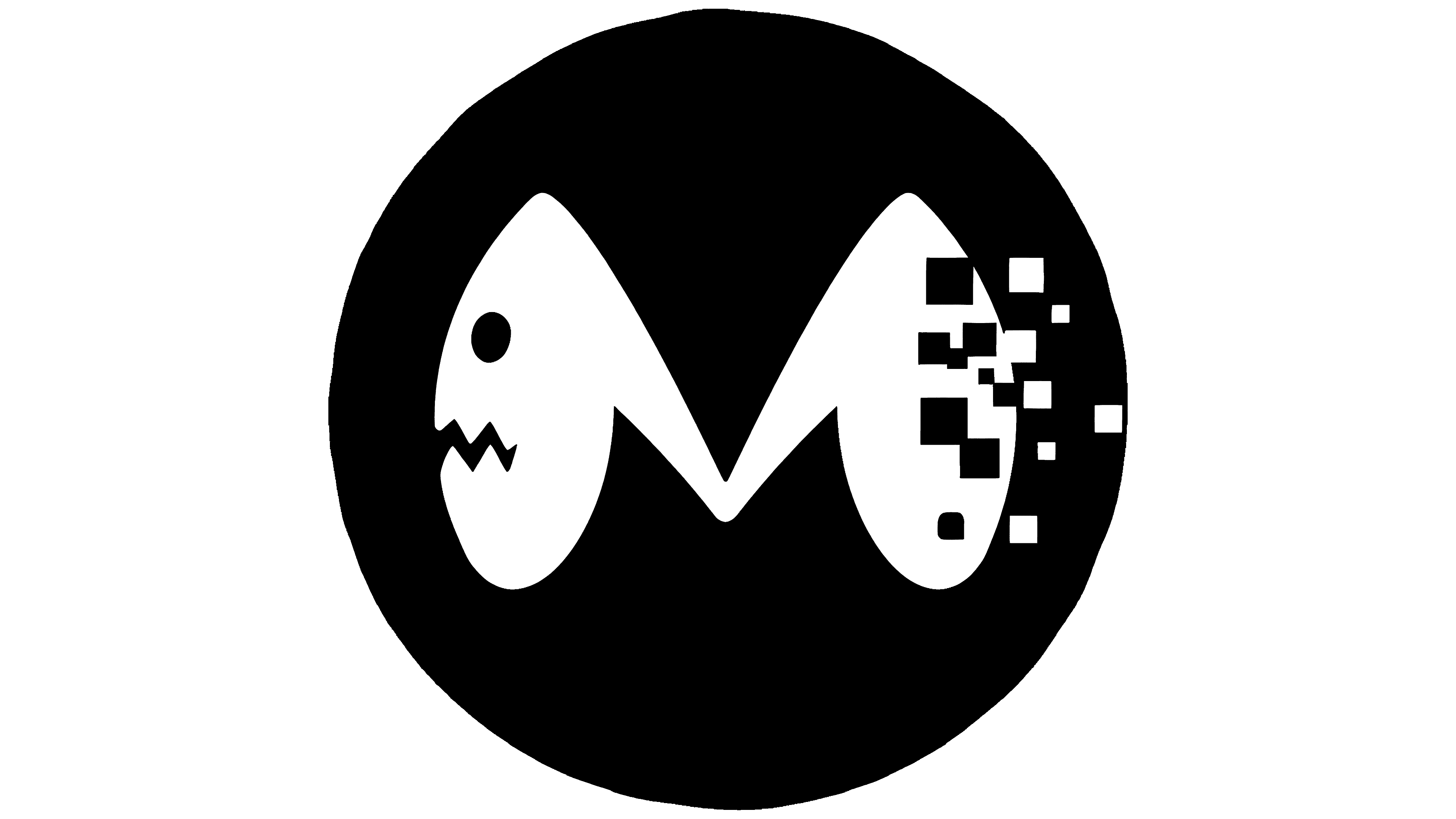
The Monster Sweeper logo is black-and-white, resembling a comic book or anime frame. It consists of two parts: at the top is a large black circle containing an unusual letter “M,” and below is text in Japanese katakana, set in a bold, heavy sans-serif font.
The letter “M” inside the circle has a distinctive design: its left side resembles a monster’s head with a sharp-toothed mouth and a round eye. The right side of the letter gradually dissolves into small square pixels, creating an impression of digital destruction or the monster’s disappearance.
This unusual design is related to the fictional company Monster Sweeper from the manga “Kaiju No. 8.” The company clears areas of the remains of giant creatures (“kaiju”) after Japanese military units destroy them. The logo reflects this specific activity: the monster is depicted at the moment of disintegration or dissolution, showing the process of its destruction or disposal.
The text below is also presented in an interesting and somewhat messy style. The letters appear massive, slightly tilted, and broken in places, reinforcing the overall theme of battling giant creatures, destruction, and the restoration of order.
The black-and-white color contrast intensifies the sense of anxiety, suitable for the monster-fighting theme. The design and style of the logo evoke the world of Japanese manga, where the action unfolds under constant threat from kaiju.