


![]() Munchkin Logo PNG
Munchkin Logo PNG
The Munchkin logo indicates that the company makes products for children. It looks bright, fun, and childishly direct, as the brand’s target audience is loving parents. The emblem symbolizes the good mood that Munchkin products give.
Munchkin was founded in Los Angeles in 1991 by Steven Dunn, a Harvard MBA who had worked at Bear Stearns, Smith Barney, Idanta Partners, and later in real estate. After becoming a father, he saw the baby-products market as repetitive and technically limited. Large competitors such as Playtex, Gerber, and Evenflo already dominated the shelves. Still, Dunn built Munchkin around practical invention and unusual product design.
The company began with $2.5 million in start-up capital from several partners. Its first hit was a baby bottle shaped like a soda can, released under a licensing agreement. The idea set the tone for the brand: familiar forms used in new ways. First-year sales reached $15 million, and by 1995, Munchkin products were sold in 20 countries. Dunn later became the lead inventor behind about 120 of the company’s 150 patented products.
Munchkin expanded into feeding items, changing mats, diaper pails, travel accessories, and bath products. Its patents covered everyday problems for parents, including burn-prevention lids, spill-proof cups, and divided formula containers. By the mid-2010s, the company held several hundred U.S. and international patents.
Growth also came through acquisitions. In 2010, Munchkin bought the British child-safety brand Lindam, entering a category in which Graco was a competitor. In 2014, it acquired Brica, a U.S. maker of travel accessories for babies and toddlers. In 2016, it bought Milkmakers, a brand of lactation cookies and teas. It later expanded in 2020 with prenatal teas, belly balms, and nausea drops. By the mid-2010s, Munchkin’s revenue was approaching $300 million, with Dunn still serving as CEO.
Meaning and History
![]()
Only two logos were presented to the target audience over the company’s entire period of operation. Both are made in a multi-colored palette that most buyers immediately associate with childhood and positive emotions. They immediately stand out from the competition by focusing on potential buyers.
What is Munchkin?
This is one of the most famous American brands specializing in producing products for pregnant women and children. Among their clients are young mothers in the United States and millions of buyers worldwide.
Old
![]()
The original version of the logo was presented immediately after the company’s creation. It consisted solely of a wordmark associated with the brand name. All letters in the word were lowercase to evoke positive emotions among potential customers. Moreover, each letter is painted in one of the colors: purple, orange, blue, green, and pink. Only purple is repeated twice: in the letters “m” and “k.” If we talk about unique elements, it is a white heart with a red outline, which is used as a dot over the letter “i.”
Globally, the classic bold sans-serif font with rounded corners and straight lines was used for the logo.
New
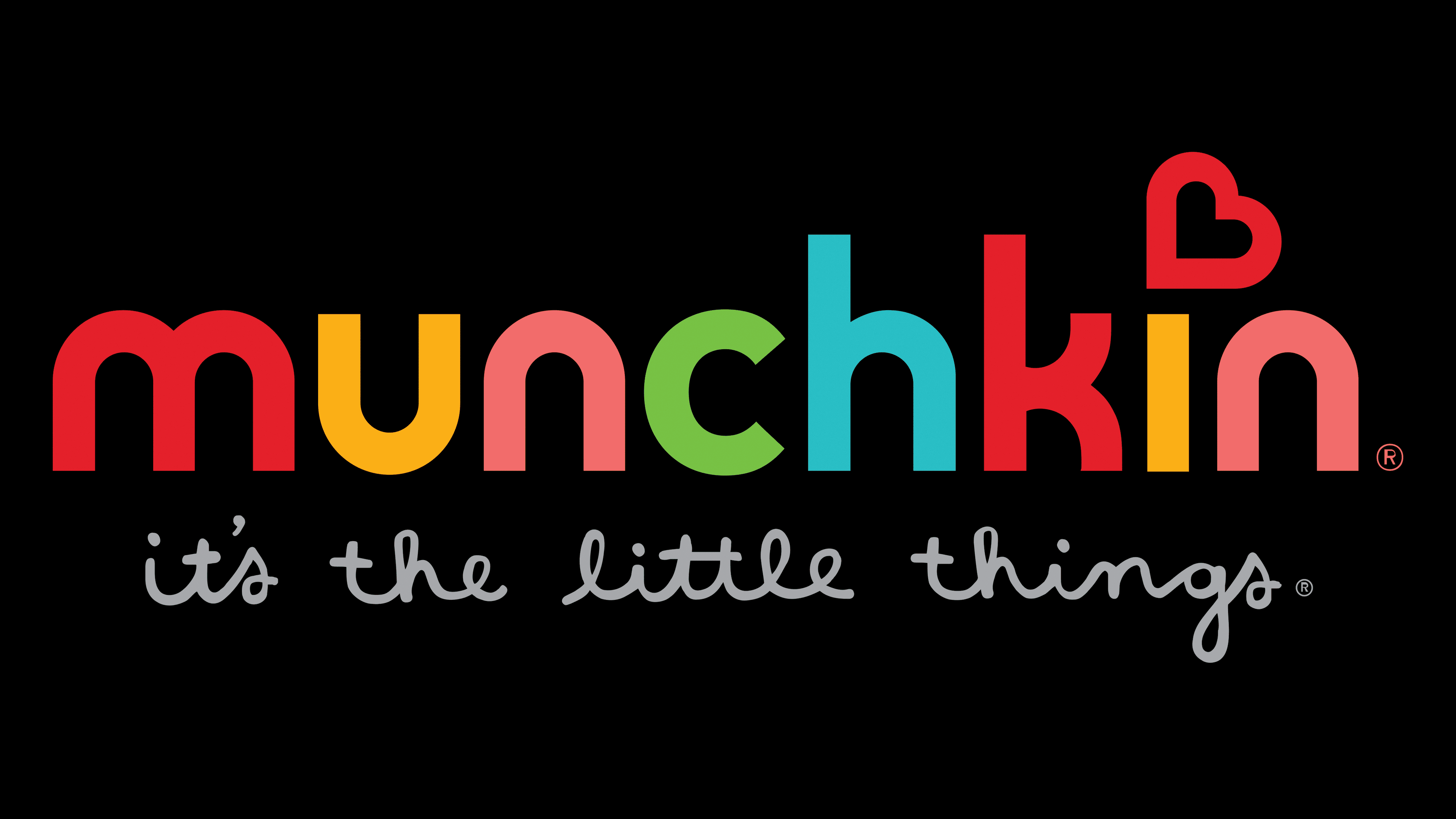
![]()
The only redesign made the logo more voluminous, and the company’s slogan, “it’s the little things,” was added. It was handwritten and immediately caught the eye, although it is much smaller than the main inscription.
Speaking of the brand name, the base has remained unchanged, but the color scheme has changed somewhat. Now the following colors were used: red, orange, pink, green, and blue. It is worth noting that the sixth, seventh, and eighth letters were painted in the same colors as the first three. Consequently, the color palette has been reduced to five shades. Quite expectedly, a white heart with a red outline was retained in the logo.
The company logo is often placed on a white background, but it also looks quite harmonious when framed in a different color.
Font and Color
The logo is based on a classic sans-serif font with straight and clear lines. Both versions of the logo use a consistent letter style that is easy to read and quickly remembered.
The multi-colored range clearly associates the presented brand with the sale of children’s goods. Probably, other shades will be used in the future, but the essence itself will remain unchanged. Indeed, it is precisely the multi-colored filling in the letters that enables the company to attract the attention of parents of babies not only in the United States but also far beyond its borders. Given that the company made changes after the redesign, you might think that each color did not have a special meaning. Munchkin’s primary goal was to stand out from the competition by adopting a friendly tone.