Navistar logo shows strength and lifts great opportunities, travel, and transportation. There is a lot of diversity in the logo that conveys the multifaceted work of the corporation. Sharp angles and peaks foreshadow leadership.
Navistar: Brand overview
| Founded: | 1986 |
| Headquarters: | Lisle, Illinois, U.S |
| Website: | navistar.com |
Navistar is a big American heavy equipment manufacturer which inherited the know-how and traditions of International Harvester. Its brands have 1 million trucks in North America and 40% of the bus fleet. It employs 14,500 workers at its enterprises. Since 2020, it has been owned by the Volkswagen Group through the company Traton.
The company was born as a remnant of the empire of a major international firm in 1986. It managed to rise by 1995. Navistar acquired AmTram and successively made profitable alliances with Caterpillar, General Motors, and Volkswagen Truck and Bus, expanding its influence and conquering the international market.
Meaning and History
The logo reflects the major milestones in the company’s development, showing its growth and expansion. Conveys the ambition of a leader. It reflects the direction of the company. It reads the power of big cars and long-distance trips on intercity highways. The use of the image of road signs, which is present in every variant of the emblem, connects the company with transport.
What is Navistar?
A US automotive company that manufactures trucks from 4th to 8th gravity, buses under the IC Bus brand, and parts brands Fleetrite, ReNEWed, and Diamond Advantage. It has been a part of Traton since 2021.
1986 – 2001
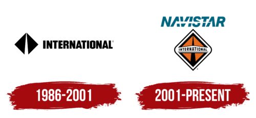
After the bankruptcy of International Harvester, the new company Navistar International Corporation, based on the HI truck division, created its logo.
The emblem is represented by the image and the name following it. All elements are in black. The company inherited the idea of minimalism. The logo consists of two triangles united by vertices, forming an unclosed rhombus.
The shapes show the subtle relationship between the two firms—the transfer of authority from a company that has completed its journey to a new one. The mirror reflection of the triangles shows: all the traditions, developments, and models will remain and just change the name.
In the center, there is a white road, where the figures are not completely closed. A new road on which the company’s heavyweights will travel.
The triangles also resemble the wings that are beginning to unfold. Navistar planned to climb to the top again. And it succeeded. Having mastered light, medium, and heavy trucks, buses, armored cars, and engines were added to the fleet. In the first decade, 600,000 cars and engines came out annually, and sales spread to the United States, Canada, Mexico, and Latin America.
For the logo, the name used was not the name of the company but the brand name of the trucks. It is with their production all began.
2001 – today
The new logo has changed but has not changed its concept. It still consists of an image and a name.
The name is stylized, written in capital letters, and between the two A’s, the word is pierced with a wedge cutting through it. It represents speed, and forward motion demonstrates the power of trucks and points to long distances and the roadway converging in the distance.
An image has been placed below the name. It was also redesigned. The two triangles changed color to orange. They were placed in a rhombus with two rounded corners. In the center, the name is written and placed on a white plate from the bumper.
The emblem looks absurd and cluttered, and its color scheme does not match the upper name at all. Therefore, most often, they are used separately.
The rhombus corresponds to the sign “Main Road,” demonstrating that all roads are open for the brand’s cars and are intended for driving on the main highways. The road itself is placed between two triangles in the form of a black center strip.
Due to the sharp upper and lower corners, the whole picture seems to stretch upwards, telling about the growth and the desire to surpass the competition and to take leading positions in the market.
Placing the word Navistar at the head shows the increase in the company’s scale. International is now just one of its brands.
Font and Colors
The logo is quite motley. It includes blue-green, orange, white, and black colors. They don’t blend together much, but they show the multifaceted work of the corporation.
- Blue-green is the color of the sea wave, indicating the spread of the firm like the waves of the sea, selling products to other continents.
- White – the new life of an old corporation, the start.
- Orange – striving for the sun, climbing into the sky, winning.
- Black – high-powered machinery, long-distance roads, off-road driving.
The font of the inscription Afical Neue Black Italic is transformed by the break, which makes it unique, just like the company’s history became unique due to the separation of Navistar from the big corporation.
Navistar color codes
| Spanish Orange | Hex color: | #e46b1f |
|---|---|---|
| RGB: | 228 107 31 | |
| CMYK: | 0 53 86 11 | |
| Pantone: | PMS 1595 C |
| Black | Hex color: | #000000 |
|---|---|---|
| RGB: | 0 0 0 | |
| CMYK: | 0 0 0 100 | |
| Pantone: | PMS Process Black C |
| Duck Blue | Hex color: | #026680 |
|---|---|---|
| RGB: | 2 102 128 | |
| CMYK: | 98 20 0 50 | |
| Pantone: | PMS 7707 C |


