


![]() Nespresso Logo PNG
Nespresso Logo PNG
The elegant Nespresso logo of the well-known manufacturer of coffee machines and capsule coffee is distinguished by luxury, exquisite taste, and unmatched style. It emphasizes the drink’s perfection and the packaging design’s originality.
In 1975, Nestlé engineer Eric Favre discovered a new brewing principle in a Roman café, where repeated pressure created dense crema. Back in Switzerland, he developed a sealed capsule system that could reproduce this process. In 1976, Nestlé filed its first patent, though internal interest remained low due to Nescafé’s success.
In 1986, Nespresso launched as a separate company under Favre. Early machines targeted offices and restaurants in Japan, Switzerland, and Italy, but sales were slow. In 1988, Jean-Paul Gaillard shifted the model toward premium home use, lowered machine prices, and raised capsule costs. In 1989, the Nespresso Club introduced a direct-to-consumer system.
In the early 1990s, partnerships with Turmix, Krups, Magimix, Philips, Siemens, Alessi, and De’Longhi expanded production and distribution. Favre left after an internal conflict, and Gaillard exited in 1997. In 2000, the first Nespresso boutique opened in Paris.
In 2006, George Clooney became the face of the brand, joined later by John Malkovich, Danny DeVito, and Matt Damon. By 2010, capsule coffee was growing far faster than the global coffee market. At the same time, patent protection weakened. Competitors like Keurig and Ethical Coffee Company entered the segment, leading to legal disputes.
In 2014, Nespresso introduced the VertuoLine, which uses high-speed capsule rotation and barcode-controlled brewing. By 2018, annual capsule sales reached about 14 billion units.
Meaning and History
![]()
It’s a luxurious brand with exquisite taste and superior style, extending to everything associated with it. The emphasis is not only on impeccable coffee but also on original packaging adorned with an individual logo.
The company’s logo is simple and combines two elements: a graphic and a verbal element. It was adopted at its founding and has not changed since (except for the color).
What is Nespresso?
Nespresso is a brand of coffee machines and single-use coffee capsules owned by Nestlé, as reflected in its name. The capsules are made of aluminum and contain more than 30 varieties of high-quality coffee, including robusta and arabica of various intensities. Nespresso machines can prepare cappuccino, lungo, espresso, and other beverages. There are separate product lines for home use, offices, and restaurants.
The logo style is Art Deco, refined and elegant, yet modern and practical. The font used is proprietary and developed by the design agency Zecraft. It reflects the technical power and reliability.
Font and Colors
The word “Nespresso” is in all capital letters and is the only graphic element that enlivens the logo. Thus, the letter “N” consists of two identical parts arranged in a mirror image. They resemble a checkmark or a stylized letter “V” with a long, slightly curved stem. According to the developers’ idea, this emphasizes the brand’s products and signals the coffee’s impeccable quality.
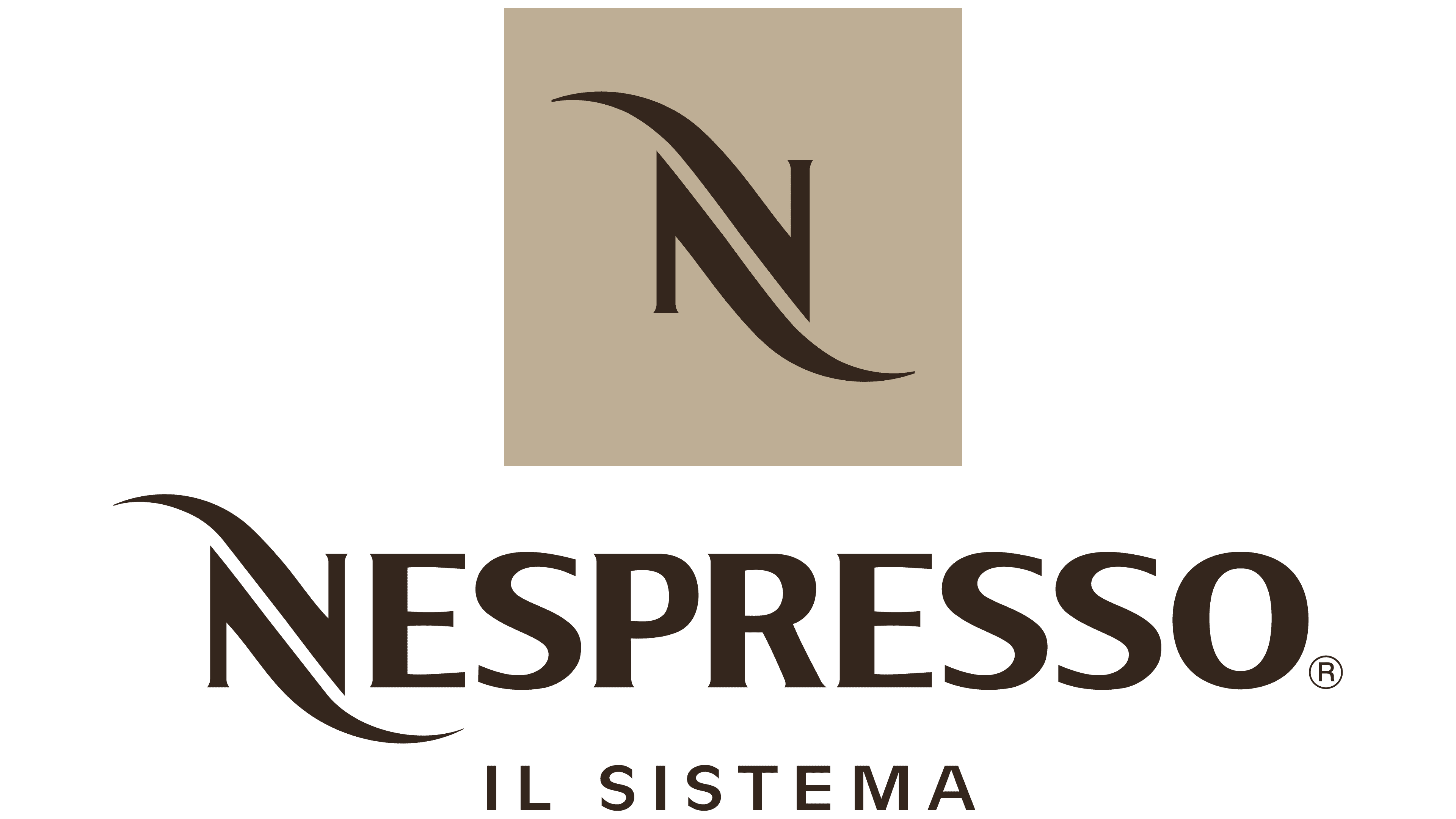
The logo’s color palette varies from monochrome (classic black and white) to dark brown, which is used in some versions. The brown palette corresponds to the natural shade of coffee. This testifies to the product’s high quality and demonstrates care for consumer convenience.