![]() Netscape Logo PNG
Netscape Logo PNG
The Netscape logo symbolizes the company’s innovative approach to Internet technology. Its design captures the early web browser era, representing openness, progress, and the company’s ambition to explore new digital opportunities.
Netscape’s history began in 1994, when Marc Andreessen and Jim Clark founded Mosaic Communications Corporation, which later became Netscape Communications. Andreessen had previously developed the Mosaic browser at the National Center for Supercomputing Applications at the University of Illinois, the first graphical web browser.
The company’s first product, Netscape Navigator, launched in late 1994 and rapidly gained market share thanks to its intuitive graphical interface and free license for non-commercial users. In August 1995, Netscape went public on the NASDAQ exchange, marking the beginning of the dot-com era.
However, Netscape faced fierce competition from Microsoft, whose free browser, Internet Explorer, was bundled with Windows. The resulting “browser wars” ultimately ended with Netscape’s defeat, leading to a significant reduction in its market share by 1998.
To remain competitive, Netscape open-sourced its browser code as part of the Mozilla project, eventually giving rise to Firefox. AOL acquired Netscape in 1999 for $10 billion, but AOL’s interest quickly faded. The final version of Netscape Navigator was released in 2008, after which development ceased.
Meaning and History
![]()
What is Netscape?
It was a prominent American company that created the first widely used web browser. The browser’s simple graphical interface with image support made the internet accessible to millions. Eventually, it lost its market leadership to a free competitor bundled with an operating system. After being acquired by a major media corporation, the company ceased its independent operations.
1994
![]()
The Mosaic Communications Corporation logo appeared in 1994, preceding the well-known Netscape brand, which emerged after a legal conflict with the National Center for Supercomputing Applications (NCSA). The name Mosaic reflected the background of the company’s founders, Marc Andreessen and Eric Bina, who had developed the Mosaic browser at NCSA. After claims from the center, Mosaic Communications Corporation was forced in the fall of that same year to change its name to Netscape Communications Corporation. It was during this brief period that the M emblem was used, foreshadowing the introduction of the famous Netscape Navigator.
The design of the first version of the emblem featured a white, embossed letter “M” enclosed in a transparent sphere resembling a glass lens, with a characteristic glare. The letter was created in a custom style with geometric precision, reinforced strokes, and three-dimensional shaping, highlighting the brand’s technological nature. The color scheme was based on contrasting rectangular forms in violet, emerald, and yellow tones. The combination of these colors reflected the internet’s multilayered architecture, a modular approach, and the virtual space of a new generation of browsers.
From a visual standpoint, the Mosaic logo demonstrated the legacy of early Windows 95 interfaces. It carried all the recognizable attributes of that era: three-dimensional shapes, saturated color gradients, and glass-like surfaces, marking a departure from the simpler two-dimensional graphics of the DOS era. The aesthetic symbolized the transition from academic web development to a commercial internet where technical achievements began to be perceived as a mark of prestige.
Despite its brief period of use, the M emblem remains an important artifact of early internet history, reflecting the beginning of an era when the design of the digital environment was taking shape.
1994 – 1997
![]()
The Netscape emblem became a symbolic mark of the early Internet era, connected to the turning point when Mosaic Communications Corporation officially became Netscape Communications Corporation. This occurred in 1994, almost simultaneously with the release of the first full version of the Netscape Navigator browser (1.0), which quickly gained dominance in the web space.
The visual foundation of the sign featured a hand-drawn letter “N” in a classical serif style, with proportions and geometry reminiscent of Times New Roman. Still, it was adapted for on-screen display in browsers of that period. The letter’s serifs had a smooth transition and thickened vertical strokes, making the character highly recognizable.
Beneath the letter was an arched horizon line, interpreted as a visual code of the global information space. It formed a clear contour dividing the upper turquoise part of the emblem from the lower dark area. The upper zone featured a turquoise gradient that gradually lightened toward the bottom, symbolically conveying the atmosphere of a digital sunrise and the arrival of a new era of the global internet.
The Netscape Navigator browser symbol unofficially served as a universal icon of web surfing and online connectivity, alongside other marks of its time, such as Internet Explorer, Yahoo!, and AltaVista. The leading figures in developing the emblem were company founders Marc Andreessen and Jim Clark, who coordinated the work of internal teams and external consultants.
1997 – 2002
![]()
After the release of the Netscape Communicator browser in 1997, the company revised its visual identity by introducing a new logo. The new version continued the development of the original Netscape emblem, retaining its basic elements: the serif letter N and the semicircular horizon image. The symbol was complemented by the brand name in capital letters to the right of the mark, emphasizing the company’s corporate identity amid growing competition with Microsoft and its Internet Explorer product.
The letter N, set within a turquoise gradient that transitioned to black at the bottom, was almost fully preserved in its original form. The horizon line became symmetrical and less curved, visually reinforcing the sense of reliability.
For the first time in Netscape’s history, the sign was accompanied by the full name written in a sans-serif typeface. The font had uniform-thickness strokes and smooth lines, closely resembling standard digital families such as Meta and Myriad. The letter spacing was increased, highlighting a sense of visual freshness and technological progress. The word Netscape looked stable and confident, strengthening brand identity and aiding recognition among consumers.
The introduction of the new logo was Netscape’s attempt to move away from its startup image and establish a reputation as a stable, major producer of Internet products.
2002 – 2005
![]()
By the early 2000s, Netscape was undergoing a period of change as the company transitioned to AOL’s full control. As part of its 2002 image update, a new version of the mark was introduced. The company preserved recognizable features of the previous emblems. Still, it reworked them in the spirit of the digital aesthetic typical of that era, associated with Windows XP and the mass development of web applications.
The sign changed from a square to a rounded shape, and its composition was adapted to a three-dimensional style. At its core remained the same white letter N, with thin, slightly accentuated serifs and elegant, elongated verticals. The letter was set against a black horizon, with an arched line highlighting the brand’s global scale. The turquoise area at the top featured a complex gradient and a glossy effect that enhanced the sense of volume and evoked associations with glass-like interface icons.
To strengthen the tactile impression, a thin, light-gray frame was added around the perimeter, creating the illusion of a button or a virtual control element. The color palette and its highlights symbolically emphasized the product’s technological character, aligning with user expectations of the early 21st century.
For the first time, the company’s name was placed below the mark, serving as a reliable base for the emblem. The typeface became more massive and dense, with letters set in uppercase sans-serif, resembling contemporary technological fonts. This placement of the letters enhanced the perception of the company’s stability and responsible approach, as it sought to maintain authority amid strong competition from Internet Explorer.
The updated Netscape logo accompanied the final versions of the browser, Netscape 7, as well as the early releases of Netscape Browser on the Mozilla Suite platform. However, by 2005, Netscape had completely lost its status as an independent browser, giving way to Firefox and the Mozilla Foundation projects.
2005 – 2007
![]()
The redesign of the Netscape emblem, which took place from 2005 to 2007, marked the final visual stage in the company’s history before its closure in 2008. This period marked a complete reevaluation of the brand. Netscape, having lost its leading position in browsers, was relaunched under AOL as a digital portal with a different market role.
The main form of the new mark remained a rounded sphere. Still, its execution became maximally three-dimensional and realistic, resembling a glass interface element or a drop of water with highlights and shading. The symbolism of the previous version, the classic white letter N with neat serif details, was preserved, but placed in a richer three-dimensional setting. This visually aligned Netscape with the aesthetics of Web 2.0 services, where gloss and dimensionality were characteristic signs of digital quality.
The horizon in the lower part of the sphere retained its recognizable curve, symbolizing global reach, but appeared even more expressive due to a deeper palette of turquoise and black. Around the contour, the sphere received a thin light line that enhanced the sense of volume and emphasized the brand’s modernity and digital nature.
Next to the updated sphere was the wordmark “Netscape,” written in a straightforward sans-serif typeface with rounded letterforms. The font was a modification of popular typefaces from the early 2000s, such as Myriad Pro and Frutiger, specifically selected by AOL’s internal team. The letters featured wide proportions and increased spacing, visually highlighting the platform’s balance, transparency, and accessibility.
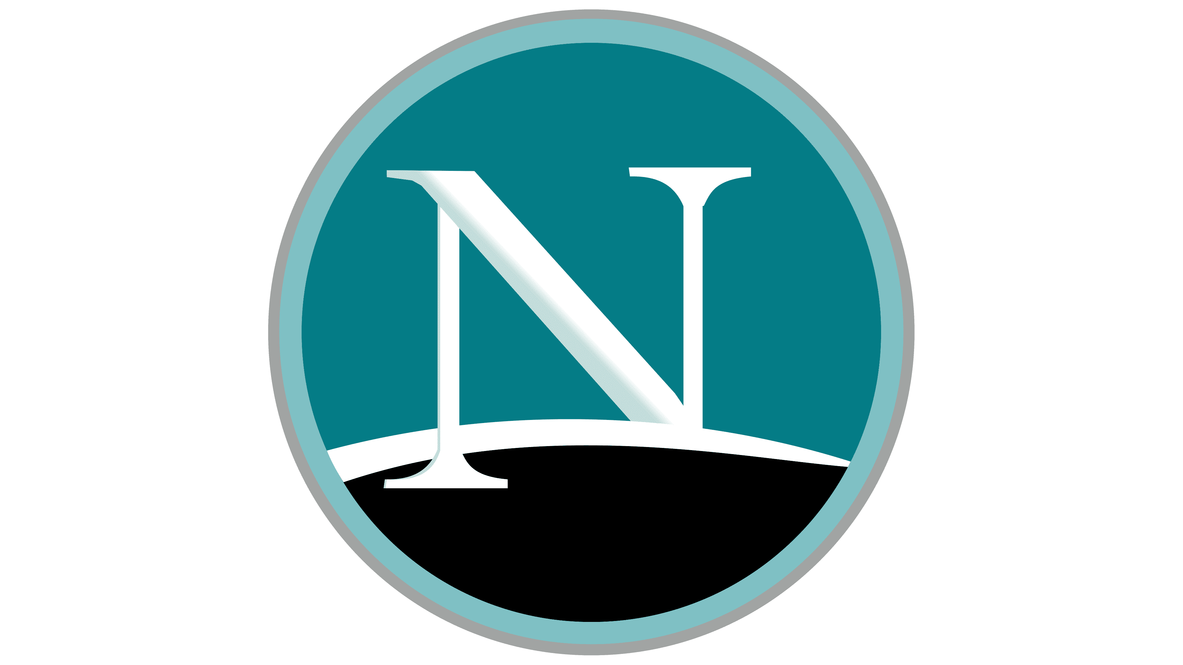
2007 – today
![]()
The final version of the Netscape emblem, created in 2007, marked the culmination of the brand’s development and signified the end of its history as an internet browser. The updated mark was introduced with the release of Netscape Navigator version 9, which turned out to be the last in the series. By this time, AOL, which owned Netscape, aimed to adopt a simpler, minimalist design aligned with the visual culture of Web 2.0 and the trend toward interface simplification.
The overall configuration of the emblem was streamlined, becoming less dimensional and losing its three-dimensional character. At its core remained the classic white letter N, executed in a serif style with thin, elegant details, partially hidden behind the horizon line.
The turquoise zone of the logo became solid. Along the edge of the circle ran a thin, light gray border, giving the mark neatness and a sense of completion. Next to the symbol was the brand name, written in a bold sans serif with narrow proportions, smooth lines, and uniform stroke thickness. The typeface choice was stylistically close to Helvetica Neue or Avenir.
The color palette, based on a sea turquoise shade combined with black and white, reinforced Netscape’s corporate image, communicating qualities such as reliability, professionalism, and brand confidence in a competitive technological environment.
The logo design was carried out by AOL specialists, who sought to ensure visual compatibility with popular competitors Firefox and Safari, whose styles were already shaping new interface design rules in the late 2000s. The logo served as the concluding visual stage for Netscape, symbolizing its last step in the browser market before the official discontinuation of brand support in February 2008.