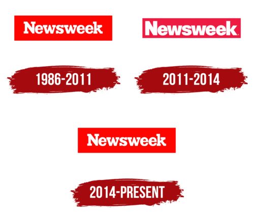
Businesslike, serious, strict – in three words, this is how the Newsweek logo can be precisely characterized. Despite a long history spanning nearly a hundred years, it retains the same energy. This is evidenced by the appearance of the emblem, which also serves as the title on the cover, appearing each time in a new setting.
Newsweek: Brand overview
| Founded: | February 17, 1933 |
| Founder: | Dev Pragad and Johnathan Davis |
| Headquarters: | New York City, United States |
| Website: | newsweek.com |
Meaning and History
The founder used a strict cover design to represent the magazine and underline its seriousness properly. This allowed it to stand out from regular glossies with half-true information and non-serious topics. News, however, required a business emblem to attract readers’ attention. As a result, a bright red rectangle with a horizontal orientation was introduced, with a white inscription prominently displayed. It stuck on both the front page of print issues and the website.
What is Newsweek?
Newsweek is a news magazine published weekly in the U.S. since 1933. It is dedicated to the most topical information from all corners of the country and the world. Its founder is Thomas J. C. Martyn, and the current owners are Dev Pragad and Johnathan Davis. The publication is released in eight languages, including English, Serbian, Arabic, Spanish, Romanian, Polish, Korean, and Japanese.
1986 – 2011
The Newsweek logo consisted of a horizontally oriented rectangle, wide, large, and scarlet. Right in the middle was an inscription in a geometric style with large serifs. The author of the emblem was Jim Parkinson: he developed a unique font based on square brackets. Massive serifs were harmonious and beautifully decorated lowercase letters, which seemed uppercase because of this. The typeface generally resembled Geogrotesque Slab Bold with rounded “e”s.
2011 – 2014
The inscription retained sharp lines, smooth edges, and symbols but lost its serifs. During this period, the font in the logo was sans-serif. The glyphs were so bold that their internal clearances were almost indistinguishable. This was especially evident in the “e” and “s.” But thanks to the lack of serifs, it became clear that the font was lowercase. The background color was also revised: the designers replaced the bright red with a dark red. However, this did not affect either the text’s readability or the cover’s attractiveness. The letters were colored white.
2014 – today
The redesign of Newsweek’s visual identity reverted to the old logo. Expressive serifs reappeared in the letters – massive and rectangular. They added recognition to the magazine. The color of the substrate also improved, turning into a striking red, overflowing with energy, passion, and dynamism.
Font and Colors
In the text logo of the weekly news magazine, an individual font is used, created by graphic designer Jim Parkinson based on the Clarendon font, which he modified for other requirements. The resulting variation is similar to Egiziano, so the letters are bold, with characteristic rectangular serifs.
The corporate palette of the print publication has always been true to two colors – white (used for the inscription) and red (of two shades).
Newsweek color codes
| Candy Apple Red | Hex color: | #ff0500 |
|---|---|---|
| RGB: | 255 5 0 | |
| CMYK: | 0 98 100 0 | |
| Pantone: | PMS 1655 C |


