 Nexon Logo PNG
Online games create digital worlds where users interact, complete tasks, and spend time. Developing such projects involves creating content and updates and supporting gaming services. The Nexon logo represents a company that develops and publishes online games and supports their operations and development.
Nexon was founded on December 26, 1994, in Seoul. Entrepreneurs Kim Jung Ju and Jake Song founded it. In 1996, the studio released Nexus: The Kingdom of the Winds. It was one of the first massively multiplayer online role-playing games. The project became the foundation of the company’s success.
In the early 2000s, Nexon developed a series of new projects. Among them were KartRider and Shattered Galaxy. In 2003, the company gained global recognition with the game MapleStory, created by its partners at Wizet. The game was adapted for different regions and became one of the company’s longest-running franchises.
Through its subsidiary studio Neople, the company launched Dungeon and Fighter. This game became one of the most profitable in the Asian market. In 2005, the company moved its headquarters to Tokyo. This helped strengthen its position in the Japanese market.
On December 14, 2011, the company listed its shares on the Tokyo Stock Exchange. It raised about 1.2 billion dollars. The offering provided access to capital and accelerated global expansion.
From 2016 to 2018, Nexon made a series of acquisitions. The portfolio included Big Huge Games, Pixelberry Studios, and Ngine Studios. These deals reinforced its mobile and online gaming divisions.
In 2019, the company came into focus amid an attempt to sell NXC’s controlling stake. The deal did not take place.
Since 2020, the company has invested in major gaming and entertainment brands. Partners included Hasbro and Sega Sammy. In 2021, Nexon Film and Television was established. It focuses on adapting games into movies and TV series.
In February 2022, the company lost its founder, Kim Jung Ju, a pioneer of the Korean gaming industry.
By 2024, Nexon supported more than 45 projects in 190 countries. The company acquired Swedish studio Embark Studios AB, expanding its presence in Europe.
The company remains one of the largest online game publishers. It continues to develop its key franchises, MapleStory, Dungeon and Fighter, KartRider, and FC Online. The total audience exceeds one billion players worldwide.
Meaning and History
What is Nexon?
A Japanese game developer and publisher from Tokyo, Nexon manages the franchises MapleStory, Dungeon & Fighter, Mabinogi, and The Finals through divisions in Asia, the United States, and Europe. Its subsidiary, Embark Studios, released Arc Raiders, which sold over 4 million copies and reached about 700,000 Steam players. Nexon is developing a mobile version of Dungeon & Fighter in China with Tencent’s support. Revenue comes from in-game purchases and customization.
1994 – 2009
Kim Jung-ju and Yoo Jung-hyun founded Nexon in Seoul on December 26, 1994. The company developed online games. Its first major project was The Kingdom of the Winds, which Jake Song led. The game launched in April 1996 and was released outside Korea as Nexus: The Kingdom of the Winds. Nexon describes it as the world’s first massively multiplayer online role-playing game with a fully graphical game world.
The company used the name NEXON from its beginnings and wrote it in Latin letters even in the Korean market. The short name suited game releases in different countries. By the late 1990s, Nexon was developing persistent game worlds and had begun using a free-to-play model supported by in-game item sales. Its portfolio later expanded to include MapleStory, Mabinogi, KartRider, and Dungeon & Fighter. The logo on startup screens identified the developer before gameplay began.
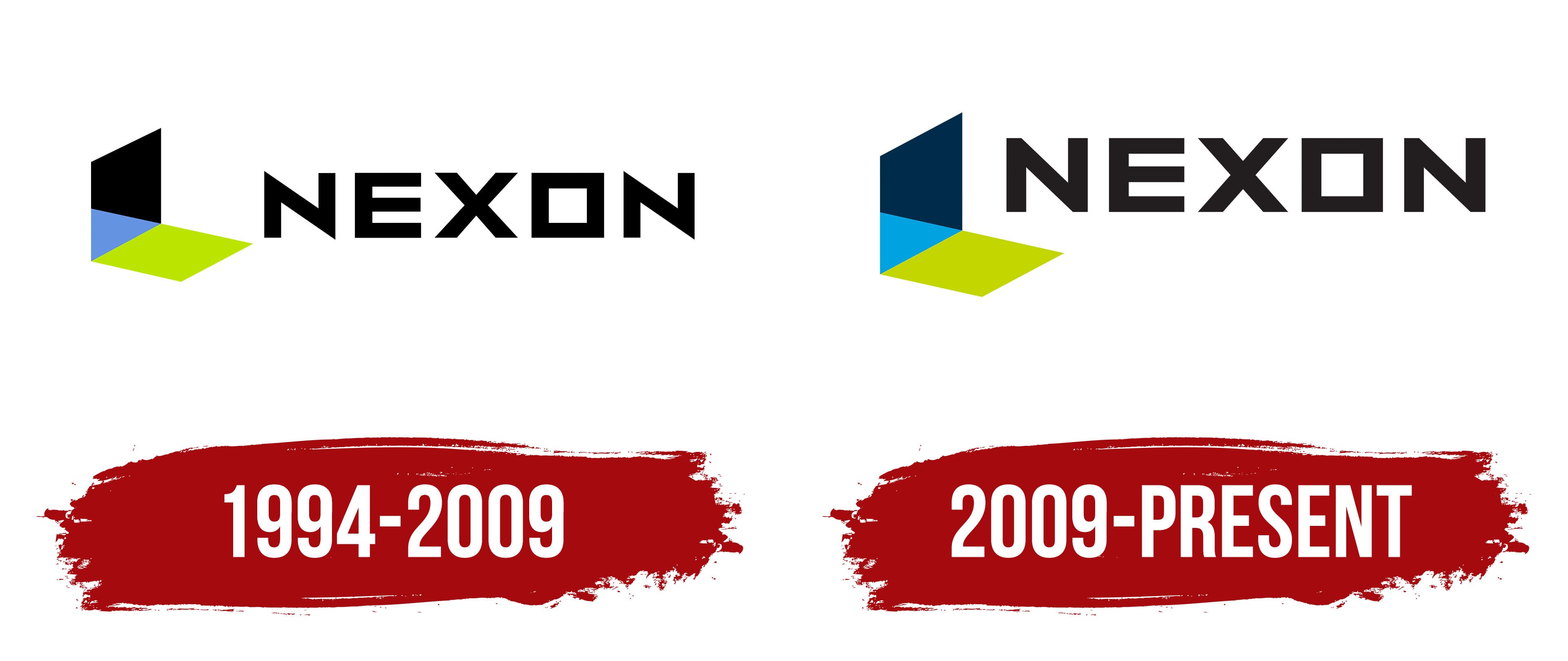
The early logo consisted of a black name and a three-dimensional figure on the left. The emblem was formed by 3 planes meeting at a single point. A tall black trapezoid rose vertically. A central triangle connected it to a green parallelogram at the bottom, angled in perspective. Together, they resembled an open door or a room corner, suggesting an entrance into a virtual space.
The arrangement and colors of the planes helped convey depth. The black section looked like an upright wall, the middle section receded behind it, and the green section resembled a floor. In early versions, the triangular section was light blue or light purple. The color differences separated the faces while preserving their connection at a shared point.
A large NEXON wordmark appeared on the right in uppercase sans-serif letters. Its black color connected it to the emblem’s tall section. Straight strokes and angular geometric forms dominated the lettering. The “O” had a square outline that matched the other letters. Generous letter spacing stretched the name horizontally, creating a distinct area beside the three-dimensional figure.
On game startup screens, the emblem supported the idea of entering a virtual world. The doorway motif was later carried into the Nexon Museum logo. The image of an entrance into another dimension built on the 3-plane construction used in the corporate brand.
2009 – today
In the early 2000s, Nexon expanded its international network and released new games. Nexon Japan was incorporated on December 18, 2002, and Nexon America was established in September 2005. During the same period, the portfolio added MapleStory in 2003, followed by Mabinogi and KartRider in 2004. Dungeon & Fighter launched in the Korean market in 2005. The growing number of projects and divisions required shared identity guidelines for regional companies, publishing operations, and game startup screens.
The identity was updated in 2009. On April 1, Nexon Japan adopted the legal name NEXON Co., Ltd. The company linked the name change to raising its profile and supporting further international expansion. A new version of the logo appeared during the same period. The three-dimensional figure to the left of the name was retained, while its colors were revised.
The upper plane changed from black to dark blue. The central triangle shifted to a rich blue with a turquoise tone, while the lower parallelogram remained lime green. The dark vertical section, blue connecting face, and green base continued to create perspective. Consistent guidelines were established for the boundaries between the colored areas and their digital reproduction.
The NEXON wordmark retained its uppercase, angular sans-serif letters. The bold lettering complemented the emblem’s substantial dark blue plane. The text remained dark. In the horizontal version, the name appeared to the right of the figure; in the vertical version, it appeared below. Both arrangements allowed the shared brand to be used in elongated and compact formats.
We prepared versions with an additional gray line for the divisions. “America,” “Taiwan,” and “Thailand” identified the region, while “Networks,” “Space,” “Games,” and “Communications” identified the organization’s area of work. These additions were set in small type beneath the main name. The three-color emblem and NEXON wordmark connected the companies to the group. At the same time, the lower line helped distinguish the divisions.
For Nexon’s 30th anniversary in 2024, the in-house Brand Design Team created a separate anniversary emblem. To represent the entire portfolio, the team used the corporate name and the pixel. The pixel referred to early computer imagery and Nexon’s origins as the developer of a multiplayer game with a fully graphical game world.
The number 30 was constructed from letters in the name. The 3 horizontal strokes of the “E” were transformed into the numeral “3,” while the square “O” became the basis for the “0.” The numerals retained the angular contours of the NEXON wordmark. The pixel treatment connected the anniversary to the games that had accompanied players over 3 decades. An animation showing NEXON transforming into the number 30 was prepared for the anniversary program, revealing how the numerals originated.
The anniversary emblem appeared at the beginning of the celebration program and accompanied events from March through December 2024. It served as a separate anniversary identifier. The three-color, three-dimensional figure and the 2009 version of the NEXON wordmark remained the primary corporate logo.