The Nickelback logo is worn and steeped in legend. It reflects the band’s long-standing dedication to music despite constant criticism and even attempts to ban them. The emblem shows that the band remains steadfast and will continue to delight its fans.
Nickelback: Brand overview
Emerging in 1995, Canadian rock ensemble Nickelback has firmly established itself as a musical force. Consisting of Chad Kroeger – vocals and guitar, Ryan Peake – guitar and backing vocals, Mike Kroeger – bass guitar, and Daniel Adair – drums and percussion, Nickelback has been delighting audiences with their unique sound and soulful performances for over two decades, hailing from Hanna, Alberta.
In 1996, Nickelback began their musical journey, performing cover songs in local bars and clubs across Alberta. The release of their debut album “Curb” brought them some recognition in Canada. But it wasn’t until their third album, “Silver Side Up,” that the band became known worldwide.
The release of the album Silver Side Up in 2001 marked a turning point in Nickelback’s career. It was during this period that the band’s popularity took off. The album included two of the band’s most famous singles, “How You Remind Me” and “Too Bad,” which quickly rose to the top ten of the Billboard Hot 100 chart. The album sold 10 million copies worldwide and was nominated for a Grammy Award for Best Rock Album.
However, the triumph of “Silver Side Up” was only a prologue for Nickelback. The band’s ascent continued throughout the 2000s, marked by the release of “The Long Road” and “All the Right Reasons”. Hits such as “Someday,” “Photograph,” and “Rockstar” further cemented Nickelback’s reputation as one of the most successful rock bands of the decade.
Music critics and the public have criticized and ridiculed Nickelback despite their commercial triumphs. They are often accused of creating monotonous, formulaic rock music with uncreative lyrics. In particular, in 2011, a petition to ban Nickelback from performing in London, England, garnered an astounding 55,000 signatures!
Nickelback has managed to maintain its fan base over the years, releasing albums such as “Here and Now” and “Feed the Machine.” While the band’s mainstream success may not have reached the level of its early years, its fervent and loyal fans continue to support the band around the world.
Regardless of individual opinions, Nickelback’s influence on the rock music industry is undeniable. Their catchy melodies and energetic live performances have captured the hearts of millions of fans worldwide. Their music is still played on rock radio stations around the world. Whether you like them or not, Nickelback’s influence on the history of rock music is undeniable.
Meaning and History
What is Nickelback?
They are a Canadian rock band formed in Hanna, Alberta. Known for combining elements of heavy metal, rock and post-grunge with introspective lyrics, they have become one of the most recognizable names in modern rock music. Their thrilling performances and chart-topping albums have brought them worldwide fame. Their sound, characterized by catchy phrases and lyrics, has resonated with listeners around the world, spreading their influence far beyond their Canadian roots and achieving considerable commercial success.
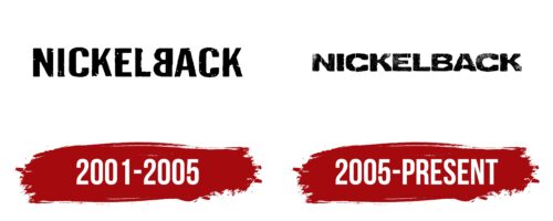
2001 – 2005
The Nickelback logo features the band’s name. The name was inspired by a nickel (five-cent coin) that one of the founders, Mike Kroeger, often gave as change while working at a café. This simple and clear name reflects the idea that the band generously gives back love and attention to their fans. Concertgoers of Nickelback always leave with something valuable, leaving a mark on their hearts and minds.
The black sans-serif font used in the emblem conveys the band’s commitment to post-grunge and the distinctive sound of their music, which can sometimes irritate some listeners. This font emphasizes the straightforwardness and strength of Nickelback’s music, along with their aim to deliver their messages without unnecessary embellishment.
The main feature of the logo is the mirrored “B.” This element symbolizes constant energy exchange and mutual contact with the audience. The band aims to return the good vibes from their fans through new songs and concerts, highlighting the close connection between the artists and their audience. The mirrored “B” indicates the mutual reflection of emotions and experiences during their performances, creating a unique unity between the musicians and their listeners.
2005 – today
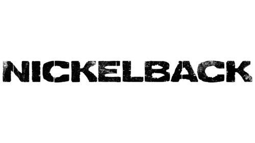
Nickelback’s logo features blurry lettering, resembling poorly printed or aged text and fading over time. Despite the blur, it remains easy to read due to the simple, bold sans-serif font chosen by the designers. The black letters emerge from the empty white space, drawing focus to the band’s name.
The fuzzy appearance recalls a classic, worn band T-shirt, kept and cherished for years. The design’s simplicity speaks volumes, appealing to raw and unpolished rock music fans. The black-and-white color scheme has an old-school vibe, evoking a sense of nostalgia and a desire to listen to retro tunes.
The design captures the essence of Nickelback’s music with its straightforward yet impactful style. The blurred effect adds character and a sense of authenticity, reflecting the band’s gritty rock sound. The bold font ensures clarity, while the blurred edges add a unique touch.

