 Norwegian Cruise Line Logo PNG
Cruise travel combines travel and leisure, where passengers move between countries while enjoying onboard services. Restaurants, relaxation areas, and entertainment programs are all in one place, allowing passengers to plan their day on their own schedule. The Norwegian Cruise Line logo represents a company that organizes sea voyages and operates cruise ships offering a full range of services for passengers.
Norwegian Cruise Line was founded in 1966 as Norwegian Caribbean Lines. The company was established through a partnership between Knut Kloster and Ted Arison. Its first ship, Sunward, began Caribbean voyages. In 1968, the company launched the Starward liner. In 1971, the fleet was expanded with Southward and Sunward II. In 1979, the company acquired the famous liner SS France, renamed it Norway, and rebuilt it for Caribbean service. This ship became one of the largest cruise liners of its time and marked the beginning of the era of large ships. In 1987, the company adopted the new name Norwegian Cruise Line.
In 1988, the new ship Seaward entered service. In 1992, Dreamward was launched, the first liner to operate from Fort Lauderdale. In 1996, the company became independent and was officially named Norwegian Cruise Line Ltd. In 1998, the company completed its acquisition of the British company Orient Lines. In 1999, the company held an initial public offering on the New York Stock Exchange.
In 2000, Star Cruises, a Malaysian company, acquired Norwegian Cruise Line. This enabled the introduction of the Freestyle Cruising concept, which features flexible scheduling and no strict dress code. In 2001 and 2002, new liners built according to this concept joined the fleet. In 2004, NCL America was founded under the U.S. flag with a national crew on board.
From 2005 to 2008, the company significantly expanded its fleet by adding Jewel-class ships. In 2010, the innovative liner Norwegian Epic entered service. In 2014, Norwegian Cruise Line Holdings acquired Prestige Cruises International, which managed the Oceania Cruises and Regent Seven Seas Cruises brands. Starting in 2015, the fleet began receiving Breakaway Plus-class ships. In 2023, the company introduced a new class of ships called Prima. The Norwegian Aqua liner is expected to launch in 2025.
Meaning and History
What is Norwegian Cruise Line?
A cruise operator based in Miami-Dade County, it ranks among the world’s top three, with about an 8% market share. It operates 13 ships under the Norwegian Cruise Line, Oceania Cruises, and Regent Seven Seas Cruises brands. It introduced the Freestyle Cruising concept, featuring open dining options and no dress code. Onboard, there are up to ten restaurants, studio cabins for solo travelers, and The Haven area with suites, a restaurant, and a pool. The fleet is expanding with Prima-class ships featuring the Ocean Boulevard promenade and Oceanwalk bridges. Routes include the Caribbean, the Mediterranean, Alaska, the Panama Canal, South America, and Hawaii.
1966 – 2000
Norwegian Cruise Line grew from a cruise venture created by Norwegian shipowner Knut Kloster and entrepreneur Ted Arison. In 1966, the partners began passenger voyages from Miami aboard the M/S Sunward. The ship departed on its first Caribbean itinerary on December 19, 1966. The voyage marked the beginning of Norwegian Caribbean Line. The name referred to Kloster’s origins and the geographic focus of the company’s first cruises.
As the route network expanded, the Caribbean reference became too limited for the business. The company adopted the name Norwegian Cruise Line in 1987. NCL Holdings associates the renaming with the introduction of cruise programs outside the Caribbean. The abbreviation “NCL” remained in use and became the brand’s short name.
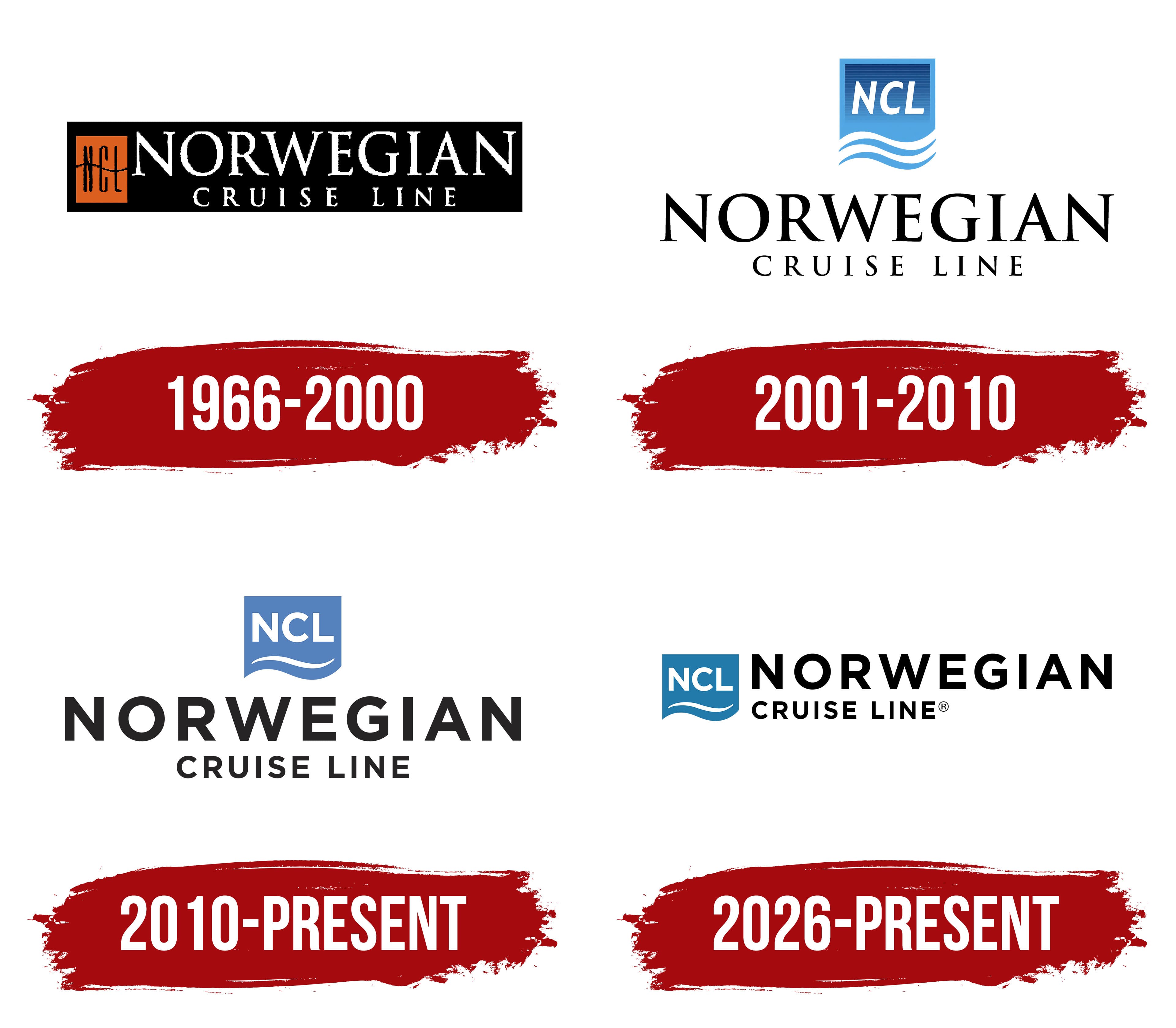
The early Norwegian Cruise Line logo appeared after the renaming. Some logo timelines date its use from 1966 to 2000. The corporate name provides a more precise starting point, placing this version in 1987 or later. The signature already included the company’s new name and the “NCL” monogram.
An elongated black panel containing two white lines of text formed the main composition. The large word “NORWEGIAN” appeared in uppercase serif letters. The smaller “CRUISE LINE” inscription below used the same serif style. Wider letter spacing extended the lower line across the width of the main word.
A brick-orange vertical block appeared on the left. A black wavy line divided it into two sections and connected the identity with ocean travel. A monogram made of thin elongated “NCL” letters appeared inside. The abbreviation represented the company in a compact form, while the full name reflected the broader range of cruise destinations.
2001 – 2010
During the 1990s, Norwegian Cruise Line began building its image around a flexible approach to cruising. Goodby, Silverstein & Partners promoted the phrase “It’s Different Out Here” through a campaign featuring photographs by Herb Ritts. The advertising focused on people, personal experiences, and the freedom to plan a trip around individual preferences.
The concept developed into the Freestyle Cruising program in May 2000. Passengers could visit restaurants at convenient times, follow a relaxed dress code, and plan their days around their preferences. The company introduced Norwegian Sun, Norwegian Star, and Norwegian Dawn as part of the new vacation model. Changes in onboard service required a unified corporate presentation connecting NCL with ocean travel and the new approach to cruising.
A blue maritime emblem appeared above the Norwegian Cruise Line name in the early 2000s. It was an elongated panel with a wavy lower edge. The upper section was dark blue and gradually transitioned to vivid light blue near the bottom. A light blue outline ran around the edges, while two wavy stripes in different shades crossed the lower area.
The white initials “NCL” appeared inside the blue block. The three uppercase letters used a heavy sans-serif style and leaned to the right. The monogram occupied the upper part of the figure, leaving the lower section for the waves. The compact maritime emblem suited ship hulls, documents, and terminals.
A black two-line inscription appeared below the emblem. The large word “NORWEGIAN” used uppercase serif letters. The smaller “CRUISE LINE” line below appeared in the same serif typeface with wider letter spacing. The contrast between the slanted “NCL” initials and restrained wordmark separated the company’s abbreviation from its full name.
Norwegian Cruise Line introduced its first major brand overhaul in 10 years on September 19, 2006. GSD&M of Austin developed the project. The new system expressed Freestyle Cruising through consistent advertising, documents, ships, terminals, and other corporate applications. The public rollout began on October 2, 2006. The blue NCL emblem with ocean waves remained part of the updated identity.
2010 – today
By the early 2010s, Norwegian Cruise Line itineraries covered Europe, Alaska, Hawaii, Bermuda, and other regions. “Norwegian” continued to refer to the company’s origins and gradually came to represent its style of cruising across international routes.
The company began using a revised logo on February 18, 2010. The maritime emblem remained part of the brand but received a simpler structure. A single white wave replaced several wavy stripes, while the lower edge of the blue block gained a smooth curve. The corporate system allowed the full name to appear either to the right of the emblem or below it.
The emblem resembled a blue shield with straight sides and a wavy base. Large white uppercase sans-serif letters spelling “NCL” appeared inside. The strokes were uniformly thick, and the characters stood upright. A white wave beneath the monogram followed the curve of the lower border, preserving the brand’s maritime theme.
The wordmark moved from a serif to a sans-serif style. The black word “NORWEGIAN” consisted of heavy uppercase letters and occupied the upper line. The smaller “CRUISE LINE” appeared below with wider letter spacing and thinner strokes. The scale difference emphasized “Norwegian,” while the lower line identified the company’s business.
The phrase “Cruise Like a Norwegian” appeared alongside the brand in 2011, and NCL registered it for cruise services. The slogan turned “Norwegian” into a description of vacations organized around the company’s approach. Its geographic meaning gave way to the idea of a distinctive cruise experience. The phrase connected the historic name with passengers’ experiences on itineraries around the world.
2026 – today
In 2026, Norwegian Cruise Line returned to the theme of freedom used in its 1990s communications. The slogan “It’s Different Out Here” reentered the brand system and connected the new phase with the earlier promise of flexible cruise vacations. NCL shifted the focus from the number of onboard features to passengers’ experiences and personal journeys.
The company introduced a global identity developed with Arnold Worldwide on January 12, 2026. The agency helped create the brand platform and the “For All Maritime” campaign. The update established consistent brand use across countries and communication formats.
The corporate system adopted an open layout, large areas of negative space, and a limited number of decorative elements. NCL described the new style as “fluid and uncluttered.” The visual presentation became more restrained, emphasizing relaxation, destinations, and the emotional experience of a cruise.
Color became the logo’s main change. Black replaced blue, giving the primary signature a black-and-white appearance. The abbreviated “NCL” and ocean wave remained in the composition, preserving continuity with the 2010 version. The move to black gave the brand a more restrained foundation. The letters, wave, and surrounding open space define its form.