


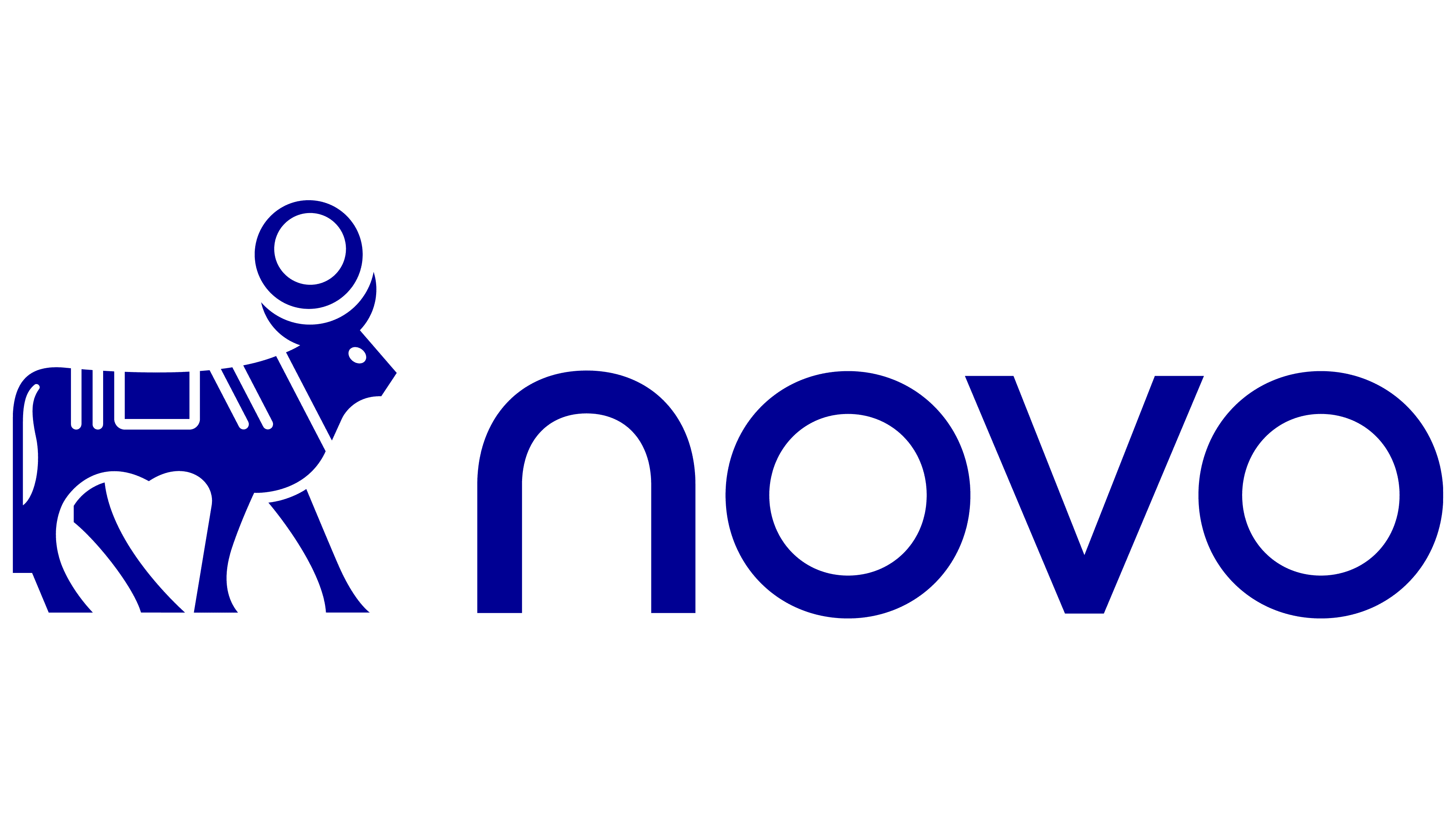
The Apis bull now faces right and stands beside the shortened name Novo. Danish pharmaceutical company Novo Nordisk, maker of Ozempic and Wegovy, unveiled the update on September 14, 2026. It is adopting Novo in communications with consumers and partners while retaining Novo Nordisk A/S for legal documents.
The name change reflects a shift in the company’s relationship with the people who use its medicines. For some weight-management patients, treatment is part of everyday health care. The previous mission, focused on combating serious chronic diseases, needed reconsideration in light of those expectations. The new promise, “Lasting Health Starts Now,” addresses daily habits and how treatment affects people’s lives.
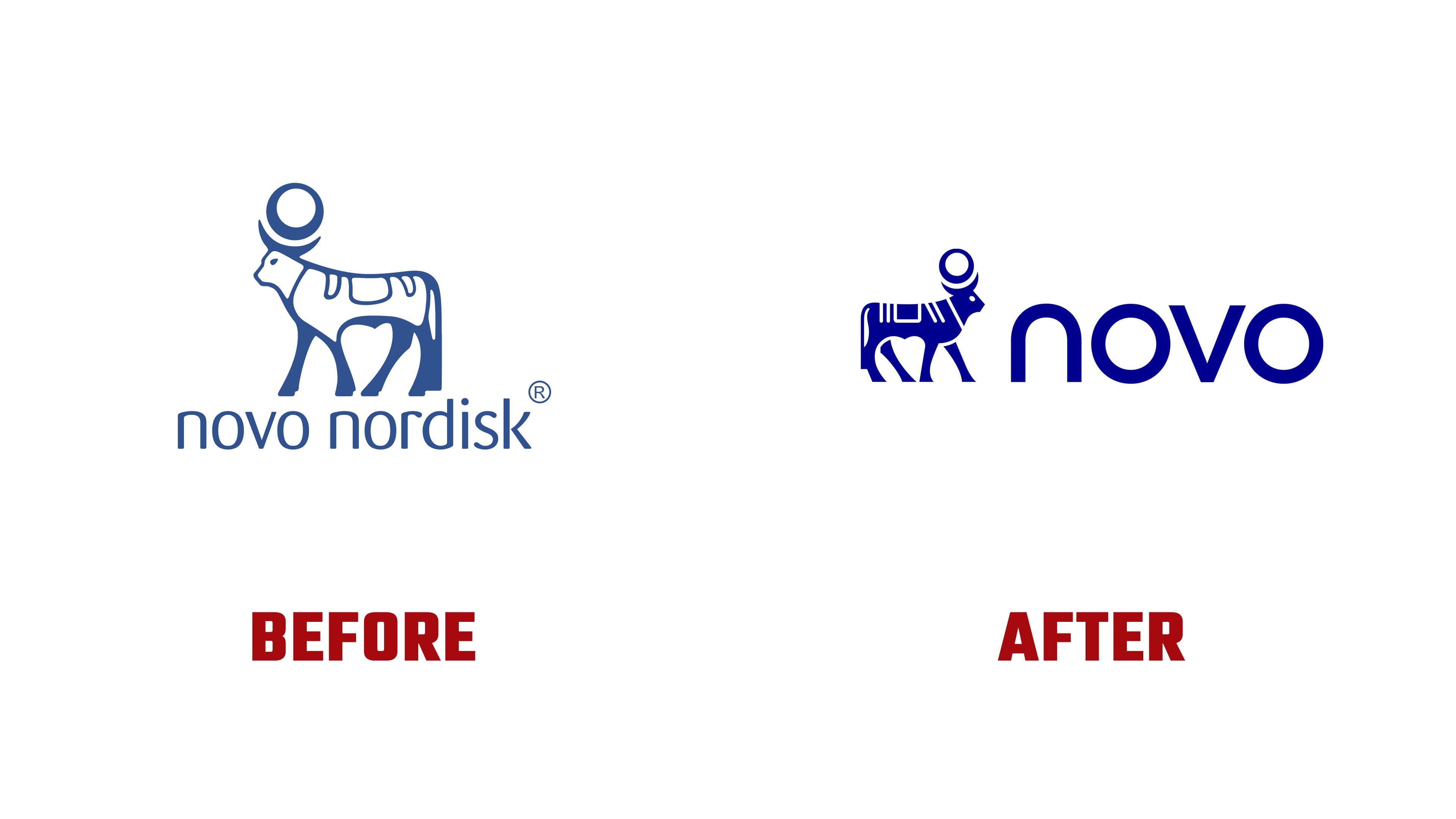
The Novo name returns the company to one of its predecessors. Novo Nordisk was formed by merging Novo and Nordisk in 1989. Today, the century-old business develops treatments for chronic diseases and employs more than 67,000 people worldwide.
Apis continues the historical connection in the logo. The company has used the bull since 1926. Its inspiration was an ancient Egyptian statuette of the sacred bull revered as an embodiment of the god Ptah. The statuette dates to approximately 664-323 BCE. Earlier interpretations of the emblem included opposites like day and night, and life and death.
Previously, the bull stood above the novo nordisk wordmark. The smaller figure now sits to the left of novo, creating a horizontal logo. Company leadership connects the bull’s turn to the right with readiness for change and respect for its heritage. The redesign changes the head, body outline, and back decoration.
The previous illustration combined a blue outline, white areas, and large blue shapes within the figure. The new body is blue, with white openings defining the eye, tail, and decorative markings. The contours are more angular, and the eye has become a dot. Short lines and angular joins have replaced loops on the back. The sun disk remains between the curved horns.
The lowercase novo wordmark has rounder proportions and uniform stroke widths. Previously, the letters were narrow, with alternating thin and thick sections. In the updated name, both “o” letters are nearly circular, while the “n” resembles an arch with a smooth transition from its left stem to the top. The “v” consists of two diagonals, introducing a sharp angle into the rounded lettering. The company’s typeface is called Novo, and Fast Company also associates it with the wordmark.
A saturated blue called Lasting Blue anchors the identity. It is paired with bright Now Turquoise, which replaces the previous light blue. The color names reference the two parts of the brand promise: long-term health and caring for it today. The update extends across corporate, digital, advertising, and partner materials. Alongside the new identity, the company introduced a corporate culture program called The Novo Way.