 NZ Post Logo PNG
The NZ Post logo exudes powerful energy, reflected in its bright color and dynamic shapes. This visual activity emphasizes the postal service’s modernity, which aims to break all records for delivery speed. Such an emblem is a perfect fit for an institution that connects the residents of a large country.
NZ Post traces its origins to 1840, when New Zealand’s first postal service was created after the Treaty of Waitangi. The Post Office Act of 1858 introduced stamps and standard rates. By the 1880s, the national Post Office handled mail, savings banks, telegraph services, and delivery, while local branches often served as banks, telephone points, and weather stations.
Automated mail sorting began in 1981, but government reform changed the structure in 1986. On 1 April 1987, the organization was divided into Telecom New Zealand Limited, Postbank, and New Zealand Post Limited. NZ Post became a state-owned postal company, introduced postcodes in 1989, and modernized sorting and delivery systems.
The company expanded beyond letters during the 1990s and 2000s. It acquired Couriers Please in 1998, launched its first website in 1999, founded Kiwibank in 2002, and introduced the YouPost digital mailbox in 2005. A major infrastructure program began in 2010. Falling mail volumes led to three-day urban delivery in 2013, followed by YouShop in 2015 and a parcel-tracking app in 2018.
An automated sorting center opened in Auckland in 2019, alongside an e-commerce platform for small businesses. Parcel demand rose in 2020, prompting fleet expansion, with electric vehicles forming over 30 percent of the urban fleet by year-end. Drone trials began in 2021, a digital-services division was created in 2022, and Asia-Pacific postal partnerships expanded in 2023 to support cross-border logistics.
Meaning and History
What is New Zealand Post?
It is New Zealand’s national postal service. A network of post offices provides a wide range of postal and logistics services, including domestic and international mail delivery, parcel delivery, courier services, and retail services. It also offers financial services such as bill payment and banking through a partnership with Kiwibank, which operates in many post offices. The organization aims to connect people and businesses by providing reliable and affordable postal and logistics solutions throughout New Zealand.
1987 – 2000

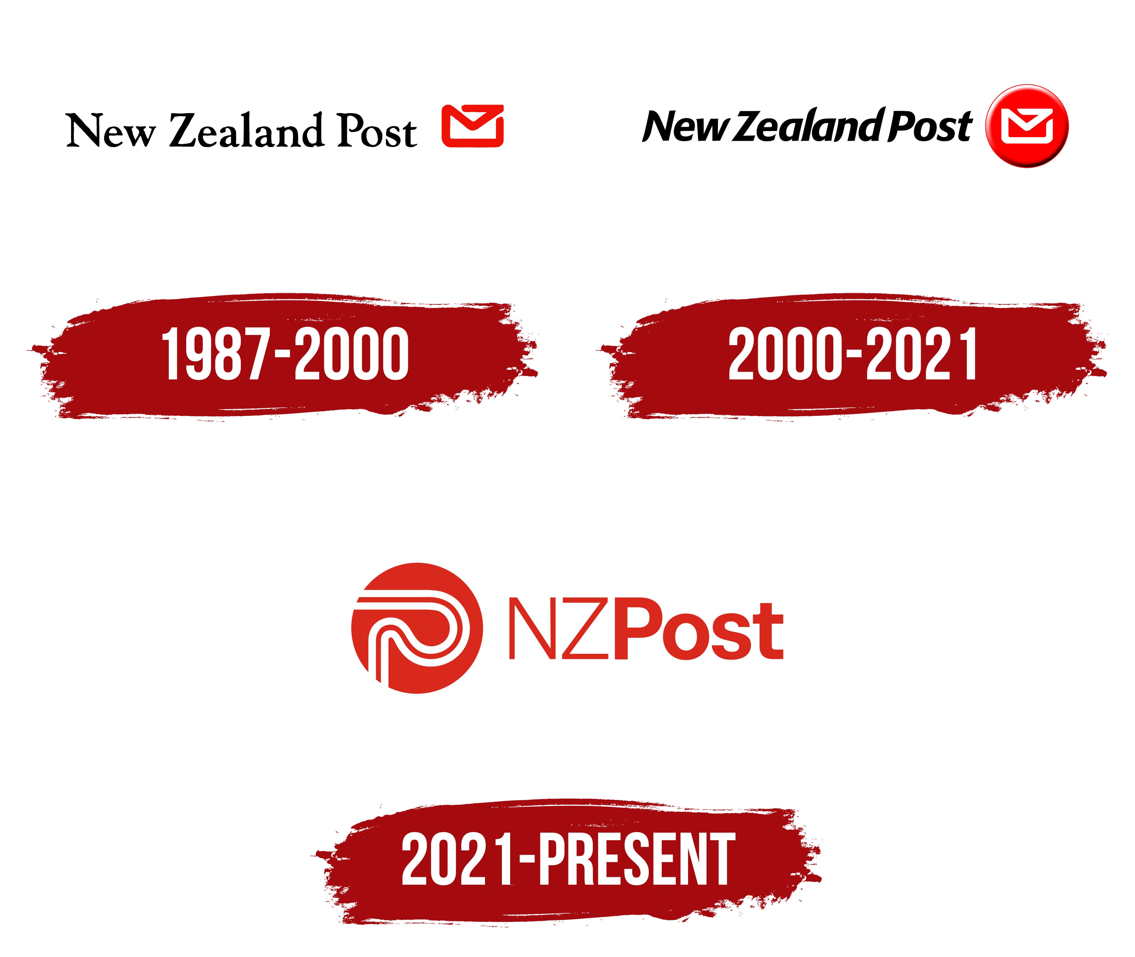
The old logo appeared during the early days of NZ Post, using the service’s original name: New Zealand Post. It is complemented by a small pictogram of a white envelope outlined in red. This is a visual representation of the correspondence that postal workers deliver to millions of addresses every day. The curved line symbolizes the complex logistics involved, as parcels and letters travel long before reaching recipients. At the same time, the bright red color represents speed, one of the key elements of quality delivery.
The envelope outline is not closed; the stripe has a clear beginning and end. This shape conveys the postal service’s accessibility and openness. It also evokes the image of a long route connecting the starting and ending points. In this sense, the red line represents connection, as NZ Post links people across the country.
The black text draws attention with its long serifs, diagonal cuts, and contrasting stroke thickness. This elegant font resembles the typical fonts of print publications, reflecting one of the institution’s main tasks: delivering paper newspapers and magazines, which were in high demand before the rise of digital technologies.
The designers used Times New Roman or a similar font, making subtle modifications. The upper serifs of the letters “N,” “l,” “d,” and “P” have small notches that enhance the visual interest of the text. The varying line thickness and smooth curves add a sense of dynamism to the emblem, highlighting the high speed of postal deliveries. Another unique detail is the incomplete curve of the letter “P.” It creates a sense of openness, just like the envelope’s open outline.
2000 – 2021

The postal service entered the third millennium with a new visual identity, reflecting the spirit of a progressive era. The structure of the logo remains unchanged: it still features the brand name and a stylized envelope. However, both the text and the image are now perceived differently, highlighting the rapid pace of technological advancement.
- First, the phrase “New Zealand Post” is rendered in bold italics, unlike the formal newspaper font previously used. The noticeable slant gives the text a sense of motion, evoking the image of a fast-moving postal van. Another reason for this visual dynamism is the diagonal cuts at the ends of the letters, which are also rounded. This symbolizes modern solutions that accelerate the process of delivering letters and parcels.
- Second, the stylized envelope now sits on a round red base. This base resembles a large button due to a gradient that creates a 3D effect. The circle appears convex, with its top edge outlined by a soft white line and the bottom highlighted by a black shadow. The three-dimensional design is associated with progress and the implementation of innovative technologies that have significantly streamlined NZ Post’s operations. The button, in turn, symbolizes the universality and accessibility of services, which are always within reach.
For greater contrast, the envelope outline has been recolored white, as it now sits on a red background. The lines are no longer as soft and flowing as before; their curves now appear sharper, giving the emblem a sense of speed. The ends are diagonally cut and rounded, just like the letters in “New Zealand Post.” This small detail visually connects the text and the pictogram, making the logo feel unified.
The brand name stands out thanks to its rich black color, which conveys an aura of professionalism and seriousness. The large red button draws attention with its bold brightness, practically demanding that customers use the service. Meanwhile, the white line echoing the envelope’s shape adds a sense of calm, simplicity, and confidence, balancing the emotional intensity of the other elements in the logo.
2021 – today

This emblem appeared in the postal service in 2021 when it decided to consolidate several brands for customer convenience. The new visual identity was intended to unify the various trademarks so they would be perceived as a cohesive whole.
The altered logo reflects the evolution of NZ Post and demonstrates its forward-looking ambitions, as almost nothing remains of the previous design except for the red circle. However, this element no longer resembles a button; it now has a simple two-dimensional appearance, typical of the currently popular minimalism. The modern style emphasizes the accessibility and clarity of the service, as the institution is actively advancing, improving package sorting technologies, modernizing processing centers, and utilizing the latest transport for cargo handling.
Inside the red circle, the traditional envelope is no longer present. NZ Post’s services have long expanded beyond mail delivery: the state enterprise owns its bank, delivers KFC orders, and fully controls ECN Group. Thus, the brand needed a universal symbol that does not point to any specific activity area.
This became a stylized letter, “P,” formed by white grooves inside the red circle. It gives the impression that the designers simply untangled the envelope’s outline and laid it out as two curving lines to add the needed fluidity to the logo. Between the white stripes is red space, which makes the “P” more noticeable and expressive. Thanks to this three-layer structure, the letter resembles a road, a symbol of transportation and logistics.
The road is meant to convey a connection between different places, but in this case, it looks like a road to nowhere because the ends of the white lines extend beyond the circle. The endless path indicates that there are no boundaries for the postal operator. It is a visual embodiment of development and progress, leading to an unknown future.
To the right of the graphic symbol is the inscription “NZ Post.” The short name was chosen for its conciseness and simplicity, as the brand identity is minimalist. The designers made the inscription the same red as the circle to prevent it from appearing dull. The maximum concentration of red is associated with activity, energy, and constant movement. The font enhances the logo’s dynamic, as the two parts of the inscription differ in thickness: “NZ” is in a thin grotesque, and “Post” is bold. This contrast is the only element that distinguishes the two words, as there is no space between them.