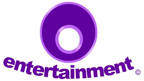
The O Entertainment logo features a unique visual style that reflects the company’s work and creative approach. Each element of the identity contains multiple layers of meaning, symbolizing the variety of series and cartoons produced by the company aimed at delighting its audience. Simplicity and presentability blend seamlessly, creating a distinctive visual effect. The emblem stands out with its unique color scheme, whose brilliance adds charm to the modern image.
The design accents deliberately direct the viewer’s attention, pointing to the broad range of original works created for audiences of different ages and preferences. The elegant outlines of the symbols, the restrained background, and the smooth gradient of the primary tone make the identity a vivid example of a creative approach. All the elements of the visual sign seem to proclaim the brand’s main motto: “Originality comes first!”
O Entertainment: Brand overview
O Entertainment was founded in 1998 by acclaimed filmmaker and animator Steve Oedekerk. Known for his work on films like Ace Ventura and Dumb and Dumber, Oedekerk sought to create a company where he could explore his artistic vision in animation.
Based in San Clemente, California, the studio aimed to produce original and creative content for families and children. Oedekerk wanted the studio to stand out from major Hollywood studios by embracing a unique approach to humor and animation.
The company’s first major project was the 2001 animated film Jimmy Neutron: Boy Genius. The studio collaborated with Nickelodeon Movies and DNA Productions on this computer-animated feature, known for its distinctive humor and storyline. The movie was a financial success and received an Academy Award nomination for Best Animated Feature.
Following the film’s success, Jimmy Neutron was adapted into a television series aired on Nickelodeon from 2002 to 2006. The production house played a key role in producing the series, further solidifying its presence in the television animation industry.
In 2002, the company produced Santa vs. the Snowman, an IMAX 3D animated short film. One of the first animated movies created specifically for the IMAX 3D format, it demonstrated the studio’s commitment to using cutting-edge technology in animation.
In 2006, the studio released Barnyard, a full-length animated film produced in collaboration with Nickelodeon Movies and Paramount Pictures. The movie, which followed the adventures of a cow named Otis, continued the company’s tradition of creating original and humorous animated stories.
After Barnyard, the focus shifted to developing new ideas and projects. In 2009, the company produced Back at the Barnyard, an animated television series spun off from the original film. The show aired on Nickelodeon until 2011, keeping the Barnyard world alive for fans.
Throughout the 2010s, the studio remained active, although little information about specific projects was publicly available. In 2016, the development of Jimmy Neutron 2, a sequel to the 2001 original, was announced. However, no formal updates have been provided, leaving the project’s future uncertain.
By 2020, the company continued as an independent production house, though it was less visible to the public. Steve Oedekerk remained involved in entertainment, but not all his projects were directly tied to the animation studio.
As of early 2023, the studio had not made any major announcements or releases, yet it remained a functioning entity. The studio still holds the rights to its earlier works, such as Jimmy Neutron and Barnyard, opening the door for potential revivals or sequels.
Over the years, the studio has earned a reputation as an innovative animation house, producing several notable and successful projects. Despite having a relatively small output, the company has significantly impacted the animation industry, especially with the Jimmy Neutron franchise. Its distinctive humor and animation style have set it apart and earned a loyal audience.
Meaning and History
What is O Entertainment?
This American animation production company is known for its colorful and inventive works aimed at children’s television. The studio’s unique visual style and innovative approach to storytelling make its productions particularly appealing to children and adults. The inspiring settings and eccentric characters enable the company to create popular animated shows that have gained international recognition and a loyal fan base. The company’s shows feature a balanced mix of humor, adventure, and educational elements, providing viewers with entertainment and a valuable experience.
1996 – 1998
The company’s first logo was conceptually complex and layered. At its core was the combination of a deep dark background and the bright golden glow of the letters, creating a multifaceted perception. The central focus was on the brilliant capital letter “O. ” This striking combination of dark tone and golden radiance became a powerful tool for attracting attention, making the emblem and the company easily recognizable among a wide audience.
However, it wasn’t just the colors that played a key role. The two-tier placement of the company symbol and its name in the center created a sense of duality, adding an element of mystery. The background seemed to conceal a story the viewer was left to imagine, giving the logo even more intrigue and appeal.
The company name was rendered in elegant superscript letters, symbolizing unity and togetherness. They appeared both graceful and strong. The serifs on the letters added character and a mystical aura, enhancing the overall impression.
Gold was used in the visual sign as a decorative element with a specific purpose. This precious metal, symbolizing value and status, conveyed the company’s prestige and high authority. The unique graphics of the letters, with their sparkles and glow, highlighted the exclusivity and importance of the brand, pointing to its prominent position in the market.
1998 – 2007
Each year, O Entertainment strengthened its status, rapidly growing and offering its audience increasingly engaging projects. During a time when family activities at home became popular in America, the company’s work became beloved by both children and adults. The company, which had brought numerous films and cartoons to young audiences, came to be seen as a trusted friend by viewers. In light of this, the founder decided to refresh the primary element of the visual identity.
The new logo was defined by minimalism, emphasizing the company’s core values. The background remained mysterious and dark but with a focus on elegant simplicity. A purple gradient added sophistication to the design, avoiding excessive ornamentation. The text portion of the visual sign became softer and more refined. The capital letter “O” took center stage, serving as the visual anchor for the entire company name. The word “Entertainment” was positioned at the base, like three pillars supporting the entire structure, highlighting the brand’s authority and reliability. The font appeared expressive and elegant—each letter looked flawless, making the company’s name refined and original.
An interesting feature was the unconventional arrangement of the letters, which were not placed on a single line. This gave the logo a sense of dynamism and playfulness, underscoring the brand’s flexibility and creative energy.
2001 – 2002
In 2001, one of the most unusual and creative logos was introduced. Its uniqueness lay in the fact that it resembled a scene from a movie, completely different from others. It could be suggested that the person depicted in the visual sign, standing in total darkness, plays the role of a detective or explorer. The plot is not entirely clear, but it gives the impression that the character is either conducting an investigation or trying to hide from some fantastical creatures. In any case, the emblem conveyed this mysterious atmosphere through two key elements.
The focus of the identity is not on the figure of the person with the flashlight, who fades into the background, but on the company name “Entertainment,” illuminated by the flashlight’s beam. This effect makes the bright letters the central element of the emblem, drawing attention. The black-and-gray color palette perfectly complements the concept, creating a tense and mysterious mood. At the same time, the brightness of the illuminated letters enhances the impression and leaves a lasting impact.
2002 – 2006
The new O Entertainment logo reflected changes in the company and entertainment industry. It retained its recognizability through the central letter but adopted a brighter and more modern look. This is an example of how minimalism and simplicity can form the basis of a memorable brand image. Instead of the previous dark background, the new visual sign acquired a transparent base, giving it a more open and light appearance. This change made the identity less mysterious while maintaining its presentability and recognizability.
The main symbol of the visual sign is a large purple letter “O,” which stands out due to its size and shape. Inside this letter is another smaller ring, creating a sense of depth and volume. The outer and inner contours of the letter “O” were lightened, adding an unusual touch to the overall design. Additionally, the expanded upper part of the symbol drew attention with its unconventional shape, making the logo even more original and memorable. This design choice enhances the emblem, giving it a sense of dynamism, as though the “O” is more than a letter. This element symbolizes something complete and enclosed yet open to interpretation—perfect for the entertainment industry, where entire worlds and fantasies are created.
The purple color used in the visual sign adds mystique and energy. This color is often associated with creativity, innovation, and something new. Purple speaks to both dreams and the extraordinary, perfectly reflecting the essence of a company working in the entertainment industry. Combined with the white accents on the inner and outer rings, the logo looks fresh and contrasting, emphasizing its modern and creative approach.
The font for the word “entertainment” at the bottom is done in a semi-circular form that mirrors the curves of the main “O” symbol. This creates visual harmony, as though the logo is complete and logical. The bold and clear letters highlight the company’s reliability and confidence. The font is slightly angled upward, giving a sense of movement and progress—a visual hint that the company is not standing still but constantly moving forward, creating something new and exciting for its audience.
This emblem design was relevant in the early 2000s when many brands sought simplicity and added dynamic and original elements. Creative cinema and television were evolving, and logos needed to reflect that dynamism and flexibility.

