 Origin Energy Logo PNG
Electricity and gas supply power residential and business systems, supporting daily operations in cities and regions. Generation, distribution, and network maintenance form the foundation of energy supply. The Origin Energy logo is associated with an Australian company that generates and supplies electricity and gas to the residential and commercial sectors.
Origin Energy was established on February 18, 2000. This followed the spin-off of the energy division from Boral Limited. The new entity combined gas and electricity supply assets, including the South Australian Gas Company. The company quickly became a major player in the Australian market.
In 2001–2002, Origin obtained retail electricity sales licenses in Victoria. During the same period, SEAGas launched its pipeline, connecting markets in the southern states. By 2004, the company had acquired a stake in New Zealand’s Contact Energy and began developing coal seam gas in Queensland.
In 2006, Origin purchased the retail supplier Sun Retail for $ 1.2 billion. In 2008, the company acquired the Uranquinty power station. In 2010, Origin bought the assets of Country Energy and Integral Energy.
In 2011, the company launched the large-scale Australia Pacific LNG project. The partners were ConocoPhillips and Sinopec. The project was valued at about AUD 23 billion. The first shipment of liquefied natural gas was exported in 2016.
In 2013, Origin acquired Eraring Energy. In 2020, the company acquired a 20 percent stake in the British firm Octopus Energy and launched its digital platform, Kraken, in Australia.
In 2024, the company received approval to build the second stage of the Eraring battery, with a capacity of 240 megawatts. The company continued to develop solar and wind energy projects.
The company reported an underlying profit of A$1.49 billion. It continues to invest in energy storage and renewable energy development, strengthening its position as a leading electricity supplier in Australia.
Meaning and History
What is Origin Energy?
Based in Sydney, the energy company was formed after Boral split in the late 1990s. It supplies more than 15 billion kilowatt-hours of electricity to 4.5 million customers. Main business segments include Energy Markets and Integrated Gas. The first manages the Eraring coal power station (2.88 GW capacity) and gas facilities, which provide most of its revenue. The second owns a 27.5 percent stake in the Australia Pacific LNG project with ConocoPhillips and Sinopec. The company holds a 20 percent stake in Octopus Energy and plans to close Eraring earlier than scheduled.
2000 – 2011
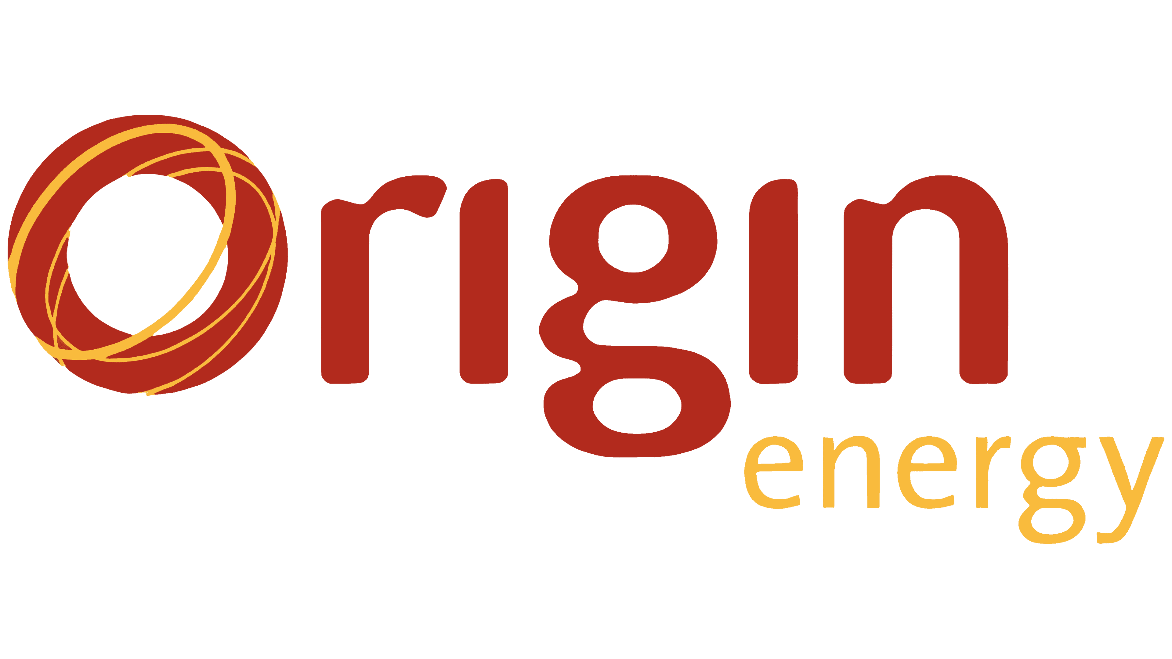
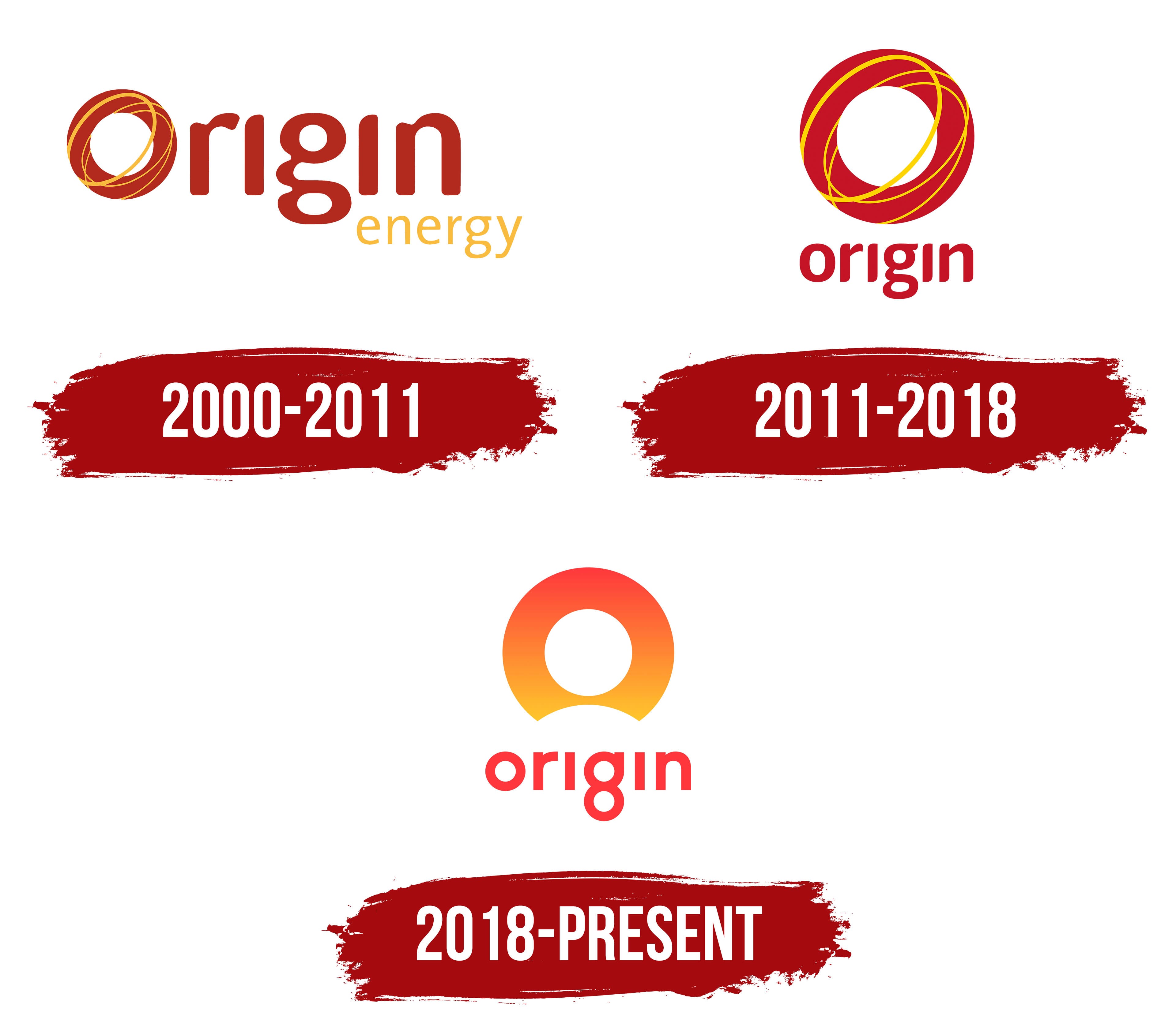
The first letter of Origin Energy’s name became the company’s emblem. In the original logo, a wide brick-red ring with a white opening replaced the usual “o.” Thin yellow lines crossed the ring along elliptical paths, suggesting swirling streams of light. The circular shape resembled a sun disk or a stylized turbine, connecting the name to the energy industry.
The name Origin appeared in 2000, when Boral split its energy business from its building materials operations. The energy business remained within the existing legal entity, which was renamed Origin Energy Limited. The company generated electricity and supplied Australian customers with electricity and gas. “Origin” refers to a source, beginning, or point of emergence, while “Energy” identifies the industry. The new name separated the energy business from the Boral brand.
The letters “rigin” appeared to the right of the circular emblem, completing the word “origin.” The lettering used a heavy, rounded sans-serif style in the same brick-red color. Its shapes resembled VAG Rounded. A double-story “g” appeared alongside 2 lowercase “i” letters shaped like short capital “I” letters.
The word “energy” appeared in pale yellow beneath the right-hand portion of the main name. Its lowercase letters echoed the rounded shapes above but were smaller, with thinner strokes. The color matched the lines inside the ring. Size and weight distinguished the company name from its industry description.
2011 – 2018
As Origin expanded, it needed a shared identity for its different businesses and audiences. Davidson Branding developed the system around a circle, using the shape in the emblem and other company materials. Additional colors drew on Australian natural surroundings. Orange represented sunsets, blue the ocean, and green grasslands.
In the logo version already in use by 2011, the ring sat above the name. It had previously replaced the first “o,” but “origin” was now written in full. The emblem was larger than the lettering beneath it. A compact, stacked arrangement replaced the elongated horizontal logo. The name was reduced to the single word “origin.”
The red ring retained its opening and thin yellow lines. The lines curved around the ring and crossed, suggesting swirling streams of energy. Beneath the symbol, the name appeared in red lowercase sans-serif letters with rounded forms and consistent stroke widths. The lettering resembled VAG Rounded. Its double-story “g” and 2 “i” letters, shaped as short vertical strokes, maintained a connection to the earlier version.
Within the new identity system, the logo appeared in a seal-like arrangement. Circles carried through to other materials, giving the growing company a shared look.
2018 – today
Origin’s 2018 update promised affordable energy with a lower environmental impact. The company introduced “Good Energy” and its first redesign in 18 years. Retail executive Jon Briskin linked the changes to customer needs. The brand sought to reduce price barriers and make it easier for customers to deal with their energy supplier. TBWA\Melbourne and Atomic 212° helped prepare the Good Energy launch.
The circular emblem retained its connection to the initial “o” in the name. The interwoven yellow lines gave way to a smooth color gradient. Scarlet at the top of the ring transitions through bright orange to soft yellow at the bottom. The white center remained circular, while a concave, arched cutout appeared along the lower edge. The shape suggests the sun or a light source. The curve at its base also resembles a horseshoe and a dome.
Beneath the symbol, “origin” appears in a bright red-orange shade close to coral. The lowercase sans-serif lettering was redrawn. The opening “o” became geometrically rounded, and the double-story “g” developed 2 distinct rounded sections. Both “i” letters retained their vertical-stroke form. The lettering resembles typefaces such as Avant Garde Rounded and Gotham Rounded.
The emblem’s gradient carried into corporate materials. Cordestra applied the updated guidelines to templates for reports, business documents, and presentations, aligning their colors and typography with the new identity.