 Orsted Logo PNG
Electricity generation increasingly relies on offshore wind turbines, which use wind to generate power. These projects require coordinating and managing offshore infrastructure and energy facilities. The Orsted logo is associated with a company that develops offshore wind farms and generates electricity from renewable sources.
Dansk Naturgas was founded in 1972. The company managed Denmark’s North Sea gas resources. It was soon renamed Dansk Olie og Naturgas (DONG) and began developing oil and gas production. In 2005, DONG merged with several energy companies, including Elsam and Energi E2. This formed DONG Energy. The merger strengthened the company’s position in the electricity market and marked the beginning of major renewable energy projects.
In 2009, DONG Energy adopted the “85/15” strategy to gradually shift away from fossil fuels toward renewable energy sources. By 2013, the company had built one of the world’s largest offshore wind farms, Anholt, with a capacity of 400 megawatts. In 2014, the company stopped using onshore turbines entirely.
In 2014, Goldman Sachs and Danish pension funds ATP and PFA Pension became shareholders. In 2016, DONG Energy went public on the Copenhagen Stock Exchange. In 2017, the company sold its oil and gas business to the British firm Ineos for 1.3 billion dollars and renamed itself Ørsted. The company chose the new name in honor of physicist Hans Christian Ørsted.
By 2018, renewable energy accounted for 75 percent of Ørsted’s production. Since 2006, carbon dioxide emissions have been reduced by 72 percent. The company expanded its presence in the United States, acquiring Lincoln Clean Energy and Deepwater Wind. After these acquisitions, Ørsted became the largest operator of offshore wind farms in the country.
In 2023, the company incurred losses due to the cancellation of the Ocean Wind 1 and Ocean Wind 2 projects in the United States. The negative result amounted to 20.2 billion Danish kroner. In 2024, it reduced its workforce to 6,000 employees and suspended dividend payments.
Despite temporary difficulties, the company maintains its leadership in offshore wind energy. It continues to implement projects in Rhode Island, Maryland, Connecticut, and New York.
Meaning and History
What is Orsted?
A Danish energy company that has completely moved away from fossil fuels, focusing on wind and solar power. Previously engaged in oil and gas production and coal power generation, it sold those assets. The company is now the world’s largest operator of offshore wind farms, with a total capacity of over 18 gigawatts across the United Kingdom, the United States, Denmark, Germany, the Netherlands, and Taiwan. More than half of its facilities are offshore, requiring complex engineering solutions. The organization is converting old coal plants to biomass and developing onshore wind and solar projects in Europe and America.
1990s – 2000s
The company later known as Ørsted began as Denmark’s state-owned gas company. On March 27, 1972, the country established Dansk Naturgas A/S to develop the national energy sector and utilize North Sea resources. The company became Dansk Olie og Naturgas A/S in 1973. The abbreviation “DONG” came from the Danish name meaning “Danish Oil and Natural Gas” and described the company’s business.
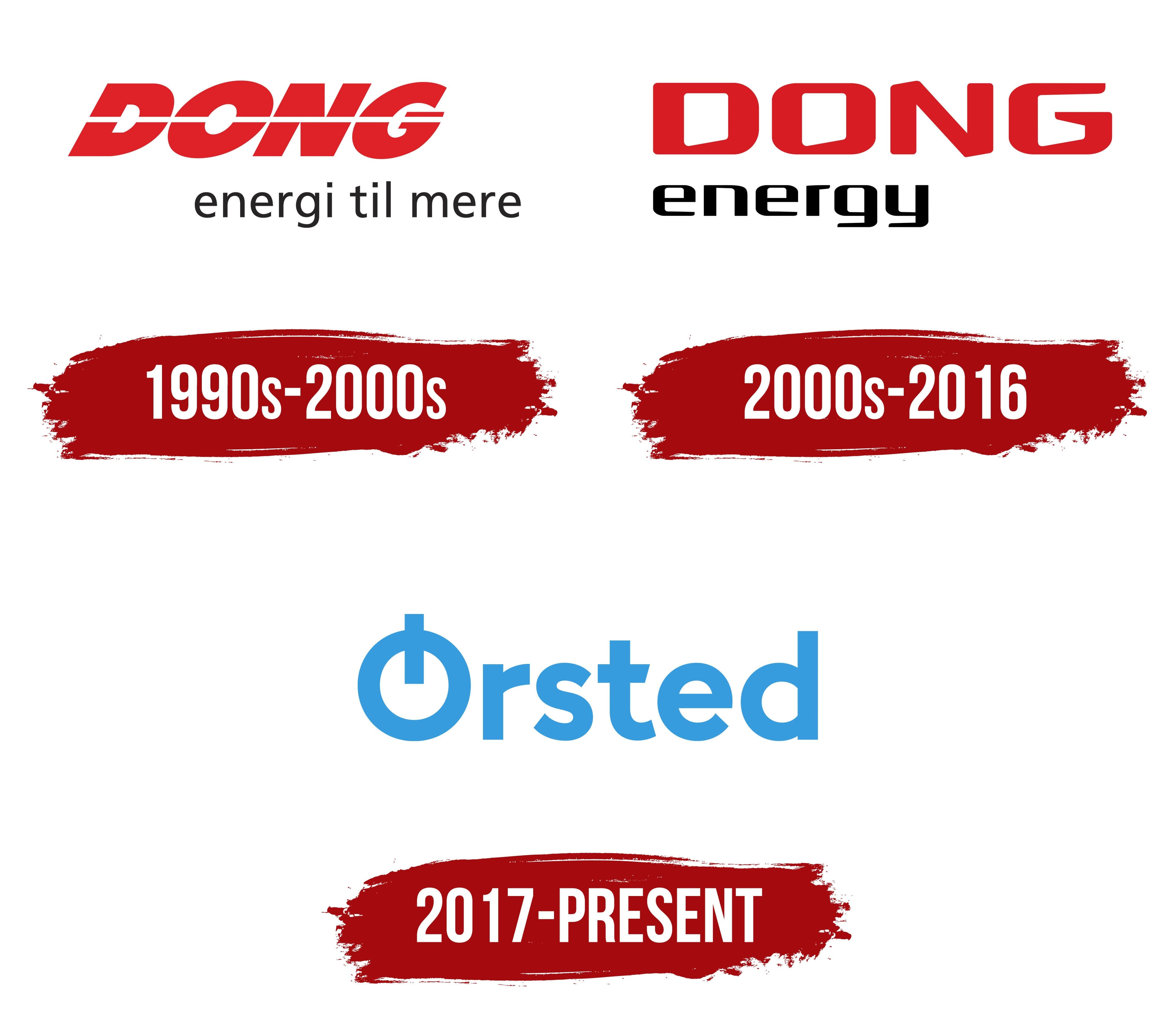
In 2006, DONG merged with Elsam, Energi E2, NESA, energy assets from Københavns Energi, and Frederiksberg Forsyning. The new group became DONG Energy and operated in oil and gas production, electricity generation, heating, and renewable energy. The corporate signature from this period had been used before the merger, when DONG remained the company’s primary name.
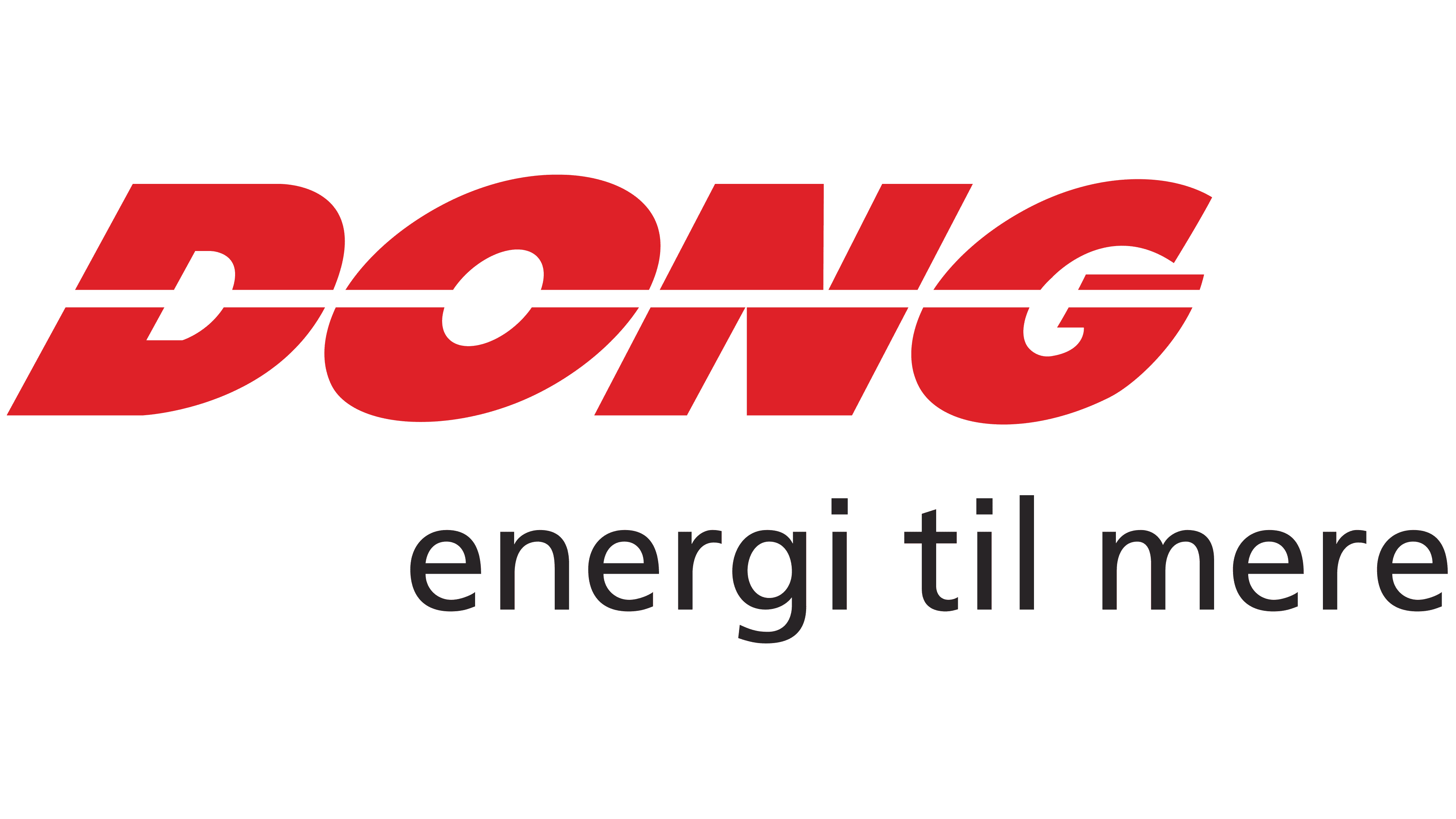
The logo consisted of two levels of text. The large word “DONG” occupied the upper section in heavy, bright red uppercase letters. The characters were tightly spaced and leaned to the right. A white horizontal line crossed the entire wordmark, dividing the letters into upper and lower sections. The treatment gave the abbreviation a custom appearance.
The Danish phrase “energi til mere,” associated with energy and new possibilities, appeared below. It used lowercase, dark-gray sans-serif letters. Thin strokes and a small size separated the slogan from the heavy DONG wordmark. The main name aligned with the left edge, while the lower line shifted to the right and completed the elongated two-level composition.
The phrase “energi til mere” appeared in DONG’s corporate communications in the early 1990s and remained in use during the following years, including a 2004 campaign. DONG A/S registered it as a trademark in Denmark in January 2004.
2006 – 2016
The 2006 merger of several energy companies required a unified brand for a group operating across different business areas. DONG Energy’s corporate structure began operating on October 13. The new name combined the abbreviation “DONG,” inherited from the historic oil and gas company, with “Energy,” reflecting the expanded business created by the merger. The organization separated its operations in 2016, and the consumer division became Radius.
The corporate signature retained the red DONG wordmark. The white stripe that had previously crossed the letters was removed in favor of solid fills. Heavy uppercase characters with rigid geometric forms and rounded outer corners made up the upper line. Diagonal counters introduced asymmetry into the lettering. The redesign preserved the DONG abbreviation while updating it for the combined group.
The black lowercase word “energy” appeared below DONG and aligned with the left edge of the upper line. Its lighter sans-serif style featured broad proportions, rounded contours, and sharp cuts along the bottom. The technical construction of the lower word contrasted with the massive red letters and separated the two parts of the name. DONG preserved the historical connection, while “energy” represented the company’s broader activities.
2017 – today
By 2017, the Danish energy group needed a new name. The company had been shifting from fossil fuels toward renewable energy since 2008, with offshore wind farms becoming one of its leading business areas. The sale of its oil and gas division to INEOS ended the earlier period associated with the meaning “Danish Oil and Natural Gas.” DONG Energy announced the change to Ørsted on October 2, 2017. Shareholders approved the legal name Ørsted A/S on October 30.
The name honors Danish physicist and chemist Hans Christian Ørsted, who lived from 1777 to 1851. In 1820, he discovered the relationship between electricity and magnetism and laid the foundation for further research into electromagnetism. For the company, his name connected Danish scientific tradition, the study of nature, and the conversion of natural forces into energy. Copenhagen agency Kontrapunkt helped develop the name, created the brand architecture, and spent about two years preparing the corporate system with Ørsted’s internal team.
The logo was introduced with the new name on October 2, 2017. A light blue Ørsted wordmark replaced the red two-line DONG Energy signature. The first letter received the main emphasis. A vertical stroke passes through the circular body of the “Ø” and rises above its upper edge. The structure distinguishes the initial character and preserves the Danish spelling of Ørsted’s last name. The remaining letters have soft rounded forms and a sans-serif style.
Kontrapunkt developed the custom Ørsted Sans typeface. It draws on early 20th-century Northern European modernism and 1930s Danish functionalism. Geometric letterforms combine with flowing curves and details inspired by wind. The agency connected the wordmark’s blue shade with the work of Danish modernist Vilhelm Lundstrøm and his search for an “eternal blue.” The color system drew inspiration from Northern landscapes and architecture. At the same time, the broader style emphasized restraint, practicality, and a human scale.