


![]() Pall Mall Logo PNG
Pall Mall Logo PNG
The legendary brand has an expressive visual identity. The Pall Mall logo is not just text but a complete layout with a corporate crest. The multi-component chic design demonstrates the brand’s solid status, long history, and the uniqueness of tobacco products. The stylized coat of arms means bright individuality. The company used it to stand out from its competitors. It is not only about the packaging’s appearance but also about the features of the company’s activities.
Pall Mall was introduced in New York in 1899 by Butler & Butler as Pall Mall Famous Cigarettes. The brand used a Turkish tobacco blend and took its name from Pall Mall, the London street associated with gentlemen’s clubs in St. James’s. Its early image was built around premium status, gold heraldry, and magazine advertising, a format still unusual for tobacco promotion at the time.
In 1907, American Tobacco Company bought Butler & Butler and added Pall Mall to its portfolio. After the 1911 antitrust breakup of American Tobacco, the brand stayed with the reorganized company. During the 1920s, Pall Mall moved beyond its narrow elite image, adding new formats and using more forceful advertising, including the “Captain X” character.
The major product shift came in 1939, when Pall Mall launched the first 85 mm “king-size” cigarette. It was marketed as a longer, milder smoke with more tobacco for the same price. By the end of World War II, Pall Mall and Lucky Strike had made American Tobacco one of the most profitable cigarette companies in the United States.
By 1960, Pall Mall was the best-selling cigarette in America, and its 100 mm version became a strong seller in the 1960s. The brand then lost ground as smokers moved toward filtered cigarettes. Marlboro from Philip Morris passed Pall Mall in 1963, while Camel from R.J. Reynolds remained another major rival. In 1994, Brown & Williamson acquired American Tobacco, and in 2004, it merged with R.J. Reynolds to form Reynolds American. Internationally, Pall Mall remained under British American Tobacco.
Meaning and History
![]()
Pall Mall is not only popular but also one of the oldest brands of tobacco products. It appeared on the market more than 100 years ago and continues to develop steadily. One of the brand’s highlights is its status as an industry icon. This status is partly due to the many references to cigarettes in famous films and even literary works. For example, the name appears in the works of Stephen King and Kurt Vonnegut. Among celebrities, popular film actor Lee Marvin provided particular support.
The brand’s visual identity also impresses buyers. It consists of a symbol that can be considered the coat of arms of Pall Mall, along with a neat, elegant company name. A characteristic feature of the font is its strong elongation. Thin, narrow lines designed in this style are a very expressive detail that makes the logo recognizable. The coat-of-arms decor emphasizes the brand’s power and strength, which have helped it gain global popularity.
What is Pall Mall?
Pall Mall is a popular brand of tobacco products manufactured in England and the United States of America. These cigarettes are owned by British American Tobacco and R.J. Reynolds Tobacco. Both companies are world leaders. But the difference is that the first one manufactures cigarettes for deliveries to different countries, and the American company supplies products exclusively to the domestic market. In general, Pall Mall cigarettes are the best option in their segment in terms of quality and price.
Pall Mall tobacco products have been in production since 1899. But the company’s official logo appeared only in 1922, when the production process was already well established, and deliveries were beginning to increase. Since then, the brand has used a stylish, timeless logo that clearly shows the core values and features of the renowned manufacturer. It consists of two parts: the coat of arms and the word mark.
The company’s name is at the top of the package, set in an outstanding Art Nouveau font. In the presented version, the letters are rather elongated, thin, and straight. The chosen design betrays respect for tradition, reliability, and reverence. In addition, this unique font variety symbolizes progressiveness and determination. The management observed the harmonious balance of these principles throughout the entire period of activity.
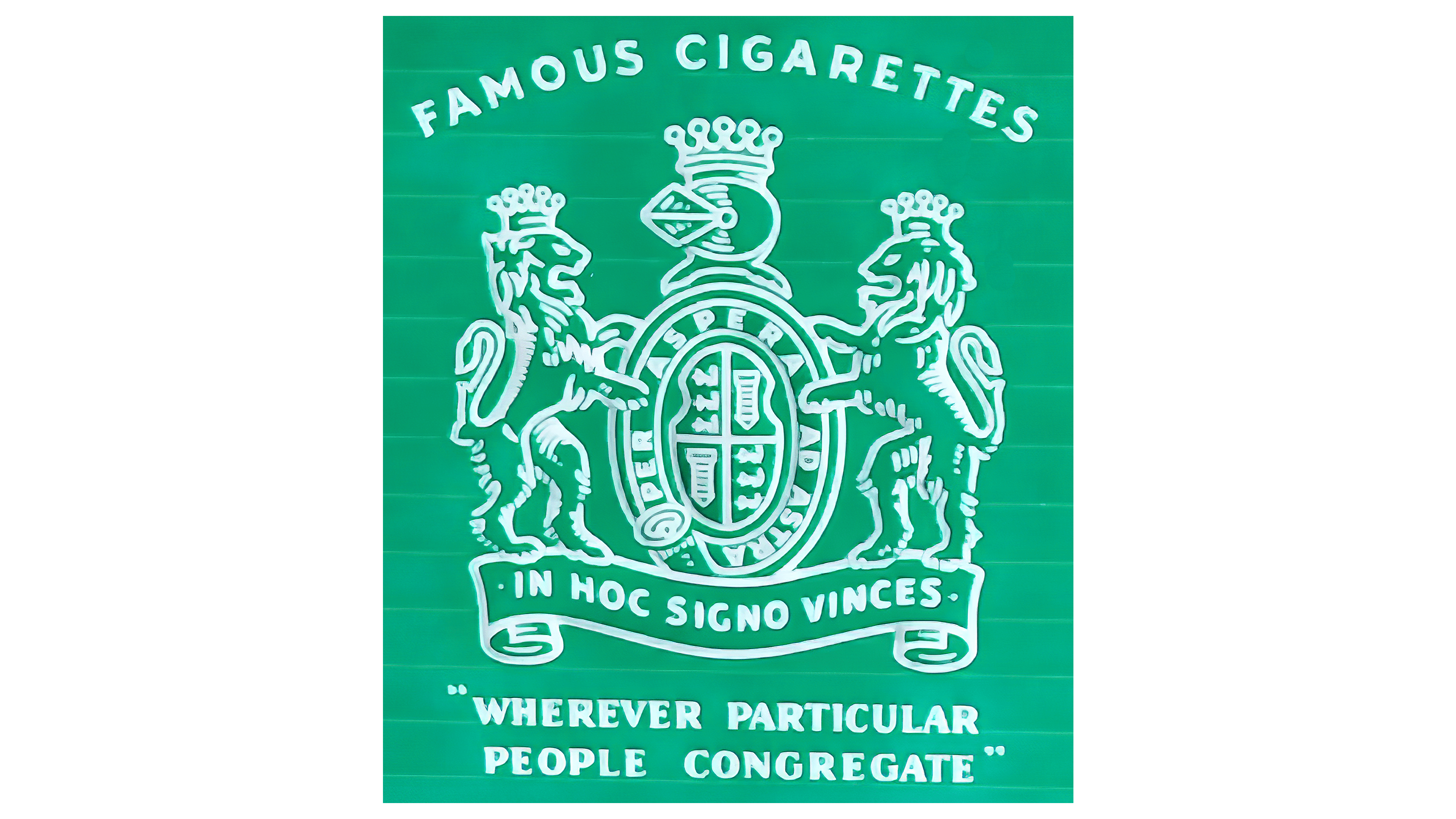
But these are far from all the brand’s features expressed through visual identity. A few more important characteristics are evident in the sumptuous, bold coat of arms, typically located beneath the main inscription. It consists of several images. On the sides are figures of lions in crowns, standing on their hind legs and facing each other. In the center, you can see the image of a knight with a shield. There are also two phrases on the ammunition and at the bottom of the picture.
One of them meant: “Through thorns to the stars,” and the essence of the second was to demonstrate victory. Bold statements were integral to the company’s strategy to conquer local markets and become one of the world’s best tobacco brands. Ambitious plans were also reflected in light, confident colors. For the background, a classic shade was used to convey honesty and responsibility, and for the main design details, a base color denoting trust was used.
Font and Colors

Pall Mall’s visual identity was based on the uniqueness of its technology and the high quality of its products. In addition, the designers focused on the history of iconic cigarettes. Their creations resulted in an elegant, stylish emblem featuring an original inscription and a powerful coat of arms. The logical conclusion of the visual concept was beautiful light coloring.
It consisted of only two colors, white and light blue. White was used to decorate the logo’s background. It conveyed an honest, responsible, and conscientious attitude to production. In most cases, the main elements (coat of arms and name) were presented in a light blue tint. It is a symbol of authority, reliability, trust, and professionalism. For the main inscription of the logo (company name), an elegant, modern font was used.
This category is perfect for Pall Mall branding. This is because it simultaneously demonstrates respect for traditions, courage, and readiness for new achievements. A tribute to the past is expressed through classic serifs, and the desire for development is symbolically reflected in elongated, thin lines tending toward the top. All this is harmoniously combined with a detailed coat of arms that underscores the solid status of one of the world’s best tobacco brands.