The naturalness of the ingredients is visible in the brand logo. These means have a mild effect. Nourish and fortify the skin due to vegetable raw materials. The Palmolive logo guarantees effectiveness throughout the application.
Palmolive: Brand overview
| Founded: | 1898 |
| Founder: | Colgate-Palmolive |
| Headquarters: | United States |
| Website: | palmolive.co.uk |
Meaning and History
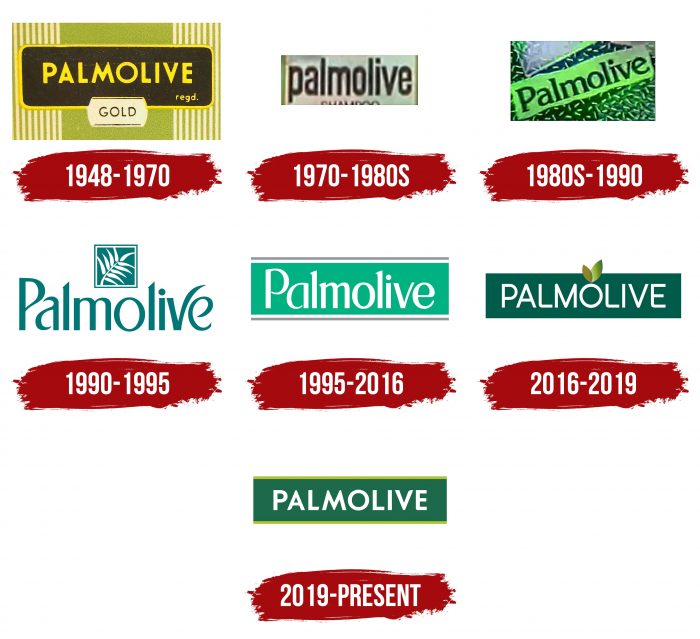
The permanent and well-recognized logo of this trademark appeared in 1948. It is made based on the word “Palmolive,” which means the composition of the branded soap – palm and olive oil. In total, there are seven emblems in the history of the company.
What is Palmolive?
Palmolive is an American personal hygiene brand owned by Colgate-Palmolive Company. At the time of its appearance in 1898, it produced bar soap based on palm and olive oils. Today, its product range has expanded to include hair conditioners, shampoo, shower gel, and liquid soap. Its headquarters is located in New York City.
1948 – 1970
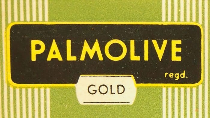
The label features a black horizontal rectangle with the yellow “Palmolive” lettering and the same border around the edge. Olive color serves as a background.
1970 – the 1980s
By that time, the version with elongated black letters on a white background belongs.
the 1980s – 1990
In the 1980s, there was a color version in which green turned into a neon palette.
1990 – 1995
The designers redesigned the logo, offering a palm leaf and an elongated font with obliquely cut tops “l” and an elongated right side “v.” Green has become much darker.
1995 – 2016
The brand adopted a new logo consisting of a light olive rectangle with top and bottom underlining and a white “Palmolive” word on the inside.
2016 – 2019
The developers added two sheets, changed the font, and made the olive one much darker.
2019 – today
Now we use a version with a lightened olive color and yellow-olive lines at the top and bottom.
Palmolive: Interesting Facts
Palmolive, known for cleanliness and personal care, has been around for over a century, starting with soap and now including shampoos, conditioners, shower gels, and dishwashing liquids.
- Starting with Soap: In 1898, the B.J. Johnson Soap Company in Milwaukee made soap from palm and olive oils, naming it “Palmolive.”
- Becoming a Global Brand: After merging with Colgate & Company in 1928, it expanded worldwide, becoming Colgate-Palmolive in 1953.
- Memorable Ads: It is known for catchy ads like “Palmolive softens hands while you do dishes,” which feature Madge, the manicurist.
- Worldwide Reach: Palmolive is now available in over 88 countries, tailoring products to different markets.
- Eco-Friendly Moves: Palmolive and Colgate-Palmolive focus on sustainability, aiming to reduce plastic waste and conserve resources.
- Innovative Products: Continuously innovating, Palmolive offers products for various skin types and preferences, including eco-friendly and sensitive skin options.
- Wide Range of Products: What started as a single soap has grown to include a broad selection of personal care items, from shampoos to dishwashing liquids.
- Giving Back: Through donations and support programs, Colgate-Palmolive helps with disaster relief, education, and health initiatives worldwide.
- A Cultural Icon: Palmolive has become a familiar name in households and is often referenced in popular culture.
- Focused on Improvement: With ongoing research and development, Palmolive aims to stay ahead in the personal care industry, emphasizing product quality and environmental sustainability.
From its origins as a soap made with palm and olive oils, Palmolive has become a global brand, continually evolving to meet consumer needs and preferences.
Font and Colors
The idea of a brand name is simple: it is directly related to the brand’s name. It was played up in many versions but always remained within the olive color of different variations. The background of the word “Palmolive” is still a horizontally elongated rectangle.
The current typeface consists of closely spaced sans-serif letters. Compared to previous versions, the marks are slightly thicker. The Fontsmith studio contributed to the development of the current trademark design. The logo color has always been olive in various shades.
Palmolive color codes
| Bottle Green | Hex color: | #1d694b |
|---|---|---|
| RGB: | 29 105 75 | |
| CMYK: | 72 0 29 59 | |
| Pantone: | PMS 7727 C |
| Acid Green | Hex color: | #aec02f |
|---|---|---|
| RGB: | 174 192 47 | |
| CMYK: | 9 0 76 25 | |
| Pantone: | PMS 583 C |
