


 PBS News Weekend Logo PNG
The PBS News Weekend logo closely matches the television program’s theme, which focuses on providing updates on current events. The emblem is professional and reflects the project’s informational focus.
PBS News Weekend began in September 2013 as PBS NewsHour Weekend, an extension of PBS NewsHour created by the Public Broadcasting Service to expand weekend news coverage. The program launched from WNET studios in New York with Hari Sreenivasan as anchor and senior correspondent. Its early format combined detailed reporting with a more accessible presentation for weekend audiences.
In 2014, the program formed a dedicated newsroom team and developed partnerships with agencies and correspondents worldwide. By 2015, the show had added weekly analysis, special reports, and documentary segments. From 2016 to 2017, cooperation with regional PBS stations widened coverage of local stories that received limited national attention.
Digital expansion followed in 2018 through an updated website, social media accounts, and a podcast. In 2019, the program increased international reporting and introduced regular segments on science, culture, and technology. During 2020 and 2021, production methods were updated, digital distribution became more important, and interactive formats gave audiences more ways to engage with the reporting.
The program adopted the name PBS News Weekend in 2022, along with new graphics, a redesigned studio, and restructured broadcasts. By 2023, it remained focused on in-depth weekend reporting while distributing its journalism across television, online platforms, social media, podcasts, and other digital formats for audiences across the United States.
Meaning and History
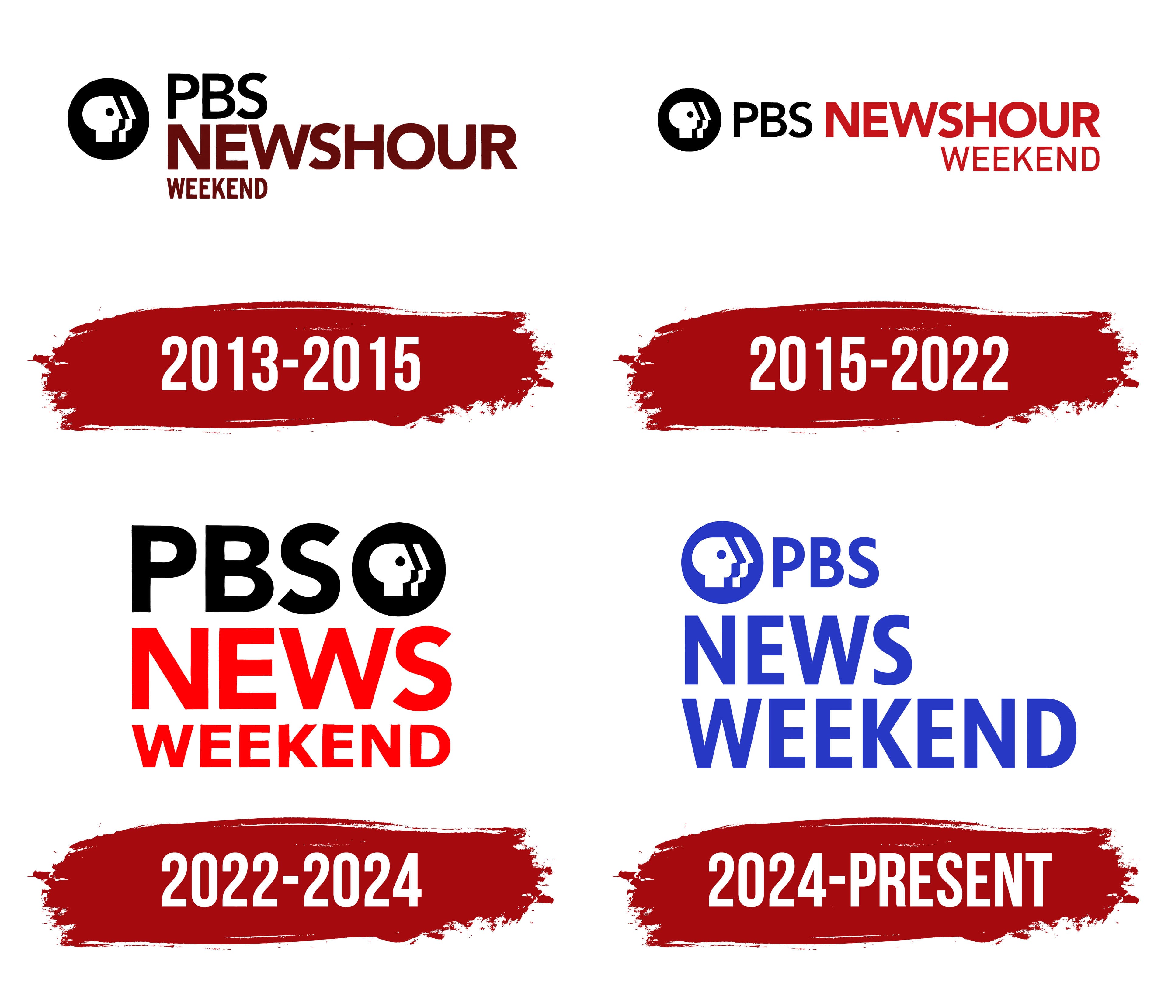
What is PBS News Weekend?
On weekends, this television program offers in-depth coverage of important national and international topics. It focuses on thorough analysis and reporting, complemented by interviews with newsmakers, experts, and cultural leaders. The program adheres to high journalistic standards, providing balanced information and helping viewers better understand complex issues often overlooked by other news sources. Its style prioritizes context and insight over sensationalism.
2013 – 2015
When PBS NewsHour, which aired on weekdays, expanded its programming, the new Sunday show received its logo. The surrounding world served as its foundation, acting as the background, a source of information, the target audience, and an observer of current events. For this reason, the emblem’s key element is the brand’s distinctive icon featuring multiple faces.
The right side of the emblem is occupied by text featuring a significant amount of red, suggesting that all the news is hot, fresh, engaging, and relevant. On the left side is the highly recognizable symbol: a circle with profiles of heads. These are drawn in a geometric style and positioned one behind the other, creating the impression of three figures rather than two, with lighter skin and one with darker skin, clearly visible in the negative space.
Next to it is the program’s title, “PBS NewsHour,” with a subtle note below reading “Weekend.” The top row is rendered in large, black font, while the lower lines use smaller, dark red letters. All the glyphs are uppercase and grotesque, exhibiting a harmonious combination of angles and curves.
2015 – 2022

The updated PBS News Weekend logo appears more formal than the previous one. It lacks the abundance of large text, creating a more restrained atmosphere. To achieve this, the designers took several steps:
- They reorganized the text portion.
- Reduced the weight of the letters in the first and last words.
- Decreased the size of the icon.
As a result, the TV show’s name now spans two levels instead of three, as it did before. The abbreviation “PBS” is now combined with the phrase “NewsHour.” To prevent them from blending into a single blur and to ensure they were visible, they were colored black and red. The bottom line with the word “Weekend” is also red, but it doesn’t appear bright due to the excessively small glyphs.
The name is written in capital letters using three fonts: bold, semi-bold, and thin. This variety reflects the desire to distinguish each part, highlight it among the others, and even rank them in importance. The boldest font is used for the second word, the thinnest for the last, and the medium weight for the first, representing the general name of the newsgroup.
The round icon with faces is placed at the front and reduced in size so that it properly aligns with the single-line text and doesn’t appear too large relative to it. In this way, the designers maintained the logo’s optimal scalability.
2022 – 2024
The modernization of the PBS News Weekend emblem is linked to the increasing popularity of weekend news broadcasts, which necessitated separating it into an independent show distinct from weekday programs. To maintain the recognizability of the visual identity (the familiar design), the designers simply reorganized the standard elements:
- They split the text into parts and arranged them into three levels.
- They enhanced the brightness of the red color.
- They moved the brand icon to a different location.
They did not alter any details, preserving the original font and style. The first line is bold and black. It is written in uppercase block letters and contains a round symbol to the right (after the abbreviation). It features white profile heads, a symbol of the public’s mass interest in the TV show. These also represent viewers who closely follow events in the country and around the world.
The word “News” in the second row is written in extra-large red glyphs to attract the audience’s attention and emphasize the nature of the news program. The third row contains “Weekend,” which indicates the program’s release schedule. Interestingly, this is the first version of the logo without adding “Hour”: it has been retained only in the weekday editions.
2024 – today
The latest PBS News Weekend logo modernization has added lightness without altering the concept. The airiness comes from two factors:
- the light color;
- the free space.
Now, a calming sky-blue is used instead of the intense color scheme (black and red). In this way, the company producing the news program emphasizes the weekend’s peaceful atmosphere and carefree relaxation in front of the TV. After all, blue symbolizes tranquility, confidence, perfection, and clarity.
The free space appeared due to the reduction of the first line and the enlargement of the last one. When the text is aligned to the left, the size difference creates a large space that the white background leaves unoccupied. Additionally, the designers moved the round icon with faces to the front and placed it before the “PBS” abbreviation.
Another significant change in the emblem concerns the font. The old version, resembling the Rutan Bold typeface from The Northern Block, has now disappeared. In its place is a version with elongated characters, similar to the glyphs from the Prenton RP Cond Medium font. The grotesque letters appear confident and strict, evoking a sense of stability.