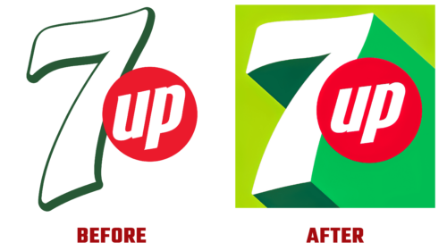
This spring, PepsiCo updated the logo for the world-famous lemon-lime drink 7up for the first time in seven years. From now on, it will have an even fresher and more modern look. All products of the given line underwent a change.
The bottles and cans now correspond to the new style with a predominance of green. The zesty citrus hues add extra brightness to them, making them eye-catching products even on standard store shelves. The update went into effect in March 2022. With its innovation, the company has several goals:
- active interaction with consumers;
- increasing the dynamics of static items;
- evoking positivity, uplift, and surprise;
- matching the new brand slogan.
Eric Melis, vice president of global marketing for 7Up, said the logo would remain in its signature green palette. But at the same time, it will increase with the addition of new citrus tones that will give the logo a bright and inspiring look. They will emphasize the freshness of the drink’s taste. Therefore, the brand retained the familiar UPliftment style.
The PepsiCo design and innovation team worked on the renewal of the visual identity. It found the edge that is reflected in different regions, cultures, and languages. The addition of crisp lines of high contrast conveys the sense of growing energy well.
The white seven is located in the background and serves as a favorable background for the rich red circle with contrasting “up” lettering. Diagonal lines extend downward from the edges of the number, forming an unusual green shadow. This is a desire for customers for the citrus beverage to bring them the long-awaited freshness.


