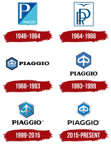
The elegant Piaggio logo symbolizes the pursuit of progress and continuous development. It reflects the true Italian spirit, which helps the company combine tradition and innovation in transportation. The emblem highlights the reliability of the vehicles and their modern design.
Piaggio: Brand overview
The tale of Piaggio, the legendary Italian company famous for its iconic Vespa scooters, weaves through over a century of innovation and transformation.
In 1884, Rinaldo Piaggio founded Piaggio & C. in Genoa, Italy, starting with the production of ship equipment. By 1915, Piaggio had shifted gears to aviation, producing aircraft engines and airplanes, securing its place as a leading aviation manufacturer through the 1920s and 1930s. In 1938, Enrico Piaggio, Rinaldo’s son, established a new factory in Pontedera, Tuscany, setting the stage for the next phase.
World War II bombings left Piaggio’s factories in ruins, but 1946 marked a pivotal moment. Enrico decided to diversify, and engineer Corradino D’Ascanio designed the Vespa scooter. This innovative scooter soon became a symbol of post-war Italy. By 1948, Vespa scooters were exported internationally, quickly gaining popularity worldwide.
The 1950s and 1960s saw Vespa sales soar, establishing the scooter as a cultural icon of freedom and Italian style. In 1964, Piaggio introduced the Ape, a three-wheeled utility scooter that became essential in Italy and beyond. Five years later, in 1969, Piaggio acquired the renowned Italian motorcycle brand Gilera, further expanding its market presence.
The 1980s brought financial challenges due to increased competition from Japanese manufacturers, leading to the sale of the company to the investment fund Morgan Grenfell in 1992. Roberto Colaninno, an Italian businessman, acquired a controlling stake in Piaggio in 1999, bringing the company back under Italian ownership. The early 2000s saw modernization efforts and product diversification, including acquiring brands like Aprilia and Moto Guzzi.
Piaggio went public in 2006, listing its shares on the Milan Stock Exchange. The 2010s were marked by global expansion, particularly in India and Southeast Asia. In 2018, Piaggio launched an electric version of the Vespa, continuing its tradition of innovation while focusing on sustainability.
Today, Piaggio Group is the largest European manufacturer of two-wheeled vehicles and a global industry leader. The company continues pushing boundaries with electric and hybrid technologies while maintaining its heritage and signature Italian flair.
Meaning and History
What is Piaggio?
This Italian company is known for producing scooters, motorcycles, and compact commercial vehicles. The company is widely known for its iconic Vespa scooters, which symbolize Italian design and mobility. Piaggio’s product range includes a variety of two-wheelers and small commercial vehicles, popular for their reliability, efficiency, and stylish design.
1946 – 1964
1946 was one of the most significant years in Piaggio’s history. That was when the company introduced its iconic Vespa scooter and began using the original logo, a quadrangular shield with a pointed base. This heraldic element highlights the rich heritage of a brand founded in 1884. It helps create an image of a premium and respected automobile manufacturer, fostering trust in the quality of its products.
The shield is outlined with a thin silver stripe and divided diagonally into two parts: dark blue and azure. The large white letter “P” is in the upper half, an abbreviation of the company’s full name. It is rendered in an elegant font with sharp serifs, giving it a light and airy appearance. This visual lightness and the chosen color palette reflect the company’s historical connection to producing airplanes and motorboats.
The lower part of the shield features the word “PIAGGIO.” The word consists of small but capital letters that are vertically stretched. Their smooth, streamlined shape creates a sense of dynamism, referring to moving vehicles and the rapidly developing company. After all, Piaggio pioneered an entire generation of European scooters with an inimitable design.
1964 – 1966
The Piaggio company changed its visual identity in 1964 when it split into Piaggio & C. (the former motorcycle division) and Rinaldo Piaggio Industrie Aeronautiche Meccaniche (an aircraft manufacturer). The logo belongs to the latter company and thus features a stylized airplane. It is depicted as a checkmark with two pointed lines on the sides, resembling a flying bird.
An elegant geometric sign is complemented by the monogram “RP” – a reference to entrepreneur Rinaldo Piaggio, who founded the company. The superimposed letters remain easily distinguishable due to the clear font, balanced line thickness, and thin, shortened serifs. The emblem harmoniously blends the past and the future:
- The “RP” monogram honors the brand’s origins.
- The stylized airplane reflects innovative technologies, progress, and rapid movement.
They are colored in dark blue and placed in a white rectangle with a matching dark blue border. This color scheme evokes the sky, purity, confidence, and reliability, aligning with the core values of the aircraft manufacturer. The rectangle symbolizes stability, structure, and a business-like approach.
1966 – 1993
1966, the company realized it needed a new logo oriented towards future products. Thus, the most famous Piaggio symbol, still in use today, was created: a white “leaf” placed in a blue hexagon. What appears to be a leaf is a stylized monogram of two mirrored “P” letters, referencing the brand name and its founder’s surname. This element resembles an inverted heart split in half by a long vertical line.
The emblem also reflects the main products that made Piaggio famous worldwide:
- Iconic Vespa scooters
- Three-wheeled Ape vehicles
“Vespa” translates to “wasp” in Italian, so the monogram of the two “P” letters is stylized to resemble a flying insect with large wings. The pointed top enhances the association with a wasp, known for its painful sting. In turn, the Italian word “Ape” means “bee.” It is represented as a hexagon, reminiscent of a honeycomb cell.
Designers added the brand name to the logo to show the connection between scooters, vehicles, and their manufacturers. It is written twice: below the wasp and next to the polygon. The same bold font appears whimsical in both instances due to smooth curves and rectangular serifs. The unique letter style matches the ergonomic shape of the vehicles and highlights their dynamic nature.
The emblem retains Piaggio’s traditional color scheme: blue and white. These colors were initially associated with the aviation industry, as the company used to produce airplanes. Over time, they became symbols of reliability and stability for all Italian manufacturers’ vehicles. Black has been added, reflecting power, luxury, and elegance.
1993 – 1999
In the early 1990s, Piaggio changed leadership, necessitating a new visual identity to reflect the company’s modernization. The result was a more balanced and clear logo that retained recognizable elements, ensuring the brand did not alienate its long-time customers.
A few minor changes were sufficient to give the emblem a clean and modern look.
- The stylized wasp appears harmonious due to its elongated vertical line and reduced wings. The visual balance adds a sense of lightness associated with the vehicles’ high speed.
- The black outline of the hexagon became much thinner, no longer weighing down the logo or distracting from the elements dedicated to Vespa scooters and Ape vehicles.
- The font retained its rectangular serifs but gained a clearer form, giving the brand name an impression of confidence, reliability, and professionalism.
1999 – 2015
In 1999, the company became a property of the Morgan Grenfell Fund. The new owner decided Piaggio needed a modern identity to reflect the brand’s transition into the next millennium. The updated logo achieved this goal, with a silver gradient giving it a stylish metallic shine.
The smooth gradient highlights the stylized wasp’s dynamism and emphasizes the hexagon’s balanced angles. This gradient texture creates an illusion of perfect smoothness, evoking a cool sensation associated with the automotive industry. It symbolizes innovative technologies, demonstrating the company’s commitment to progress.
To prevent the logo from appearing too dark, designers used a lighter shade of blue. This color conveys a sense of luxury and comfort that is familiar to everyone who drives Piaggio vehicles. Black, as usual, supports an aura of business elegance.
The new font made the brand name asymmetrical, as the rectangular serifs disappeared, leaving only one serif at the top corner of the “P.” This imbalance infuses the text with energy, accentuated by the contrasting stroke thickness.
2015 – today
The modern Piaggio logo reflects the company’s long history and pays homage to its origins when the first scooters began to appear on the market. The abstract symbol of a “leaf” enclosed in a hexagon honors two iconic vehicle models.
- The monogram of two “P” letters is stylized to resemble an insect with widely spread wings, alluding to the name of the Vespa scooter, which translates to “wasp.”
- The hexagon shape resembles a honeycomb cell dedicated to the three-wheeled Ape vehicles, as “Ape” means “bee” in Italian.
The new silver gradient is much lighter and more optimistic. Only the edges are darkened, making the wide border around the hexagon appear raised. The blue part of the logo also has a smooth gradient, creating a sense of movement. The three-dimensional texture evokes modern automotive industry technologies.
Designers reworked the lettering to balance it. They gave the “O” a square shape, sharpened the lone serif at the top of the “P,” and aligned the thickness of all the lines. The name Piaggio combines softness, which supports comfort and safety, with sharpness, conveying the dynamic nature of fast-moving vehicles.


