


 Pirateship.com Logo PNG
The Pirateship.com logo is extravagant. It shocks, just like the platform’s prices for shipping large and small packages with quick processing and instant label printing. The emblem shows that every user can “rob” an international freight carrier by choosing the most advantageous rate for themselves.
Pirate Ship began in 2014, when a group of e-commerce entrepreneurs set out to simplify shipping for small online businesses. Early development focused on a browser tool with rate comparison, label creation, and integration with USPS. By 2015, carrier agreements gave users discounted shipping prices that were difficult for small sellers to obtain independently.
In 2016, the platform added e-commerce integrations, automatic order imports, and faster label generation. A year later, Pirate Ship adopted a model without monthly charges or hidden fees, earning revenue from the gap between negotiated and retail carrier rates. That structure helped the company expand its user base among online shops and independent merchants.
The partner network widened in 2018 through an agreement with UPS, while updated pricing algorithms improved shipping estimates. In 2019, machine learning was introduced to predict delays and support route planning. During 2020, the company redesigned the interface, improved order management, and released a mobile app for handling shipments from smartphones.
International expansion began in 2021 through partnerships with overseas logistics providers. Predictive analytics followed in 2022, using past shipping data and market patterns to help users plan inventory, dispatches, and delivery schedules. By 2023, Pirate Ship had added more carriers and e-commerce integrations while continuing to provide domestic and international shipping tools for small businesses.
Meaning and History
What is Pirateship.com?
This is an innovative online platform that transforms shipping for both independent sellers and e-commerce businesses. With no monthly fees or commitments, this user-friendly service acts as an intermediary between shippers and major carriers, offering discounts on USPS, UPS, and other shipping services. The intuitive interface allows users to easily compare rates, print labels, and track items, streamlining the often complex world of shipping logistics. Popular e-commerce websites can seamlessly integrate with the platform, automating order fulfillment and saving busy vendors time. With features like address verification, the ability to create custom forms for international shipments, and comprehensive analytics, it provides users with the tools they need to manage shipping procedures efficiently.
2014 – 2023
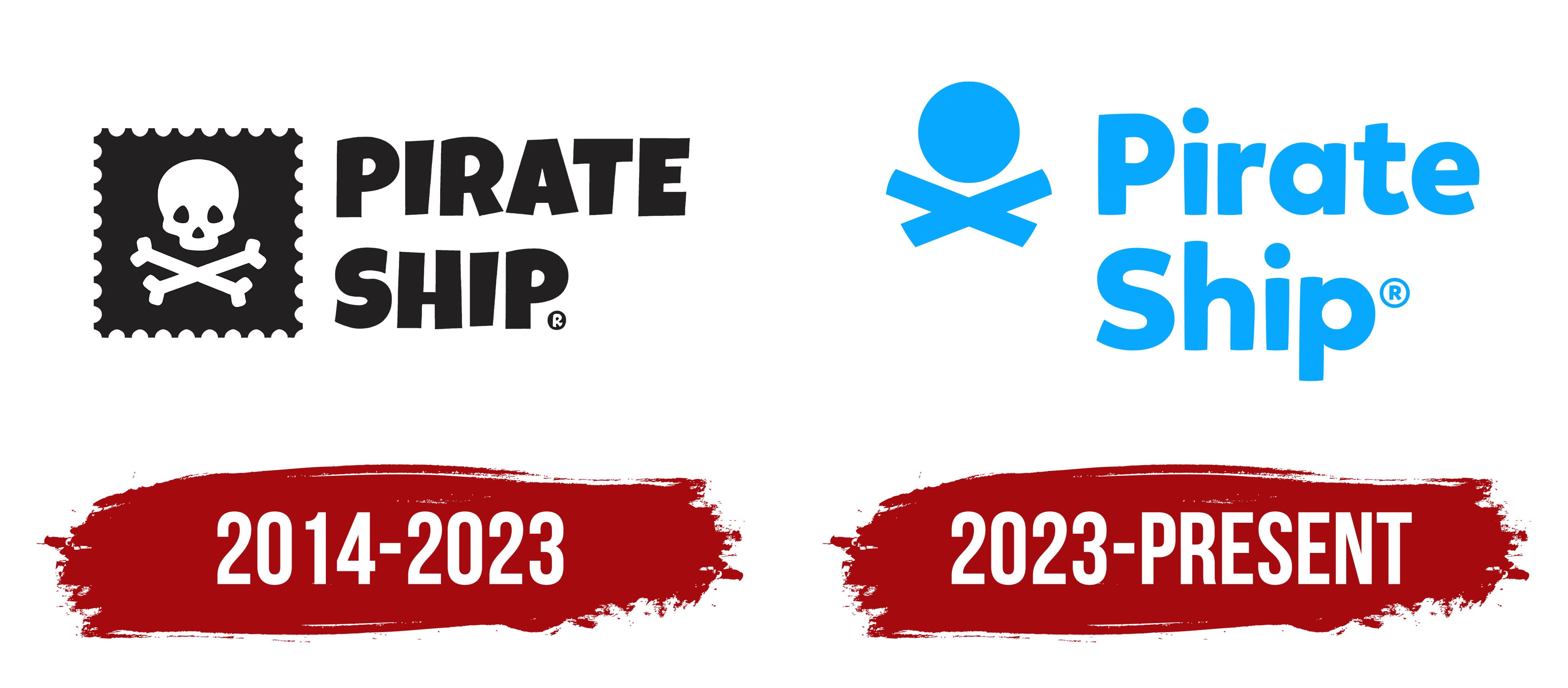
In developing its visual identity, the online service Pirateship.com relied entirely on its unique concept, which is why its logo looks unusual, even though the site offers standard services. Yet, its concept is incredibly intriguing: a pirate theme. This theme is connected to the company’s area of activity, which conceived such an interesting idea. The thematic emblem has a playful aspect, playing on associations with pirates.
How do they relate to this? It’s simple: the web resource doesn’t just offer services; it provides “adventures” with “looting,” meaning the search for the best rates for sending packages abroad. After all, a pirate also seeks favorable conditions and travels the world without significant expenses. Thus, the Pirateship.com logo suggests considerable benefits and competitive pricing for delivering packages to any corner of the planet. It also increases interest in the service, preventing it from “drowning” in a sea of similar offers. It effectively stands out among traditional companies in the logistics sector.
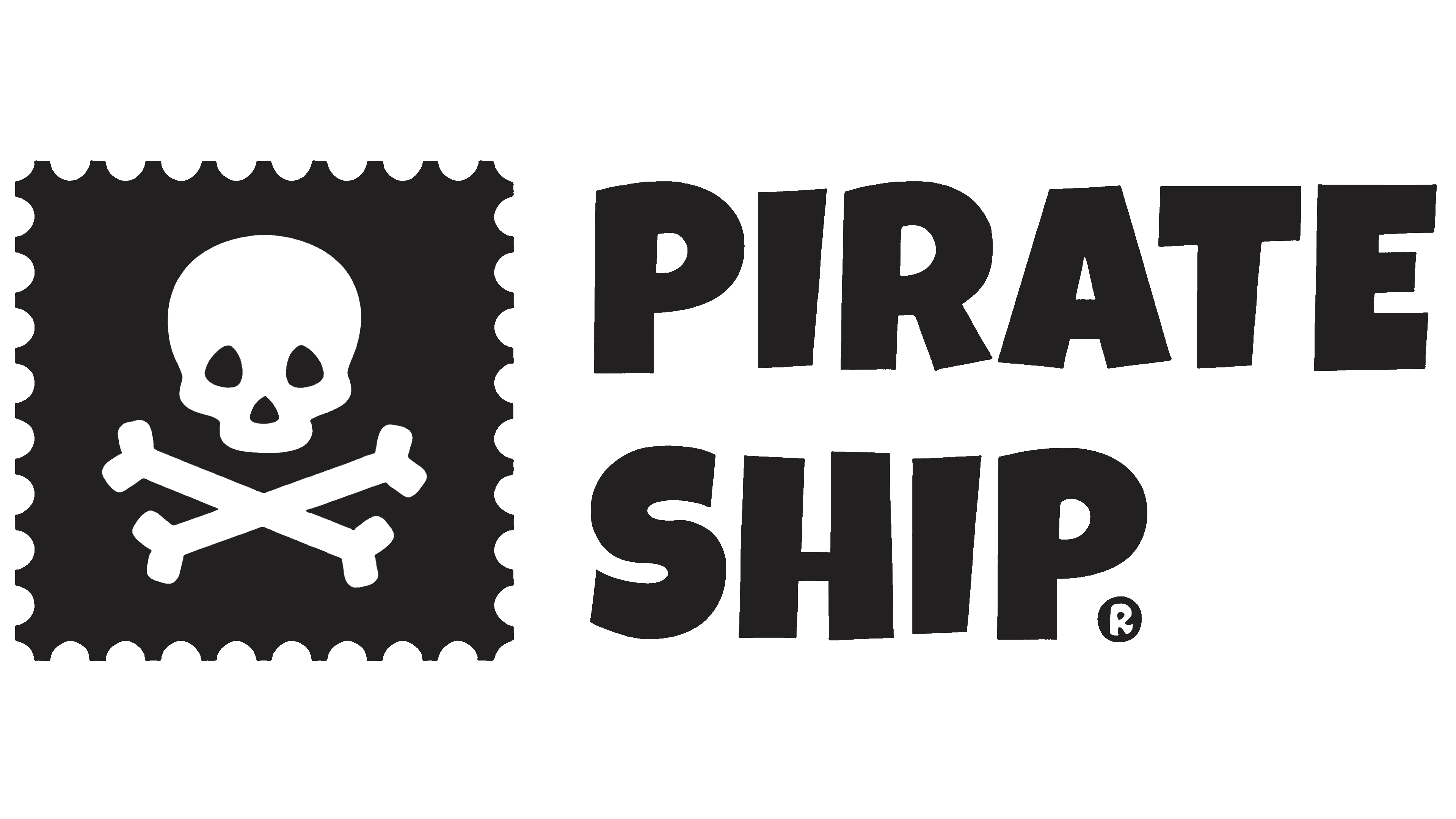
The emblem is a white rectangle, barely noticeable due to the contrasting elements. This is a well-thought-out design choice because the light background avoids any negative associations for users.
- On the left side is a pirate flag stylized as a square postage stamp. It’s black and, naturally, features a skull with two crossed bones. This is the only intimidating element in the identity. To soften its menacing appearance, the designers round the lower part of the skull, giving it a kind of smile. The other edges are also smooth and curved.
- The textual part is on the right side. It consists of a two-level inscription because, at the time, the package delivery service’s name was used in split format. The top line reads “Pirate,” and the bottom line reads “Ship.” They are set in an informal font that neutralizes the theme’s negative impression and highlights its clear advantages for users.
The extra-bold letters are unevenly arranged in the line, making them look bouncy: some have shortened strokes, while others are elongated. Overall, they create an atmosphere of playfulness and childhood, resembling a cartoon’s title more than a serious service’s branding. However, this works in the company’s favor and enhances its reputation.
Even though the letter spacing in the inscription is minimal, and the internal letter gaps are almost nonexistent, it reads well. The text is visible on any electronic device screen and retains letter clarity when scaled. This carries an element of playfulness and surprise, as the entire visual identity of Pirateship.com is based on contrast, leading to a light, pleasant shock, as the ability to compare rates delights customers.
2023 – today
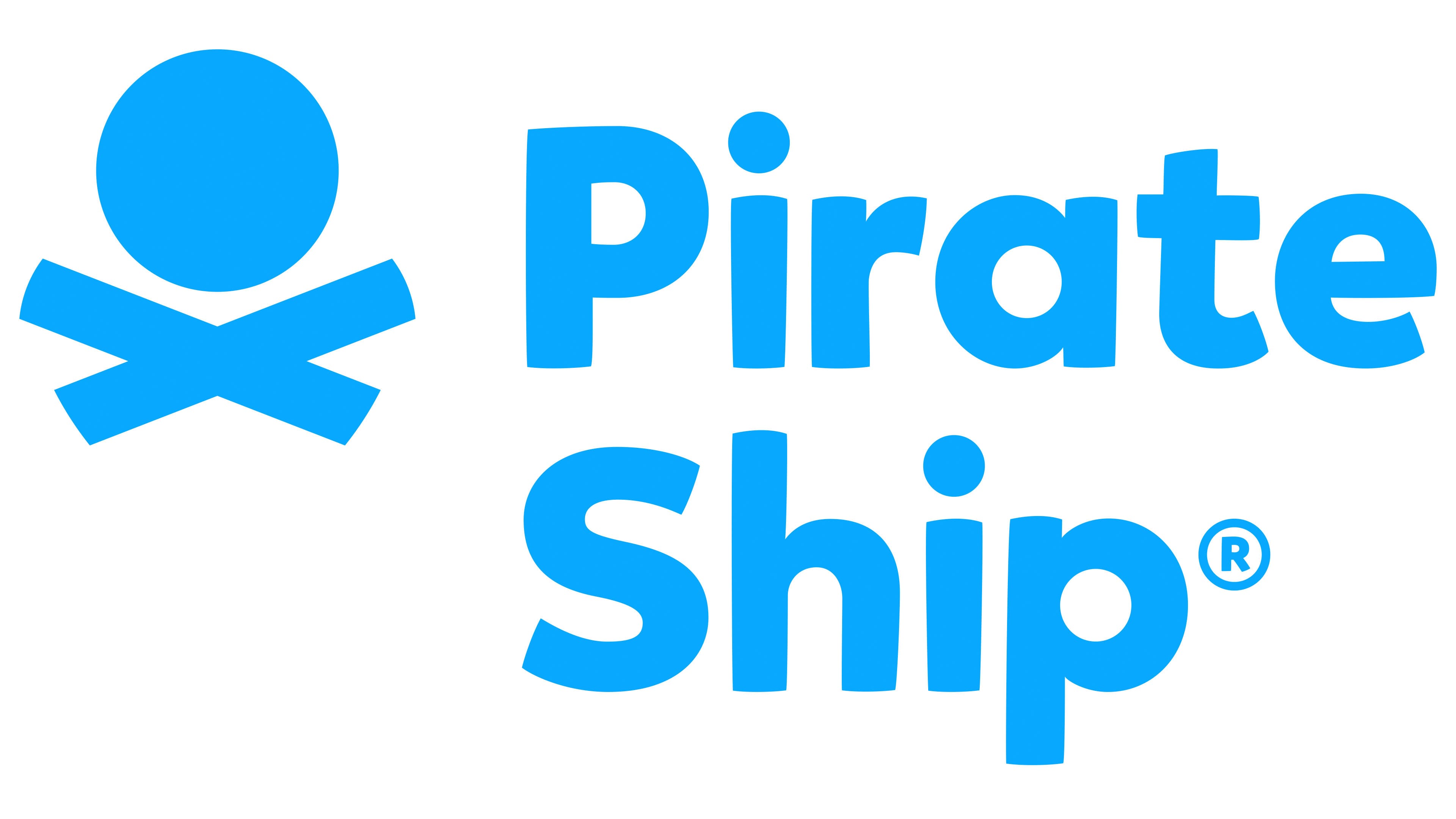
In this case, the Pirateship.com logo was partially rebranded: its appearance changed, but the concept and structure remained unchanged. This was done to make the visual identity more appealing, not to deter potential customers, since not everyone understands the connection between a pirate and an international parcel delivery service. After all, bones and a skull do not inspire confidence for everyone.
As a result, a less shocking logo was created, still exclusive and thematic, yet positive and attractive. The company decided to move away from the pirate flag, which fit perfectly into the concept but raised concerns about the fate of the shipped parcels. Therefore, after revising the emblem, designers updated it to remove any negative associations.
Instead of a skull, a circle is used, symbolizing an ordinary, classic head shape, hinting that the service uses its head to provide the best delivery conditions for an unlimited number of parcels. The neat geometric figure has well-defined edges, making it precise and contrasting. Below the circle are two wide, crossed lines with smooth-cut edges. In place of the bones, they resemble folded arms, which aligns with the website’s concept.
The text also changed. Only the two-level structure remained from the old version; everything else was significantly modernized. The company abandoned the childish and playful style, emphasizing seriousness and strictness. Thus, a matching font was chosen: sans-serif, even, and bold. Although most glyphs are lowercase, they are still imposing because of their wide strokes. To create a positive impression, the designers rounded every corner of every letter. This way, the online service Pirateship.com highlighted its services while preserving its original identity.