 PMI Logo PNG
The PMI logo reflects the commitment to efficiency, innovation, and organizational management, which underpin this international resource. It symbolizes precision and professionalism, helping individuals and companies achieve their goals. The emblem is associated with fostering leadership and introducing new approaches to project management. The organization started with the idea of creating a platform for knowledge sharing and professional growth, and its symbol has become a hallmark of significance in the global community, inspiring professionals to uphold high standards and achieve new milestones in their careers.
In 1969, James Snyder, Gordon Davis, Eric Jenett, A. E. “Ned” Engman, and Susan Gallagher met at Georgia Institute of Technology in Atlanta to discuss forming a professional body for project management. PMI was incorporated in Pennsylvania on October 9, 1969, as a nonprofit association with only a few dozen members and ambitions for an international network.
During the 1970s, PMI began organizing conferences and seminars for practitioners. Its first symposium took place in 1975. In 1984, the institute awarded the first Project Management Professional certification, known as PMP. Three years later, it published the first PMBOK Guide, which became a major reference for the profession.
PMI expanded abroad during the 1990s, opened international offices, and promoted common standards across national markets. In 1999, ANSI accredited the institute as an official standards developer. The Registered Education Provider program followed in 2002, and the Program Management Professional certification, or PgMP, was launched in 2006, when membership passed 200,000.
In 2011, PMI introduced the Agile Certified Practitioner certification as agile methods spread across the industry. From 2015 to 2020, it added standards, credentials, and digital learning programs. By 2022, PMI counted about 700,000 members in more than 185 countries. In 2023, it revised certification and training programs around digital transformation and expanded further in emerging countries.
Meaning and History
What is PMI?
This is a leading professional association in project management, offering certifications that set the benchmark for qualifications in this area and serving as a global authority on establishing industry standards and best practices. With more than 300 chapters in over 200 countries, the organization provides its members with extensive resources, including scholarly publications, professional development opportunities, networking, and access to the Project Management Body of Knowledge (PMBOK Guide), a critical resource for project management professionals worldwide.
Before 2019
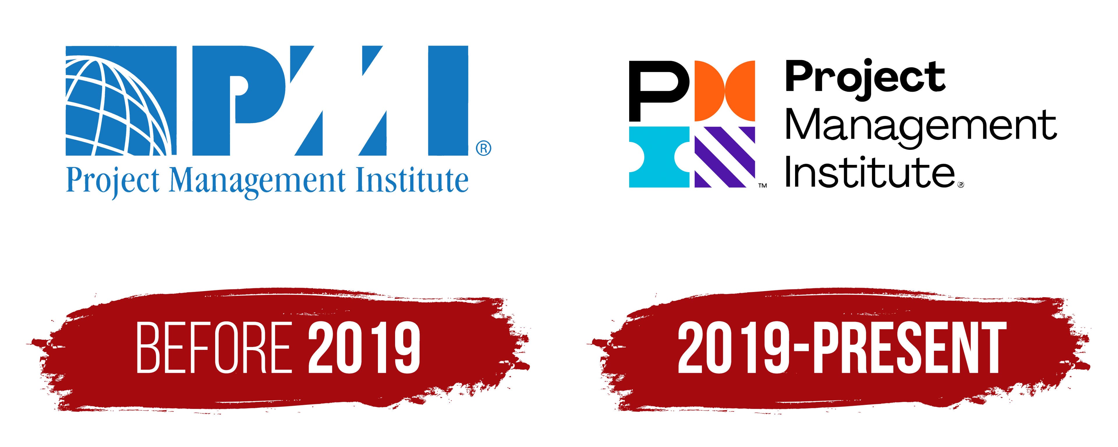
The PMI (Project Management Institute) logo, used until 2019, symbolizes professionalism and the global scope of this organization’s activities. It is designed in blue and is associated with reliability, stability, and trust. The color emphasizes the organization’s focus on establishing high standards in project management and providing long-term support to professionals worldwide.
The central element of the emblem is the abbreviation PMI, which occupies a significant portion of the composition. The letters’ font is bold and austere, without unnecessary details, imparting a sense of solidity. The letter “P” appears monolithic, with its rounded top creating a balanced visual design. The letter “M” is rendered in negative space, formed by triangles that symbolize goal achievement and ascend to the top. It reflects PMI’s core mission: to help professionals reach the pinnacle of their careers by enhancing their knowledge and skills.
The letter “I” is a simple rectangle, adding a sense of rigor and stability to the composition, underscoring the structured approach to project management that PMI advocates.
To the left of the abbreviation is a global figure, a hemisphere with a grid representing a globe. This element symbolizes the organization’s worldwide reach and dedication to creating a unified professional environment for project managers worldwide. The globe is intentionally placed next to the abbreviation to illustrate how PMI connects professionals from different corners of the world and establishes universal standards for all.
The inscription “Project Management Institute” is written in a classic serif font, adding seriousness and formality. This text is placed beneath the logo, neatly completing the composition and emphasizing the organization’s status as an institution that sets standards and certifications for the entire profession.
The name reflects the organization’s mission: an institute that unites and supports those dedicated to project management. Over the years, the company has grown into a leading global organization that provides certifications and tools to help professionals succeed in their careers.
2019 – today
In 2019, the organization celebrated its 50th anniversary by unveiling a refreshed logo that reflects a modern approach and global mission. The new design is fundamentally different from the previous one: it is brighter, bolder, and more visually diverse, highlighting PMI’s commitment to keeping pace with the times and adapting to the evolving needs of professionals.
The abbreviation PMI is now presented in a new style. Each letter is represented by an individual symbol, making the logo modular and allowing each element to function independently. The letter “P” is rendered in black and retains a classic appearance, symbolizing the reliability and professionalism that the organization has upheld over the years.
The next symbol, representing the letter “M,” consists of two bright orange semicircles resembling circular shapes. These symbolize dynamism and development. The orange adds energy and vibrancy to the composition, reflecting movement and a drive for change.
The letter “I” is depicted as two blue squares with rounded cutouts, resembling puzzle pieces. These elements convey that the organization helps create projects by finding the right solutions and bringing together the necessary resources. The blue color represents stability and calm, essential qualities in project management where a clear structure and confidence in every step are crucial.
The final symbol in the PMI emblem is a set of diagonal purple stripes. These lines cut diagonally through a square, giving the visual mark a sense of dynamism and strength. They symbolize upward movement and the drive to reach new heights. The purple color is associated with innovation and wisdom, emphasizing that the organization is at the forefront of project management, continually enhancing its approaches and standards.
The logo has become colorful and vibrant, reflecting PMI’s diversity and global reach as it works with professionals worldwide. Below the main symbols, the organization’s full name is displayed in a modern sans-serif font. This clean and simple typeface underscores accessibility and openness.
Each element of the Project Management Institute logo carries its meaning and functions as an independent symbol, emphasizing the organization’s flexibility and modularity of project management approaches. The logo conveys the institute’s core values: a global scope, dynamism, reliability, and a focus on innovative solutions.