


 Portland Sea Dogs Logo PNG
The Portland Sea Dogs logo symbolizes a baseball club founded from scratch and now deeply integrated into its city. The name reflects the team’s spirit and its connection to the maritime character of a region where sports became a daily routine.
The Portland Sea Dogs were created in 1992 after businessman Dan Burke secured a Double-A franchise for Portland, Maine. Residents selected the Sea Dogs name through a public contest, linking the club to the city’s coastal and maritime background. The team entered the Eastern League in 1994 as an affiliate of the Florida Marlins.
Portland played its first road game against the Reading Phillies and opened Hadlock Field against the Albany-Colonie Yankees. Hadlock Field stood downtown. Attendance exceeded expectations during the early seasons. The original affiliation lasted until 2002 and included pitcher Josh Beckett, who later reached the majors through the Marlins system.
In 2003, the Sea Dogs became affiliated with the Boston Red Sox, located about two hours from Portland. The club adopted red-and-blue uniforms, while Hadlock Field added the Maine Monster, a left-field wall modeled on Fenway Park’s Green Monster. Portland won its first Eastern League championship in 2006 by defeating the Akron Aeros in the final series. Games against the New Hampshire Fisher Cats formed a recurring New England rivalry within the Eastern League.
Jonathan Papelbon, Jacoby Ellsbury, and Mookie Betts passed through Portland before established careers in MLB. Betts later became a Los Angeles Dodgers player, while Papelbon and Ellsbury won World Series titles with Boston. Diamond Baseball Holdings assumed control in 2023. In 2024, the stadium was renamed Delta Dental Park at Hadlock Field.
Meaning and History
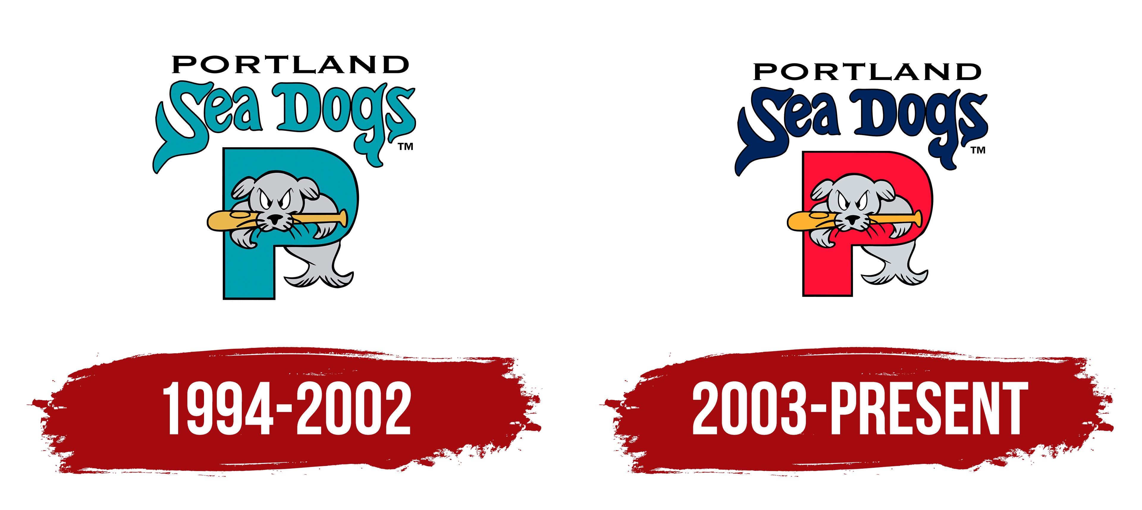
What is Portland Sea Dogs?
It is a baseball team from Maine, playing in the second-highest division in the US. The team’s name reflects local maritime traditions. The club is known for developing young, talented players. Local cuisine, including the famous lobster rolls, is popular at the home stadium.
1994 – 2002
When American cartoonist Guy Gilchrist was developing the identity for the Portland Sea Dogs baseball club, his initial concept featured a puffin, a bird native to coastal Maine. However, the club considered this image too weak for a sports competition and asked the artist to propose another character. Gilchrist returned with a new option. It was a bright, memorable image of a seal that earned the nickname “sea dog” and fit the team’s sporting style.
In the final version of the logo, a cartoon gray seal with a frown and long whiskers is depicted holding a yellow baseball bat in its mouth. The animal peers through an opening in a large turquoise letter “P,” emphasizing the city’s name, Portland. The letter is turquoise, outlined with a thin black contour that creates a dimensional effect.
At the top is a two-line inscription. The upper word “PORTLAND” is executed in a simple geometric typeface with thin black lines and resembles the well-known Optima font. On the second line is the word “Sea Dogs,” rendered in a turquoise shade with a black outline. The letters appear uneven, as if drawn by hand, with soft contours and wavy forms reminiscent of marine motifs.
The entire composition appears light, ironic, and illustrative, as is common in minor American sports leagues. The character evokes sympathy and a smile. Turquoise, blue, black, and gray are associated with the region’s maritime theme and emphasize the club’s local identity.
2003 – today
In 2003, the Portland Sea Dogs baseball club updated its logo, once again created by Guy Gilchrist. The update changed the color and details, making the emblem brighter and more modern.
The letter “P” became a rich red. Inside the letter, as before, is a gray seal with a baseball bat firmly clenched in its teeth. The animal did not change and conveys the team’s competitive mindset.
The inscription Sea Dogs is now executed in dark blue. The letters, as before, have unusual curves resembling sea-animal tails, further strengthening the thematic connection to the ocean and coastal areas.
As a result of the changes, the composition retained all the key features and elements of the logo’s first version. The style became more saturated, and the seal’s image reinforced the club’s sporting character.
Font and Colors

The logo uses bright colors. Red symbolizes activity and competitive spirit, while dark blue evokes the ocean’s proximity and Portland’s port heritage. Black is used as an additional element to emphasize contours and typographic details.
Although the seal’s gray tone is not officially part of the club’s colors, its inclusion is justified by artistic necessity. It visually softens the composition, complementing the bright shades with a calm balance. The golden baseball bat adds lightness and brightness, making the central image lively.
The name “Sea Dogs” is set in a unique, handcrafted typeface. Its forms are rounded, with individual details. The letters S and G resemble the silhouettes of seal tails.
At the top is the inscription “PORTLAND,” set in the Copperplate Gothic typeface.