Proximus: Brand overview
Emerging in 1994 as a joint venture between Belgacom with a 75% stake and AirTouch with a 25% stake, Proximus marked its entry into the telecommunications industry. AirTouch subsequently became part of Vodafone through a merger. In 2004, Proximus went public, but Belgian telecommunications company Belgacom retained its controlling stake. Two years later, Belgacom fully absorbed Vodafone’s stake, consolidating its ownership.
Over time, Proximus significantly expanded its business and began offering various telecommunications services such as mobile, internet connectivity, television, etc. These services were provided under different brands such as Proximus Mobile, Scarlet, Telindus, and Tango. In 2014, Belgacom took an important branding step by unifying its various brands under the name Proximus Group.
Starting in 2016, the company committed €3 billion over ten years to build fiber networks across Belgium. Proximus Group is now Belgium’s largest telecommunications operator and is largely owned by the Belgian government. The corporation continues to develop its digital capabilities, fiber network, and 5G services.
Proximus has evolved since the 1990s as a joint venture to become Belgium’s leading telecommunications operator. The company has consistently invested in state-of-the-art networks and diversified its suite of brands, eventually consolidating them under the Proximus Group umbrella, of which the Belgian government remains the majority shareholder.
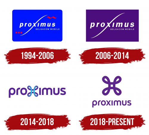
Meaning and History
1994 – 2006
2006 – 2014
2014 – 2018
2018 – today
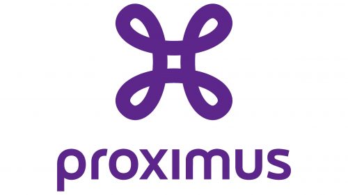
To emphasize its involvement in telecommunications, the Belgian mobile operator uses a visual identity that hints at the network. These are stylized wires connected in an endless bundle with no beginning or end, reminiscent of a Mobius strip. The icon consists of four loops, one in each corner and a tiny square in the center. Underneath is the company name, typed in block letters. Almost all the letters are rounded (except for the “x” and “i”), lowercase, and soft, which creates a friendly image. Both the glyphs and the unique symbol are colored purple.
The purple color adds creativity and imagination to the symbol, making you take notice. The loops at the corners are reminiscent of an endless path, making it clear that they are always in touch and always around. The tiny square in the center is like the heart of the whole picture, ensuring communication and smooth operation.
Proximus color codes
| Rebecca Purple | Hex color: | #562495 |
|---|---|---|
| RGB: | 98 36 149 | |
| CMYK: | 42 76 0 42 | |
| Pantone: | PMS 267 C |
| Blizzard Blue | Hex color: | #27c1e4 |
|---|---|---|
| RGB: | 39 193 228 | |
| CMYK: | 83 15 0 11 | |
| Pantone: | PMS 3125 C |
