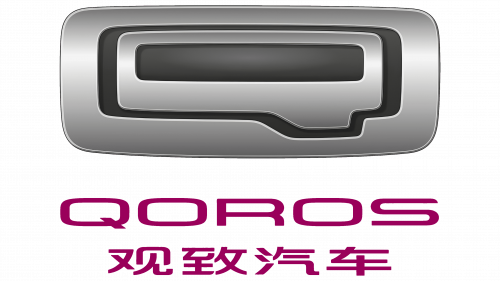
The Qoros logo is silver with a metallic sheen, making it an ideal car emblem. It adorns the entire model range, distinguishing it from other brands’ products. Despite its minimalist appearance, the stylish emblem stands out with its modernity and progressiveness.
Qoros: Brand overview
The tale of this company begins with a bold vision: to merge Chinese manufacturing prowess with European design and quality. This ambitious joint venture, founded in December 2007 by Chery Automobile and Israel Corporation, later known as Kenon Holdings, set out to create a car brand capable of competing globally.
By 2011, the venture was named Qoros Auto Co., Ltd., symbolizing their commitment to excellence and innovation. The real action started in 2013 when the brand introduced its first model, the Qoros 3 sedan, at the Geneva Motor Show. This debut was praised, particularly for its safety features, earning high ratings from Euro NCAP and establishing a solid reputation for the brand.
In 2014, the company began selling the Qoros 3 in China and select European markets, expanding its lineup with the Qoros 3 hatchback to attract a wider audience. They ventured into the SUV market the following year with the Qoros 5 crossover. Despite strategic expansions, 2016 brought financial challenges due to lower-than-expected sales.
To stabilize, the Baoneng Group acquired a controlling stake in the company in 2017, providing crucial financial support. In 2018, the brand showcased its innovative spirit with the Mile 1 electric crossover concept, marking its entry into the electric vehicle market.
By 2019, the company shifted focus primarily to the Chinese market, halting most export operations to strengthen its domestic presence. In 2020, they announced ambitious plans to develop electric vehicles, aligning with global trends toward sustainable transportation.
The year 2021 saw the brand continue developing new models, including electric vehicles, adapting to the evolving automotive world. The company endeavored to create an international brand that married Chinese efficiency with European quality.
Meaning and History
What is Qoros?
It is a Chinese automobile company known for producing stylish cars. The brand strives to combine European design and engineering standards with Chinese efficiency and manufacturing capabilities. The cars are known for their modern aesthetics, advanced technology, and robust safety features. The company specializes in supplying premium vehicles serving domestic and international markets, aiming to compete with established global automotive brands.
2007 – today
Expression, mirrored in the Qoros logo, sparks a response, as it represents the most modern form of transportation – electric vehicles. The emblem has many unique features related to this type of technology. The most striking is the metallic texture, achieved through a combination of shadows and highlights on a gray background. The result of the designer’s efforts is silver – magnificent, charismatic, and noble.
Silvery hues are crucial to this brand’s visual identity, which aims to transcend national borders and become an international trademark. To achieve this, the manufacturer has focused on the technical content and innovative nature of the vehicles, as well as the appearance of the logo adorning them. A positive image is a powerful driver of commerce and helps rapidly recognize products.
The emblem’s shape is simple – a horizontal rectangle with rounded corners. However, its simplicity ends there, as inside the clear geometric figure lies a multi-layered world that requires decoding. It reflects:
- The brand name was originally composed of letters with similar features captured by the designers.
- The car’s windshield is harmoniously placed in the center of the rectangle.
- The rearview mirror is compactly integrated into a single structure with similarly shaped glyphs.
- The standard handle block assembly is typically found on every car door.
- The first letter of the company’s name is balanced by elements that echo its contours.
All this is crowned with a chrome texture, emphasizing the presence of metal. With this feature, the manufacturer successfully conveyed the idea of car manufacturing and highlighted the high quality of electric vehicles, their excellent degree of protection, and passenger safety.
All the letters are rectangular, squat, horizontally elongated, with rounded corners. They differ in the intensity of the gray color, which creates the outlines of the glyphs. The “Q” stands out with a characteristic elongation on the right. In this case, the descending tail is larger and wider than it is.
However, the sign’s readability is poor. The name becomes clear when looking at the lower part of the emblem, where inscriptions in two languages, English and Chinese, are located. The letters in the English version are rectangular, horizontal, and wide, with softened corners. However, this effect could not be achieved in the hieroglyphs due to the specifics of their writing. Both lines are colored in dark purple, symbolizing sincerity, trust, and friendship. It creates a sense of confidence and harmony with the surrounding world.


