


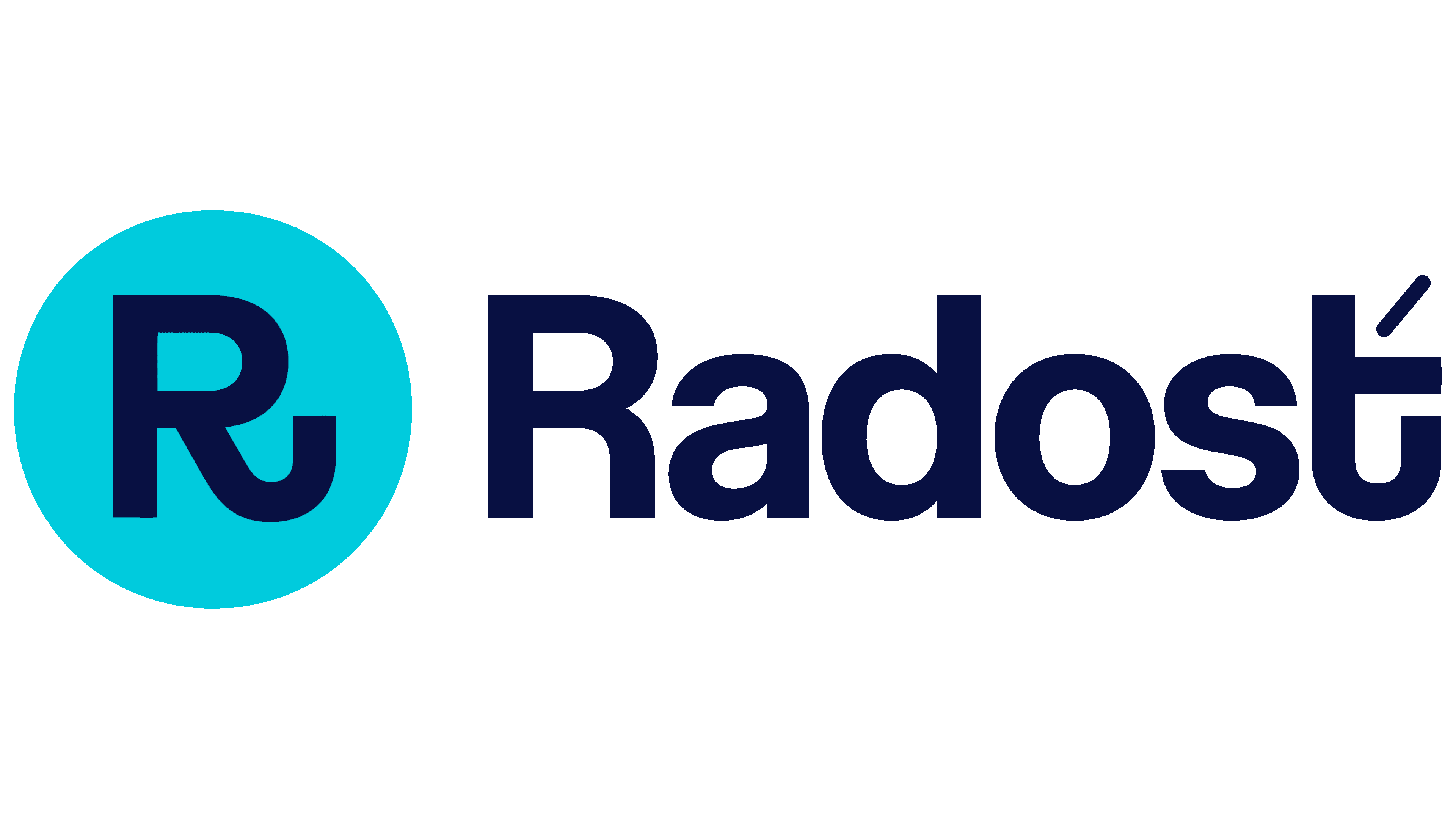
Radosť updated its identity to reflect changes in its customers’ lives. Over its first 5 years, the Slovak mobile operator’s audience had grown up, prompting a rethink of branding built around childlike illustrations. Bratislava-based agency Echt Brands retained the rounded lettering and turquoise color while reworking the logo and digital services. The new identity debuted in a May 2026 campaign.
Radosť launched in 2020 as a digital sub-brand of O2 Slovakia. Customers sign up, manage services, and pay their bills through an app. The name means “joy” in Slovak. The updated identity connects that idea with the convenience of everyday communication. For customers navigating their first jobs, apartment rentals, and loans, the service aims to help with daily practical needs.
Inconsistencies across the brand’s growing collection of materials also prompted the update. The team identified problems with color combinations and design consistency. Echt Brands needed shared guidelines for digital services and information design while preserving the brand’s humor and informal tone. Ondrej Kořínek handled positioning, Maroš Ľuba served as creative director, and Ester Lysá developed the identity. Majdži Baťová led the project on the client side.
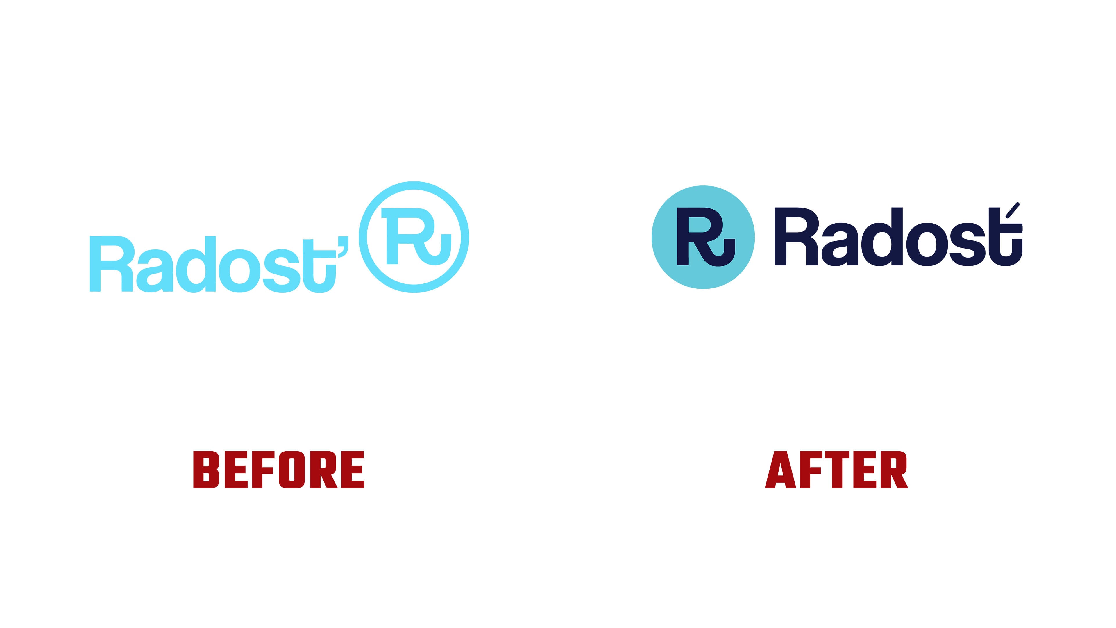
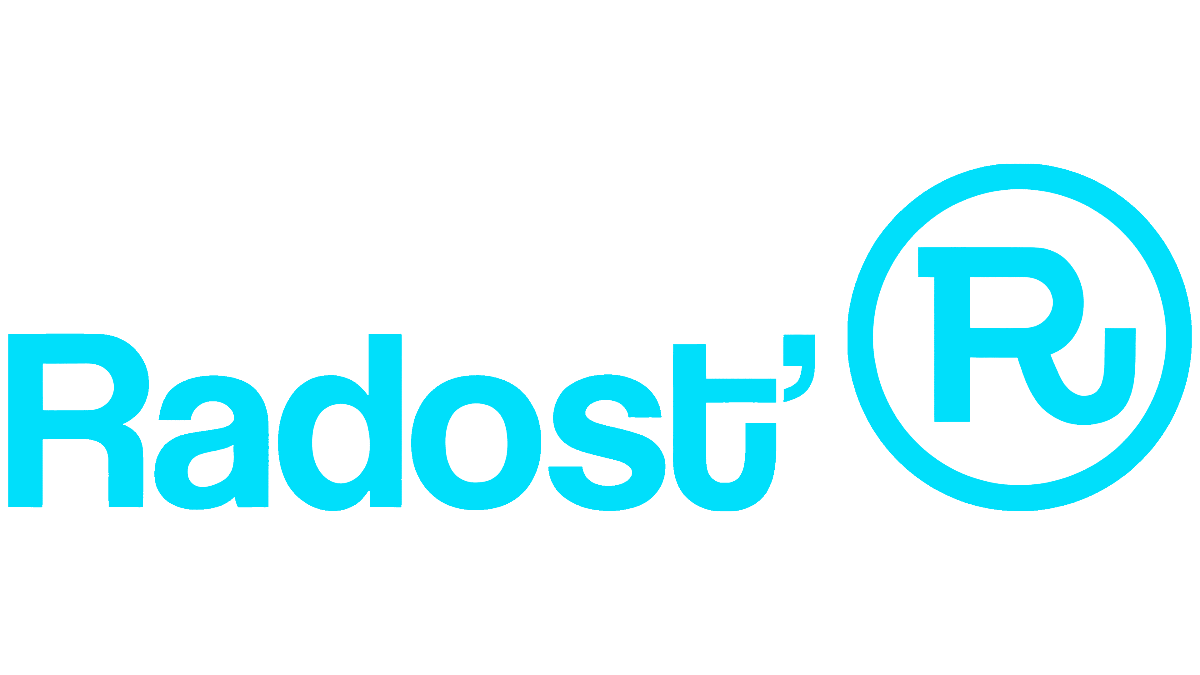
The symbol moved within the logo. Previously, an outlined circle containing a stylized “R” sat to the right, rising above the name. It now sits to the left, aligned with the wordmark. The outline became a solid turquoise disc, and the lettering changed to dark blue. The two components are now similar in size, forming a horizontal arrangement.
The name retains its capital “R,” lowercase “adosť,” heavy strokes, and rounded bowls. The designers refined the letter proportions and changed the terminals. The curved “ť” remains at the end of the word. Its lower stroke extends to the right and turns upward, forming a U-shaped curve. A thin, slanted diacritical mark now sits above the letter, replacing the heavy, angular shape that resembled an apostrophe.
A similar curve appears in the “R” monogram, connecting the symbol to the name’s final letter. The upturned terminal suggests a smile and reinforces Radosť’s meaning. The designers smoothed the transitions between angular and rounded sections of the monogram, reducing the number of projections. The app icon places a dark blue “R” inside a light-colored circle on a turquoise background.
Ondrej Jób created a custom typeface for the supporting text. The curved “ť” reappears in headlines, extending a detail from the logo into larger text. Heavy sans-serif letters are paired with fine diacritics and punctuation. This contrast in stroke weight adds subtle accents to the bold typography.
Confetti remains part of the identity. It now serves as a backdrop for text and appears throughout the materials as colored fragments. The website and app received a shared component system, shorter explanations, and redesigned screen layouts. O2 published the official announcement on June 29, 2026. By then, the updated onboarding screens were already available on iOS, with the Android release planned for early July.