


 Rammstein Logo PNG
Rammstein’s logo resembles a doctor’s office sign, promising healing of both the soul and the body through the band’s music. The emblem represents a band with profound, meaningful artistry that addresses complex societal issues.
Rammstein originated in East Germany after the fall of the Berlin Wall, formed by musicians from the former GDR underground scene. Members included Till Lindemann, Richard Kruspe, Paul Landers, Christoph Schneider, Christian “Flake” Lorenz, and Oliver Riedel. Several of them previously played in East German punk projects, such as Feeling B, which was active during the final years of the GDR.
The band formed in Berlin in 1994 after guitarist Richard Kruspe assembled early demos and recruited Till Lindemann as vocalist. A breakthrough came after winning a local band contest, which provided studio recording time and led to the formation of the final lineup. The name Rammstein was derived from the Ramstein Air Base incident of 1988. It had already been used informally by members in earlier projects. The group signed with Motor Music for a multi-album deal.
The debut album “Herzeleid” (1995) was recorded with producer Jacob Hellner at Polar Studios in Sweden. The sound combined industrial metal and electronic elements, placing the band in the same European scene as Oomph!. International attention increased after Nine Inch Nails founder Trent Reznor included tracks from the band in the 1997 film “Lost Highway”.
The album “Sehnsucht” (1997) brought global recognition through the single “Du Hast”. It became the first German-language album certified platinum by the RIAA. Later releases, “Mutter” (2001), “Liebe ist für alle da” (2009), and “Rammstein” (2019), expanded international chart presence, including number-one positions in multiple countries. In 2019, the album reached number one on the UK Albums Chart, followed by the 2022 release “Zeit”, which continued the band’s presence in global rock markets.
Meaning and History
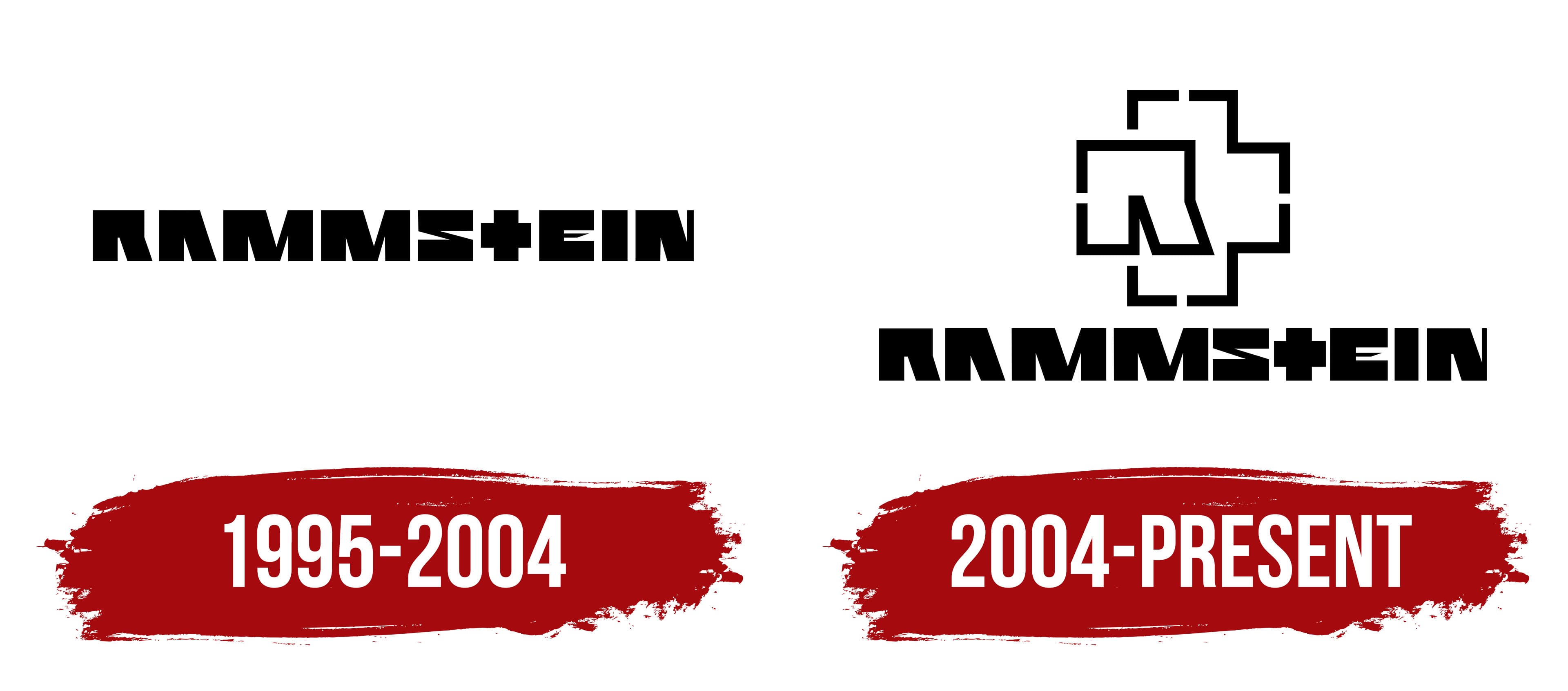
Over a thirty-year career, the musicians have changed their logo twice. Both were designed by German photographer and designer Dirk Rudolph. The artist tried to convey the performers’ spirit and musical style in the design. The emblems exude a heaviness offset by very light and sharp strokes. This combination reflects a massive sound, complemented by refined hints and references to well-known poetry and prose.
What is Rammstein?
A German band whose honor an asteroid is named after and whose artistry has been the subject of a book, yet whose artistry hasn’t garnered major music awards, is a notable representative of industrial metal. Most songs have deep meanings, dedicated to real events or artistic works, but they are presented in controversial ways.
1995 – 2004

The band’s logo was designed for the first single, “Du riechst so gut,” and their debut album. The emblem consists of large, solid glyphs, which, like stone blocks, form something resembling the letters of the name. Thin elements of the symbols are omitted, and only the middle bar of the E resembles a needle.
The letter T is transformed into a cross, which, in the designer’s mind, is already present in the glyphs. According to Dirk Rudolph, the image of the cross is very strong and suits the band perfectly. The shape resembles a medical cross, but the image is often associated with symbols of Nazi Germany, which seems close to reality, especially since the band has ambiguous songs and shows reminiscent of the Nazis.
A particular scandal erupted after the release of the video for “Stripped,” which was banned from daytime viewing, and the band had to apologize for crossing the line.
The band’s name, which underpins the logo, is associated with Ramstein Air Base, where a famous air show took place. The musicians jokingly dubbed themselves Rammstein-Flugschau and couldn’t shake it. After a major tragedy at the show, in which 70 people died, the guys decided to distance themselves from the air base and came up with another explanation for the word Rammstein.
As if the name were taken from the stones placed on sidewalks to protect pedestrians from being run over. The word “battering stone” sounded powerful, solid, and harsh, matching the band’s style. Therefore, the fans kindly accepted this explanation.
2004 – today
The band’s brief symbol was designed for the album “Reise, Reise.” The image depicts the letter R as one side of a cross. The elements in the band’s name point to R and T and are meant to be associated with Rammstein. Echoing the album’s title, the cross resembles a crossroad.
Font and Colors
Black is the predominant color in the group’s emblems. It alludes to heavy music and theatrical stage shows accompanying the artists’ performances. The dark shade also speaks of lyrics that tread on the edge of morality. A striking example is Sehnsucht’s second album, which delves into perverse desires, as well as the music video for the song “Pussy.”
The font of the name is unique, with even and hefty letters. The glyphs hint at the deep bass riffs. Each element of the inscription resembles the previous one, suggesting a consistent rhythm in songs, which is why the musicians refer to their style as Tanzmetall.