The Raytheon logo is made in a rather original style. Its format is atypical for this field of activity. The design is more like the design of logos used by IT companies. But this also makes sense since Raytheon is developing a wide range of equipment based on microchips and special programs. The features of the company’s activities are reflected in the emblem through several components at once, which are harmoniously combined and create a balanced visual image of the enterprise.
Raytheon: Brand overview
| Founded: | July 7, 1922 – April 3, 2020 (Raytheon); 2020 (Raytheon Technologies) |
| Founder: | Vannevar Bush, Laurence K. Marshall, Charles G. Smith |
| Headquarters: | Arlington, Virginia, U.S. |
| Website: | rtx.com |
Raytheon is one of the largest American manufacturers with a military-industrial specialization. Permanently, the firm provides equipment and weapons to the United States armed forces and countries with the status of allies. High achievements are recognized at the state level. The company is one of the “Big Three” suppliers of US military equipment.
Raytheon is the largest supplier of military developments and weapons at the state level. He creates the basis of the American military-industrial complex with the two giants, Lockheed Martin and Boeing. The modern Patriot air defense systems and the Stinger MANPADS are among the most famous developments. In addition, the manufacturer is engaged in manufacturing navigators, pocket radios, radars, and missiles.
Meaning and History
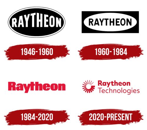
Raytheon went through different periods throughout its run. This was noticeable at the level of visual identity. During its existence, the company has repeatedly changed its emblems, which had significant differences. Early versions were austere and restrained, while later versions were designed in an energetic, bright format.
What is Raytheon?
Raytheon is a well-known American company operating in the field of weapons and military equipment. The assortment includes missiles, radars, anti-aircraft missile systems, and other military equipment. The main office is located in Massachusetts. Deliveries of products are carried out directly to the armed forces of the United States and its allies. Therefore, most of the company’s income is provided by government defense orders.
1946 – 1960
Raytheon was founded in 1922. The company was called the American Appliance Company and produced various types of consumer electronics. Over time, it has undergone significant changes in production and direction of activity, which became a prerequisite for forming modern Raytheon. The process gave results in 1946 when the company took up developments of a military nature. It was in this year that the first official logo appeared.
The badge was a rather discreet emblem decorated with classic colors. It was based on an elongated oval, inside which there was a large verbal sign in the form of a name. For its design, a straight geometric font without serifs was used. In general, this format was unremarkable. But, the designers were able to add originality to the picture.
This was done by stretching the letters in the icon’s central part. If you look closely at the inscription in this format, you can see a stylized figure of the house. The picture has a special meaning, which is protection and reliability. It is for these purposes that the company manufactures military equipment and weapons.
Another Raytheon principle was expressed through stylish colors that perfectly matched the field of activity. The black color used for the background denoted authority, solid status, and strength. White was chosen for the letters and outlines of the frame. This color symbolizes responsibility, which is very important in the production process of such products.
1960 – 1984
In 1960 it became necessary to update the Raytheon corporate identity. The new version retains the common features of the visual concept, but the content has changed significantly. The frame became more complex, symbolizing the expansion of production and the addition of new positions in the company’s assortment. It was a rectangle, inside of which there was an oval with a clearly defined brand name.
The font style was different from its predecessor. The presented logo was distinguished by more elegant and thin lines and stylish modifications in some letters. The coloring has remained the same. But, in this version, the letters are black, and the background of the oval is white. The new design showed the developing brand’s progress, improvement, and power.
1984 – 2020
In 1984, management decided to change the visual concept radically. The result was a large striking logo that expressed energy, confidence, courage, and professionalism. These features can be seen in the wordmark’s colors and style. An important feature was also the complete absence of frames that were in the early versions.
The exclusion of these elements from the concept meant unlimited possibilities and progress. The company never rested on its laurels, and its developments became more and more perfect every year. Another innovation was a bright, bold coloring in red and white. She demonstrated active work, a desire for improvement, and incredible strength. The massive letters were made in ExtraBold format with elements similar to the Proceed Ultra Black style.
2020 – today
In 2020, a very important event happened for Raytheon – the merger with the large American company United Technologies was completed. The new formation was named Raytheon Technologies Corporation. The changes also affected the visual identity. The company got a beautiful multi-component logo, which symbolizes the beginning of a new period in the manufacturer’s development.
This is confirmed by an unusual icon that resembles a program download sign. It is located right next to the central element – the inscription Raytheon Technologies. The wordmark itself looks very neat and simple. The upper part is more massive, and thin, rounded lines distinguish the lower part. The color scheme has remained unchanged.
Font and Colors
The Raytheon logo is the perfect visual representation of a modern, fast-growing company open to new solutions. This is confirmed by the rich red coloring, with which the company boldly asserts itself on the market and a stylish straight sans-serif typeface. The wordmark focuses on the brand, and additional characteristics can be found in the design features.
The Raytheon Technologies inscription is located on two levels. This placement option was not chosen by chance. It shows Raytheon’s value, solid status, and important role in the merger process. To do this, the first part of the inscription is designed in a more massive thick font with original oblique cuts. But, the main feature is the predominance of rounded shapes, which demonstrates trust and reliability.
The lower character uses a thin, simple typeface without flashy features. The color scheme of the Raytheon logo includes classic white, associated with stability and tradition, and expressive red. This shade demonstrates power, progress, authority, and strength, which have become the basis of the company’s philosophy in recent years.
Raytheon color codes
| Fire Engine Red | Hex color: | #ce1126 |
|---|---|---|
| RGB: | 206 17 38 | |
| CMYK: | 0 92 82 19 | |
| Pantone: | PMS 185 C |
