


![]() Rebel Logo PNG
Rebel Logo PNG
The Rebel logo symbolizes a retail chain that offers sports equipment for practical and active individuals. It’s a brand for those who prioritize functionality over fashion trends, with a focus on sport and convenience.
The Rebel brand’s history began in 1985 with a small sports clothing and equipment store in a Sydney suburb. The company grew gradually, expanding its network throughout Australia, and went public on the ASX in 1993. In July 2001, Rebel was acquired by Australian retailer Harvey Norman, and in 2007, Archer Capital became the brand’s owner.
In 2011, Rebel joined Super Retail Group, a major player in Australia’s sports and leisure market. The following year, the brand rebranded, shortening its name to Rebel and adopting a minimalist logo featuring an inverted “e” and a black-and-yellow color scheme.
In 2017, Amart Sports stores were renamed Rebel, expanding the network to nearly 160 locations nationwide. Since 2020, the company has introduced the Rebel Customer Experience (RCX) format, featuring interactive zones, virtual games, and exclusive products from leading brands such as Nike and Adidas.
Today, Rebel operates over 160 stores across Australia, actively integrating digital technologies with its traditional retail operations.
Meaning and History
![]()
What is Rebel?
It is an Australian sporting goods retail chain selling clothing, footwear, and equipment from leading global brands. The first store opened in a Sydney suburb and gradually became the country’s largest national chain. The range encompasses all popular sports, from running to rugby, and includes its collections of activewear.
1995 – 2012
![]()
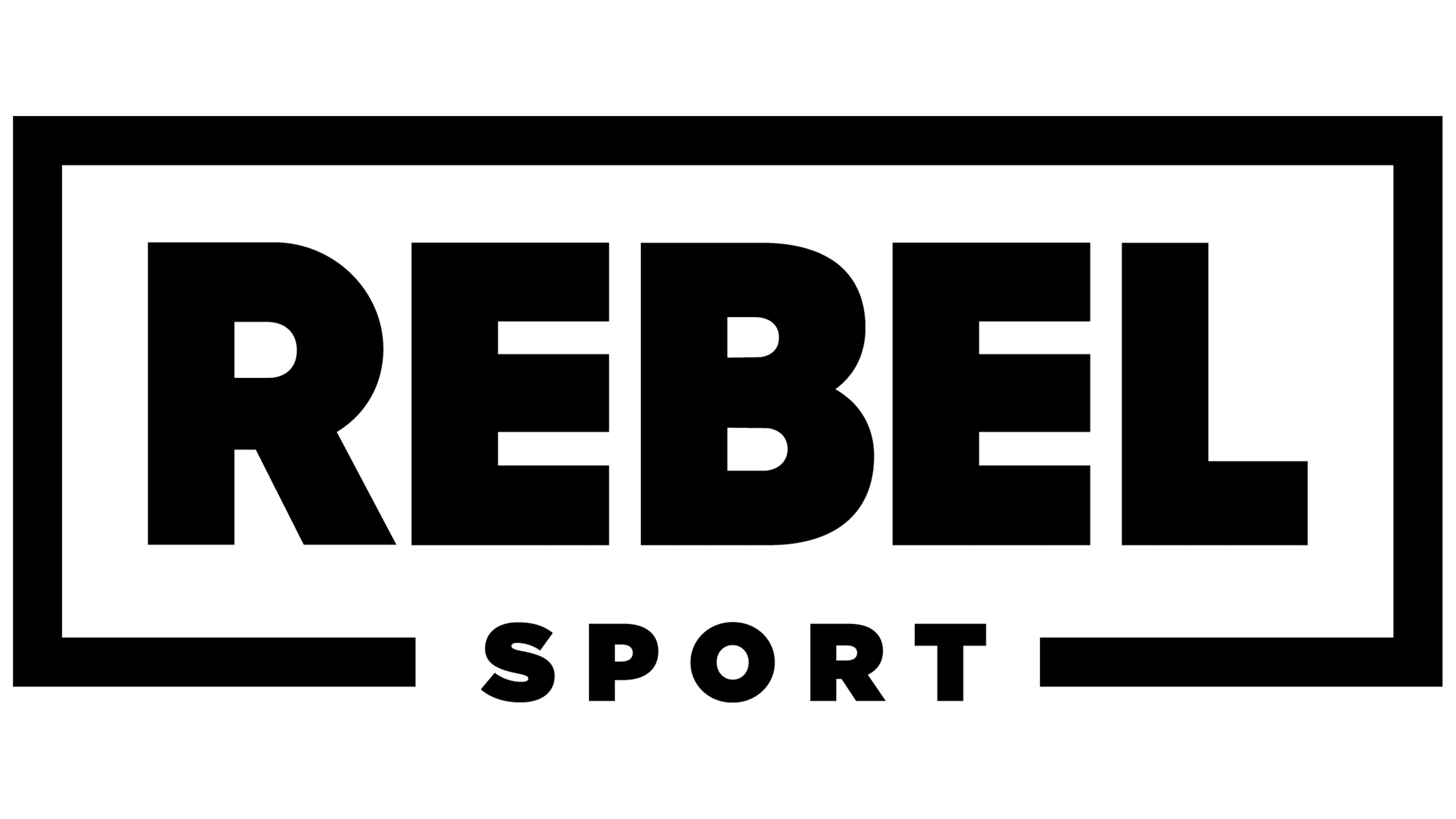
The Rebel Sport logo was a concise representation of an Australian sports goods retail chain, part of Super Retail Group Limited. Designers opted for a minimalist style to create a design suitable for a broad audience of athletes.
The primary symbol featured two rectangular blocks: the top block displayed “REBEL,” while the lower one displayed “SPORT.” The letters in “REBEL” were elongated and compressed, adding a sense of boldness. The typeface was strict, geometric, and highly contrasted, resembling classic sports typography from the 1990s.
The black-and-white color scheme emphasized the company’s reliability without excess. Avoiding bright colors, the brand opted for practicality and minimalism, reflecting its commitment to offering affordable sports products to true sports enthusiasts who value substance over appearance.
2012 – today
![]()
The logo of the Australian sports retailer Rebel, introduced in March 2012 as part of a rebranding, became central to the brand’s renewed identity. During this period, the word “Sport” was removed from the company’s name, simplifying it to the concise form “rebel.” The new emblem, designed by the Australian agency Hulsbosch, features a minimalist aesthetic combined with expressive form.
The foundation of the visual concept is a custom-designed sans-serif typeface characterized by bold, block-like letters and low stroke contrast. The font’s geometry consists of heavy, substantial letterforms with proportions similar to well-known typefaces such as Helvetica Neue or Gotham Black, but with unique adjustments to their contours. A notable design detail is the unconventional treatment of the letter “e,” which is reversed horizontally. This expressive choice symbolizes rebelliousness, challenging conventional norms, and embracing individuality. The inverted glyph captures attention and conveys associations of personal freedom and the competitive spirit inherent in sports.
The logo’s color palette is limited exclusively to black, sometimes complemented by a yellow background within the broader brand identity. The use of pure black lends seriousness, premium quality, and simplicity to the visual identity, aligning with the company’s strategic goal of occupying the high-quality segment of sports retail with an emphasis on style and individuality. Black reflects the minimalism and restraint characteristic of Australian aesthetics, reinforcing brand reliability.
The transition to the new style occurred gradually. Initially, the logo debuted at the flagship store in Sydney, and subsequently expanded across all locations, especially following the merger with Amart Sports in 2017. By that time, all 185 stores had fully adopted the new identity, making the emblem with the reversed letter “e” a recognizable element of Rebel’s visual language across Australia.
Font and Colors
After a significant rebranding, the company redesigned its entire visual identity. Lowercase characters replaced the original uppercase letters. Designers drew inspiration from typefaces such as Futura Bold or Gotham Black, but significantly adjusted their outlines. The flipped “e” creates a provocative impression, highlighting the brand’s individuality and boldness.
The color palette remains simple. Black supports the brand’s solid reputation, reinforcing the Australian sportswear retailer’s seriousness. This simplicity enhances the visual impact, drawing attention to the unconventional, reversed letter. Additional color variations are used sparingly, reserved mainly for special occasions or promotional campaigns.