


 Harris Teeter Logo PNG
The Harris Teeter logo invites customers to purchase fresh, high-quality products. The emblem emphasizes the brand’s respectability and premium level of service. With a rich history of market leadership, Harris Teeter offers its shoppers a complete range of products, ensuring they have everything needed for a full grocery basket.
Harris Teeter began in 1936, when William Thomas Harris and Willis L. Teeter opened Teeter’s Food Mart in Charlotte, North Carolina. In 1939, Harris opened Harris Super Market in the same city. Both stores became the base for a supermarket chain shaped by grocery retail, local customers, and steady service standards.
In 1950, Harris and Teeter combined their businesses under Harris Teeter Supermarkets, Inc. During the 1960s, the company expanded across North Carolina, opening new locations in nearby communities. In 1969, Ruddick Corporation acquired the chain and provided it with stronger financial backing to support further growth. In the 1970s, Harris Teeter expanded into Virginia and South Carolina, transitioning from a North Carolina operator to a regional grocery retailer.
The 1980s brought new checkout technology, including barcode scanning, as well as the development of private-label products. In the 1990s, Harris Teeter entered Florida and Georgia, improved store layouts, expanded employee training, and worked to strengthen service in established markets. During the 2000s, the company opened larger supermarkets, expanded its product range, and began offering online grocery ordering.
A major change came in 2013, when Kroger Co. acquired Harris Teeter for 2.5 billion dollars while keeping the brand and operations separate. From 2015 to 2023, the chain expanded its VIC loyalty program, delivery services, organic range, self-checkout, mobile payments, ExpressLane online shopping, AI-based inventory tools, private label meals, supply chain upgrades, distribution centers, and smaller urban store formats.
Meaning and History
What is Harris Teeter?
It is an American grocery company based primarily in the Southeast and Mid-Atlantic regions of the country. It is known for providing an elegant shopping experience and offers a wide selection of premium groceries, fresh produce, meats, seafood, and prepared delicacies. Stores often feature full-service departments, including bakeries, delis, pharmacies, and floral departments. The company emphasizes local, fresh goods, impeccable displays, and a commitment to providing excellent customer service. In addition, the brand offers a range of services, including fuel centers at select locations, online shopping with home delivery or in-store pickup, and a rewards program for loyal customers.
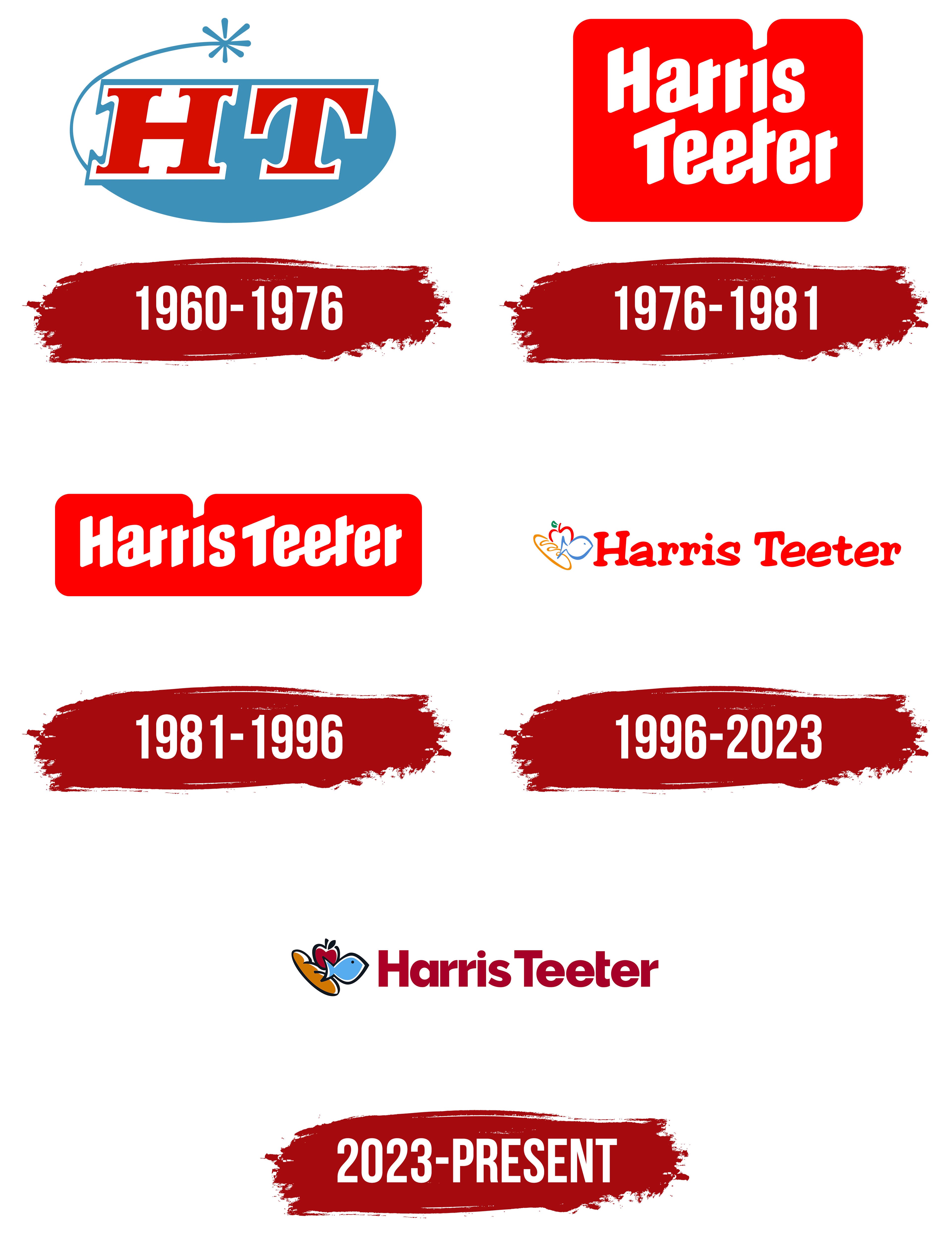
1960 – 1976
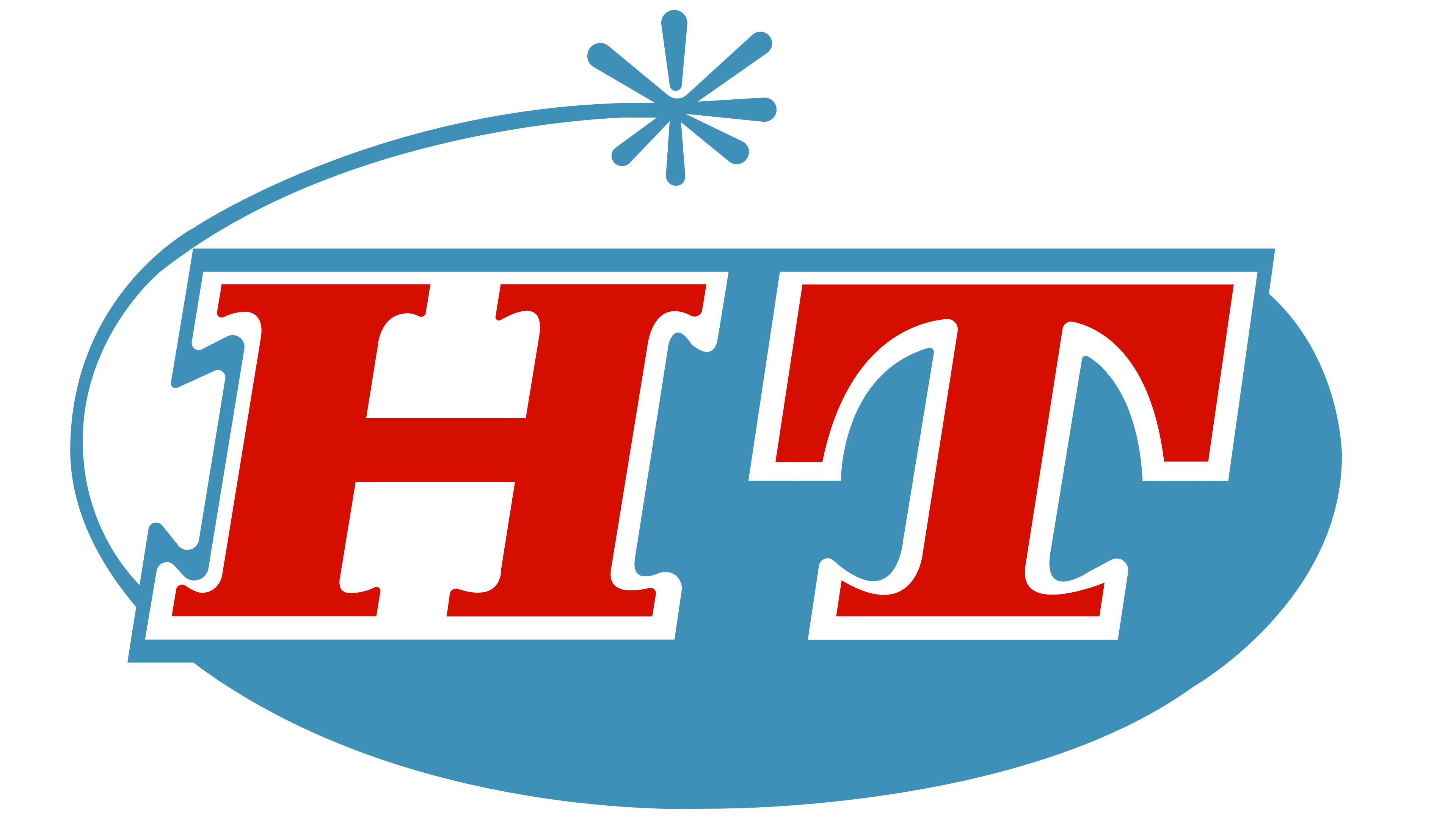
The first Harris Teeter emblem was designed as an incomplete oval, with two-thirds of it colored blue. The upper white portion was partially framed by a thin line that ended in a seven-petal figure. This figure symbolized:
- A Salute: A representation of the celebratory union of two independent businesses into a single network, signifying the ability to offer customers a significantly larger selection of products.
- A Flower: One of the founders owned a pharmacy chain, and the flower symbolized the herbs and medicinal mixtures now included in the store’s offerings.
At the center of the emblem were large red letters “H” and “T,” each representing the first initials of the founders’ last names: Harris and Teeter. On the white part of the oval, the letters were outlined in blue, blending with the background in the lower section, creating a sense of unity and merging. This design technique emphasized combining two businesses into a powerful partnership.
The bold red letters symbolized the significance and long history of each enterprise. Before the merger, Harris and Teeter stores were family businesses, with the founders’ relatives working in them, ensuring clear values and high service levels.
The addition of the salute reference and bold red letters made the emblem festive and celebratory, highlighting the importance of this merger and its positive impact on the brand.
1976 – 1981
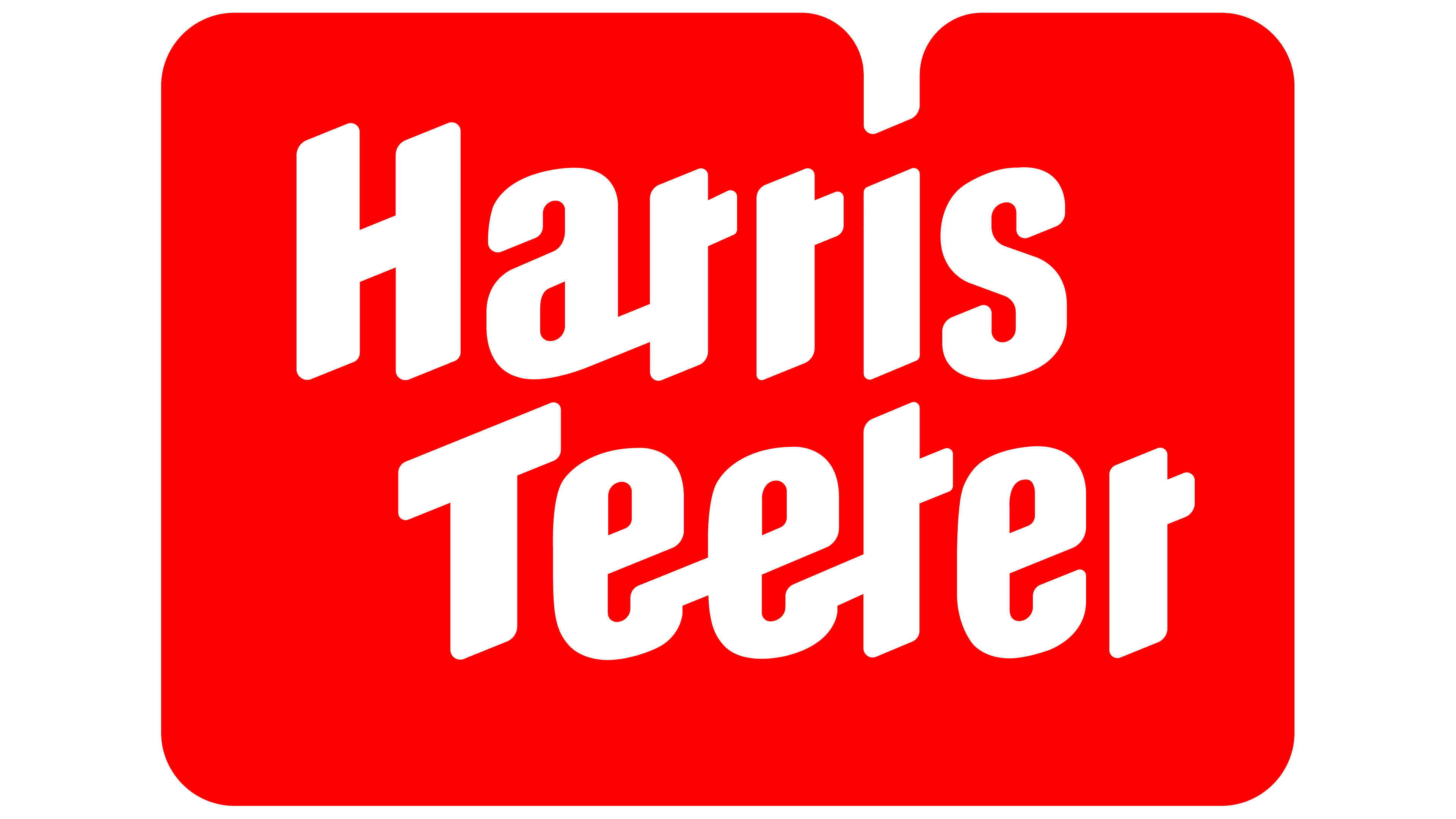
The emblem transformed into a shape resembling a red folder or a closed box, with a bright background that immediately catches the eye. This rich red shade symbolizes advanced technology and top-tier service. The name “Harris Teeter” is set at two levels in an italicized, left-slanted font, giving the logo a sense of dynamism and setting it apart from competitors.
The logo’s elements point to the company’s progressive approach and leadership in innovation. Harris Teeter became the first supermarket to allow customers to select and pack their groceries. They were also the first to extend store hours until 9 p.m. for customer convenience and install air conditioning in their stores.
Red emphasizes the company’s leadership, while white symbolizes innovation and commitment to high standards. The slant of the letters represents forward momentum, highlighting that Harris Teeter is focused on customer comfort and always ready to meet their needs.
1981 – 1996
The logo retains the theme of previous versions, with some changes that emphasize the brand’s evolution and its pursuit of simplicity and recognizability. The founders’ last names, Harris and Teeter, are now aligned in a single row, significantly altering the emblem’s visual perception. This decision made the logo more horizontal, simplifying its placement on store facades and allowing for longer signage rather than nearly square displays.
The red background of the emblem remains, symbolizing energy, determination, and passion, which aligns perfectly with the brand’s mission to provide its customers with quality products and services. The white font on the red background creates a contrast that makes the brand name easily readable and memorable. The font is slightly italicized, with soft, rounded lines, giving it a dynamic, modern look.
The emblem’s shape, with rounded corners and a small notch at the top, adds uniqueness and helps it stand out among competitors. This simple yet effective design choice highlights the brand’s friendliness and accessibility, which have always been key aspects of its image.
1996 – 2023
The red background, which had previously appeared too aggressive, was removed, and the brand name’s red letters were set in a new, softer font. A signature mark appeared in the upper left corner, highlighting the brand’s primary focus. These changes were made following the retirement of the last representative of the founding family.
The letters of the name became smoother, as if carefully written on a sheet of paper, making the brand feel more approachable and easier for customers to understand. The handwritten style symbolizes the supermarket’s accessibility and friendliness. The red color retained the idea of leadership, which was especially relevant in the 1990s when the chain was actively expanding across the U.S.
In the left corner of the logo, simple lines form images of key products: bread, an apple, and a fish, representing the main product categories: fruits and vegetables, groceries, and meat. Each element is colored, intended to convey the essence of the products. However, the designers made a mistake: the overall image resembles a butterfly, making it difficult to immediately understand what the emblem depicts.
2023 – today
In 2023, the brand underwent a rebranding, resulting in significant changes to the logo. The main update uses a new, more professional, uniform font. This step highlights the company’s professionalism and its commitment to meeting the industry’s high standards. The maroon color of the letters symbolizes stability, reliability, and the accumulated experience the brand can proudly boast over its many years of existence.
The symbol representing the main product categories, bread, fish, and an apple, was also redesigned. These product images feature a black outline with color fill, adding contrast and making them more striking. This design choice helps distinguish the image elements more clearly and enhances their visibility, making the logo more modern and easier to remember.
Amid growing market competition, the company aims to emphasize its expertise and high level of service. The updated logo reflects these aspirations, showing that the brand keeps pace with the times while remaining true to its core values.