 Kesko Logo PNG
Retail covers food, household goods, and building materials that people buy regularly. Stores combine product ranges and create a convenient shopping system for everyday needs. The Kesko logo represents a company that operates retail chains across Northern Europe and sells food, household goods, and home improvement products.
Kesko Oy was founded in 1940 after the merger of four regional wholesale cooperatives in Finland. This took place during World War II. The goal was to create a centralized supply system amid shortages. After 1945, the company helped rebuild the economy and develop the country’s trade infrastructure.
In the 1950s, Kesko expanded its warehouse network and opened distribution bases in industrial centers. The company followed the urbanization process. In 1960, the K-kauppa network was established, bringing independent entrepreneurs together under a single brand. In 1964, the company was listed on the Helsinki Stock Exchange and became a joint-stock company.
In the 1970s, the company began selling home goods and building materials. In 1985, the company opened its first hypermarket, Citymarket. In the 1990s, amid economic recession, the company optimized its business. In 1994, international expansion began. Kesko acquired a stake in the Norwegian chain Nordstjernen. In 1997, the company gained control of the Swedish firm Byggmakker.
In 2002, Kesko sold non-core assets and focused on grocery and construction retail. In 2005, the company entered the Baltic markets. After the 2008–2009 crisis, Kesko maintained stable operations. In 2010, it sold the Anttila chain and continued to focus on its key sectors.
In 2013, Kesko exited the Russian market. In 2015, the company sold its automotive division. In 2016, it reinvested in Byggmakker Group. In 2018, the company launched the online platform K-ruoka.fi. In 2019, the company sold its Baltic assets. In 2020, it implemented warehouse automation systems.
In 2022, the company acquired the Swedish chain Onninen. In 2023, it launched a grocery delivery subscription service. In 2024, the company expanded its K-Citymarket hypermarket network in Finland, Norway, and Sweden.
The company operates more than 1,800 stores under the K-Group brands. It ranks among the largest retailers in Northern Europe.
Meaning and History
What is Kesko?
A Finnish retail holding company headquartered in Helsinki, operating under a cooperative model. The company manages about 1,800 stores. Revenue is around 11 billion euros. The main areas are grocery retail (K-Market, K-Supermarket, K-Citymarket), construction (K-Rauta, Rautia), and car dealership (K-Auto, with brands such as Volkswagen, Audi, Škoda, Porsche, and others). After exiting the Russian market, the company sold the K-Ruoka chain and Leroy Merlin construction hypermarkets. The holding acquired the Suomen Lähikauppa chain.
1994 – 2015
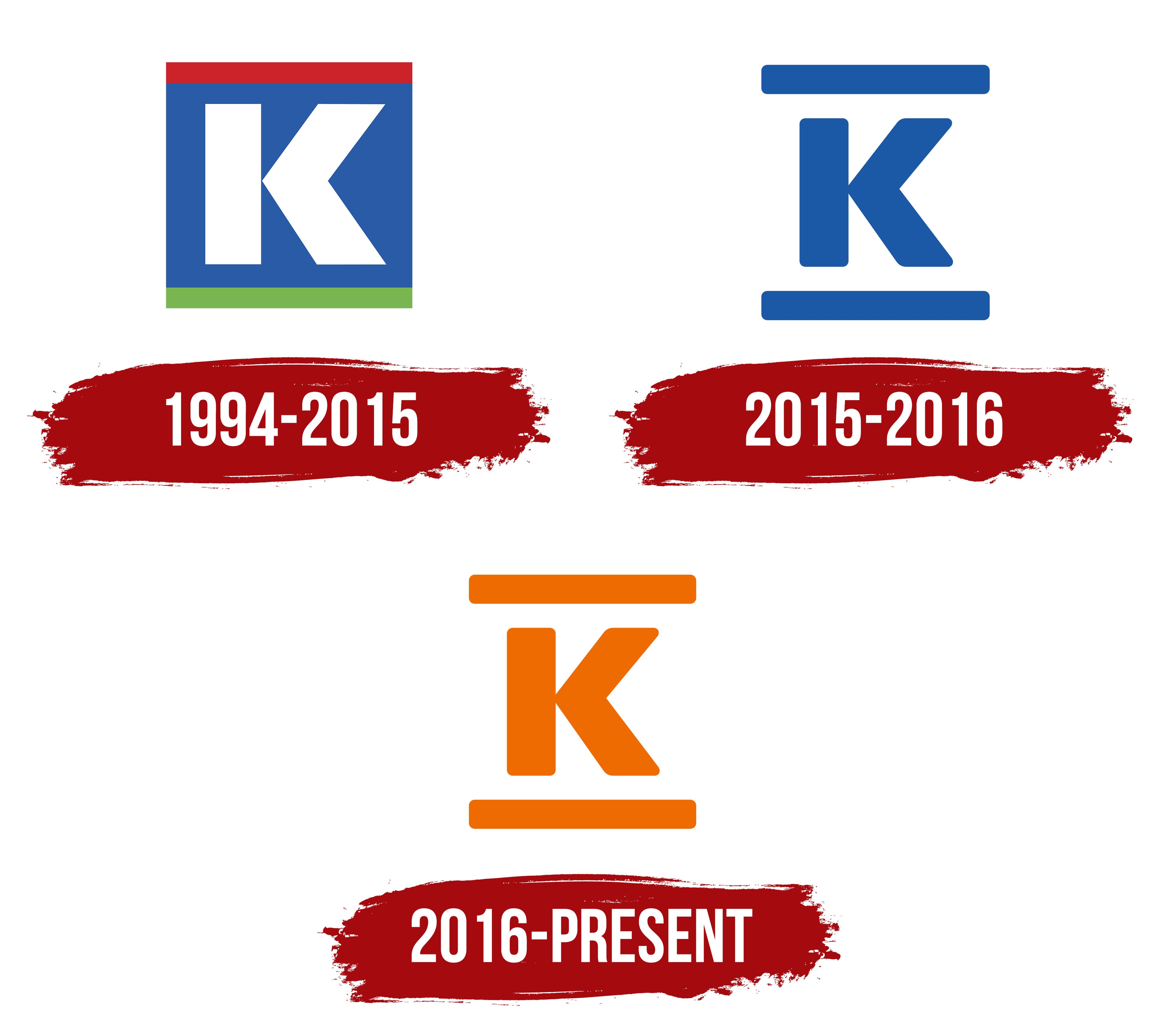
From 1994 to 2015, Kesko used a square logo divided into three colored areas. A dark red stripe occupied the top, while a green stripe ran along the bottom. Between them was a large blue field containing a white “K.” The emblem represented Kesko within the shared K-Group identity.
The group’s history began in October 1940 with the merger of four regional wholesale companies. The new organization included Savo-Karjalan Tukkuliike, Keski-Suomen Tukkukauppa Oy, Kauppiaitten Oy, and Maakauppiaitten Oy. Retail merchants helped establish all four companies. Kesko began operations in early 1941.
Managing Director E. J. Railo proposed the name. Kesko is an invented Finnish word resembling “keskittyminen,” meaning “concentration.” The association reflected the consolidation of four regional wholesalers into a nationwide organization. A network of independent K-retailers emerged alongside the company, and the letter “K” became the common identifier for their work with Kesko.
The 1994 version emerged from a K-Group identity overhaul that began the previous year. Finnish designer Erkki Ruuhinen and his studio developed the project. The team was assigned to update the “K-tunnus,” or “K symbol,” in the late 1980s. The work covered Kesko and four grocery formats: K-lähikauppa, K-market, K-supermarket, and Citymarket. All of them received identities connected by the letter “K.”
The white “K” had a heavy sans-serif form with sharp corners and massive strokes. The typography system used Univers 75 Black. Blue occupied most of the square, while the red and green stripes were equally thick. K-Group had used all three colors before the project began, so Ruuhinen’s studio retained them across the retail formats.
2015 – 2016
Kesko introduced an updated logo in 2015 as part of a major company transformation program. The letter “K” was removed from the square background and became an independent figure. In the previous version, the white character stood on a blue field between red and green stripes. The revised identity had a simpler, more open appearance.
Management connected the company’s business areas with the K-Group name and placed greater emphasis on customer needs. One logo could serve multiple divisions and support the group’s shared system. The historic letter “K” continued to represent Kesko in the new identity.
The uppercase “K” had a bold geometric sans-serif form. Thick strokes created one vertical stem and two diagonal arms. Slightly rounded corners and terminals softened the large character’s outline. Open space around the letter made its shape more prominent.
Two blue horizontal bars of equal length and thickness appeared above and below the “K.” Their ends echoed the rounded corners of the letter. The bars defined the open structure’s upper and lower boundaries. Blue united all parts of the logo, replacing the blue, red, and green combination used in the 1994 version.
2016 – today
In 2016, K-Group changed the logo color from blue to the vivid Pantone Bright Orange. The blue version introduced in 2015 was used only briefly. Its form carried over without alteration. The large letter “K” continued to appear between two horizontal bars.
The rollout began at K-Market locations during the conversion of Suomen Lähikauppa stores. The update later expanded to other retail chains within the group. Orange became the common color across the K brands, connecting their identities across stores and Kesko’s corporate materials.
Designer Chris Bolton participated in the project. He described orange as the common color of K-Group’s retail chains. The work included guidelines for logo use and the identities of the group’s business areas. The shared system maintained the connection among the divisions through the letter “K.”
The logo used a single color on a white background. The upper and lower bars had equal lengths and thicknesses, with the letter occupying the space between them. Rounded bar ends complemented the shape of the “K.” Pantone Bright Orange covered the entire symbol.
Orange appeared with red in store interiors and signage. Supporting colors included burgundy and berry-red tones. Kesko and K-Group used a single orange color for the corporate logo.