


![]() Waitrose Logo PNG
Waitrose Logo PNG
The emblem symbolizes freshness, naturalness, growth, and development. The Waitrose logo perfectly conveys the idea of grocery stores. Its symbols spread like a network along the base, demonstrating the unification of many outlets to meet visitors’ needs.
Waitrose (full name: Waitrose & Partners) is a retail chain with several hundred supermarkets across the UK. It is also a brand for selling products both domestically and abroad. The firm was founded in 1904 by Wallace Waite, David Taylor, and Arthur Rose, and in 1937 it was acquired by the John Lewis Partnership, which still owns the trademark. The first store is located in the Acton area of London (UK). Today, the head offices are located in the English cities of Bracknell and Victoria.
At first, it was just a grocery store opened in West London by three entrepreneurs. The organization was, in fact, a partnership, but after four years, it ceased to be one when a founder left. When the John Lewis Partnership absorbed it, it already had ten retail outlets of its own.
Then the story of ups and downs began. So, in 1944, the network increased by 12 points of sale at once. In 1951, one of the Waitrose brand stores completely switched to a self-service system. In 1955, the commercial network expanded throughout London; in the 1960s, it focused on the southeast region of England; and in the 1970s, nationwide expansion began.
Moreover, the Waitrose brand was the first to offer organic products and launched online shopping with home delivery. As a result, the brand became so famous that the UK population came to trust its emblem. No wonder he received a warrant from the royal court to supply food and alcoholic beverages for Queen Elizabeth II and Prince Charles. As for branding, the chain of stores was initially called Waite, Rose & Taylor, after the organizers’ names. But after one of them left, it changed its name to Waitrose. It was this version that became the basis of the emblem.
Meaning and History
![]()
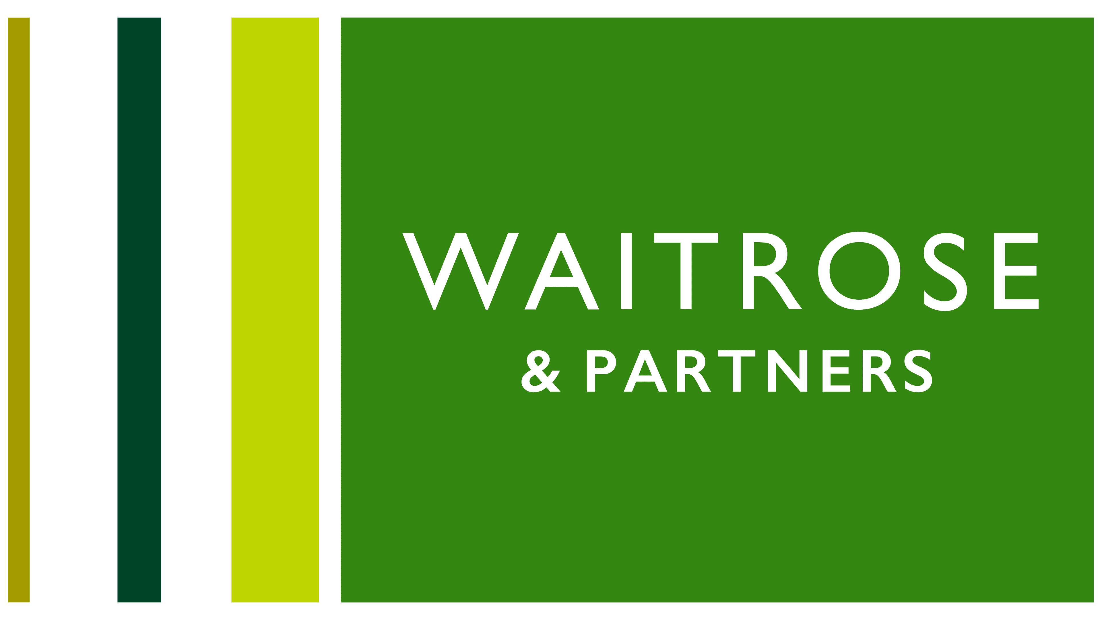
The British supermarket chain changed its name several times, which affected its visual identity. At first, she was known as Waite, Rose & Taylor, and this phrase became the basis for the wordmark. Then the name was shortened to Waitrose, and the inscription in the logo was reduced as well. And in 2018, the brand was renamed Waitrose & Partners after it entered a marketing partnership with high-end department store John Lewis & Partners. Colleagues agreed to use emblems made in the same style. They share a thin, minimalistic sans-serif typeface, and the signs have a similar background, consisting of a large quadrilateral and many thin stripes. The colors are strikingly different: Waitrose traditionally sticks to its usual green palette.
What is Waitrose?
Waitrose is a British supermarket chain, officially called Waitrose & Partners. Its history began in 1904 with the opening of a small shop. Since then, the company has transformed into a major retailer, holding a royal warrant for the supply of food and alcoholic beverages. It offers a wide range of environmentally friendly and organic products. The brand owner is John Lewis Partnership.
1904 – 1908
![]()
The first logo looked like a simple plaque listing the names of the store chain’s owners. The text was on an elongated brown rectangle and read “Waite, Rose & Taylor.”
1908 – 1955
![]()
After Taylor left the business, the name was shortened to the Waitrose version, which is still relevant today. In terms of individual brand identity, almost nothing has changed. The logo looked like simple, grotesque lettering on a dark background.
1955 – 1969
![]()
Since the signboard is the most important brand element with real sales points, it was decided to continue using a personal identity. There was nothing extra on the emblem, only the network’s name, set in uppercase. The letters had pronounced serifs and a wide inter-character arrangement. The logo’s color scheme is monochrome, consisting of black and white.
1969 – 1987
![]()
The designers made the font massive, wide, and bold. As a result, the inscription looked large. The serifs have also been enlarged, forming a kind of mini-rectangle at the ends of the characters.
1987 – 2004
![]()
The developers kept the same font but reduced the letter width. As a result, the lettering on the logo has become thin, graceful, and easy to read.
2004 – 2018
![]()
After the redesign, the brand received a color emblem with the name in a sleek typeface. The letters are green and completely devoid of serifs. They are elongated, clear, and chopped. The main emphasis was on the “t,” which was completely missing its bottom and had its top cut off at an angle, making it appear sharp.
2018 – today
![]()
The update pertains to the company’s rebranding. After the renaming, an addition appeared in the name: the ampersand (&) and the word “Partners.” The designers also worked on the lettering, using a clean, open, thin font that makes it easy to read. They also tweaked the color by choosing a dark olive shade. This option has one little feature that is almost invisible. The fact is that the last two letters in the added part (“R” and “S”) are slightly lower in size than the rest of the characters.
Font and Colors
For a brand, the most important things are logo recognition and versatility so that the supermarket’s name is heard. Therefore, the owners settled on a simple but effective solution: a minimalist logo consisting only of text. Advertising and marketing agency Monotype Imaging and studio Interbrand developed some variants for Waitrose.
Initially, the retail chain used signage dominated by serif letters. But starting from 2004, a radically opposite letter was approved, smooth and chopped, from the sans-serif category. Each logo had its own writing style. The year was close to fonts such as Clarendon Wide Medium, Typewriter FS Condensed Bold, Century Schoolbook FS Regular Humanist 521 Regular, and Chantilly Medium. The color scheme is monochrome, consisting of black and white (formerly) and olive and white (now).